
OCR Specification focus:
‘Plot suitable graphs with correctly labelled axes, appropriate scales, and units; measure gradients and intercepts to extract physical quantities.’
Graphical representation of data is one of the most powerful tools in physics. A well-constructed graph not only displays trends but also reveals relationships between variables, validates models, and allows key quantities to be determined visually.
The Purpose of Graphs in Experimental Physics
Graphs serve as visual summaries of numerical data. They help identify correlations, proportionality, and functional relationships between variables. By plotting data points and analysing the resulting trend, physicists can test hypotheses, confirm laws, and detect anomalies that may not be obvious from tabulated data alone.
Graphs also assist in error analysis and are an essential component in assessing the reliability of experimental results. A carefully prepared graph enables the extraction of meaningful quantities such as gradients, intercepts, and rates of change, which connect directly to physical laws.
Choosing Appropriate Axes and Scales
Selecting suitable axes is critical to ensure clarity and precision in presentation. The independent variable (the one deliberately changed during the experiment) is always plotted on the x-axis, while the dependent variable (the one measured) is plotted on the y-axis.
When assigning scales:
Choose a linear scale unless the relationship is known to be non-linear (e.g. logarithmic or exponential).
Ensure the scale uses simple, evenly spaced increments.
Use at least half the available graph paper or plotting area to maximise readability and accuracy.
Avoid awkward intervals that make plotting or interpretation difficult.
All axes must be labelled with both the variable name and its unit, such as Time / s or Current / A.
Linear scale: A scale in which equal distances on the axis correspond to equal intervals in the measured quantity.
A well-chosen scale makes it easy to identify trends and measure key values, while poor scaling can distort relationships and lead to misinterpretation.
Plotting Data Points Accurately
Each data point represents a single experimental measurement. For best practice:
Use small, neat crosses or dots with circles to mark data points.
If the measurement has uncertainty, display this using error bars, which show the possible range of the true value.
Avoid connecting data points directly with straight lines unless the relationship is clearly piecewise linear.
Where data scatter exists, draw a line of best fit, not necessarily passing through all points, but representing the overall trend of the data.
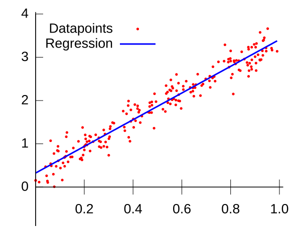
Scatter plot with a superimposed linear regression line. The diagram is clean and clearly shows how a straight line represents the overall trend, enabling measurement of gradient (rise/run) and y-intercept. Axis ticks provide an appropriate linear scale; units can be annotated to match the experiment. Source.
Line of best fit: A straight or smooth curve that best represents the pattern of the plotted data, balancing points above and below the line.
This line allows accurate determination of gradient and intercept values for further analysis.
Identifying Relationships and Interpreting Graph Shapes
The shape of a graph often indicates the nature of the physical relationship:
A straight line through the origin suggests direct proportionality.
A straight line with a non-zero intercept indicates a linear relationship with an offset.
A curve may suggest exponential, inverse, or quadratic dependence.
Students must interpret these shapes in light of theoretical expectations, confirming or questioning whether the data matches the predicted model.
Directly proportional: A relationship where one quantity increases by the same factor as another, expressed as y ∝ x or y = kx.
If a non-linear relationship is found, mathematical transformations such as taking logarithms can often linearise the data, simplifying analysis.
Measuring Gradients and Intercepts
Once a line of best fit is drawn, key parameters can be extracted.
EQUATION
—-----------------------------------------------------------------
Gradient (m) = Δy / Δx
m = Change in y-coordinate (dependent variable) / Change in x-coordinate (independent variable)
—-----------------------------------------------------------------
The gradient represents the rate of change between two quantities and frequently corresponds to a physical constant. For example, in a graph of force against extension, the gradient gives the spring constant.
When measuring the gradient:
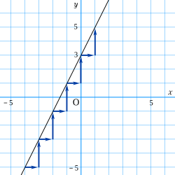
Diagram of a straight line with a right-angled gradient triangle annotated as rise (Δy) and run (Δx). This layout makes the definition gradient = Δy/Δx explicit and encourages using a large triangle to reduce percentage error. Units should be taken from the axes when reporting the gradient. Source.
Label the triangle clearly with Δx and Δy.
Avoid using individual data points with large random errors.
The intercept is the point where the line of best fit crosses the y-axis. This may reveal fixed quantities or systematic effects in an experiment, such as background radiation count rates or zero-error offsets.
EQUATION
—-----------------------------------------------------------------
Intercept (c): Value of y when x = 0.
—-----------------------------------------------------------------
Always express gradients and intercepts with appropriate units derived from the axes’ quantities.
Use of Units and Consistency
Maintaining unit consistency is essential for meaningful interpretation. The gradient’s unit results from dividing the y-axis unit by the x-axis unit. For instance, if velocity (m s⁻¹) is plotted against time (s), the gradient’s unit is m s⁻² — representing acceleration.
All numerical results should follow correct significant figure rules, matching the precision of the raw data used to construct the graph.
Assessing Graph Quality and Reliability
Good graphs exhibit:
Accurate plotting of all points within the smallest possible uncertainty range.
Straight or smoothly curved lines reflecting the expected theoretical trend.
Clear axis labels and properly chosen units.
Uniform and suitable scales.
Consideration of anomalies, which appear as points lying well outside the general trend.
Anomalous result: A data point that does not fit the expected pattern of the rest of the data, often due to measurement or procedural error.
Recognising anomalies is crucial for assessing data reliability and identifying potential procedural improvements.
Extracting Physical Quantities from Graphs
Graphs allow determination of constants and relationships. Common examples include:
Ohm’s Law: From a voltage-current graph, the gradient yields resistance.
Hooke’s Law: The force-extension gradient provides the spring constant.
Uniform acceleration: A velocity-time graph’s gradient gives acceleration, and the area under the graph represents displacement.
EQUATION
—-----------------------------------------------------------------
Area under graph = Physical quantity derived from integration (depends on axes)
Example: Area under velocity-time graph = Displacement (m)
—-----------------------------------------------------------------
Understanding these graphical relationships bridges theory and experimental data, making graph interpretation a vital analytical skill in physics.
Key Tips for OCR Examinations
Always plot using pencil and ruler for straight lines and neat scales.
Include units in both axis labels.
Select data ranges that make best use of graph paper or plotting software.
Indicate error bars when uncertainties are significant.
Show working triangles clearly when calculating gradients.
Round answers appropriately and quote results with matching significant figures.
Effective graph plotting and interpretation demonstrate not only competence in data handling but also a deeper understanding of the physical relationships being investigated.
Practice Questions
Question 1 (2 marks)
A student plots a graph of current (I) against potential difference (V) for a resistor. The graph is a straight line passing through the origin.
(a) State the relationship between I and V shown by this graph.
(b) Determine what the gradient of the line represents.
Mark Scheme
(a) (1 mark)
Current is directly proportional to potential difference.
(b) (1 mark)
The gradient represents the conductance (or the reciprocal of resistance) of the resistor.
(Accept “resistance is constant” as an indication of understanding the relationship if “conductance” is not mentioned, but full credit for “conductance” only.)
Question 2 (5 marks)
A student investigates the relationship between the force F acting on a spring and its extension x. The following data are collected, and a graph of F against x is plotted. The line of best fit is straight and passes close to the origin. The student draws a large right-angled triangle on the line of best fit and measures:
ΔF = 4.0 N, Δx = 0.020 m.
(a) Calculate the gradient of the line and state its physical significance. (2 marks)
(b) Explain how the student could use the graph to identify any anomalies in the data. (2 marks)
(c) Suggest one improvement to the experiment that would reduce uncertainty in the gradient measurement. (1 mark)
Mark Scheme
(a) (2 marks)
Gradient = ΔF / Δx = 4.0 / 0.020 = 200 N m⁻¹ (1 mark for correct substitution and calculation)
Gradient represents the spring constant (k) (1 mark).
(b) (2 marks)
Anomalies appear as points significantly away from the line of best fit (1 mark).
These could be caused by measurement errors or inconsistent extension readings (1 mark for explanation).
(c) (1 mark)
Use smaller scale divisions on measuring instruments / take repeated readings and average results / use a longer spring to reduce percentage uncertainty (any one valid suggestion).
FAQ
A line of best fit smooths out random experimental errors and highlights the underlying relationship between variables.
Joining points directly implies each data point is exact, which is rarely true due to uncertainties.
A best-fit line ensures proportionality and trend analysis are more reliable, especially when deriving gradients or constants.
Several factors can distort linearity:
Measurement errors or miscalibration of apparatus.
A variable that was assumed constant but actually varied.
Reaching the limit of proportionality (e.g., in Hooke’s law when the spring stretches beyond its elastic limit).
Checking the theoretical model and reassessing experimental control variables often clarifies the cause.
Uncertainties are shown using error bars on data points. Each error bar indicates the range of possible values based on measurement precision.
For a given quantity:
Vertical error bars show uncertainty in the dependent variable.
Horizontal error bars show uncertainty in the independent variable.
The size of these bars helps assess whether deviations from the line of best fit are significant.
Transforming data simplifies analysis and enables straightforward extraction of constants from gradients and intercepts.
For example:
Exponential data can be linearised by plotting ln(y) against x.
Power-law data can be linearised by plotting log(y) against log(x).
Once transformed, the relationship becomes easier to test and interpret mathematically.
Choose scales that make full use of the graphing area while keeping increments simple and regular.
Key guidelines include:
Select scales that give at least half-page coverage both horizontally and vertically.
Avoid awkward intervals like 3, 7, or 9, which complicate plotting.
Use scales that allow precise reading of intermediate values.
Good scaling not only improves accuracy but also enhances the clarity and professionalism of your graph.
