
OCR Specification focus:
‘Model Q(t) = QT e^(−t/RC) for discharging capacitors; use graphs and spreadsheets to analyse data.’
Modelling capacitor discharge behaviour with graphs and spreadsheets provides a powerful method for visualising exponential decay, interpreting physical parameters, and reinforcing mathematical understanding of capacitor–resistor circuits.
Graphical Modelling of Capacitor Discharge
Graphical modelling helps students connect theoretical exponential decay with observed data. When a capacitor discharges through a resistor, its charge decreases exponentially, producing a distinctive curve on a Q–t graph. This visualisation is essential for interpreting the nature of exponential change and identifying the effect of circuit components such as resistance and capacitance.
When introducing the concept of capacitor discharge, the term exponential decay appears frequently.
Exponential decay: A process in which a quantity decreases at a rate proportional to its current value.
A discharging capacitor follows a well-defined relationship between charge and time. This relationship forms the basis for both graphical and spreadsheet models. Before applying the equation, it is essential to recognise that the maximum charge of the capacitor at the beginning of discharge is often labelled QT, and this value determines the starting point of the decay curve.
EQUATION
—-----------------------------------------------------------------
Discharge Equation (Charge–time relationship) = Q(t) = QT e^(−t/RC)
Q(t) = Charge remaining on the capacitor at time t, measured in coulombs (C)
QT = Initial charge on the capacitor, measured in coulombs (C)
t = Time from the start of discharge, measured in seconds (s)
R = Resistance in the discharge path, measured in ohms (Ω)
C = Capacitance of the capacitor, measured in farads (F)
—-----------------------------------------------------------------
In plotting this relationship, the graph of charge against time yields a smooth curve descending steeply at first and gradually flattening. Such a curve allows students to infer the behaviour of the circuit without performing extensive calculations.
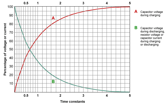
Graph showing exponential charging and discharging curves of a capacitor, illustrating the characteristic shape and behaviour of exponential change in RC circuits. Curve A rises while curve B falls, both governed by the same exponential form. The use of time constants and percentages is additional detail but supports understanding of exponential trends. Source.
Key Features of Q–t Graphs
Charges on capacitors do not drop linearly; instead, the rate of decrease is highest at the start of discharge. Students should learn to recognise several characteristic features:
Steep initial gradient, indicating a high discharge current when the capacitor is fully charged.
Constant-ratio property, where equal time intervals produce the same proportional decrease in charge.
Asymptotic behaviour, meaning the curve approaches zero charge but never actually reaches it.
Dependence on RC, with larger values of R or C increasing the time taken for charge to fall significantly.
Understanding these properties through graphs helps reinforce the physical significance of the time constant, although detailed study of τ occurs in another subsubtopic.
Spreadsheet Modelling
Spreadsheets allow rapid calculation and manipulation of the discharge equation. By automating calculations and producing real-time graphical outputs, students can more easily explore how changes to circuit values influence capacitor behaviour. This encourages active investigation and supports the analytical approach required at A-Level.
Modern spreadsheets offer tools for precise modelling, including calculated columns, fill-down functions, and graph-plotting features. These enable repeated recalculations with different values of resistance or capacitance, reinforcing patterns in exponential decay.
Structure of a Basic Spreadsheet Model
A clear and well-organised spreadsheet is essential for accurate modelling. Students should construct spreadsheets with columns that reflect underlying physical quantities. A recommended structure includes:
Time values progressing in equal steps such as 0.01 s or 0.1 s
Calculated charge values using the discharge equation
Optional additional columns for voltage or current if needed for extended analysis
A plotted graph showing Q against t, automatically updating as parameters change
Between each calculated value, spreadsheets highlight the smooth nature of the exponential pattern. As a result, the graph closely mirrors the theoretical Q–t curve, enabling easy visual comparison.
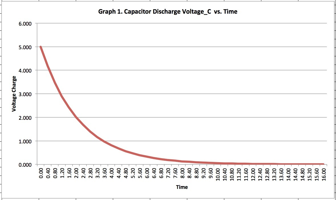
Spreadsheet-generated graph demonstrating exponential decay of capacitor voltage with time. Although plotted for voltage rather than charge, the curve follows the same exponential form as Q(t)=QTe−t/RCQ(t) = Q_T e^{-t/RC}Q(t)=QTe−t/RC. Numerical values such as the 5 V starting point provide additional context beyond the syllabus but illustrate spreadsheet modelling effectively. Source.
Using Spreadsheets to Explore Parameter Changes
Spreadsheets are particularly effective for demonstrating how different values of R and C influence the discharge curve. Students can explore these effects by adjusting input values and observing the resulting graph.
Useful approaches include:
Creating editable cells for resistance, capacitance, and initial charge
Observing how increasing R slows discharge by reducing current
Examining how larger C values extend the timescale of the decay
Comparing several curves on the same axes to highlight contrasting behaviours
Identifying the time taken for charge to reach a specific fraction of its original value
The spreadsheet environment encourages experimentation, allowing students to appreciate the sensitivity of exponential processes without performing repeated manual calculations.
Interpreting Spreadsheet Graphs
Graphs produced in spreadsheets should be analysed with the same care as hand-drawn graphs. Students must ensure:
Axes are labelled clearly, typically with charge on the vertical axis and time on the horizontal axis
Appropriate scales are selected to show the curve’s early steep drop and later gradual decline
Data points are calculated accurately using the exponential formula
Lines are smooth, indicating a correctly modelled exponential relationship
Comparisons between curves reflect true differences resulting from altered input values
Using spreadsheets for modelling not only supports accurate representation of capacitor discharge but also develops skills in digital data analysis, essential for practical and theoretical work in physics.
Practical Applications of Graphical and Spreadsheet Methods
Graphical and spreadsheet modelling form an important bridge between theory and experiment. They allow students to:
Prepare predictions before conducting a practical investigation
Compare experimental data with theoretical curves to assess accuracy
Identify experimental limitations, such as internal resistance or measurement lag
Interpret the physical meaning of changes in the discharge pattern
Build confidence in manipulating exponential relationships in capacitor circuits
These modelling tools are indispensable for understanding and analysing the discharge behaviour of capacitors in OCR A-Level Physics, giving students a structured and accessible means to interpret exponential decay in RC circuits.
Practice Questions
Question 1 (2 marks)
A spreadsheet is used to model the discharge of a capacitor using the equation Q(t) = QT e^(−t/RC).
State two advantages of using a spreadsheet to model the discharge of a capacitor.
Mark scheme:
• Any two of the following (1 mark each):
Allows rapid recalculation when values such as resistance or capacitance are changed.
Automatically generates graphs showing the exponential decay.
Reduces calculation errors by using formulas.
Enables easy comparison of multiple discharge curves on the same axes.
Question 2 (5 marks)
A student constructs a spreadsheet to model the discharge of a capacitor. The spreadsheet contains columns for time t and calculated charge Q(t).
(a) Describe how the student should use the discharge equation to generate the Q(t) column.
(b) Explain how the student could use the completed spreadsheet to analyse the effect of increasing the resistance R on the discharge curve.
Mark scheme:
(a)
• States that the student must enter the equation Q(t) = QT e^(−t/RC) into the spreadsheet (1 mark).
• Explains that the equation should reference spreadsheet cells containing QT, R, C, and t (1 mark).
• Indicates that the equation can be filled down to calculate Q(t) for each time value (1 mark).
(b)
• States that increasing R will increase the value of RC, slowing the discharge (1 mark).
• Explains that the student can change the R value in the spreadsheet and observe the updated curve (1 mark).
• Describes that the new graph will show a shallower gradient and a longer time before Q(t) approaches zero (1 mark).
FAQ
By plotting measured charge or voltage values alongside calculated exponential values from the model, discrepancies become visually apparent. Larger deviations at early times may suggest internal resistance or measurement delays.
A spreadsheet also allows students to generate residual plots (difference between measured and model values).
• Randomly scattered residuals indicate a good exponential fit.
• Systematic patterns suggest non-ideal behaviour or experimental error.
A clear model often includes adjustable input cells for QT, R, and C, making parameter exploration easier.
Additional useful features include:
• Conditional formatting to highlight rapid changes in charge
• Columns converting charge to voltage if desired for comparison
• A dynamic chart that automatically updates when input values change
These additions improve the clarity and analytical value of the model.
Too large a time step produces a jagged or poorly resolved curve, masking the smooth nature of exponential change. This can make interpretation of the decay rate difficult.
Too small a time step, while accurate, may clutter the spreadsheet and slow graphing performance.
A practical compromise is selecting time intervals that produce roughly 50–200 points across the decay, allowing clear visualisation of the curve.
Students can duplicate the original dataset and change parameters such as R or C in a second model. This allows two curves to be plotted simultaneously.
By overlaying these graphs, changes in gradient, curvature, or discharge duration become immediately noticeable.
This method highlights the sensitivity of exponential behaviour to small changes in RC.
Mistakes often include referencing incorrect cells for R, C, or t, leading to incorrect Q(t) values. Careful labelling and using absolute cell references for constants avoids this.
Another frequent error is forgetting to convert units, such as milliseconds to seconds.
Checking units, testing with known values, and displaying intermediate calculations (like RC) help ensure accuracy.
