
OCR Specification focus:
‘Present information and data scientifically, and use appropriate software and tools to process data, conduct research, and report findings effectively.’
Presenting scientific data clearly and accurately is essential for communicating experimental results. Effective presentation combines appropriate data formats, careful analysis, and the competent use of software tools for processing and reporting.
Presenting Data Scientifically
Data presentation is a crucial skill in physics. It ensures results are clear, interpretable, and scientifically valid. When data are presented correctly, trends become apparent, errors are identified, and conclusions can be justified. Students must learn to select the most appropriate representation—tables, graphs, or written summaries—to suit the type of data and investigation.
Tabular Data Presentation
Data tables should be well-organised, with headings, units, and uncertainties clearly stated. Each column should represent a measured or calculated variable, written with consistent decimal places and significant figures.
Independent variables (those you change) are usually placed in the first column.
Dependent variables (those you measure) follow in subsequent columns.
Derived quantities (such as ratios or differences) may be added as additional columns.
Always include units in column headings, e.g. Voltage / V, not Voltage (V).
A clear table allows the reader to assess precision, range, and reliability. The inclusion of uncertainties for each measurement—whether absolute or percentage—demonstrates awareness of experimental limitations.
Graphical Representation of Data
Graphs enable visual identification of relationships and trends. For linear data, a line of best fit illustrates the underlying pattern, even if some scatter exists.
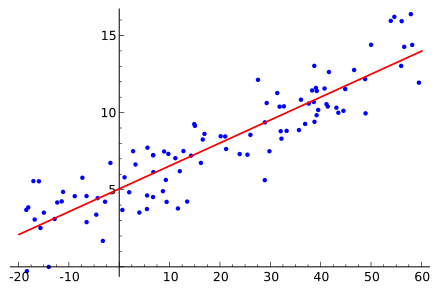
Scatter plot with a fitted straight line showing how a best-fit model summarises the overall trend despite point-to-point scatter. Axes are clearly labelled and evenly scaled, aiding reliable gradient and intercept estimation. This visual directly supports scientific presentation of results for linear relationships. Source.
Key rules for graph plotting:
Label both axes with quantity and unit.
Use a sensible scale so that data occupy at least half the graph paper.
Plot data points accurately, typically using small crosses.
Draw best-fit lines as smooth curves or straight lines through the data trend.
Avoid joining points dot-to-dot, unless data are discrete categories.
Gradient: The rate of change of the dependent variable with respect to the independent variable on a graph.
EQUATION
—-----------------------------------------------------------------
Gradient (m) = Δy / Δx
Δy = Change in dependent variable (unit varies)
Δx = Change in independent variable (unit varies)
—-----------------------------------------------------------------
A clear graph not only supports quantitative analysis but also provides qualitative insights—such as proportionality, inverse relationships, or saturation effects.
Data Processing and Analysis
Once data are recorded, the next step is to process them into useful forms—calculating averages, gradients, or derived values. Data processing may be done manually or using software tools.
Statistical Treatment of Data
Statistical tools help assess accuracy, precision, and reliability.
Mean: The arithmetic average of a set of values, obtained by summing all measurements and dividing by the number of measurements.
Other useful statistical measures include:
Range – difference between the largest and smallest value.
Standard deviation – shows the spread of data around the mean.
Percentage uncertainty – expresses uncertainty relative to the measured value.
Statistical analysis supports more accurate reporting and allows meaningful comparison between datasets.
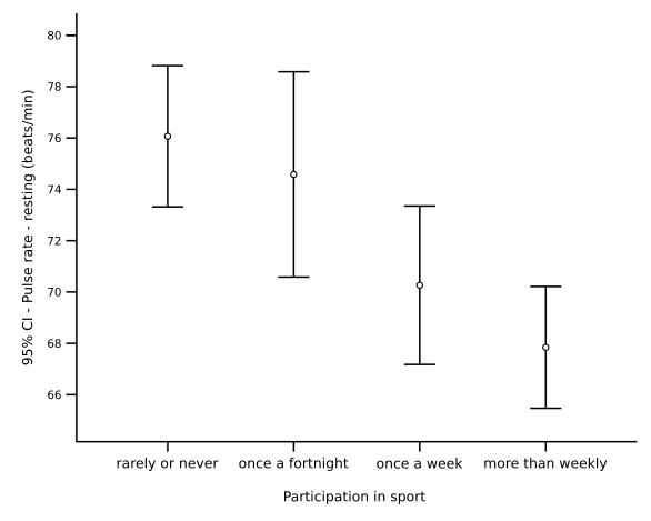
Bar chart of mean pulse rate by exercise level with error bars indicating 95% confidence intervals. It demonstrates how uncertainty can be visually encoded alongside central values. The real-world context is extra to the syllabus, but it usefully exemplifies best practice in reporting uncertainty. Source.
Data Transformation and Linearisation
Many physical relationships are non-linear, but they can often be linearised for easier analysis. For example, plotting y² against x or ln(y) against x can reveal a straight-line relationship. This approach helps verify theoretical models and constants.
Using a line of best fit, students can determine gradients, intercepts, and hence physical quantities—such as resistances, spring constants, or refractive indices.
Using Software Tools for Data Processing
In modern physics investigations, students must be proficient with ICT-based tools for data collection and analysis. These not only improve accuracy but also efficiency in reporting.
Spreadsheet Software
Spreadsheets such as Microsoft Excel or Google Sheets are common in physics for:
Calculating means, gradients, and percentage uncertainties automatically.
Creating high-quality graphs with trendlines and regression analysis.
Formatting tables and labelling data consistently.
Useful features include formulas (e.g. =AVERAGE()), error bars, and chart tools to produce publication-ready figures. Care must be taken to label graphs correctly and check for rounding errors.
Data Logging and Sensor Software
Data loggers record measurements directly from sensors—such as temperature probes, motion sensors, or light gates—into a digital platform. This reduces human error and allows rapid data collection. Software packages often display real-time graphs, enabling instant recognition of trends or anomalies.
Data can be exported for further analysis or combined with spreadsheet software to refine results. Students should ensure correct calibration and sampling rates to maintain data integrity.
Graphing and Analysis Tools
Advanced graphing programs such as Logger Pro, Graphical Analysis, or Python with matplotlib can perform curve fitting and complex modelling. These allow precise determination of physical constants and enable residuals analysis to test model validity.
Such tools are especially useful for waveform analysis, oscillation studies, and radioactive decay investigations, where accurate curve fitting and smoothing are essential.
Reporting Findings Effectively
Scientific communication demands clarity and transparency. Reports should follow a logical structure, allowing others to understand, replicate, and evaluate the investigation.
Structure of a Scientific Report
A well-structured report typically includes:
Title and aim – stating the investigation’s purpose.
Apparatus and method – describing the setup and procedure.
Results – presenting data in tables and graphs.
Analysis – discussing trends, calculations, and uncertainties.
Evaluation – assessing limitations and reliability.
Each section should be concise yet detailed enough to demonstrate scientific reasoning. Avoid vague descriptions; use quantitative detail wherever possible.
Ensuring Clarity and Accuracy
Write in the third person and past tense.
Use SI units consistently.
Ensure graphs and tables are fully annotated.
Include references to any theories, equations, or secondary data used.
Scientific Report: A structured written document that presents the aims, methods, data, analysis, and conclusions of an investigation, allowing peer understanding and replication.
Using professional software tools ensures that the final presentation meets the standards expected in academic and professional physics contexts, fulfilling OCR’s requirement to “present information and data scientifically, and use appropriate software and tools to process data, conduct research, and report findings effectively.”
Practice Questions
Question 1 (2 marks)
A student plots a graph of current (I) against potential difference (V) to determine the resistance of a wire. Describe two features that should be included on the graph to ensure it is presented scientifically.
Mark scheme:
1 mark for correctly stating that axes must be labelled with quantities and units, e.g. “Current / A” and “Potential difference / V”.
1 mark for identifying another correct feature, such as a suitable linear scale, accurate plotting of data points, or a line of best fit.
Question 2 (5 marks)
A student uses spreadsheet software to analyse data from an experiment investigating how the period of oscillation of a pendulum depends on its length. The student calculates averages, plots a graph, and adds a trendline with an equation and R² value.
(a) Explain how the use of spreadsheet software can improve the accuracy and clarity of data presentation compared to manual methods. (3 marks)
(b) State two ways the student could further improve the scientific reporting of their results within the spreadsheet. (2 marks)
Mark scheme:
(a)
1 mark for stating that the software can automatically calculate averages or gradients, reducing arithmetic error.
1 mark for stating that graphs and trendlines can be produced precisely and neatly, ensuring clear visual representation of data.
1 mark for stating that adding R² values provides a quantitative measure of how well the data fit the model.
(b)
1 mark for suggesting inclusion of error bars or uncertainty values on the graph.
1 mark for suggesting clear axis labels with units or consistent significant figures in the data table.
FAQ
Choose a table when you want to display precise numerical values or when comparing multiple variables clearly is essential.
Use a graph when showing trends, relationships, or proportionality between variables. A line or curve of best fit helps visualise these relationships more effectively.
As a rule of thumb:
Tables highlight accuracy and raw data.
Graphs highlight patterns and relationships.
Systematic errors shift all results in one direction due to consistent bias—such as calibration errors or zero offsets. They affect accuracy.
Random errors cause unpredictable variations from measurement to measurement, often due to human reaction time or environmental fluctuations. They affect precision.
When presenting data:
Include uncertainty ranges to indicate random error.
Note any possible systematic errors in the report’s evaluation.
Placing units in column headings keeps the table neat, readable, and consistent with scientific conventions. It also prevents misinterpretation of numerical values.
For example:
| Length / m | Time / s |
Including units only once in the heading ensures that readers immediately understand the measurement scale and avoids cluttering data entries.
Digital data loggers automatically record data at precise time intervals, improving consistency and reducing human error.
Advantages include:
Continuous or high-frequency sampling for detailed trends.
Instant graph generation for real-time analysis.
Easy export to spreadsheet or modelling software for deeper processing.
These systems are especially useful for capturing rapid or long-duration changes that are difficult to record manually.
To ensure your graphs look professional and convey data effectively:
Use clear axis labels with quantity and unit (e.g. Temperature / °C).
Ensure axes scales are evenly spaced and appropriate to data range.
Include a descriptive title.
Use a consistent format for fonts and line thickness.
If possible, include error bars or trendline equations to indicate uncertainty and data fit quality.
Professional formatting demonstrates attention to scientific accuracy and enhances credibility in reports.
