
AP Syllabus focus:
‘Understanding the role of graphical representations in identifying and highlighting key data features.
Learning how to represent categorical data using bar charts, focusing on the use of frequencies (counts) or relative frequencies (proportions).
The significance of the height or length of each bar, indicating the number or proportion of observations within each category.
Skill 2.B: Developing competency in graphically representing categorical data through bar graphs.
Essential Knowledge UNC-1.C.1 and UNC-1.C.2: Mastery of creating and interpreting bar charts, with a focus on accurately reflecting frequencies or relative frequencies.’
Bar charts provide a clear and intuitive way to visualize categorical data, helping reveal patterns, differences among categories, and essential insights that numerical summaries alone cannot convey.
Creating Bar Charts for Categorical Data
Bar charts are a foundational tool for displaying categorical variables, offering an immediate visual summary of how frequently each category appears in a dataset. Because categorical variables represent groups or labels rather than numerical magnitudes, bar charts emphasize comparisons in counts or relative frequencies rather than numerical calculations. Students must demonstrate accuracy, clarity, and context awareness when constructing bar charts, as emphasized by Skill 2.B and Essential Knowledge UNC-1.C.1 and UNC-1.C.2.
Understanding the Purpose of Bar Charts
Bar charts serve as graphical representations that highlight key features of categorical data. Each bar represents a category, and the height (or length, for horizontal bar charts) communicates either the frequency or the relative frequency of observations within that category. This visual distinction allows quick recognition of which categories are most or least common and supports meaningful interpretation within the context of the data.
A categorical variable is one whose values represent group labels or classifications.
Categorical Variable: A variable whose values identify categories or groups rather than numerical quantities.
Bar charts translate these non-numerical groupings into interpretable visual comparisons, allowing viewers to identify patterns that might not be evident from raw counts alone.
Components of an Effective Bar Chart
Creating a high-quality bar chart involves careful attention to structure and labeling so the display conveys accurate and meaningful information.
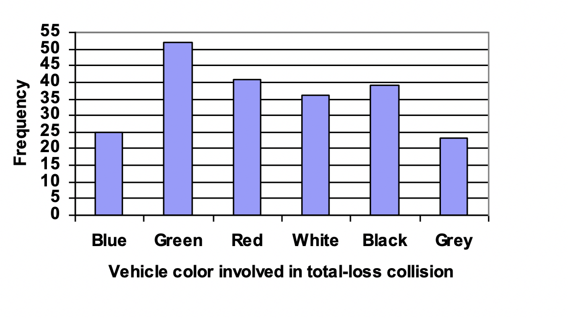
This bar chart displays the frequency of total-loss collisions for cars of different colors. The horizontal axis lists categories, while the vertical axis shows counts. It demonstrates proper scaling, distinct non-touching bars, and clear labeling consistent with AP bar chart construction guidelines. Source.
Key components include:
Clearly labeled axes, with categories on one axis and frequencies or relative frequencies on the other.
Distinct, non-touching bars, emphasizing that categories are separate and unordered (unless the context suggests a meaningful sequence).
Consistent scaling, so bar heights reflect proportional differences accurately.
Informative titles, describing what variable is being represented and, when appropriate, the unit of measurement for frequency.
When a bar chart represents frequencies, it displays the number of observations in each category. When representing relative frequencies, each bar displays the proportion of the sample that falls within each category. These perspectives highlight different aspects of the same dataset and can support different interpretive questions.
Frequency vs. Relative Frequency in Bar Charts
Understanding the distinction between frequency and relative frequency is crucial for accurate bar chart construction and interpretation.
Frequency: The number of observations belonging to a specific category.
Relative frequency places each category in proportion to the whole, allowing comparisons across samples of different sizes.
Relative Frequency: The proportion of observations in a category, calculated as the category’s frequency divided by the total number of observations.
Including both frequency and relative frequency perspectives deepens understanding, especially when comparing multiple datasets or communicating findings to different audiences.
A normal sentence is needed here to maintain flow after the definition blocks and ensure clarity before moving into procedural aspects of bar chart creation.
When representing relative frequencies, each bar displays the proportion of the sample that falls within each category.
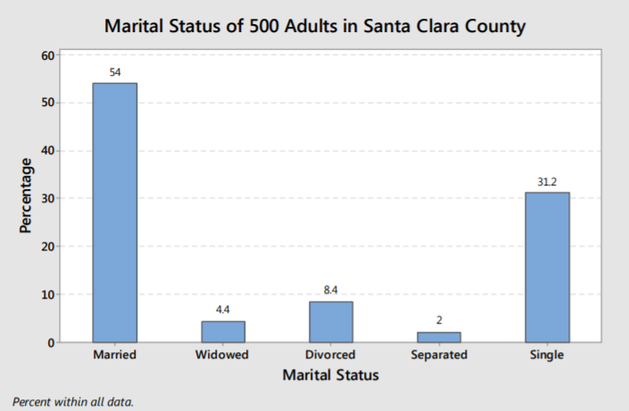
This bar chart shows the relative frequency of marital-status categories in a sample of adults. Bar heights represent percentages, demonstrating how proportions can be graphed effectively. It illustrates that switching from frequency to relative frequency preserves overall bar chart structure while shifting the scale to percentages. Source.
Constructing a Bar Chart
To construct a bar chart that aligns with the AP Statistics expectations, follow a structured approach:
Identify the categorical variable and list all categories it contains.
Determine frequencies or relative frequencies for each category, depending on the intended message of the graph.
Choose an appropriate orientation: vertical bars for traditional readability or horizontal bars for long category names or large category sets.
Create non-touching bars, clearly separated to emphasize the categorical nature of the data.
Scale the vertical axis so that the highest bar fits well without crowding.
Label categories and axes using clear, context-appropriate terminology.
Add a descriptive title indicating the variable and the population or sample being represented.
This structured process ensures bar charts accurately represent categorical data while supporting meaningful interpretation, fulfilling the expectations of Skill 2.B.
Interpreting Bar Charts
Interpreting bar charts requires attention to the height of each bar, which directly reflects the count or proportion in each category. Students should focus on:
Which categories dominate (highest bars).
Which categories are least common (shortest bars).
Comparative differences, such as whether one category is twice as frequent as another.
Contextual interpretation, linking category sizes to the situation being studied.
Because bar charts visually emphasize differences among categories, they are effective tools for drawing justified claims grounded in the dataset’s context. Interpreting a bar chart correctly requires connecting visual patterns to the story behind the data, consistent with AP Statistics’ emphasis on contextual reasoning.
Variants and Considerations
Bar charts can take several forms, including clustered (grouped) or segmented bars, though the standard single-variable bar chart remains the focus of this subsubtopic. Regardless of form, the guiding principle remains the same: bars represent categories, and bar height communicates frequency or relative frequency.
Careful construction and interpretation of bar charts allow students to uncover patterns, communicate findings effectively, and meet the AP requirement for mastery of categorical graphical representation.
FAQ
Common pitfalls include:
• inconsistent scaling on the vertical axis
• failing to label axes or categories clearly
• using bars of different widths
• adding unnecessary images or colours that distract from the data
Avoiding these errors ensures the chart remains readable and scientifically appropriate.
Bar charts alone do not display uncertainty, but you can supplement them.
For example, you may include:
• error bars representing sampling variability
• annotations showing confidence intervals or margins of error
These additions must be relevant to the context, used sparingly, and clearly explained so the chart remains simple and accessible.
Separated bars emphasise that the categories are distinct and non-numerical. Touching bars can imply continuity or ordering, which is appropriate for histograms but misleading for categorical variables.
A visible gap also helps viewers distinguish categories quickly and reduces visual clutter.
Reordering is useful when you want to emphasise comparisons more clearly. Common approaches include:
• ordering from highest to lowest frequency
• grouping similar categories together
• alphabetical ordering for ease of reference
However, reordering should never distort or hide the meaning of the categories; context must always guide the arrangement.
Use frequencies when the raw number of occurrences is important, such as identifying which category was chosen most often.
Use relative frequencies when comparing groups of different sizes or when the proportion of responses is more meaningful than the count.
Relative frequencies are particularly helpful when presenting survey data to a broad audience who may be unfamiliar with the sample size.
Practice Questions
Question 1 (2 marks)
A student collects data on the preferred study locations of pupils in a class: Library, Home, Café, and Classroom. They wish to present this categorical data using a bar chart.
State two essential features the student must include to ensure the bar chart is correctly constructed.
Question 1 (2 marks)
Award one mark for each correct feature stated (any two):
• Bars must be separated (non-touching) to show distinct categories. (1)
• Axes must be clearly labelled with categories on one axis and frequency/relative frequency on the other. (1)
• A suitable title identifying the data set must be included. (1)
• A consistent scale must be used on the vertical axis. (1)
Question 2 (5 marks)
A researcher surveys 200 people about their preferred type of exercise: Running, Cycling, Swimming, or Gym Work.
They decide to represent the results using a bar chart showing relative frequency.
(a) Explain why a bar chart is an appropriate choice for presenting this data.
(b) Describe the steps required to construct a clear and accurate relative frequency bar chart.
(c) The researcher notices that the bar for Swimming is the tallest. State what this indicates about the data, and explain why context is important when interpreting this result.
Question 2 (5 marks)
(a) Up to 2 marks:
• Bar charts are suitable for categorical variables with distinct groups. (1)
• They clearly show comparisons between categories using height or length of bars. (1)
(b) Up to 2 marks for describing steps:
• Determine the relative frequency for each exercise category by dividing each category's count by the total number surveyed. (1)
• Draw separate bars for each category with equal width and no touching, using a vertical scale that represents relative frequency or percentage. (1)
• Label axes appropriately and include a clear, descriptive title. (1)
(c) Up to 1 mark:
• The tallest bar indicates that Swimming has the highest relative frequency (i.e. the largest proportion of people prefer it). (1)
• Context is important because the meaning depends on the population surveyed (e.g. a community with strong access to swimming facilities may bias preferences). (1)
(Any 1 valid point for context; maximum 1 mark.)
