
AP Syllabus focus:
‘Techniques for comparing multiple sets of categorical data graphically, employing bar charts, frequency tables, or other graphical methods. Understanding how comparisons across different data sets can reveal similarities, differences, and trends related to the same categorical variable. Skill 2.D: Developing the ability to compare and contrast categorical data sets effectively, with a focus on justifying claims or conclusions derived from the graphical data representation. Essential Knowledge UNC-1.E.1: Learning to use graphical comparisons to analyze two or more data sets, focusing on methodological approaches and the interpretation of findings.’
Comparing categorical data across groups helps reveal meaningful similarities, differences, and trends. Effective comparison relies on clear graphical representations, accurate interpretation, and attention to context within each dataset.
Understanding the Purpose of Comparing Categorical Data
Comparisons of categorical data across groups allow statisticians to examine how the distribution of a categorical variable differs under varying conditions or among distinct populations. Such analysis is foundational in identifying patterns that support or challenge claims about the data. Because categorical data summarize counts or proportions across categories, interpretation must focus on comparing relative frequencies, patterns, and notable contrasts rather than numerical magnitudes alone.
Key Graphical Tools for Comparing Groups
Bar Charts for Multiple Groups
Bar charts are primary tools for visual comparison because they display frequencies or relative frequencies clearly across categories. When comparing groups, they are typically modified in one of two ways to ensure that patterns are easy to detect.
Clustered bar charts, which position bars for different groups side-by-side within each category, support direct visual comparisons.
Stacked bar charts, which combine multiple groups within a single bar to show proportions, highlight differences in category composition.
These methods expose similarities or differences in distribution shape across groups by focusing on bar height or segment size.
In a side-by-side bar chart, each category shares the same axis position, and separate bars for each group allow direct visual comparison of frequencies or relative frequencies.
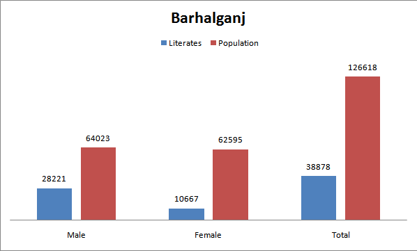
This grouped bar chart shows population and literacy for males and females in Barhalganj. It demonstrates how side-by-side bars allow clear visual comparison across groups. The geographic context is additional detail beyond the syllabus, but the chart structure aligns with standard comparative bar chart design. Source.
Segmented (Stacked) Relative Frequency Graphs
Segmented bar charts can display relative frequencies rather than raw counts, making it easier to compare groups of different sizes. Because relative frequencies standardize group size, any observed differences more reliably reflect changes in category proportions, not sample size variation.
In a segmented (stacked) bar chart, each bar corresponds to a group, and colored segments show how that group’s total is split among categories, often using relative frequencies.
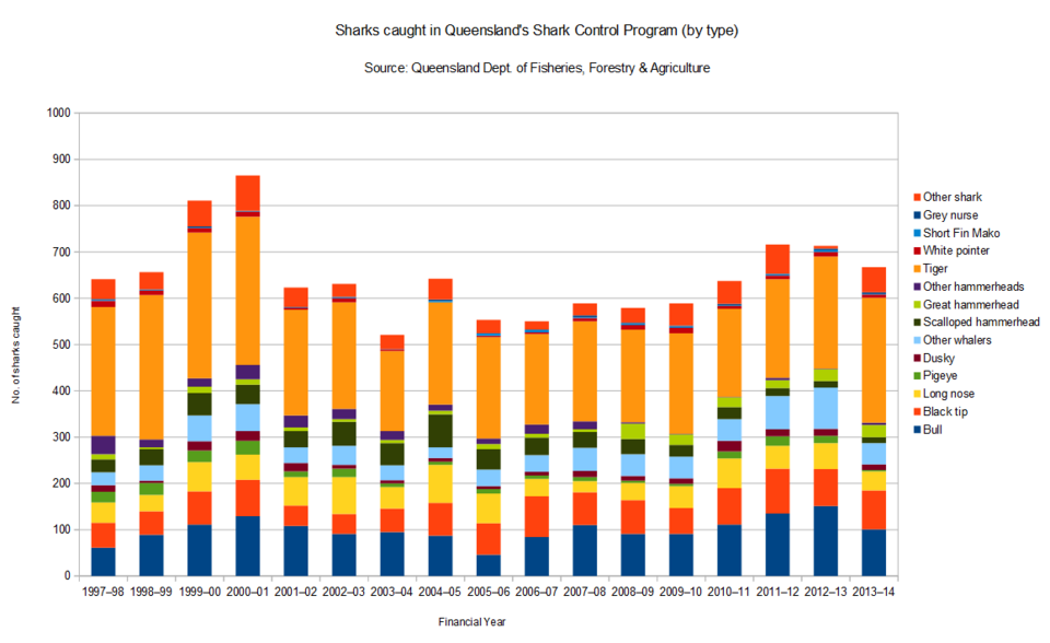
This stacked bar chart illustrates counts of shark species caught in Queensland over many years, showing how stacked segments reveal both totals and internal category composition. The detailed species and time span exceed AP scope, but the graphical structure exemplifies segmented bar charts used for comparing categorical proportions. Source.
Using Frequency and Relative Frequency Tables
Constructing Comparative Tables
Tables remain essential when graphical representation is insufficient or when precise values are required. A comparative table lists each category and shows each group’s:
Frequency (count)
Relative frequency (proportion or percentage)
This structure allows readers to trace patterns and poses minimal cognitive strain when moving between groups.
Interpreting Comparative Tables
When studying comparative tables, focus on:
Which categories dominate within groups
Whether groups share similar proportional patterns
How any differences support claims about distinctive trends
Trends should always be framed using context, as emphasized in the AP syllabus, to avoid drawing conclusions disconnected from the scenarios the data represent.
Identifying Patterns and Trends Across Groups
Recognizing Similarities
Groups may display similar distributions when bars align in height or proportions match across categories. These similarities often suggest that the categorical variable behaves consistently under different conditions.
Recognizing Differences
Differences emerge when bar heights diverge or relative frequencies vary notably. These divergences can reveal effects associated with conditions, treatments, or demographic attributes, depending on the study context.
Highlighting Trends
Trends refer to repeated directional patterns across categories and groups. These may include:
A rising or falling pattern in category frequencies
Shifts in dominant categories
Differences that widen or narrow between groups across categories
Because trends form the basis for claims, conclusions must be expressed cautiously and supported by the graphical or tabular evidence presented.
Methodological Considerations When Comparing Groups
Consistency in Graphical Scales
Maintaining identical scales across groups ensures that visual comparisons are valid. Whether comparing frequencies or relative frequencies, all groups must be plotted using the same vertical axis to avoid misleading interpretations.
Choosing Between Counts and Relative Frequencies
Counts are appropriate when comparing groups of equal size, while relative frequencies are necessary when group sizes differ. Relative frequencies allow fair comparison by portraying proportional representation.
Contextual Interpretation
The AP syllabus stresses the centrality of context when describing categorical data. In comparative settings, context guides interpretation by linking observed patterns to real-world explanations. Without context, comparisons may seem artificially similar or different.
Justifying Claims Using Comparative Graphs
Making Evidence-Based Claims
Graphical comparisons enable students to justify claims about group differences by pointing to observable contrasts. For claims to be valid, they must reference:
Differences in bar heights or segment proportions
Notable shifts in category dominance
Clear variations in relative frequencies
Supporting Claims with Multiple Representations
Using both graphs and tables strengthens justification by reinforcing visual observations with numerical evidence. This practice aligns with Skill 2.D, which emphasizes the importance of justifying conclusions with appropriate statistical tools.
Recognizing Limitations
Comparisons may be limited by sample size, lack of categories, or insufficient variation. Students should be aware that some apparent differences may not represent meaningful patterns but may instead reflect randomness within categorical data.
Selecting Effective Methods for Comparison
Choosing the most suitable representation depends on:
The number of groups
Whether group sizes vary
Whether the goal is to compare totals or proportions
The complexity of the categorical variable
Bar charts often provide the clearest comparison, but tables offer precision, and segmented charts highlight compositional differences. Awareness of these advantages aids in selecting methods that best support accurate interpretation.
Bar charts used to compare groups can be drawn either vertically or horizontally; the key is that corresponding categories for each group line up so their bar lengths are directly comparable.
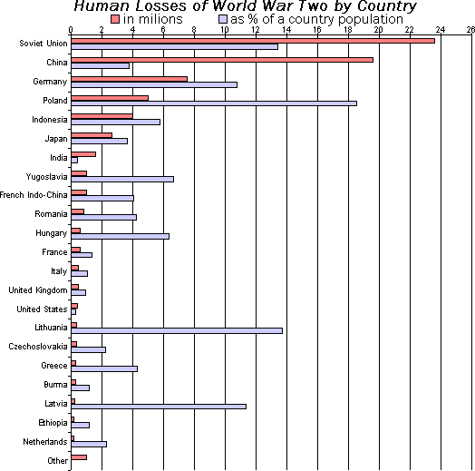
This horizontal grouped bar chart illustrates how bar length allows direct comparison of categories across groups. Although the wartime subject matter exceeds AP scope, the display effectively demonstrates the structure of horizontally aligned grouped bars used for comparing categorical data. Source.
Interpreting Findings Across Groups
A thoughtful interpretation synthesizes observed similarities, differences, and trends while connecting them to the data context. Students should aim to articulate how the categorical variable behaves across groups and what meaningful insights emerge from the comparison process, focusing on clarity, justification, and context-driven reasoning.
FAQ
Visual differences alone do not confirm meaningful patterns. Small differences in bar heights may occur by chance, especially with small sample sizes.
To judge whether differences are meaningful, consider:
The size of the difference relative to the overall scale
Whether the same pattern appears consistently across multiple categories
Whether sample sizes are large enough to support reliable comparison
Context is essential — if a pattern aligns with a plausible real-world explanation, it is more likely to be meaningful.
Relative frequencies allow comparisons in a standardised way, which helps reveal proportional differences that raw counts might obscure.
Even with similar sizes, small differences in totals can slightly distort comparisons. Using proportions ensures that each group’s distribution is shown on the same basis.
Relative frequencies also simplify reading patterns when groups contain many categories, as proportions highlight which categories dominate.
Horizontal layouts can improve readability when category labels are long or when many categories must be shown without overlapping text.
They also make it easier to compare differences when bars represent large numerical values because readers naturally judge length more accurately on a horizontal axis.
Horizontal grouped bars are often used in social or demographic comparisons where categories are descriptive phrases.
The total height of each bar is easy to compare, but individual segments—especially those not touching the baseline—can be harder to compare accurately.
Possible issues include:
Middle segments appearing distorted if colours are similar
Difficulty judging small differences when categories have thin segments
Misinterpretation if colours are inconsistent between groups
Clear legends, distinct colours, and sensible category ordering help reduce confusion.
Comparison becomes difficult when the viewer can no longer track patterns reliably across bars.
As a guide:
More than four or five groups may overwhelm a side-by-side bar chart
More than five or six categories can make stacked bars cluttered
Too many colours reduces clarity and makes the legend harder to interpret
If the chart becomes too busy, consider simplifying categories, splitting the comparison into separate charts, or using a table for precise values.
Practice Questions
(2 marks)
A researcher creates a side-by-side bar chart to compare the proportion of students choosing different lunch options at two schools. State what feature of the bar chart allows for a clear comparison between the two schools, and explain why this feature is helpful.
(2 marks)
1 mark: Identifies that bars for the two schools are placed side-by-side within each category.
1 mark: Explains that this arrangement allows direct visual comparison of bar heights or proportions for the same category.
(5 marks)
A study compares three age groups (18–29, 30–49, 50+) on their preferred type of news source: online news, television news, or printed newspapers. The results are displayed in a segmented (stacked) bar chart, where each bar represents an age group and the segments show the relative frequency of each news source.
Discuss how this graphical representation can be used to identify differences and similarities between the age groups. In your answer, comment on scale consistency, category proportions, and how trends or patterns can be interpreted from the chart.
(5 marks)
1 mark: States that each bar shows the distribution of news source preferences within an age group.
1 mark: Notes that using relative frequencies allows fair comparison even if age group sizes differ.
1 mark: Comments on the importance of a consistent scale across the bars for valid comparison.
1 mark: Identifies that differences in segment sizes reveal how preferences vary between age groups.
1 mark: Describes at least one possible observed pattern or trend (e.g., one age group showing a notably larger segment for a particular news source).
