
AP Syllabus focus:
‘Definitions and implications of unimodal, bimodal, and uniform distributions.
- How the mode(s) of a distribution can influence its classification and interpretation.
- Identifying real-world scenarios where different types of distribution shapes are observed.
- Skill 2.A: Gaining insights into how the presence of peaks affects the distribution's interpretation.’
Understanding the number of peaks in a quantitative distribution helps reveal underlying patterns, potential subgroups, and the overall behavior of the data, supporting accurate, context-driven interpretation.
Exploring the Number of Peaks in a Distribution
The shape of a distribution is one of the central components of describing quantitative data. One especially meaningful aspect of shape is the number of modes, or peaks, that appear when the data are graphed using displays such as histograms, dotplots, or stem-and-leaf plots. Each mode represents a value or range of values where observations tend to cluster. Recognizing whether a distribution is unimodal, bimodal, or uniform helps analysts interpret data patterns, hypothesize about underlying causes, and identify meaningful differences in subgroups.
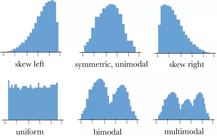
This set of histograms illustrates several common distribution shapes, including uniform, unimodal, bimodal, and multimodal patterns. The bottom row highlights how the number of peaks distinguishes different modalities. Additional shapes shown provide helpful broader context for interpreting distribution form. Source.
Unimodal Distributions
A unimodal distribution has one clear peak where values concentrate noticeably more than elsewhere in the distribution. This peak represents the mode and often provides an immediate sense of the most typical or frequent values in the dataset.
Unimodal Distribution: A distribution with one prominent peak indicating a single concentration of data values.
A unimodal shape is common in many naturally occurring phenomena, particularly when data cluster around a central point due to consistent underlying processes. When the peak appears at the center and the distribution is roughly symmetric, it may resemble a bell-shaped pattern. However, unimodality does not require symmetry; the distribution may still be skewed left or right while maintaining a single dominant peak. Understanding its mode helps students identify the most common region of data without assuming any particular functional model.
Bimodal Distributions
A bimodal distribution contains two distinct peaks separated by a noticeable dip or valley in frequency.
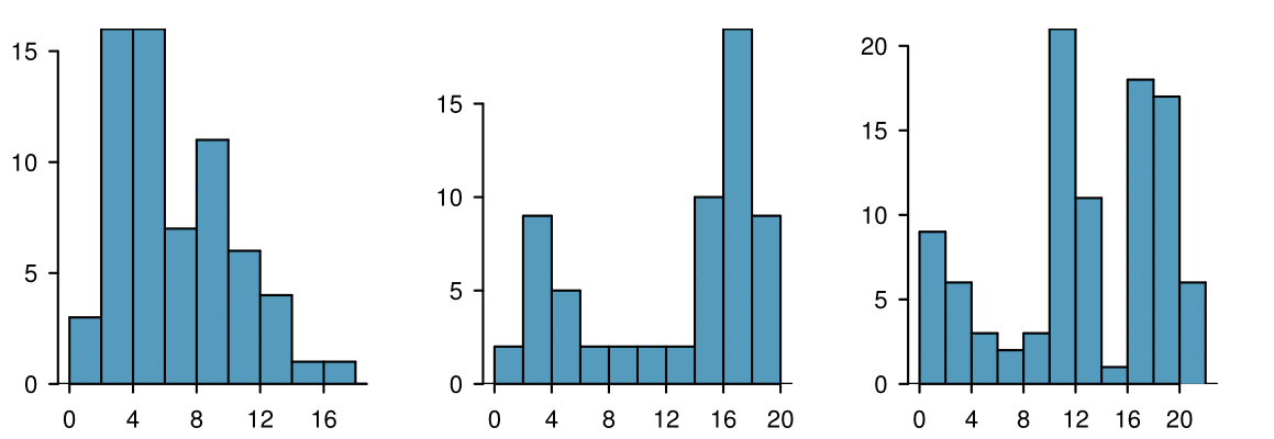
These three histograms demonstrate how distributions differ when they contain one, two, or three prominent peaks. The middle graph clearly shows a bimodal pattern with two clusters separated by a valley. Multimodality is also included to help students understand how counting peaks extends beyond the bimodal case. Source.
Bimodal Distribution: A distribution with two prominent peaks, often suggesting two underlying subpopulations or processes.
The separation between the modes is typically meaningful. It may reflect categorical distinctions—such as comparing two teaching methods, two geographic regions, or two product types—that influence the values of the quantitative variable. For AP Statistics students, identifying bimodality is crucial for avoiding misleading interpretations. Treating a bimodal dataset as unimodal may obscure important insights, such as when two different groups exhibit different central tendencies. Because bimodal shapes often arise from mixed populations, investigating context is essential to understand why the peaks occur.
Uniform Distributions
A uniform distribution occurs when all values in the dataset occur with approximately equal frequency, producing a flat or nearly flat shape across the range of data. Unlike unimodal or bimodal distributions, a uniform distribution does not contain any meaningful peak.
Uniform Distribution: A distribution in which all values occur with roughly equal frequency, resulting in a flat overall shape without prominent peaks.
Uniform distributions signal that observations are spread evenly, with no particular value or region exhibiting dominance.
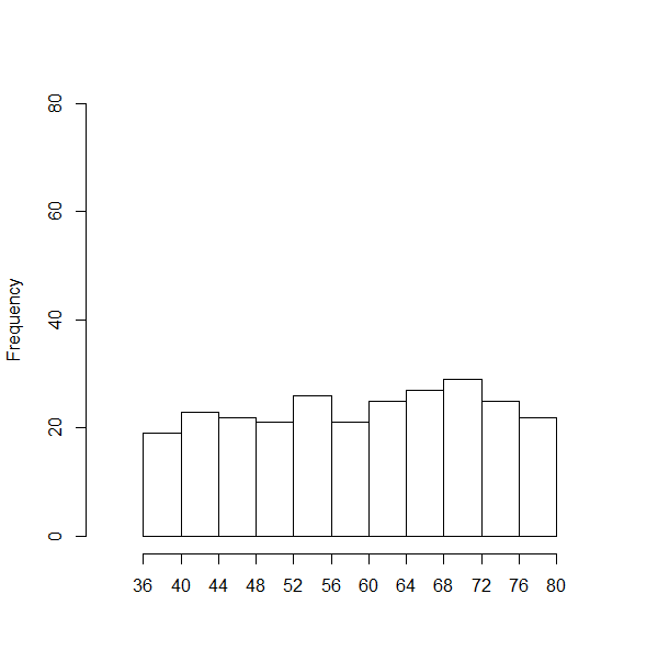
This histogram illustrates a uniform distribution, where bar heights remain approximately equal across the full range of values. The visual shows the absence of a dominant mode, emphasizing even spread. Although the page includes additional plots, this histogram aligns directly with the concept of uniformity discussed in the notes. Source.
Understanding this pattern helps analysts describe situations in which all outcomes are about equally likely or where no concentration of observations appears.
Interpreting Modes and Their Implications
The number of peaks in a distribution does more than classify its shape; it provides essential information for interpretation. A single peak may suggest a consistent underlying process, while two peaks may point to distinct groups or repeated measurement conditions. Uniform patterns highlight a lack of concentration, suggesting that no particular outcome stands out.
Understanding these distinctions helps students better describe patterns in context, aligning with Skill 2.A's emphasis on articulating distribution characteristics. When describing data, students should consider:
How many modes are present and whether the peaks are clear.
What the peaks represent in context, such as behavioral patterns, natural variation, or subgroup characteristics.
Whether the distribution’s appearance suggests uniform behavior or equal likelihood across the domain.
How the number of peaks influences interpretation, especially when comparing groups or investigating unusual features.
Real-World Scenarios Reflecting Different Shapes
Connecting distributions to realistic scenarios strengthens understanding and promotes accurate contextual interpretation. Unimodal shapes might appear in measurements influenced by a single dominant factor, such as heights of students in the same grade level. Bimodal shapes often occur when combining data from two groups with different characteristics, such as travel times from urban and rural areas. Uniform shapes arise in structured or random settings, such as simulated data where each outcome is equally probable.
These connections reinforce the idea that the form of a distribution is not arbitrary but instead reflects meaningful features of the data-generating process. Such insight supports deeper reasoning about data and strengthens students' ability to justify claims based on observed patterns.
FAQ
Begin by checking the consistency of the apparent peaks. If the dip between them is shallow or unstable across different bin widths, the distribution may still be unimodal.
A genuinely bimodal shape usually persists across:
• Alternative histogram bin widths
• Dotplots or density plots
• Subsetting the data by relevant groups
If the second peak disappears under these checks, the pattern may be noise rather than true bimodality.
Uniformity rarely produces perfectly equal frequencies because samples contain natural random variation.
Small departures from equality may result from:
• Limited sample sizes
• Random fluctuations across bins
• Slight inconsistencies in measurement or rounding
If the bar heights are broadly similar and no dominant mode appears, the distribution is still considered approximately uniform.
Yes. Real data often include minor irregularities that look like small bumps.
A distribution is still considered unimodal if:
• One peak is clearly dominant
• Secondary bumps are small, inconsistent, or unstable across different graphical displays
Local irregularities often disappear when bin widths are adjusted or when larger samples are collected.
Uniform distributions typically arise when each outcome is equally likely or when people’s choices are evenly spread across a range.
Examples include:
• Random number generators producing values across a fixed interval
• Arrival times within a very wide window where no particular time is favoured
• Simulated processes designed to avoid clustering
These settings do not create strong concentration in any specific region, resulting in a flat pattern.
Small samples can obscure or exaggerate modes, making modality harder to interpret accurately.
With larger samples:
• True peaks become clearer and more stable across different display types
• Random bumps smooth out
• The distinction between unimodal, bimodal, and uniform patterns becomes easier to confirm
Always consider whether the sample is large enough before drawing conclusions about the number of peaks.
Practice Questions
Question 1 (1–3 marks)
A histogram of weekly study hours for a group of Sixth Form students shows two distinct peaks: one around 5 hours per week and another around 15 hours per week.
(a) What term is used to describe the shape of this distribution?
(b) Suggest a reasonable contextual explanation for why this distribution may have this shape.
Question 1
(a) 1 mark
• Correct identification of the distribution as bimodal.
(b) 1–2 marks
• 1 mark for a relevant explanation linked to the presence of two groups (e.g., students with different study habits or workload).
• 1 mark for clear contextual justification (e.g., some students take more demanding subjects requiring longer study hours).
Question 2 (4–6 marks)
A researcher records the number of minutes customers spend in a small café. The resulting histogram shows that all intervals have roughly the same frequency, with no visible peak.
(a) Identify the type of distribution shown.
(b) Explain what this distribution suggests about customer behaviour at the café.
(c) The researcher expected a unimodal distribution with a clear peak. Provide two plausible reasons why the observed shape might differ from this expectation.
Question 2
(a) 1 mark
• Correct identification of the distribution as uniform or approximately uniform.
(b) 1–2 marks
• 1 mark for explaining that customer stay times are evenly spread.
• 1 mark for stating that no particular length of visit is more common than any other.
(c) 2–3 marks
Award up to 3 marks for any two valid reasons, including:
• Variation in customer purpose (e.g., some grab takeaway drinks, others stay longer to work).
• Time-of-day effects averaging out when data are pooled.
• Insufficient sample size smoothing out expected peaks.
• Differences in day-to-day patterns that flatten the overall distribution.
