
Maps are essential tools that help geographers and people around the world understand spatial relationships, analyze patterns, and visualize information about the Earth's surface. Whether paper-based or digital, maps serve as simplified models of real-world geography.
Early Maps vs. Contemporary Maps
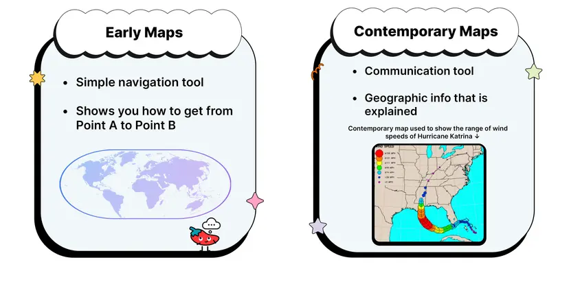
Early Maps
The earliest known maps date back thousands of years and reflect humanity’s attempts to make sense of the surrounding world. These early maps were created based on personal experience, travel routes, or religious belief rather than scientific measurement.
Ancient Babylonian maps were carved into clay tablets and focused on rivers, cities, and mythological locations.
Polynesian stick charts used materials like wood and shells to represent ocean swells and island locations.
Medieval European maps, such as the mappa mundi, often placed religious centers like Jerusalem at the center and included mythical creatures or symbolic references to divine order.
These maps had limited geographic accuracy but were valuable for cultural storytelling, identity, and navigation within known territories. They represented a combination of cartographic knowledge, belief systems, and practical information.
Contemporary Maps
Modern maps are created using advanced technologies, including aerial photography, satellite imagery, and Geographic Information Systems (GIS). Unlike early maps, contemporary maps rely on precise measurements and scientific methods.
GIS software allows layering of different spatial datasets to analyze trends and relationships.
GPS systems provide real-time positioning and have revolutionized transportation, logistics, and personal navigation.
Remote sensing uses satellite data to monitor environmental changes, urban development, and disaster zones.
Contemporary maps are interactive, customizable, and often updated in real time, making them essential in a wide range of applications from emergency response to climate research.
Map Scale
Map scale is the ratio that compares a distance on the map to the actual distance on the ground. Understanding map scale is essential for determining how much detail a map provides and how spatial relationships are represented.
Three Main Types of Map Scale
Ratio (Fractional) Scale: Expressed as a numerical ratio like 1:25,000. This means that 1 unit of measurement on the map (such as 1 inch) represents 25,000 of the same units in real life. A larger denominator means a smaller scale map.
Written (Verbal) Scale: Presented in words, such as "1 inch equals 1 mile." This type of scale is easy to understand for the general public and provides an accessible interpretation of distance.
Graphic Scale (Bar Scale): Shown as a line marked with distances. Unlike ratio and verbal scales, a graphic scale remains accurate if the map is resized or printed at a different scale, making it especially useful in digital formats.

Large Scale vs. Small Scale
Large-scale maps (e.g., 1:5,000) cover a small area with a high level of detail. They are useful for city maps, building layouts, and local navigation.
Small-scale maps (e.g., 1:1,000,000) cover large areas with less detail. These maps are often used to show countries, continents, or the entire globe.
Choosing the right scale depends on the purpose of the map. A transportation planner might need a large-scale map of a city’s streets, while a climatologist might prefer a small-scale map showing global temperature zones.
Map Projections
Since Earth is a three-dimensional sphere, it cannot be represented on a flat surface without distortion. A map projection is a method of transferring Earth’s spherical surface onto a flat plane. Every projection alters some aspect of shape, area, distance, or direction.

Four Primary Types of Distortion
Shape – The geometric form of landmasses may appear stretched or compressed.
Distance – The spacing between two points can be altered, affecting perceived proximity.
Area (Size) – Some projections make continents or countries appear larger or smaller than they are.
Direction – The bearing between two points may be distorted, especially at the edges of maps.
Types of Projections
Mercator Projection
Invented in 1569 by Gerardus Mercator.
A cylindrical projection where lines of latitude and longitude intersect at right angles.
Preserves direction and shape, which is useful for marine navigation.
Distorts size near the poles, making high-latitude regions like Greenland or Antarctica look much larger than they are.

Mercator maps are common in online mapping systems because of their simplicity and navigational benefits, but they are criticized for visually exaggerating the importance of high-latitude regions.
Peters Projection
Also called the Gall-Peters projection.
Designed to preserve the relative size (area) of landmasses.
Distorts shapes, especially near the equator and poles, making countries appear elongated.
This projection was promoted for political reasons, emphasizing equity by presenting developing nations at their true size, challenging the Eurocentric distortions of the Mercator map.
Robinson Projection
Developed by Arthur Robinson in the 1960s.
A compromise projection, balancing size, shape, distance, and direction distortions.
Visually appealing, used often in textbooks and wall maps.
Curved longitude lines reduce the pole distortion seen in Mercator maps.
While not entirely accurate in any one aspect, the Robinson projection offers a well-rounded view of the Earth, making it ideal for general-purpose world maps.

Equal-Area Projections
These projections, like the Mollweide projection, maintain area fidelity.
Useful when comparing the sizes of different landmasses or representing data like population density or resource distribution.
Tend to distort shapes more severely.
Projection Families
Cylindrical Projections: Project the globe onto a cylinder. Best for equatorial regions but highly distorted at the poles.
Conic Projections: Project the globe onto a cone. Ideal for mid-latitude areas like the United States or Europe.
Azimuthal (Planar) Projections: Project the globe onto a flat plane. Good for polar regions and used in air route mapping.
Each family serves different purposes, and no projection is perfect for all uses. The key is selecting the projection that best fits the map's goals.
Geographic Grid System
The geographic grid is a network of imaginary lines used to locate places on Earth’s surface accurately. This system allows for the precise identification of points anywhere in the world.
Latitude and Parallels
Latitude measures the distance north or south of the Equator.
Expressed in degrees from 0° at the Equator to 90° at the poles.
Parallels are horizontal lines running east-west and are equidistant from each other.
Major parallels include:
Equator (0°)
Tropic of Cancer (23.5° N)
Tropic of Capricorn (23.5° S)
Arctic Circle (66.5° N)
Antarctic Circle (66.5° S)
A helpful way to remember latitude is: “LAT is FAT”, referring to the horizontal nature of latitude lines.
Longitude and Meridians
Longitude measures the distance east or west of the Prime Meridian, which is set at 0° and passes through Greenwich, England.
Meridians are vertical lines that converge at the poles.
Longitude ranges from 0° to 180° east or west.
The International Date Line roughly follows 180° longitude and marks the transition between calendar days.
Latitude and longitude lines intersect to form a grid system, allowing geographers to pinpoint any location on Earth using coordinates, such as (40° N, 74° W).
Types of Maps
Understanding different types of maps is essential for analyzing and interpreting geographic data effectively. Each map type serves a specific purpose and presents information in a unique way.
Reference Maps
These maps show general features and are designed for broad use.
Political Maps: Show borders between countries, states, and cities.
Physical Maps: Emphasize natural features like mountains, rivers, and deserts.
Topographic Maps: Use contour lines to indicate elevation and terrain. Useful for hikers, engineers, and military planning.
Thematic Maps
These maps focus on specific themes or datasets.
Choropleth Maps: Use color or shading to represent data values. Commonly used for population density or election results.
Dot Distribution Maps: Use dots to represent the frequency of a variable. The density of dots shows patterns like disease outbreaks or crop distribution.
Graduated Symbol Maps: Use symbols of different sizes to show magnitude, such as earthquake strength or city population.
Isoline Maps: Connect points of equal value, such as temperature or elevation. Weather maps often use this format.
Cartograms: Alter the size of areas based on data values. For example, a cartogram might enlarge countries with higher carbon emissions.
Each type of thematic map helps to identify spatial patterns and interpret geographic phenomena.
Navigation and Transit Maps
Road Maps: Show streets, highways, and transportation networks. Used by travelers and commuters.
Transit Maps: Represent public transportation routes like subways, buses, and trains.
Maritime and Aeronautical Charts: Essential for ship captains and pilots to plot safe and efficient courses.
These maps are functional and designed to assist in movement and logistics.
Cartography and Map Design
Cartography is both a science and an art. It involves the process of collecting, analyzing, and visually representing spatial information. A well-designed map communicates information clearly and accurately.
Key Elements of a Map
Title: Indicates the purpose and scope of the map.
Legend (Key): Explains symbols, colors, and shading.
Scale: Provides context for distance and area relationships.
Compass Rose: Shows cardinal directions (north, south, east, west).
Grid: Assists in locating places using latitude and longitude.
Source and Date: Ensure map credibility and relevance.
Cartographers must carefully balance accuracy, clarity, and aesthetics. They must also consider potential biases in map design. For example, color choices, symbol size, and projection type can influence a viewer's interpretation.
Understanding maps and their many forms equips students to interpret the world’s physical and human geography accurately, using a variety of tools suited for diverse analytical purposes.
FAQ
Cartographers select projections based on the specific purpose and geographic focus of the map. Since every projection introduces distortion in shape, size, direction, or distance, the goal is to minimize the distortion that would interfere most with the map’s intended use.
For navigation, preserving direction is critical, so cylindrical projections like Mercator are ideal.
When displaying spatial data like population or land area, equal-area projections like the Peters projection are preferred to represent size accurately.
For global education maps, compromise projections like the Robinson are used for aesthetic and balanced distortion.
In polar or hemispheric mapping, azimuthal projections are chosen to reduce edge distortion.
Choosing the correct projection ensures geographic information is communicated clearly and appropriately for the map’s function.
Map generalization is the process of simplifying geographic features to fit the scale and purpose of a map. While necessary, it can affect both accuracy and interpretability depending on how it’s applied.
At small scales, generalization removes minor details like alleyways, small streams, or narrow borders to focus on broader patterns.
Symbol simplification, such as using a single line for a multilane highway, helps reduce clutter but may mislead if overly generalized.
Aggregation can combine similar areas or data points, helping reveal regional trends but sometimes obscuring local variation.
In thematic maps, data classification (e.g., breaking population into categories) can affect how trends are perceived.
Effective generalization strikes a balance between detail and clarity, ensuring maps are readable and useful without becoming inaccurate or misleading.
Absolute and relative location are two distinct ways to describe where something is on the Earth’s surface, each serving different purposes in geographic analysis.
Absolute location uses a fixed coordinate system, typically latitude and longitude, to give a precise, unique point. For example, New York City is located at approximately 40.7128° N, 74.0060° W.
Relative location describes a place’s position in relation to other locations. For instance, New York City is northeast of Philadelphia and south of Boston.
Absolute location is essential for navigation, scientific measurement, and GPS systems, while relative location is useful for contextual understanding and human interaction with space.
Mental maps are individual, subjective representations of spatial information, shaped by personal experience, memory, and perception, whereas formal maps are standardized, objective depictions created using cartographic methods.
Mental maps vary between people based on familiarity, travel, and cultural background. For example, a student’s mental map of their neighborhood may include landmarks, shortcuts, and emotional associations.
Formal maps are constructed using data, scale, projection, and design principles to communicate geographic information consistently.
Mental maps are important because they influence decision-making, navigation, and spatial behavior. Geographers study mental maps to understand how people perceive and interact with space in everyday life.
The convention of placing north at the top of maps became widely accepted during European exploration in the Renaissance, aligning with the use of the North Star for navigation and the influence of Western cartographers. However, it is a cultural convention, not a geographic necessity.
Orientation can be changed depending on map purpose. Some maps place south at the top to challenge Eurocentrism or provide alternative perspectives.
Polar maps often center on the North or South Pole, rotating the map accordingly.
Transit and subway maps may be rotated to better fit the page or simplify navigation, regardless of cardinal direction.
Changing orientation can shift spatial perspectives, question cultural biases in geography, and better serve specific user needs, although it may confuse those accustomed to traditional layouts.
Practice Questions
Explain the significance of map scale in geographic analysis. Provide an example of how a different map scale might affect spatial interpretation.
Map scale is crucial in geographic analysis because it determines the level of detail and area covered on a map. Large-scale maps show smaller areas with greater detail, useful for urban planning or local zoning. Small-scale maps cover broader regions with less detail, appropriate for global patterns. For example, a 1:5,000 scale map of a city reveals street layouts and building footprints, whereas a 1:1,000,000 scale map might only show the city’s general location. Misinterpreting map scale can lead to incorrect assumptions about proximity, size, or distribution, which significantly affects spatial understanding and decision-making.
Describe two ways different map projections distort geographic information and explain how these distortions can affect interpretation.
Map projections distort geographic information because they convert Earth’s curved surface into a flat representation. For example, the Mercator projection distorts size, making high-latitude regions like Greenland appear much larger than they are, which can mislead viewers about the relative importance or land area of countries. In contrast, the Peters projection preserves area but distorts shape, stretching continents near the equator. These distortions impact how people perceive spatial relationships, political significance, and cultural prominence. Choosing the wrong projection for a map’s purpose can lead to misinterpretation of data, especially in political, economic, or environmental analyses.
