Graphs are a powerful tool used in various practical situations to represent and analyse relationships between two variables. This sub-section focuses on using and interpreting graphs commonly encountered in everyday life, such as travel graphs and conversion graphs.
Understanding the Axes
The horizontal axis (x-axis) typically represents the independent variable, which is the factor being manipulated or controlled. The vertical axis (y-axis) represents the dependent variable, which changes in response to the changes in the independent variable.
Interpreting Travel Graphs
Travel graphs depict the relationship between distance travelled and time taken. They can be linear or non-linear, depending on the mode of transport and any external factors like traffic lights or stops.
Example 1:
A car travels at a constant speed. The following graph shows the distance travelled by the car over time.
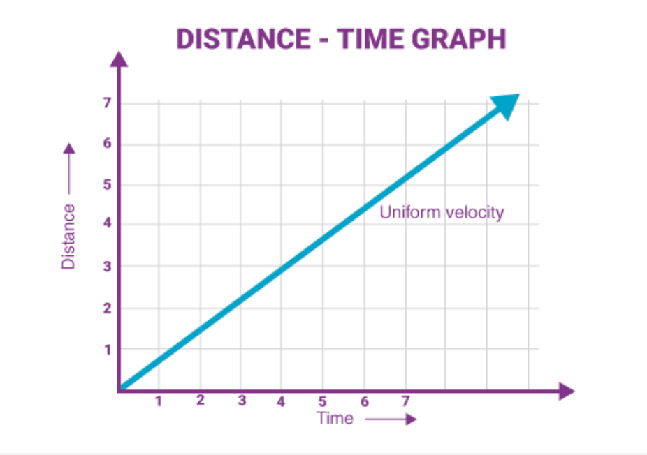
Image courtesy of BYJUS
Interpretation:
- The graph is a straight line, indicating a constant speed.
- The gradient of the line is positive, signifying that as time increases (x-axis), the distance travelled (y-axis) also increases proportionally.
- The steeper the line, the higher the speed, as the car covers more distance in the same amount of time.
Example 2:
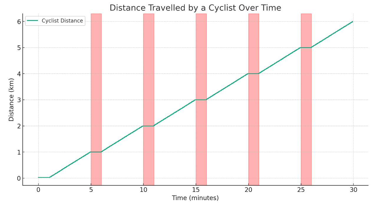
A cyclist rides a fixed route, encountering traffic lights at regular intervals. The following graph shows the distance travelled by the cyclist over time.
Interpretation:
- The graph is non-linear with plateaus, indicating periods where the distance travelled remains constant (during stops at traffic lights).
- The sloped sections represent the time intervals when the cyclist is moving, and the gradient of these sections reflects the speed.
Interpreting Conversion Graphs
Conversion graphs represent the relationship between two proportional quantities. They are often used to convert between different units of measurement, like centimetres to inches or Fahrenheit to Celsius.
Example 3:
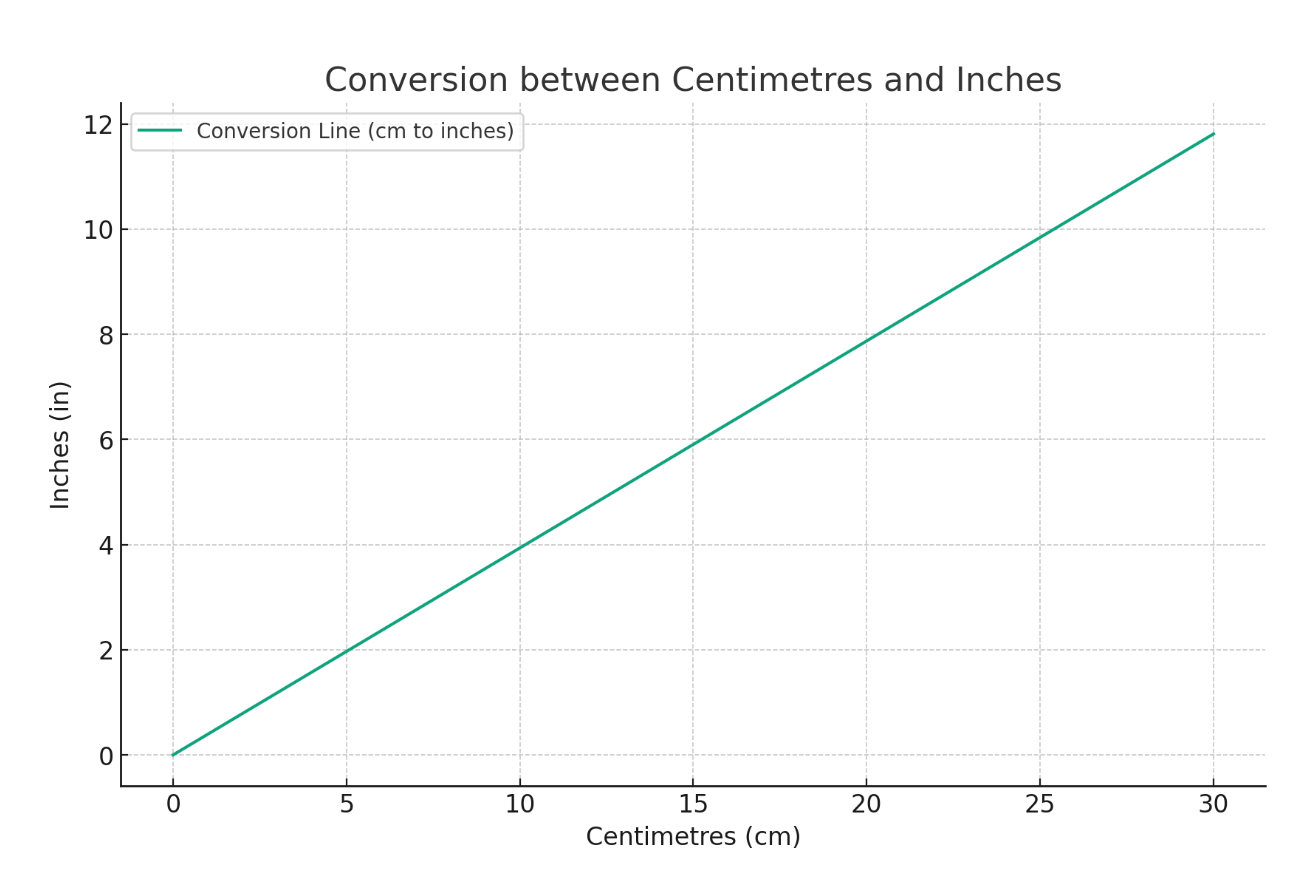
The following graph shows the conversion between centimetres (cm) and inches (in).
Interpretation:
- The graph is a straight line, indicating a proportional relationship between centimetres and inches.
- The gradient is constant, signifying that a fixed number of centimetres always corresponds to a specific number of inches, regardless of the starting value.
- The equation of the graph can be used to perform conversions directly. For instance, if the gradient is m and the y-axis intercept is c, then:
Example 4:
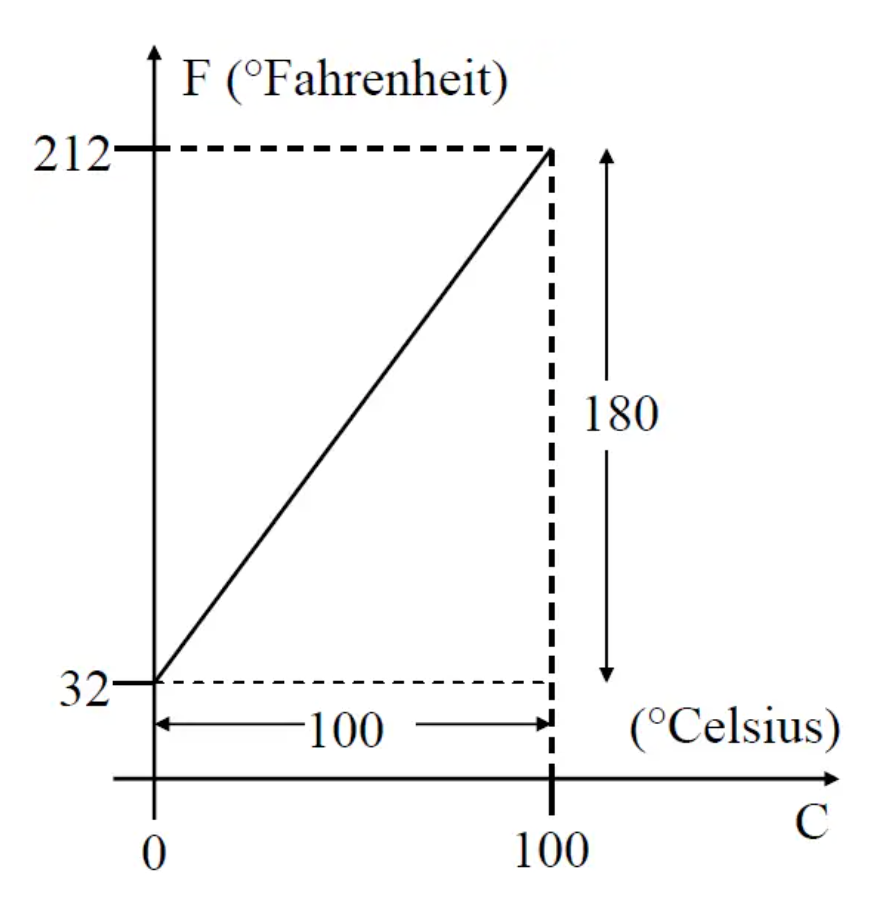
The following graph shows the relationship between temperature in Fahrenheit (°F) and Celsius (°C).
Interpretation:
- The graph is a straight line, indicating a linear relationship between °F and °C.
- The y-axis intercept is not zero, implying that a specific value on the y-axis (temperature in °C) does not correspond to zero on the x-axis (temperature in °F).
- The equation of the graph can be used to convert between °F and °C, considering the y-axis intercept.
Practice Questions
Question 1:
The graph below shows the distance travelled by a train over time.
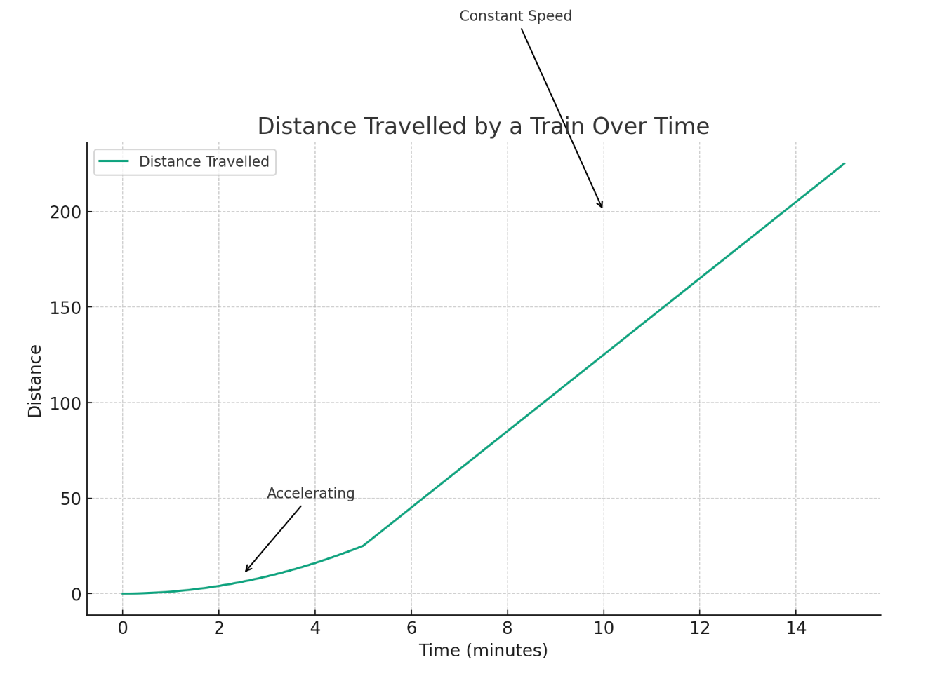
a) Describe the motion of the train during the first few minutes.
b) What does the constant gradient of the later section represent?
c) If the gradient of the straight line is 20, what does it signify in the context of this graph?
Answer:
a) During the first few minutes, the graph curves upwards, indicating that the train is accelerating.
b) The constant gradient of the later section represents the train moving at a constant speed.
c) A gradient of 20 implies that for every 1 minute that passes (on the x-axis), the distance travelled increases by 20 units (on the y-axis). In this context, it likely represents the train's speed of 20 units per minute.
Question 2:
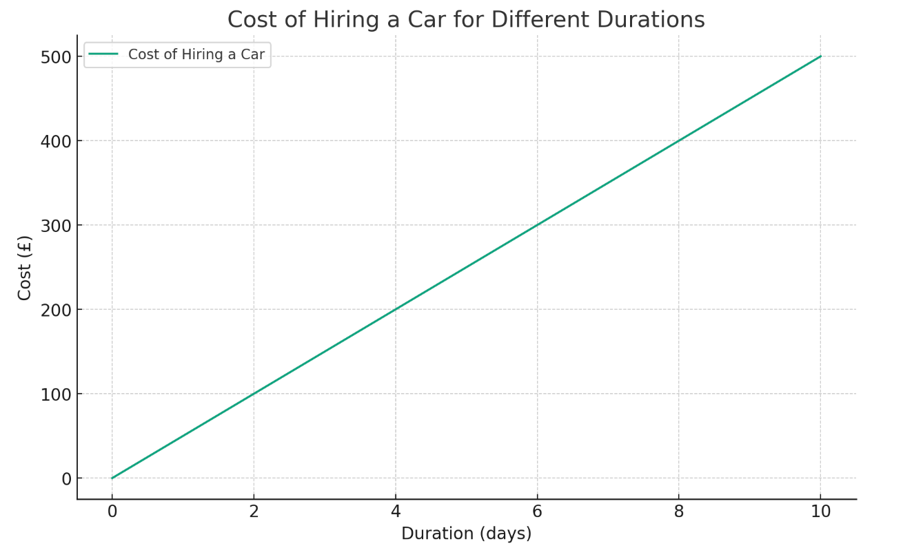
The following graph shows the cost of hiring a car for different durations.
Answer:
a) The y-axis represents the cost of hiring the car.
b) The gradient represents the change in cost per unit increase in duration. In this context, it represents the daily rate.
c) Since the cost increases linearly with the duration, the equation of the graph can be expressed as:
Where:
- Cost is the total cost of hiring the car (represented by the y-axis).
- Daily Rate is the gradient of the graph (which we know is £50).
- Duration is the time period for which the car is hired (represented by the x-axis).
- Initial Cost is the y-axis intercept, which represents the fixed cost incurred even if the car is not hired for any duration (often zero in such scenarios).
Therefore, if the daily rate is £50 and there is no initial cost (y-axis intercept is zero), the equation of the graph becomes:
This equation allows you to calculate the total cost of hiring the car for any given duration by simply multiplying the duration by the daily rate.

