
AP Syllabus focus:
‘This section explains how residual plots can be utilized to investigate the appropriateness of a selected regression model. This includes understanding patterns or systematic deviations in the residuals that may suggest the model does not capture the data's underlying relationship effectively.’
Residual plots provide essential visual evidence for determining whether a linear regression model is appropriate by revealing structure, randomness, or patterns in the model’s prediction errors.
Using Residual Plots to Evaluate Model Appropriateness for Linearity
Residual plots are a foundational diagnostic tool in AP Statistics because they allow students to assess whether a linear regression model adequately represents the relationship between two quantitative variables. A residual is the vertical difference between an observed value and its predicted value from a regression model.
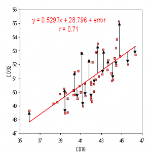
Residuals appear as vertical distances between observed data points and the regression line, showing how individual prediction errors are measured before constructing a residual plot. Source.
Residual Plot: A scatterplot of residuals on the y-axis against either explanatory variable values or predicted values on the x-axis.
Residual plots help students identify departures from linearity, systematic deviations, or irregular behavior that a numerical measure like correlation might conceal. Examining these features deepens understanding of how well the regression model captures the underlying structure of the data.
A residual plot is considered one of the most efficient ways to detect whether a linear model is justified because meaningful patterns rarely appear by chance. Instead, they indicate that the model fails to explain certain aspects of the variability in the data.
What Residual Plots Reveal About Model Appropriateness
A well-constructed residual plot allows students to detect patterns that may compromise the usefulness of the least-squares regression line. When interpreting such plots, students should focus on the shape, structure, and consistency of the plotted residuals.
Key Indicators of a Good Linear Fit
When a linear model is appropriate, the residual plot should display the following characteristics:
Random scatter of points around the horizontal axis
No systematic curves, waves, or clusters
Consistent spread across all x-values
Absence of funnels or widening bands
These indicators show that the linear model captures the overall pattern of the data and that the remaining deviations (residuals) are consistent with natural random variation.
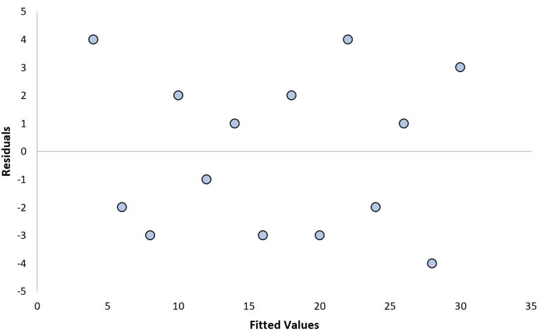
This residual plot shows random scatter around zero, indicating consistency with the assumptions of linear regression and supporting the appropriateness of a linear model. Source.
A linear model assumes that deviations from the predicted values are unpredictable, so randomness in the residual plot validates the model.
Signs That a Linear Model Is Not Appropriate
Students should look for several key warning signs in a residual plot:
Curved or systematic patterns, suggesting that the true relationship is nonlinear
Funnel shapes, indicating non-constant variability (heteroscedasticity)
Clusters or grouped patterns, implying the presence of subgroups within the data
Extreme residuals, revealing potential outliers influencing the model
Repeated directional changes, which occur when a linear model oversimplifies the underlying shape
These features indicate that the linear regression model does not capture the structure of the variation in the data. In such cases, a different model or variable transformation may be necessary.
Why Patterns in Residual Plots Matter
Residual patterns signify that the explanatory variable may relate to the response in a way that a straight line cannot fully represent. Because regression analysis relies on predicting a response variable based on an explanatory variable, the quality of those predictions depends on appropriateness of the model.
A systematic pattern in the residuals means that the model is missing an important part of the relationship. Students should recognize that a linear model cannot be considered appropriate simply because the original scatterplot looks roughly linear or because the correlation coefficient is moderate or strong. The residual plot provides more definitive evidence.
One common scenario occurs when a scatterplot initially appears linear, but the residual plot reveals a bending or wave-like pattern.
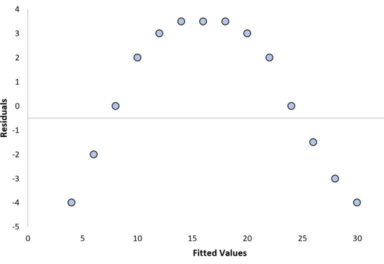
Identification: A curved residual plot forming an arch-like pattern; it appears as the first image under the heading “Example 2: A ‘Bad’ Residual Plot with a Clear Pattern”.
Caption: This residual plot reveals a curved trend in the prediction errors, demonstrating that a linear regression model systematically misrepresents the relationship between the variables. Source.
This suggests that while the trend may be roughly increasing or decreasing, the rate of change is not constant, pointing toward a nonlinear model.
Using Residual Plots to Detect Model Weaknesses
Residual plots can reveal specific weaknesses, including:
Model underfitting, where the line is too simple for the data’s complexity
Hidden subgroups, in which the presence of different categories creates layered patterns
Measurement inconsistencies, observable through uneven spread in residuals
Influential points, whose large residuals or unusual placement distort the regression results
By identifying these issues early, students gain insight into when to refine or reconsider their model choice.
How Students Should Use Residual Plots in Analysis
When evaluating model appropriateness, students should:
Generate a residual plot immediately after computing the regression line
Examine the spread, patterns, and direction of residuals
Determine whether residual behavior aligns with the assumptions of linear modeling
Decide whether the model is sufficiently appropriate or whether another modeling strategy is necessary
A careful review of residual plots enables AP Statistics students to make informed judgments about model quality and supports deeper understanding of variability, prediction accuracy, and the limitations of linear models.
FAQ
Minor, irregular fluctuations are expected and do not imply model failure. A pattern becomes meaningful when it is systematic, repeating, or clearly distinguishable from random variation.
A curved or wave-like structure, consistent widening or narrowing of spread, or any shape that could reasonably be traced by a smooth curve suggests that the linear model is not capturing the underlying relationship.
Yes. A residual plot may appear randomly scattered when sample size is small, because patterns are difficult to detect with limited data.
Additionally, influential points can distort the regression line in a way that masks underlying nonlinearity. Checking both the original scatterplot and the residual plot provides a more complete diagnostic.
Plotting residuals against the explanatory variable allows clearer visibility of nonlinearity, since deviations can be traced directly across increasing values of the predictor.
When plotted against the response variable, patterns may be less interpretable because the response already incorporates both the modelled trend and the unexplained variation.
Yes. Certain patterns are commonly associated with specific transformations.
For example:
• A curved pattern may suggest a logarithmic or power transformation.
• A funnel-shaped spread may indicate that stabilising variance (for example, using a square root transformation) could be beneficial.
Residuals provide early clues about the direction of model improvement.
Residual plots may show stacked layers, clusters, or parallel bands rather than a single cloud of points.
These patterns suggest that the relationship differs across subgroups, such as different demographic categories or experimental conditions. Considering separate models or adding categorical variables as predictors may be necessary to address this structure.
Practice Questions
Question 1 (1–3 marks)
A student fits a linear regression model to a set of bivariate data and then constructs a residual plot. The residual plot shows the residuals randomly scattered around the horizontal axis with no visible pattern.
(a) Based on the residual plot, comment on the appropriateness of using a linear model for this data set.
(b) Give one reason why this conclusion is supported by the appearance of the residual plot.
Question 1 (1–3 marks)
(a) 1 mark
States that a linear model is appropriate based on the residual plot.
(b) 1–2 marks
1 mark for identifying that the residuals show random scatter around the horizontal axis.
1 mark for explaining that the absence of patterns (curves, clusters, or funnels) supports the use of a linear model.
Question 2 (4–6 marks)
A researcher investigates the relationship between hours of study (x) and exam score (y). After fitting a linear regression model, they produce a residual plot. The plot shows a clear curved pattern in which the residuals are mostly negative for low values of x, mostly positive for moderate values of x, and negative again for high values of x.
(a) Explain what the pattern in the residual plot suggests about the suitability of the linear model.
(b) Describe how this pattern indicates that the linear model is failing to capture the true relationship.
(c) Suggest an appropriate next step the researcher could take to improve the model and justify your suggestion.
Question 2 (4–6 marks)
(a) 1–2 marks
1 mark for stating that the linear model is not appropriate.
1 mark for noting that the curved pattern indicates nonlinearity.
(b) 1–3 marks
1 mark for describing that the model systematically overestimates and underestimates y at different ranges of x.
1 mark for explaining that residuals are not randomly scattered.
1 mark for identifying that this indicates a missing nonlinear component in the model.
(c) 1–2 marks
1 mark for suggesting a valid next step (e.g., trying a nonlinear model, applying a transformation, or fitting a polynomial regression).
1 mark for a clear justification referencing the curved pattern in the residuals.
