
AP Syllabus focus:
‘Use rates of change over intervals, based on changes in one quantity divided by changes in another, to describe how a function models motion or other phenomena over time.’
Average rate of change describes how a quantity varies over a chosen interval, allowing us to interpret motion and real-world behavior using data, graphs, and functional relationships.
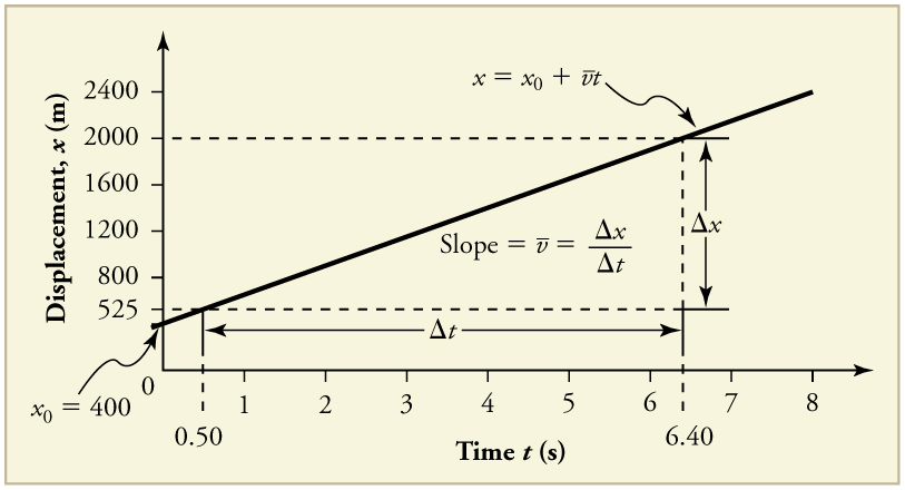
This graph shows displacement as a function of time for a vehicle moving at constant velocity. The straight-line slope illustrates a constant average rate of change of position. Additional numerical labels provide context but extend slightly beyond the syllabus. Source.
Understanding Average Rate of Change
The average rate of change of a function over an interval provides a single numerical description of how the function’s output changes relative to its input. In AP Calculus AB, this idea connects early conceptual thinking about change to later formal ideas of derivatives. Students analyze data tables, interpret graphs, and connect contextual information to determine how quickly or slowly a function’s value evolves over a finite interval.
Average Rate of Change: The ratio describing how much a function’s output changes compared with how much its input changes over a specified interval.
The concept applies broadly across mathematical and real-world settings. Interpreting average rates correctly requires attention to units, direction of change, and the behavior of the function across the entire interval being studied.
Representing Average Rate of Change from Data
When numerical information is provided in a table, the average rate of change can be extracted directly from paired values of the independent and dependent variables.
Because data may represent motion, population, economics, or scientific processes, the meaning of the rate must always be interpreted in context.
Key features when using tables
Identify two distinct input values defining the interval.
Compute the change in output and the change in input.
Interpret the resulting ratio using appropriate units.
Determine whether the computed rate reflects increasing, decreasing, or stable behavior across the interval.
Connect the numerical result to the modeled phenomenon, emphasizing what the rate tells us about real-world change.
= Change in the dependent variable (units depend on context)
= Change in the independent variable (units depend on context)
This ratio remains valid whether the data arise from direct measurement, experimental records, or discrete sampling of an underlying function.
Visual Interpretation from Graphs
Graphs provide an intuitive representation of change because the height of the curve reveals function values at different inputs. The average rate of change over an interval corresponds to the slope of the secant line, the straight line connecting two points on the graph.
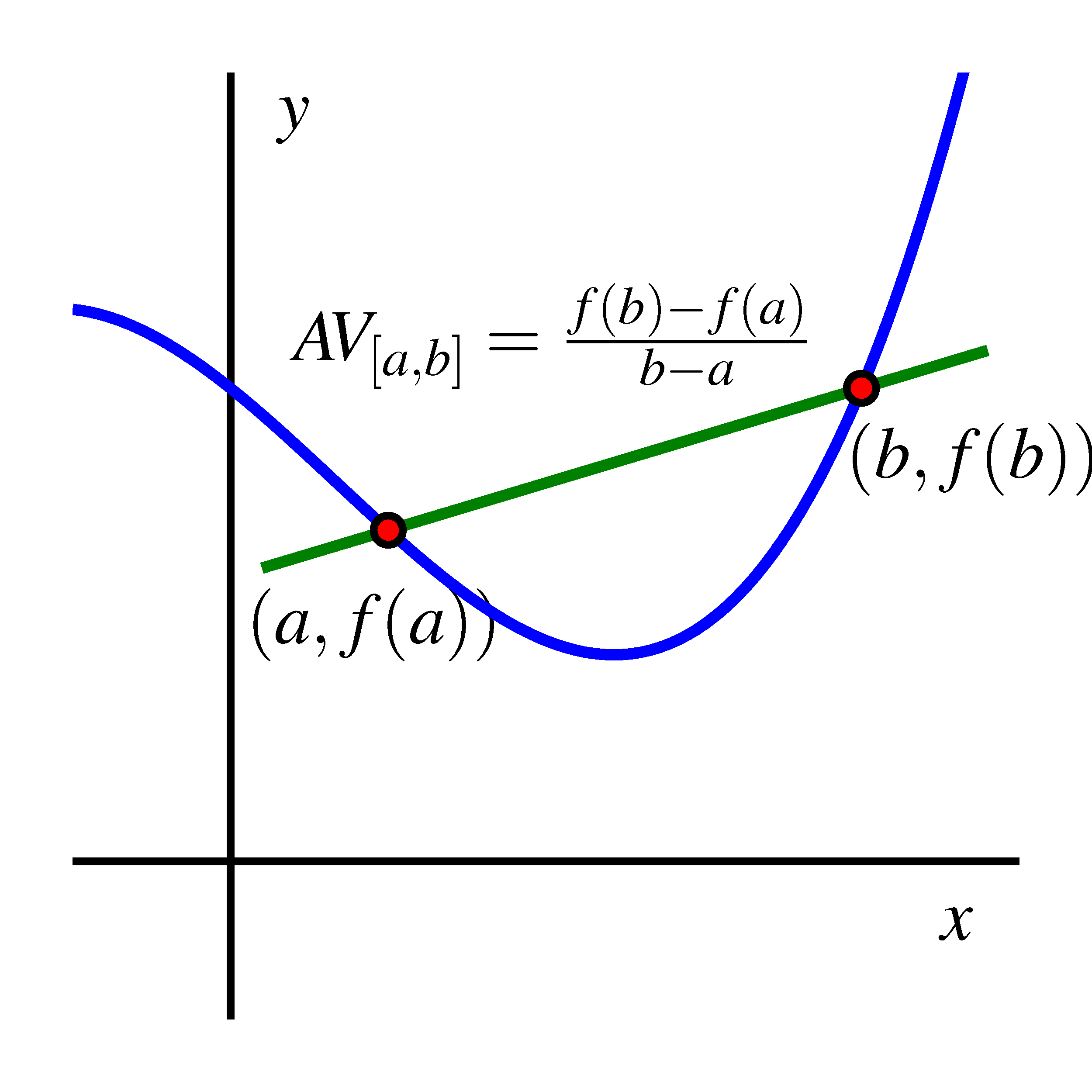
This diagram illustrates a secant line connecting two points on a function, with its slope representing the average rate of change. Color-coded elements clarify the geometric meaning of the ratio. The explicit labeling provides additional detail but aligns closely with ideas presented in the notes. Source.
When examining graphs for rate behavior
Identify the two points and on the graph.
Visualize or sketch the secant line joining these points.
Use the slope of this secant line to represent the average rate of change.
Observe whether the graph rises, falls, or remains nearly constant across the interval.
Interpret steepness: steeper positive slope indicates faster increase; steeper negative slope indicates faster decrease.
Secant Line: A line passing through two distinct points on a graph, whose slope represents the average rate of change over the associated interval.
Understanding this geometric representation builds the foundation for later ideas about instantaneous rate of change, where secant lines evolve into tangent lines.
Contextual Meaning of Rate of Change
Average rate of change is not simply a numerical output; it conveys information about real-world behavior. The interpretation should always match the scenario from which the data or graph is drawn.
Important interpretive principles
Units matter: Rate expresses a “per unit” relationship (e.g., meters per second, dollars per year).
Direction of change: A positive rate indicates increase; a negative rate indicates decrease.
Magnitude of change: Larger absolute values reflect faster change.
Interval dependence: The chosen interval determines the computed rate; different intervals can yield different insights.
Modeling implications: The rate helps describe how the function models motion or other dynamic phenomena.
Because average rates summarize behavior over entire intervals, they smooth out short-term variations. This feature makes them useful for identifying broad trends but limited in describing behavior at any single instant.
Why Interval-Based Rates Are Essential
The syllabus emphasizes that average rates rely on changes over intervals, not at isolated points. When the independent variable does not change, the ratio used to compute the rate cannot be formed. Thus, average rate of change always requires a nonzero change in input. This property naturally leads to deeper questions about how to describe change at a precise instant, motivating the later development of limits and derivatives.
Core takeaways
Average rate of change depends on having two distinct input values.
The ratio structure models how one quantity varies with respect to another.
Interpreting the rate connects algebraic, graphical, and contextual representations.
Understanding average rates prepares students for the transition from discrete change to instantaneous change.
Practice Questions
Question 1 (1–3 marks)
A function f models the height of a drone above the ground (in metres) at time t (in seconds). The table below shows selected values.
t: 2, 5
f(t): 18, 33
(a) Find the average rate of change of the drone’s height on the interval 2 ≤ t ≤ 5.
(b) State, in context, what this value represents.
Question 1
(a) 1 mark for correct calculation of average rate of change:
(33 − 18) / (5 − 2) = 15 / 3 = 5 metres per second.
Award the mark for the correct numerical value with units.
(b) 1 mark for correct interpretation:
The drone rises at an average rate of 5 metres per second between t = 2 and t = 5.
Award the mark for a clear contextual statement involving height increasing per second.
Question 2 (4–6 marks)
A cyclist’s distance D from a starting point (in kilometres) is recorded at several times t (in hours). The graph of D(t) is smooth and increasing. Two points on the graph are A = (1, 12) and B = (4, 42).
(a) Calculate the average rate of change of D(t) between t = 1 and t = 4.
(b) Explain what this rate tells you about the cyclist’s motion.
(c) The graph appears to curve upwards as t increases. Based on this visual information, discuss how the cyclist’s instantaneous rate of change at t = 4 might compare with the average rate on [1, 4].
Question 2
(a) 1 mark for correct difference in output: 42 − 12 = 30.
1 mark for correct difference in input: 4 − 1 = 3.
1 mark for correct rate: 30 / 3 = 10 kilometres per hour.
(b) 1 mark for contextual interpretation:
The cyclist travels, on average, 10 kilometres per hour over the interval from t = 1 to t = 4.
(c) 1–2 marks depending on quality of reasoning:
• 1 mark for recognising that the graph curving upwards indicates increasing steepness.
• 1 mark for concluding that the instantaneous rate of change at t = 4 is likely greater than the average rate over the interval.
FAQ
Look for consistency in how the dependent variable changes as the independent variable increases. A single interval can be misleading, but repeated intervals showing similar rates suggest a genuine trend.
If values fluctuate irregularly, consider whether external factors, measurement error, or insufficient data resolution might be influencing the pattern.
Short intervals capture fine-scale behaviour, often showing rapid or irregular changes. Longer intervals smooth out local variability and highlight broader tendencies.
A suitable interval depends on context. For example:
• In motion, shorter intervals better reflect speed changes.
• In population data, longer intervals often yield more stable rates
Yes. A graph may appear smooth due to low resolution, large scale, or missing detail. Important fluctuations can be hidden.
If the axes are stretched or compressed, small variations can seem insignificant. Always check whether the graph includes appropriate scale markings, units, and clear plotting of values.
Large jumps or irregular changes between consecutive x-values indicate that the function might vary unpredictably between sampled points.
If the spacing of x-values is uneven, rates calculated across wider gaps may overlook important behaviour. Consider whether adding intermediate data points would produce a more accurate understanding.
Physical systems often provide measurements at discrete times, so average rates are the most accessible way to describe change.
They serve as a bridge to the concept of instantaneous rate of change by showing how behaviour evolves as intervals shrink. This progression allows student
