

AP Syllabus focus: 'Graphs of pressure, temperature, and volume can describe or determine the properties of a gas.'
Gas graphs turn the ideal gas law into a visual tool. By identifying patterns in pressure, volume, and temperature plots, you can determine which quantity is fixed and how the other gas properties are related.
Reading the Meaning of a Gas Graph
A gas is described by pressure, volume, and temperature. These are the key state variables used in graphing gas behavior. When one variable is held constant, the graph of the other two reveals the relationship between them.
State variables: The measurable properties that describe a gas at a given moment, especially pressure, volume, and temperature.
A graph point represents one state of the gas. A line or curve shows how the state changes as one variable changes. To interpret the graph correctly, always check:
which variable is on each axis
whether the amount of gas stays the same
whether one variable is being held constant
whether temperature is given in kelvins
The basic model behind these graphs is the ideal gas law.
= pressure of the gas, in pascals
= volume of the gas, in cubic meters
= amount of gas, in moles
= ideal gas constant
= absolute temperature, in kelvins
If is fixed, the graph shape depends on which variable is constant. This lets you use a graph not just to display data, but to infer physical properties of the gas.
Recognizing Standard Graph Shapes
Pressure-Volume Graphs
For a fixed amount of gas at constant temperature, pressure and volume have an inverse relationship: as volume increases, pressure decreases. On a graph of versus , this appears as a downward-curving line rather than a straight line.
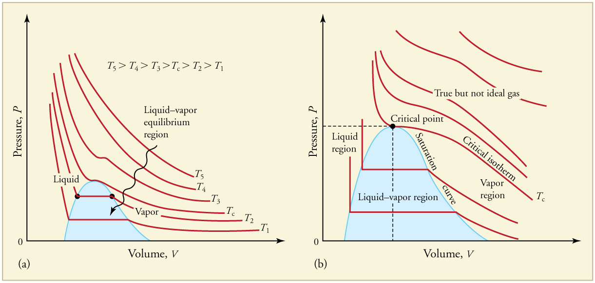
Pressure–volume (–) isotherms for a gas: each curve corresponds to a different constant temperature. The higher-temperature curves sit above lower-temperature curves, meaning that at the same the gas has a larger . This directly visualizes the inverse relationship implied by for an isothermal ideal-gas process. Source
This shape tells you several things:
small volume corresponds to large pressure
large volume corresponds to small pressure
equal changes in volume do not produce equal changes in pressure
A curved - graph is therefore an important clue that the variables are not directly proportional. If the same data were plotted as versus , the relationship would become linear. That is often useful when trying to determine whether the gas follows ideal behavior.
If several constant-temperature curves are shown on the same - axes for the same amount of gas, the higher curve corresponds to the higher temperature, because at the same volume, higher temperature gives higher pressure.
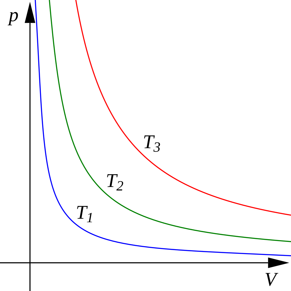
A set of ideal-gas isotherms on a – diagram, with temperature increasing for curves farther from the origin. Because each curve represents at a fixed , the graph makes the inverse relationship between and visible as a family of hyperbolas. Comparing curves at the same shows that larger implies larger . Source
Pressure-Temperature Graphs
For a fixed amount of gas at constant volume, pressure is directly proportional to absolute temperature. A graph of versus in kelvins is therefore a straight line with positive slope.
This kind of graph helps you determine:
that volume remained constant
how quickly pressure changes as temperature changes
relative container volume when comparing multiple lines for the same amount of gas
For the same amount of gas, a steeper - line means a smaller volume, because the pressure changes more strongly with temperature. A shallower line means a larger volume.
A graph of pressure versus temperature should be interpreted using kelvins, not degrees Celsius, when looking for direct proportionality. The graph’s linear pattern reflects the ideal gas law only when temperature is measured on an absolute scale.
Volume-Temperature Graphs
For a fixed amount of gas at constant pressure, volume is directly proportional to absolute temperature. A graph of versus in kelvins is a straight line with positive slope.
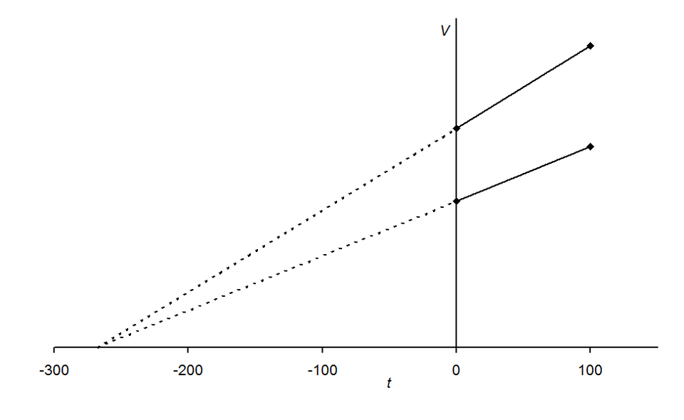
A volume–temperature (–) graph illustrating Charles’s law for two different gas samples at constant pressure. The straight-line trend indicates direct proportionality between and absolute temperature when is fixed. Extrapolating the lines shows why an absolute temperature scale (kelvins) is the correct one for identifying proportionality. Source
From this graph, you can determine:
that pressure remained constant
how much the volume responds to heating or cooling
relative pressure when comparing different lines for the same amount of gas
For the same amount of gas, a steeper - line corresponds to a lower pressure, because the volume changes more per kelvin. A less steep line corresponds to a higher pressure.
As with pressure-temperature graphs, the temperature must be in kelvins if you want the direct proportionality shown by the graph to match the ideal gas model.
What Gas Graphs Let You Determine
Gas graphs are useful because they let you determine both relationships and unknown properties.
From the graph’s shape, slope, and position, you can identify:
whether two variables are directly proportional or inversely related
which variable was held constant during the process
whether the gas data are consistent with ideal-gas behavior
relative values of pressure, volume, or temperature when comparing multiple lines
unknown values by reading from the graph or interpolating between points
A horizontal or vertical line can also carry physical meaning, depending on the axes. For example, on a - graph, a horizontal line means pressure stays constant while volume changes, and a vertical line means volume stays constant while pressure changes. On a different pair of axes, those same visual patterns represent different constant quantities, so axis labels must always be read first.
Common Interpretation Checks
When using gas graphs to determine properties, several mistakes are common.
Do not ignore the axis labels. A straight line on one set of axes may represent a very different relationship on another.
Do not use Celsius for proportional reasoning. For gas-law graphs involving temperature, kelvin is the correct scale.
Do not assume every graph should be linear. A - graph at constant temperature is curved, not straight.
Do not compare slopes carelessly. Slope comparisons are meaningful only when the compared graphs involve the same variables and the same amount of gas.
Do not focus only on individual points. The overall trend, curvature, and steepness are what reveal the gas properties.
In this topic, the most useful features of a graph are its shape, slope, intercept behavior, and the physical meaning of the variables on each axis.
Practice Questions
A sealed rigid container of gas is heated, and a graph of pressure versus temperature in kelvins is a straight line with positive slope.
State the relationship between pressure and temperature, and identify the property of the gas that remains constant.
1 mark for stating that pressure is directly proportional to temperature, or
1 mark for stating that volume remains constant
Two samples of the same ideal gas contain the same number of moles. Each sample is shown on a graph of pressure versus temperature in kelvins. Line A is steeper than Line B.
(a) Which sample has the smaller volume? Explain your answer. (2 marks)
(b) Sample B has pressure at . If its temperature increases to while remaining on the same line, determine the new pressure. (2 marks)
(c) Describe the shape of a graph of pressure versus volume for one of these samples at constant temperature. (1 mark)
(a)
1 mark for identifying Sample A as having the smaller volume
1 mark for explaining that for fixed amount of gas, a steeper - graph means pressure changes more per kelvin, so the volume is smaller
(b)
1 mark for using direct proportionality, such as or equivalent reasoning
1 mark for correct answer:
(c)
1 mark for stating that the - graph is a decreasing curve, showing an inverse relationship between pressure and volume
FAQ
Real data can differ from the ideal pattern because of:
sensor calibration errors
heat loss during the measurement
small leaks in the apparatus
friction in moving parts such as pistons
non-ideal gas behavior at high pressure or low temperature
A graph can still be useful even if it is not perfect. The key question is whether the overall trend is close enough to the expected relationship.
Changing units changes the numerical value of the slope, even when the physical relationship stays the same.
For example:
using kPa instead of Pa makes pressure values smaller by a factor of $1000$
using L instead of $m^3$ changes volume values by a factor of $1000$
That means two students can have different slope values from the same experiment if they use different units. The trend is the same, but the number attached to the slope is unit-dependent.
An inverse relationship is harder to analyze on a curved graph. Plotting $P$ versus $1/V$ turns the inverse pattern into a straight line for an ideal gas at constant temperature.
This helps with:
checking whether the data support the expected relationship
comparing slopes more easily
spotting outliers or bad measurements
Linear plots are often easier to interpret than curved ones.
A changing amount of gas can make the data drift away from one consistent curve or line.
Possible warning signs include:
sudden jumps between points
a slope that changes unexpectedly
repeated trials that do not overlap even under the same stated conditions
data that cannot be explained by holding one variable constant
This can happen if gas escapes, enters the container, or is produced or absorbed during the experiment.
Repeated trials show whether the graph pattern is reliable rather than accidental.
They help you:
check consistency of slope and shape
estimate uncertainty from the scatter of points
identify one trial that may have been affected by poor measurement
decide whether a trend is real enough to support a conclusion about the gas
In gas graph analysis, reproducibility matters because many conclusions come from the pattern of the data, not just from a single point.