
AP Syllabus focus:
‘- Describing categorical data through the use of percentages, relative frequencies, and rates to communicate proportions effectively.
- Understanding that counts (from frequency tables) and relative frequencies provide insights that can support claims or conclusions about the data within its context.
- Skill 2.A: Enhancing skills in descriptive statistics, specifically in the context of categorical data represented in tables.
- Essential Knowledge UNC-1.B.1 and UNC-1.B.2: Focusing on how relative frequencies and percentages convey identical information and how they can justify claims about categorical data.’
These notes explain how to describe categorical data using counts, percentages, relative frequencies, and rates so you can better justify claims clearly in real-world contexts.
Describing Categorical Data Using Tables
Categorical data arise when each individual in a study falls into one of several groups or categories, such as class year, favorite genre, or mode of transportation. To describe such data clearly, we organize it in tables that display counts, relative frequencies, percentages, or rates so the pattern of responses becomes easy to see.
Counts: The Foundation of Categorical Description
A frequency table lists each category and the count of observations in that category. Counts show how many individuals are in each group, but by themselves they do not always make comparisons easy, especially when sample sizes differ.
Frequency (count): The number of observations that fall in a specific category of a categorical variable.
Because total sample sizes can vary from study to study, statisticians often convert counts into relative frequencies.
Relative frequency: The proportion of observations in a specific category, found by dividing the category count by the total number of observations.
To compute a relative frequency for a category, you divide its count by the table’s overall total.

This diagram shows basic frequency tables where each category is paired with both its absolute frequency (count) and relative frequency (proportion). It highlights how dividing each count by the total produces a relative frequency for that category. The image includes minor additional visual elements, which extend slightly beyond the syllabus but still support the core ideas of categorical frequency representation. Source.
Percentages and Rates as Communication Tools
When describing categorical data to a general audience, percentages and rates are often clearer than raw proportions.
Percentage: A relative frequency expressed per 100 observations; it is obtained by multiplying a proportion by 100.
A rate describes a proportion per some fixed base, such as “per 1,000 students” or “per 10,000 residents,” and is especially useful when comparing groups of very different sizes. While the scaling differs, both percentages and rates describe the same underlying idea: what share of the whole falls into a category.
Linking Counts and Relative Frequencies
Counts and relative frequencies always go together, and both must be interpreted in context. When reading a table, it is helpful to:
Identify the variable being described and the categories used.
Locate the total number of observations in the table.
Read across each row (or down each column) to connect the category with its count and relative frequency.
Compare relative frequencies or percentages across categories to see which groups are more or less common.
Counts tell you the size of each group, while relative frequencies and percentages tell you how big each group is compared with the whole.
How Tables Support Claims and Conclusions
Frequency and relative frequency tables provide quantitative evidence to support claims about a categorical variable. Well-phrased claims:
Refer to the context, naming the population or sample and the variable.
Use proportional language, such as “a larger proportion,” “about one-third,” or “almost all.”
Are backed by counts, relative frequencies, or percentages from the table.
Acknowledge that the results are based on a sample and therefore subject to variability.
A statement that a certain category is “most common” should be supported by that category having the largest relative frequency or percentage in the table, not just a casual impression.
UNC-1.B.1 and UNC-1.B.2: What Relative Frequencies and Percentages Tell Us
Essential Knowledge UNC-1.B.1 and UNC-1.B.2 emphasize that relative frequencies and percentages convey identical information. A relative frequency of 0.40 and a percentage of 40% both describe the same share of the sample in a category. The choice between them is mostly about convenience and audience.
When interpreting a table that shows both counts and percentages, focus on the percentages or relative frequencies to compare categories more fairly, especially if the same variable is measured in different groups with unequal sample sizes.
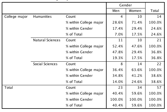
This contingency table displays the number of students in each combination of gender and academic major, along with percentages for each cell. It illustrates how counts and percents can be combined to compare groups and support claims about relative frequencies. The table uses two variables, which exceeds the one-variable scope of this subsubtopic, but it clearly demonstrates how percentages communicate proportions in tabular form. Source.
Using Tables Effectively in AP Statistics
In AP Statistics, you are expected not only to read tables but also to describe what they show in clear, context-rich language. Effective descriptions of categorical data in tables usually:
Name the categorical variable and the population or sample being studied.
Highlight the largest and smallest categories using percentages or relative frequencies, not just raw counts.
Represent important comparisons with precise proportional language, such as “twice as large a proportion” or “only a small fraction.”
Use counts to give a sense of scale when it helps the reader understand how many individuals the percentages represent.
Connect the numerical description directly to the real-world setting described in the problem.
By combining counts, relative frequencies, percentages, and rates drawn from well-constructed tables, you can communicate strong, justified claims about categorical data while always keeping the context and inherent variability of the data in mind.
FAQ
A simple frequency table tells you how many observations fall into each category, but it does not allow easy comparison between groups of different sizes.
A relative frequency table expresses each category as a proportion of the whole, making patterns in the data clearer and more meaningful.
Relative frequencies also allow comparisons between separate datasets, provided both are expressed as proportions or percentages.
Percentages are most appropriate when communicating findings to a general audience, as they are easier to interpret intuitively.
They are also useful when the proportions are very small or unevenly distributed, since percentages visually highlight small differences more effectively.
Relative frequencies may still be preferred in technical contexts where decimal precision is required.
A frequent error is comparing raw counts without recognising differences in total sample size.
Another mistake is assuming that percentages reflect exact certainty; they are still subject to sampling variability.
Students may also confuse column percentages with row percentages, especially in multi-category tables, leading to incorrect conclusions.
Rates standardise the data against a fixed population size, such as per 1,000 or 10,000 individuals.
This is especially useful when comparing groups of dramatically different sizes, where raw percentages may hide meaningful differences.
Rates also highlight the relative burden or frequency of an event in real-world contexts such as health, safety, or participation levels.
An effective table includes clearly labelled categories, totals, and either percentages or relative frequencies.
It separates categories logically and shows the proportion each represents of the overall dataset.
Good tables also minimise clutter, allowing the reader to quickly identify dominant categories, patterns, or disparities that justify evidence-based claims.
Practice Questions
Question 1 (2 marks)
A school surveys students on their preferred method of travel to school. The frequency table shows the number of students in each category:
Walking: 48
Bus: 72
Bicycle: 30
Car: 50
(a) State what is meant by the term relative frequency.
(b) Calculate the relative frequency for students who travel by bus.
Question 1
(a)
• Relative frequency is the proportion of observations in a category compared with the total number of observations. (1)
(b)
• Total number of students = 48 + 72 + 30 + 50 = 200 (allow if shown or implied). (1)
• Relative frequency for bus = 72 / 200 = 0.36 (accept 36%). (1)
(2 marks total: 1 + 1; if total incorrectly found but method correct, award method mark)
Question 2 (5 marks)
A researcher records the favourite revision technique of 200 physics students. The categories and their frequencies are shown:
Flashcards: 60
Past papers: 90
Group study: 30
Online videos: 20
(a) Construct a relative frequency table for this data.
(b) Explain how the use of percentages or relative frequencies can justify claims about patterns in students’ revision preferences.
(c) A teacher claims that “most students prefer active recall techniques.” Using the table you constructed, comment on whether this claim is supported by the data.
Question 2
(a)
Award 1 mark for each correct relative frequency:
• Flashcards: 60/200 = 0.30
• Past papers: 90/200 = 0.45
• Group study: 30/200 = 0.15
• Online videos: 20/200 = 0.10
(Max 2 marks — all four correct for full marks, otherwise 1 mark for any two correct)
(b)
Any two of the following (1 mark each):
• Percentages and relative frequencies allow fair comparison between categories.
• They show the size of each group relative to the whole sample.
• They avoid misleading interpretations that might arise from looking only at raw counts.
• They support claims by quantifying differences between categories.
(Max 2 marks)
(c)
• Active recall techniques include flashcards and past papers (must identify). (1)
• Combined relative frequency = 0.30 + 0.45 = 0.75 (or 75%). (1)
• Statement that this is a clear majority, so the claim is supported. (1)
(Max 3 marks)
(5 marks total: 2 + 2 + 1; allow ecf for incorrect relative frequencies if reasoning is consistent)
