
AP Syllabus focus: 'A relative frequency table gives the proportion of cases in each category. Percentages, relative frequencies, and rates provide the same information as proportions.'
Relative frequency tables rewrite category counts as parts of the whole, making distributions easier to interpret and communicate clearly, especially when the total number of observations matters for understanding the data.
Understanding relative frequency
In categorical data, a raw count tells how many cases fall into a category. A relative frequency tells how large that category is compared with the entire data set. This matters because a count alone does not show whether a category represents a large or small share of all observations.
Relative frequency table: A table that lists each category of a categorical variable together with the proportion of all cases that fall in that category.
A relative frequency table keeps the same categories as a count-based table, but it changes the focus from totals to shares of the whole. This makes the distribution easier to interpret because every category is measured on the same scale.
Proportion: The part of the total represented by a category, written as a number from 0 to 1.
A proportion is found by dividing the number of cases in one category by the total number of cases. That calculation is the basis of every relative frequency table.
= proportion of all cases in one category
= number of cases in the category
= total number of cases in the data set
If every category is included, the relative frequencies should add to 1, or very close to 1 if values are rounded. That check helps confirm that the table accounts for the full data set.
Proportions, percentages, and rates
The AP Statistics specification emphasizes that proportions, relative frequencies, percentages, and rates all express the same underlying information.
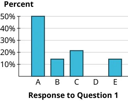
A bar chart of categorical responses with the vertical axis labeled in percent (relative frequency). It illustrates how each category’s bar height represents its share of the whole, making comparisons of category proportions immediate. Source
They are simply different ways to report the share of observations in a category.
Proportions
A proportion is usually written as a decimal between 0 and 1. This form is especially useful in statistics because it connects naturally to formulas, probability language, and later inference procedures.
Percentages
A percentage reports the same information on a scale from 0 to 100. Percentages are often easier for a general audience to read because they describe how many cases fall in a category out of every 100 cases.
Rates
A rate communicates the same idea using a stated base such as “per 100,” “per 1,000,” or another convenient unit. In this setting, the rate is still describing the same share of the whole; only the scale of reporting changes.
Because these forms are equivalent, students should be able to recognize that changing from a proportion to a percentage or rate does not change the distribution. It only changes how the information is displayed.
Constructing a relative frequency table
A relative frequency table begins with category counts, but its purpose is to show how each category contributes to the overall distribution rather than just reporting totals.
Process
List all categories of the variable.
Determine the total number of cases in the data set.
Divide each category count by the total number of cases.
Report the results as proportions, percentages, or rates.
Check that the full set of entries represents the entire data set.
This process standardizes the information. Once categories have been converted into proportions, each category can be interpreted as a share of the whole, which makes the distribution easier to read.
Relative frequency tables are particularly helpful when sample sizes differ across situations or when the total number of observations is not obvious. A large count may represent a small share of a large data set, while a smaller count may represent a substantial share of a smaller one. Relative frequencies solve that interpretation problem by placing every category on the same scale.
Interpreting entries in context
Each entry in a relative frequency table should be read as a statement about the proportion of all cases in a particular category. Good interpretation includes three parts:
the variable being studied
the category being described
the whole group to which the proportion refers
A relative frequency should never be treated as just a bare number. It should be interpreted as the share of all observations that fall into a named category. Without the category label and the group being studied, the number is incomplete.
Relative frequency tables also make it easier to identify categories with the largest shares, the smallest shares, or similar shares. Because every value is expressed on the same scale, comparisons are more meaningful than when looking only at raw counts.
Common errors to avoid
Mistakes with relative frequency tables often come from unclear denominators or incomplete reporting rather than from difficult calculations.
Frequent issues
Using the wrong total: Every category proportion should be based on the total number of cases in the data set being summarized.
Mixing forms without labeling: A proportion, percentage, and rate are equivalent, but the form used should be stated clearly.
Reporting numbers without context: A relative frequency needs a category name and a reference group.
Confusing a count with a proportion: A large count is not automatically a large share unless the total is known.
Forgetting completeness: The entries in a relative frequency table should account for the full distribution.
Clear statistical writing requires both the numerical value and its meaning in context. In AP Statistics, a relative frequency table is not just a list of transformed counts; it is a way to describe how observations are distributed across categories using proportions.
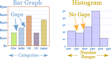
A set of simple, labeled bar-graph examples (including a bar graph vs. histogram comparison) emphasizing that bar graphs represent categories and histograms represent numeric intervals. This visual helps reinforce that relative-frequency summaries for categorical variables are often communicated with bar charts, where bar heights reflect category shares. Source
Practice Questions
A survey of 30 students recorded favorite after-school activity. Twelve students chose sports.
Write the relative frequency for the category “sports” as: a) a proportion b) a percentage
1 mark for correct proportion:
1 mark for correct percentage:
A college asked 80 students for their preferred study location. The results were:
Library: 32
Residence hall: 24
Coffee shop: 16
Outdoors: 8
a) Find the relative frequency for each category as a proportion. b) Express the “coffee shop” category as a rate per 100 students. c) Describe what the relative frequency table shows about student study-location preferences.
1 mark for using the correct total of 80
2 marks for correct relative frequencies: Library , Residence hall , Coffee shop , Outdoors
1 mark for correct rate: 20 per 100 students
1 mark for a valid contextual description, such as library being the most common category and outdoors being the least common category
FAQ
First decide whether missing responses are part of the analysis. If they matter, include “missing” as its own category.
If missing cases are excluded, the denominator should be the number of nonmissing cases, and that choice should be stated clearly. The key is consistency and clear reporting.
Rates are often more useful when proportions are very small or when a standard reporting base is expected, such as per 1,000 or per 100,000.
This makes values easier to read and compare. Public health, crime, and demographic reports often prefer rates for that reason.
Yes. In a weighted survey, categories can be summarized using weighted totals instead of simple counts.
The resulting relative frequencies represent estimated population shares rather than just sample shares. When weights are used, that should be stated so readers know the table is not based only on raw frequencies.
For a single categorical variable, categories should be mutually exclusive. Each case should belong to only one category.
If observations can fall into multiple categories, the variable needs to be redefined or the data structure changed. Otherwise, the relative frequencies may not describe a valid distribution.
Use enough precision to communicate the pattern clearly without implying false accuracy. Very small samples usually do not justify many decimal places.
A common approach is to report proportions to two or three decimal places, or percentages to one decimal place when needed. The most important rule is to use a consistent level of precision throughout the table.
