
AP Syllabus focus: 'Counts and relative frequencies of categorical data reveal information that can justify claims about the data in context.'
Describing categorical data is not just listing categories and numbers. In AP Statistics, you must use counts and proportions to make clear, accurate statements that explain what the data show about a real setting.
Describing Categorical Data Meaningfully
Categorical data place individuals into groups, so good description depends on context. A strong statement tells the reader who or what was studied, what variable was recorded, which category is being discussed, and what the numbers mean. Without that context, a claim may be technically true but statistically weak or unclear.
One key numerical description is relative frequency.
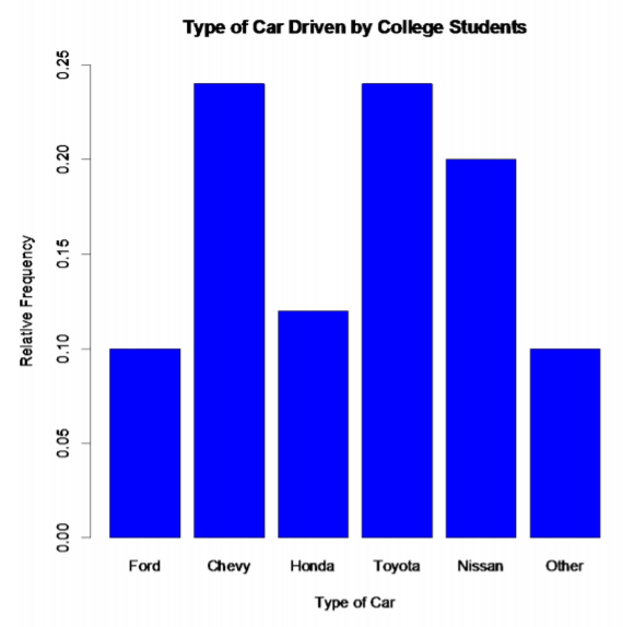
Bar charts can display categorical data using relative frequency (proportion) on the vertical axis instead of raw counts. This makes it easier to interpret how common each category is within the overall data set, since bar heights represent shares of the total rather than absolute totals. Source
Relative frequency: The proportion of observations that fall in a category, often written as a decimal, fraction, or percent.
When you describe categorical data, you should often use both counts and relative frequencies. Counts tell how many observations are in each category. Relative frequencies tell how large each category is compared with the whole data set. Together, they give evidence for claims about the data.
Using Counts and Relative Frequencies
What counts tell you
A count shows the number of individuals in a category. Counts are useful when the question is about actual amounts. If the data describe survey responses, a count tells how many people gave a particular response. If the data describe products, a count tells how many products fell into each classification.
Counts are especially useful when:
the actual number matters,
all categories come from the same total group,
you want to identify the largest or smallest category by number of observations.
However, counts alone can be misleading when comparing groups of different sizes. A larger count does not always mean a larger share of the group.
What relative frequencies tell you
A relative frequency shows how much of the whole belongs to a category. This is often the better choice when comparing categories or comparing data sets with different total sizes.
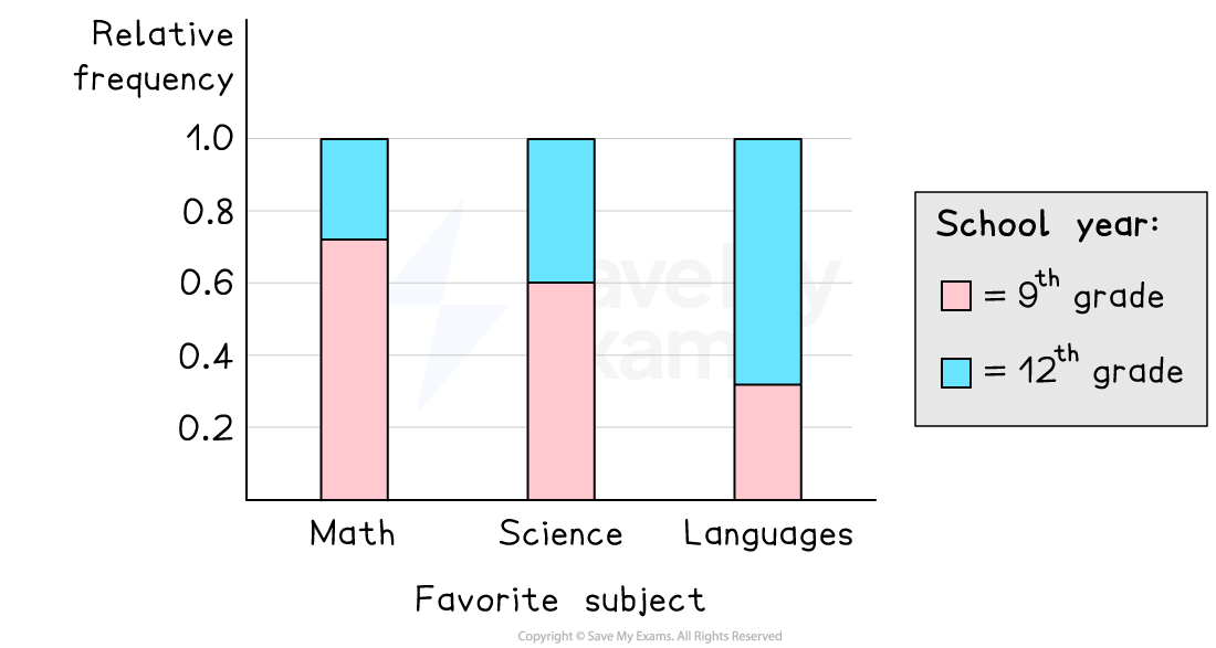
A segmented (stacked) bar chart displays each group as a bar of height 1, with segments showing conditional relative frequencies for each category. This format emphasizes comparisons of proportions within each group, which is often the correct interpretation in AP Statistics when group sizes are not the same. Source
Relative frequencies allow you to judge whether a category is common or uncommon within its own group.
They are often written as:
a proportion,
a decimal,
or a percent.
= relative frequency for a category
= number of observations in that category
= total number of observations in the data set
In written descriptions, relative frequencies help justify statements such as which category represents the largest share, whether one category is much more common than another, or whether two categories occur at similar rates.
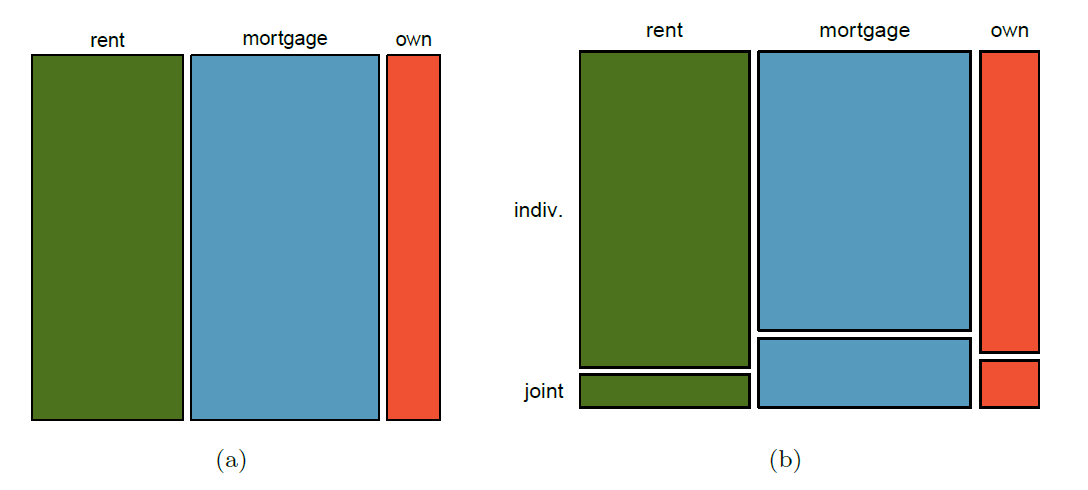
A mosaic plot represents categorical data by partitioning a rectangle so that widths and heights correspond to proportions in the data. The area of each tile is proportional to the (joint) relative frequency, helping you compare how common combinations of categories are and supporting context-based claims about differences between groups. Source
On AP Statistics questions, these statements must be tied to the actual context, not written as vague comments about “the graph” or “the data.”
Writing Justified Claims
A claim about categorical data should be supported directly by the observed counts or relative frequencies. The numbers are the evidence. If you say one category is more common, the data must show that clearly. If you say a category represents a majority, the relative frequency must be greater than one-half. If you say categories are similar, the values should be close enough to support that wording.
Strong context-based claims usually do the following:
identify the group being described,
name the category or categories,
include a count or relative frequency,
use accurate comparison language,
stay within what the data actually show.
Words such as most, majority, about the same, largest proportion, and small minority should only be used when the numbers justify them. Precise language makes the claim stronger and more defensible.
Keeping the Context in Every Statement
A common weakness in student responses is describing categorical data as if the categories exist by themselves. In statistics, categories always belong to a specific variable measured on a specific group. A complete statement should make that clear.
Good contextual description means you should refer to:
the individuals or cases,
the categorical variable being recorded,
the category names,
and the numerical evidence.
This matters because the same numbers can mean very different things in different settings. A proportion from a customer survey, a school poll, and a medical study may all be interpreted differently because the context changes what the claim actually says.
It also means you should match your wording to the scope of the data. Describe the data you were given. Do not automatically extend the claim beyond that group unless you are told that a broader conclusion is appropriate.
Common Mistakes
Several errors weaken descriptions of categorical data:
Omitting context: saying a category is “largest” without naming the group or variable.
Using only counts when group sizes differ: this can create unfair comparisons.
Using vague words: terms like “a lot” or “very common” are weak without numerical support.
Overstating the evidence: a data summary can describe what was observed, but it does not automatically prove a broader claim.
Ignoring the denominator: a proportion only makes sense when the total group is clear.
A strong AP response avoids these problems by using complete sentences, correct statistical language, and clear numerical evidence.
What AP Responses Should Show
On AP Statistics assessments, describing categorical data in context means more than identifying a category with the highest count. You should show that you can turn a frequency summary into a defensible statement about the data.
Readers look for:
correct use of counts or relative frequencies,
direct support for the claim,
comparison language when appropriate,
and clear connection to the real-world setting.
If a prompt asks you to justify a statement, your response should include the numerical evidence and explain what that evidence means in context.
Practice Questions
A survey of 250 customers at an online store recorded preferred shipping option. The results were: standard shipping 140, express shipping 75, and store pickup 35.
Write one sentence that describes the categorical data in context using a relative frequency.
1 mark for correctly finding or stating a valid relative frequency, such as 140 out of 250 or 56% for standard shipping.
1 mark for a correct contextual claim, such as identifying that standard shipping was the most common preferred option among the surveyed customers.
Two community centers asked visitors which fitness class they attend most often.
Center A results: yoga 48, cycling 20, strength 32, dance 10.
Center B results: yoga 36, cycling 30, strength 24, dance 30.
(a) Which center had more visitors in the survey? (1 mark)
(b) Use counts to write one correct comparison in context. (1 mark)
(c) Use relative frequencies to write two correct comparisons in context. (2 marks)
(d) Explain why relative frequencies are more useful than counts for comparing these two centers. (1 mark)
(a) 1 mark for stating that Center B had more visitors surveyed.
(b) 1 mark for one valid count comparison in context, such as Center A had more yoga attendees than Center B, 48 versus 36.
(c) 1 mark for each correct relative-frequency comparison in context, such as:
yoga made up a larger share at Center A than at Center B;
dance made up a larger share at Center B than at Center A;
cycling made up a larger share at Center B than at Center A;
strength made up a larger share at Center A than at Center B.
(d) 1 mark for explaining that the total numbers surveyed were different, so proportions give a fairer comparison than raw counts.
FAQ
This usually happens when individuals are allowed to choose more than one category. In that case, the categories are not mutually exclusive.
It can also happen because of rounding. If each category percentage is rounded separately, the final total may be slightly above or below 100%.
Be cautious. “Other” often combines several different responses, so it may not represent one meaningful category.
If “other” is large, mention that the category is broad and may hide important detail. That makes your description more honest and context-aware.
Rates are useful when the total group size is very large or when the event is rare. For example, a rate per 1,000 or per 100,000 can be easier to interpret than a tiny percent.
A rate can also help when audiences are used to that scale, such as public health or transportation data.
State clearly whether the percentages are based on all individuals or only on those who answered the question. The denominator matters.
If missing responses are substantial, mention that they may affect the description because the observed categories do not represent the full group equally well.
A small numerical difference may be statistically visible but not especially meaningful in context. Your wording should match the size of the difference.
If the proportions are close, use cautious language such as “slightly higher” rather than strong language such as “much more common.”
