
AP Syllabus focus:
‘Investigating various methods beyond bar graphs for representing frequencies or relative frequencies of categorical data. Emphasizing the importance of graphical representations for conveying data in an accessible and interpretable manner. Skill 2.A: Enhancing skills in describing categorical data presented graphically, identifying patterns, and drawing conclusions. Essential Knowledge UNC-1.C.3: Exploring diverse graphical tools for categorical data representation, understanding their application and impact on data interpretation.’
Graphical representations of categorical data provide accessible visual tools that highlight patterns, reveal relationships, and make comparisons clearer than raw tables alone, strengthening interpretation and communication.
Exploring Graphical Representations of Categorical Data
Graphical displays serve as essential tools for understanding one-variable categorical data because they transform counts and proportions into visual forms students can interpret quickly. This subsubtopic focuses on methods beyond bar charts and emphasizes how diverse graphical approaches can make categorical data more intuitive, reveal structures at a glance, and support justified conclusions in context.
The Purpose of Graphical Representations
Graphical representations allow viewers to identify patterns that may not be immediately apparent from numerical summaries. Visual displays emphasize proportions, relative group sizes, and noteworthy differences among categories. Because categorical variables classify observations into distinct groups, choosing an appropriate display ensures that the story inside the data becomes clear and interpretable.
Key Considerations When Representing Categorical Data
Students should recognize that each graphical method has specific strengths. To interpret categorical data effectively, consider the following:
Clarity of comparison: Some displays make category-to-category comparisons easier.
Representation of relative frequencies: Visual emphasis on proportions can reveal meaningful differences.
Contextual relevance: Graphical choices should fit both the purpose of the analysis and the nature of the categories.
Accessibility: Effective visuals ensure an audience can quickly grasp the distribution.
These considerations reinforce how a well-chosen graph improves understanding and supports claims made from the data.
Graphical Methods Beyond Bar Charts
Although bar charts are standard for categorical data, this subsubtopic highlights additional graphical representations that also display frequencies or relative frequencies.
Pie Charts
A pie chart is a circular graph divided into slices representing each category's proportion of the whole.
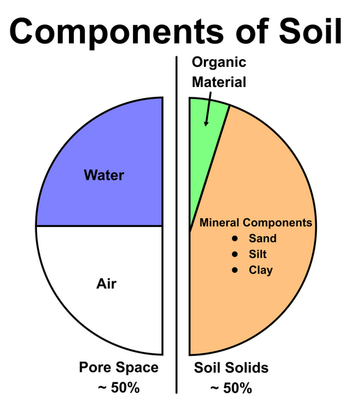
Pie chart illustrating the proportions of minerals, organic matter, water, and air, demonstrating how slices represent the relative frequencies of categorical values within a whole. Source.
Pie Chart: A circular display in which each slice corresponds to a category, with the slice’s angle proportional to its relative frequency.
Pie charts are useful for illustrating part–whole relationships and highlighting categories that dominate or contribute minimally. However, because human perception struggles with comparing angles precisely, pie charts are best when the major purpose is to communicate overall proportions rather than detailed comparisons.
A sentence following the definition helps transition smoothly before introducing the next display type.
Segmented Bar Charts
A segmented bar chart (also known as a stacked bar chart) provides a way to compare proportions across categories within a single bar when an additional grouping variable is present.
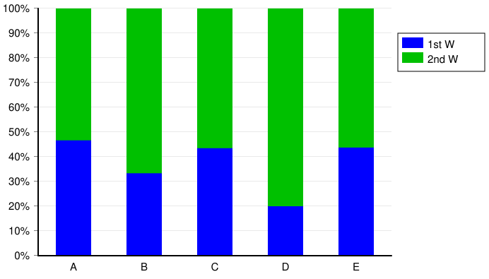
Segmented bar chart in which each bar is partitioned into proportional segments, showing how relative frequencies can be visually compared across grouped categories. Source.
Although primarily used for comparing two categorical variables, they still function as an extension of categorical representations for one variable when grouping is simplified or when proportions within a single categorical distribution must be emphasized clearly.
Segmented Bar Chart: A single bar divided into segments, where each segment represents a category and the segment length reflects its relative frequency.
Segmented bar charts highlight the cumulative distribution while maintaining visibility of each component category’s proportion.
A normal sentence here ensures separation before continuing with additional graphical forms.
Pareto Charts
A Pareto chart arranges categories from the most frequent to the least frequent, making it easier to identify dominant categories.
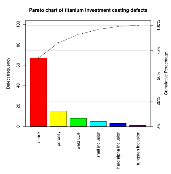
Pareto chart showing ordered bar heights and a cumulative percentage line, emphasizing how dominant categories can be identified through descending frequency arrangement. Source.
Pareto Chart: A bar chart in which categories are ordered from highest to lowest frequency, emphasizing the most significant contributors.
Pareto charts are especially helpful when the goal is to identify which categories contribute most meaningfully to the overall distribution.
Interpreting Graphical Representations of Categorical Data
The AP syllabus emphasizes Skill 2.A, which requires students to describe and interpret categorical data presented in various graphical formats. To meet this skill, students should be able to:
Identify patterns, such as dominant categories or balanced distributions.
Recognize differences in relative frequencies that affect interpretations.
Draw conclusions rooted in the context, ensuring interpretations remain tied to the real-world meaning of the categories.
Justify claims with evidence visible directly in the graph (for example, larger slices, longer segments, or ordering in a Pareto display).
The Impact of Graph Choice on Interpretation
Different displays highlight different aspects of the same data. For example:
Pie charts emphasize parts of a whole.
Segmented bar charts show relative frequencies within a cumulative structure.
Pareto charts prioritize identifying major contributors.
Because graphical choices influence how observers perceive the distribution, students must select visuals that best align with the message they want the data to convey.
Developing Flexibility With Diverse Graphical Tools
The syllabus encourages students to explore diverse graphical methods for categorical data so they can choose the most effective tool for the situation. Building fluency with multiple displays strengthens interpretation, reveals varied perspectives on the same dataset, and supports clearer communication in statistical contexts.
FAQ
Choose a pie chart when you want to emphasise the overall proportion each category contributes to the whole. It is most effective when the number of categories is small and their differences are relatively large.
A segmented bar chart is more suitable when:
You need to compare proportions across multiple groups.
You want all categories displayed within a common scale.
The categories are too numerous or too similar in size for a pie chart to remain clear.
Humans judge lengths and positions more accurately than angles or areas. This means graphs relying on angle comparisons, such as pie charts, can obscure subtle differences.
Bar-based or ordered displays help overcome this because:
Length comparisons are more intuitive.
Ordering reduces cognitive load when identifying largest or smallest categories.
Small differences remain visible, even across crowded category sets.
A Pareto chart highlights the categories that contribute the most to the total frequency, making it ideal for identifying priority areas.
Its usefulness comes from:
Ordering categories from highest to lowest frequency.
Including a cumulative percentage line to show how quickly major contributors dominate.
Clarifying whether a small number of categories account for most observations.
This allows decision-makers to focus resources on the most impactful categories first.
Yes. Misrepresentation happens when visual choices distort the perceived importance of categories.
To avoid this:
Keep scales consistent across graphs.
Avoid 3D effects, which exaggerate apparent areas or angles.
Ensure all category labels are clear and evenly spaced.
Do not overly emphasise one category through colour or size unless statistically justified.
A clean, proportional design ensures the data—not the decoration—drives interpretation.
Before relying on interpretations, verify:
Whether the categories are mutually exclusive and properly defined.
That the graph uses correct scaling and consistent units.
Whether categories are ordered logically or meaningfully (especially in Pareto charts).
That proportions or counts sum to the expected total.
Checking these details prevents incorrect conclusions and helps ensure the display truly reflects the underlying dataset.
Practice Questions
Question 1 (2 marks)
A company analyses customer satisfaction across four service categories and presents the results in a pie chart.
Explain one advantage and one disadvantage of using a pie chart to represent these categorical data.
Question 1
• Advantage: Pie charts show part–whole relationships clearly, making it easy to see which categories are the largest proportion. (1 mark)
• Disadvantage: It is difficult to compare category sizes accurately because angle and area judgments are imprecise. (1 mark)
Question 2 (5 marks)
A researcher records the frequency of five types of user feedback on a mobile app: navigation issues, loading delays, feature requests, visual design comments, and general complaints.
They wish to compare the prominence of each feedback type and identify which areas need priority attention.
(a) Suggest two suitable graphical representations for these categorical data other than a bar chart.
(b) Explain how each suggested graph helps the researcher interpret the distribution of feedback effectively.
(c) State one limitation of each graph when comparing categories with similar frequencies.
Question 2
(a) Any two of the following: pie chart, segmented (stacked) bar chart, Pareto chart. (2 marks: 1 mark each)
(b) Explanation for each suggested graph (max 2 marks):
• Pie chart: Shows proportion of each feedback type within the whole, highlighting dominant categories. (1 mark)
• Segmented bar chart: Displays category proportions within a single bar, making cumulative composition clear. (1 mark)
• Pareto chart: Orders categories from most to least frequent, helping identify key areas needing attention. (1 mark)
(c) Limitation for each suggested graph (max 1 mark):
• Pie chart: Hard to compare categories with similar proportions. (1 mark)
• Segmented bar chart: Smaller segments become difficult to distinguish when frequencies are close. (1 mark)
• Pareto chart: Overemphasis on ordering can obscure small differences between mid-ranked categories. (1 mark)
