
AP Syllabus focus: 'A boxplot represents the five-number summary; the box shows the middle 50%, whiskers extend to non-outliers, and outliers use separate symbols.'
A boxplot condenses a quantitative distribution into a compact visual display. It highlights center, spread, and unusually distant observations, making it especially useful for quick interpretation and comparison of data sets.
What a Boxplot Displays
A boxplot gives a concise picture of how a quantitative variable is distributed. Instead of showing every observation directly, it summarizes the data with key positions in the ordered list of values. This makes the display compact, especially when a data set is large.
Boxplot: A graphical display for a quantitative data set in which a box marks the middle portion of the distribution, whiskers extend outward to non-outliers, and any outliers are plotted with separate symbols.
A boxplot is read from left to right on a numerical scale.
Its main parts are the box, the median line, the whiskers, and any outlier symbols. Each part has a specific meaning, so accurate interpretation depends on knowing what the pieces represent.
The Box and the Median
The box shows the middle 50% of the observations.

Example boxplot with numeric labels for the minimum, , median, , and maximum, making the five-number summary visually concrete. Because the quartile endpoints and median are explicitly identified, this image helps connect the verbal description of “middle 50%” to the actual geometry of the box. Source
In other words, half of the data values lie inside the box. This is one of the most important features of the display because it gives a visual sense of where the central bulk of the data falls.
A line inside the box marks the median, which is the middle value of the ordered data. The median separates the lower half of the observations from the upper half. When the median is near the center of the box, the distribution may look fairly balanced in its middle portion. When the median is closer to one side of the box, the distribution may be more stretched on the other side.
The width of the box matters as well. A wider box means the middle half of the data is more spread out. A narrower box means the middle half is more tightly packed.
Whiskers and Their Meaning
The whiskers extend outward from the box to show the most extreme observations that are not considered outliers. This is an important AP Statistics idea: whiskers do not simply have to reach the minimum and maximum values in the data set.
If there are no outliers on a side, a whisker may reach the actual smallest or largest value. If outliers are present, the whisker stops at the most extreme non-outlier, and the more distant values are shown separately.
Longer whiskers suggest greater spread among the non-outlier values on that side of the distribution. Shorter whiskers suggest less spread. However, a whisker does not show exactly how observations are spaced within that interval, so it should not be read as if data are evenly distributed along its length.
Outlier: An observation shown separately on a boxplot because it lies unusually far from the rest of the data compared with the non-outlier values.
Reading Outliers on a Boxplot
On a boxplot, outliers are marked with separate symbols, often dots, asterisks, or small circles. These points appear beyond the whiskers. Their position immediately tells you whether the unusual observations are unusually low, unusually high, or both.
Outliers matter because they can signal important features of the data:
a rare but real observation
a possible recording or measurement error
a different subgroup mixed into the same data set
a distribution with a long tail on one side
An outlier should not be dismissed automatically. In AP Statistics, the key first step is to identify and interpret it in context. The boxplot tells you that the value is unusual relative to the rest of the distribution, but the plot alone does not explain why it is unusual.
What Boxplots Reveal About a Distribution
A boxplot is especially useful for describing several distribution features quickly.
Center: The median gives a clear measure of the middle of the distribution.
Spread: The box width and whisker lengths show how variable the data are.
Possible skewness: If one whisker is much longer than the other, or if the median is not centered in the box, the distribution may be more spread out on one side.
Unusual observations: Separate symbols highlight outliers immediately.
At the same time, a boxplot does not reveal every detail. It does not show exact individual values for most observations, and it does not display clusters, gaps, or multiple peaks as clearly as some other graphs do. That means a boxplot is a summary display, not a complete picture of all structure in the data.
Comparing Boxplots
Boxplots are especially effective when placed side by side using the same scale.
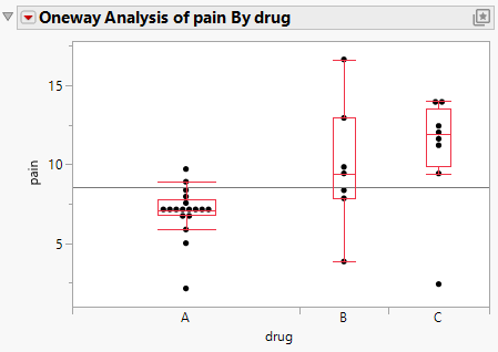
Side-by-side boxplots on a common axis, designed for comparing groups by median, IQR (box length), and overall spread (whiskers). The grouped display makes it easy to write comparative conclusions in context (e.g., which group has a higher center or greater variability). Source
This allows direct comparison of two or more quantitative data sets.
When comparing boxplots, focus on:
medians to compare centers
box lengths to compare the spread of the middle 50%
whisker lengths to compare spread outside the middle 50% among non-outliers
outlier symbols to compare unusual observations
the overall balance of the box and whiskers to notice possible differences in shape
Strong comparisons are written in context and are specific. Rather than saying one distribution is “better” or “more normal,” describe what the display actually shows, such as a higher median, greater variability, or the presence of high outliers.
Common Interpretation Mistakes
Several mistakes occur often when students first learn boxplots.
The box does not contain 50% of the numerical scale; it contains the middle 50% of the observations.
The whiskers do not always end at the minimum and maximum values.
A longer box or whisker does not mean there are more observations there; it means the values are more spread out.
An outlier symbol does not automatically mean the value is wrong.
Two different data sets can produce very similar boxplots, because boxplots summarize rather than display every detail.
Careful interpretation comes from reading the box, whiskers, median, and outlier symbols together. A boxplot is most informative when you use each feature to support a clear statement about the distribution in context.
Practice Questions
A boxplot of daily screen time for students shows two points above the upper whisker.
What do these two points represent, and what do they suggest about the distribution?
1 mark for identifying the points as outliers.
1 mark for stating that they are unusually large values on the high end of the distribution.
Two side-by-side boxplots summarize commute times, in minutes, for employees at Company A and Company B on the same scale.
Company A: median 24, box from 18 to 29, lower whisker to 12, upper whisker to 33, one outlier at 49. Company B: median 28, box from 20 to 38, lower whisker to 14, upper whisker to 44, no outliers.
(a) Compare the centers of the two distributions. (b) Compare the spread of the middle 50%. (c) Compare the unusual features of the distributions. (d) Which company has more consistent commute times? Justify your answer.
1 mark for stating that Company B has the higher median, so its typical commute time is greater.
1 mark for stating that Company B has the larger box, so the middle 50% is more spread out.
1 mark for noting that Company A has a high outlier at 49, while Company B has no outliers shown.
1 mark for noting that Company B also has greater non-outlier spread, as shown by the longer whiskers overall.
1 mark for concluding that Company A is more consistent, with justification based on its smaller box and smaller non-outlier spread.
FAQ
Different technology may use different rules for finding quartiles, especially when the data set has an odd number of observations or repeated values.
Because the quartiles can change slightly, the box edges and whisker endpoints may also change slightly. On AP Statistics, follow the method your course or teacher uses and be consistent throughout a problem.
A modified boxplot is the common version in which suspected outliers are plotted as separate points and the whiskers stop at the most extreme non-outliers.
That is the version typically used in AP Statistics. If a graph shows whiskers going all the way to the minimum and maximum with no separate outlier symbols, it is not the modified form.
Yes, but it has limits.
With a very small data set:
the boxplot can look overly simple
a single value can strongly affect the display
important details are often hidden
In that situation, a boxplot may still help summarize the data, but it is often better interpreted along with the actual values or a graph that shows individual observations.
This can happen when the smallest non-outlier is the same as the lower edge of the box, or when the largest non-outlier is the same as the upper edge of the box.
It can also happen when many values are tightly packed near one quartile. A very short whisker does not mean the graph is wrong; it means there is very little spread among the non-outlier values on that side.
Repeated values can make parts of the boxplot collapse or look compressed. For example:
the median may coincide with one side of the box
a whisker may be very short
the box itself may be narrow
This does not mean the display is flawed. It means the data have many ties, so several summary positions fall at the same number.
