
AP Syllabus focus:
‘Detailed description of boxplots as graphical representations of the five-number summary.
- Explaining how the boxplot visualizes the middle 50% of data, median, quartiles, and identifies outliers with specific symbols.
- Discussing the interpretation of boxplot features such as the spread of the data, symmetry, and outliers.
- Skill 2.B: Mastering the creation and analysis of boxplots to represent summary statistics graphically.’
A boxplot visually displays the distribution of a quantitative variable by emphasizing its central values, variability, and potential outliers to support clear and comparative data interpretation.
Constructing a Boxplot
Understanding the Purpose of a Boxplot
A boxplot is a graphical representation built from the five-number summary, a set of key statistics describing the distribution of a quantitative variable. The five-number summary includes the minimum, first quartile (Q1), median, third quartile (Q3), and maximum, and a boxplot uses these values to display both the overall spread and central tendency in a compact form.
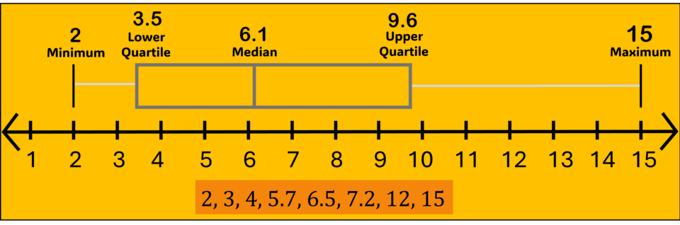
A labeled boxplot on a number line showing the minimum, first quartile, median, third quartile, and maximum for a small dataset. The box highlights the middle 50% of the values, and the whiskers extend to the minimum and maximum observations. Extra detail: the exact data values are shown below the axis, which is helpful but not required by the AP Statistics syllabus. Source.
Five-Number Summary: A set of descriptive statistics consisting of the minimum, Q1, median, Q3, and maximum of a dataset.
A boxplot provides a structured format that highlights where most data fall, how spread out the values are, and whether the distribution exhibits signs of skewness or unusual features such as outliers.
Essential Components of a Boxplot
When constructing a boxplot, each graphical element corresponds directly to a component of the five-number summary. Students must understand the purpose and placement of each part before interpreting the graphical display.
Key components include:
The Box: Extends from Q1 to Q3, representing the middle 50% of the data.
The Median Line: A vertical or horizontal line inside the box marking the median, indicating the dataset’s central value.
The Whiskers: Lines extending from the box to the minimum and maximum data values that are not classified as outliers.
Outlier Symbols: Observations beyond the whiskers, plotted with distinct markers such as dots or asterisks.
Interquartile Range (IQR): The difference between Q3 and Q1, representing the range of the middle 50% of the data.
Understanding these components is essential for constructing a graph that accurately reflects the distribution’s features.
Steps for Constructing a Boxplot
Although boxplots may appear simple, each step must be carried out carefully to ensure accurate representation.
To construct a boxplot:
Identify and order all data values.
Determine the five-number summary: minimum, Q1, median, Q3, and maximum.
Draw a scaled axis appropriate for the data’s range.
Create a box spanning from Q1 to Q3.
Mark the median inside the box with a line.
Add whiskers extending to the most extreme non-outlier values.
Plot outliers using a symbol distinct from the whiskers.
A single boxplot can show the full distribution of one variable, while side-by-side boxplots allow efficient comparison across groups.
Interpreting a Boxplot
Identifying Spread and the Middle 50%
Boxplots are especially useful for conveying the variability of a dataset. The width of the box indicates the interquartile range, a key measure of spread. Wider boxes imply more dispersed central values, while narrower boxes indicate more consistent data around the median.
Recognizing Symmetry and Skewness
The position of the median inside the box and the relative lengths of the whiskers help reveal the shape of the distribution.
Important interpretive cues include:
A median centered within the box and whiskers of similar length suggest a symmetric distribution.
A median closer to Q1 with a longer whisker on the right indicates right skewness.
A median closer to Q3 with a longer left whisker signals left skewness.
Detecting Outliers and Their Implications
Outliers are plotted as individual symbols, separate from the whiskers. Their presence can suggest irregularities, potential data entry errors, or meaningful extreme observations depending on context.
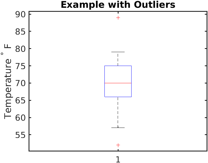
A boxplot labeled “Example with Outliers” showing temperature (°F). The box and whiskers summarize the main bulk of the data, while two red plus signs mark unusually low and high temperature values as outliers. Extra detail: the temperature scale and the group label provide real-world context beyond AP Statistics requirements. Source.
Outlier: A data point that lies unusually far from the rest of the distribution, often identified using standardized criteria such as the 1.5×IQR rule.
Outliers affect the interpretation of the boxplot by highlighting values that may distort measures like the mean or standard deviation.
Evaluating Overall Distribution Structure
Boxplots also illuminate broader patterns within the dataset, including clusters or uneven distribution of values. Analysts can draw meaningful insights by observing:
The relative size of the whiskers
The placement of the median within the box
The number and direction of outliers
How spread differs between the lower and upper halves of the data
These features collectively communicate the distribution’s behavior in a concise visual format.
Using Boxplots for Comparative Analysis
Although each boxplot represents a single distribution, comparison across multiple boxplots enables clear evaluation of differences between groups.
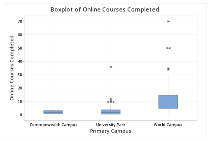
Side-by-side boxplots of online courses completed for several campuses. Each boxplot summarizes a separate group, allowing visual comparison of medians, IQRs, overall spreads, and any outliers. Extra detail: the specific context of online course counts is example-based but directly illustrates the principles of comparative boxplot analysis. Source.
FAQ
Either orientation is acceptable, but the choice depends on clarity and available space.
Horizontal boxplots work well when the scale has a wide range or when comparing several groups side by side. Vertical boxplots are useful when space is limited or when the categorical grouping variable is displayed along the horizontal axis.
Whichever format you choose, ensure tick marks are readable and the ordering of categories (if any) is logical.
A well-labelled boxplot should include:
• A clearly marked axis with units.
• Identified quartiles and median (labels or a key if necessary).
• A title describing the variable and context.
• Distinct symbols for outliers, explained in a legend if the plot includes multiple groups.
Good labelling prevents misinterpretation, especially when comparing groups.
No. Whiskers must always end at actual data values.
If a dataset includes outliers, the whisker stops at the most extreme non-outlier value. Outliers are then plotted separately.
This rule ensures the boxplot reflects the structure of the observed data rather than arbitrary cut-off points.
Boxplots do not explicitly show clusters, but certain visual cues can hint at them.
Look for:
• A long IQR combined with a median close to one quartile.
• Whiskers that differ greatly in length.
• Multiple outliers that occur on both ends of the distribution.
Such patterns may suggest mixtures of underlying groups, even though the boxplot cannot display them directly.
The five-number summary ignores how data are arranged within each quartile.
Two datasets may have:
• Different shapes (for example, one uniform, one skewed).
• Uneven spacing of points within the middle 50 per cent.
• Clusters or gaps that a boxplot cannot display.
Thus, boxplots are powerful for summarisation but cannot capture all distributional nuances present in dotplots or histograms.
Practice Questions
Question 1 (1–3 marks)
A boxplot of the reaction times (in milliseconds) of 40 participants shows a median of 245, a lower quartile (Q1) of 220, and an upper quartile (Q3) of 300. The whiskers extend to 180 and 360, with no outliers plotted.
(a) Describe the spread of the middle 50% of the reaction times.
(b) Based on the relative lengths of the whiskers, comment on the likely skewness of the distribution.
Mark scheme:
(a) 1 mark for stating that the middle 50% of reaction times lie between 220 and 300.
(a) 1 mark for identifying the interquartile range as 80 (optional but acceptable wording).
(b) 1 mark for noting that the longer upper whisker suggests the distribution is likely right-skewed.
Question 2 (4–6 marks)
Two boxplots show the distribution of daily study times (in minutes) for two groups of students: Group A (taught in-person) and Group B (taught online). Group A has a median of 50, Q1 of 40, Q3 of 65, and several high outliers. Group B has a median of 60, Q1 of 55, Q3 of 70, and no outliers. The whiskers for Group A extend from 25 to 120, while Group B’s extend from 45 to 90.
(a) Compare the central tendency of the two groups.
(b) Compare the variability of the two groups.
(c) Comment on any unusual features and explain how they may affect interpretation.
(d) Based on the boxplots, which group appears to have more consistent study habits? Justify your answer.
Mark scheme:
(a) 1 mark for identifying that Group B has the higher median study time.
(a) 1 mark for noting that Group A tends to study less on average.
(b) 1 mark for correctly describing that Group A has a larger IQR and a wider overall spread than Group B.
(b) 1 mark for correctly comparing either whisker lengths or extreme values to support the greater variability in Group A.
(c) 1 mark for recognising that Group A has several high outliers and Group B has none.
(c) 1 mark for explaining that the outliers might inflate Group A’s mean or distort impressions of typical study time.
(d) 1 mark for concluding that Group B shows more consistent study habits due to smaller spread and absence of outliers.
