
AP Syllabus focus:
‘Introduction to the use of various graphical representations (histograms, side-by-side boxplots, etc.) for comparing two or more independent samples. Discussing key aspects to compare, including center, variability, clusters, gaps, outliers, and other distributional features. Highlighting the importance of visual representations in identifying similarities and differences across distributions. Skill 2.D: Developing the ability to select and interpret appropriate graphical methods for comparing multiple sets of quantitative data.’
Comparing distributions graphically helps reveal meaningful similarities and differences between independent samples by focusing on shape, center, variability, and unusual features visible in visual representations.
Graphical Comparisons of Quantitative Distributions
Graphical displays allow statisticians to compare two or more independent samples by visually examining essential characteristics of their distributions. The AP Statistics curriculum emphasizes selecting appropriate graphs—such as histograms and side-by-side boxplots—to understand how groups differ or resemble each other across key aspects including center, variability, and unusual features like outliers or gaps. Effective graphical comparison requires careful attention to how each display summarizes and communicates quantitative information.
Choosing Appropriate Graphical Representations
Selecting the correct graph is crucial when examining differences among distributions. Each display highlights distinct features of the data, and students must match the graph to the comparison goal.
Histograms for Distribution Shape
Histograms are particularly useful when the goal is to understand the shape of the distributions. By dividing data into intervals and representing frequency with bar height, histograms emphasize:
The overall shape of each distribution (symmetry, skewness, modality)
How the data are spread across values
General patterns of clustering or spacing
Because histograms group values into bins, they help reveal distributional patterns, but they do not show exact data values.
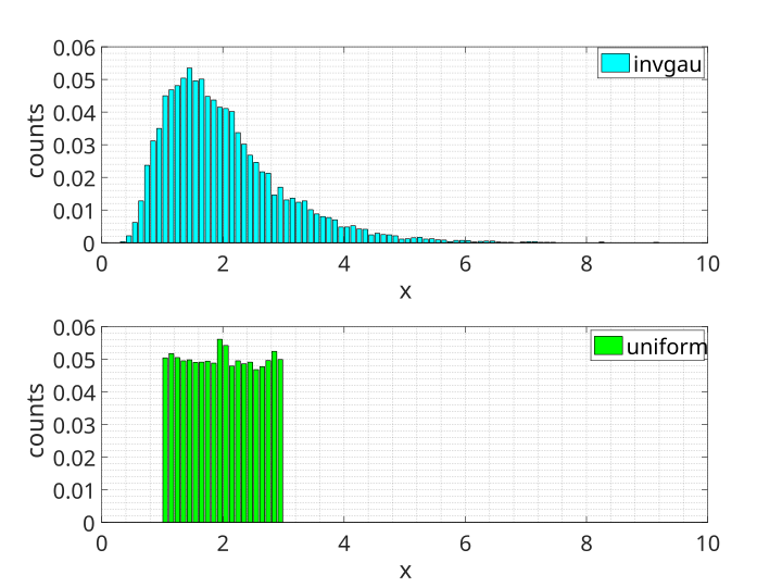
Two histograms display distributions of inverse Gaussian and uniform models over the same range, highlighting pronounced differences in shape and spread. The contrasting bar heights reveal how one distribution clusters while the other remains evenly dispersed. Although labeled with specific probability models, the visual comparison directly supports understanding how histograms reveal differences between groups. Source.
When using histograms for comparison:
Ensure both samples use the same bin width and common scale
Compare the prominent features of each distribution’s outline
Note whether distributions have similar or different degrees of skewness
Side-by-Side Boxplots for Center and Spread
Side-by-side boxplots provide a compressed summary of each dataset and are ideal for comparing center, variability, and overall range. Boxplots rely on the five-number summary (minimum, Q1, median, Q3, maximum), allowing quick identification of structural differences.
Key comparisons visible in boxplots:
Median position, indicating differences in central tendency
Interquartile range (IQR), reflecting variability within the middle 50%
Whisker length, showing the spread of the overall distribution
Potential outliers, marked with special symbols outside the whiskers
Relative symmetry, inferred from median placement within the box
Side-by-side boxplots are especially effective for comparing groups because they standardize visual structure, making differences immediately perceptible.
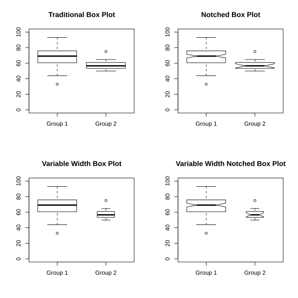
Four paired boxplot displays illustrate how different boxplot styles compare two distributions while emphasizing center, spread, and potential outliers. Each variant presents the same datasets, reinforcing how standardized formats aid visual comparison. Notches and width adjustments exceed syllabus requirements but help students recognize common real-world boxplot variations. Source.
Core Aspects to Compare Across Distributions
Graphical comparisons in AP Statistics emphasize four major distributional features: center, variability, shape, and unusual characteristics. Each contributes to a complete comparative analysis.
Comparing Centers
The center of a distribution—typically represented visually by the median in boxplots or the peak region in histograms—helps determine which group tends to have larger or smaller values.
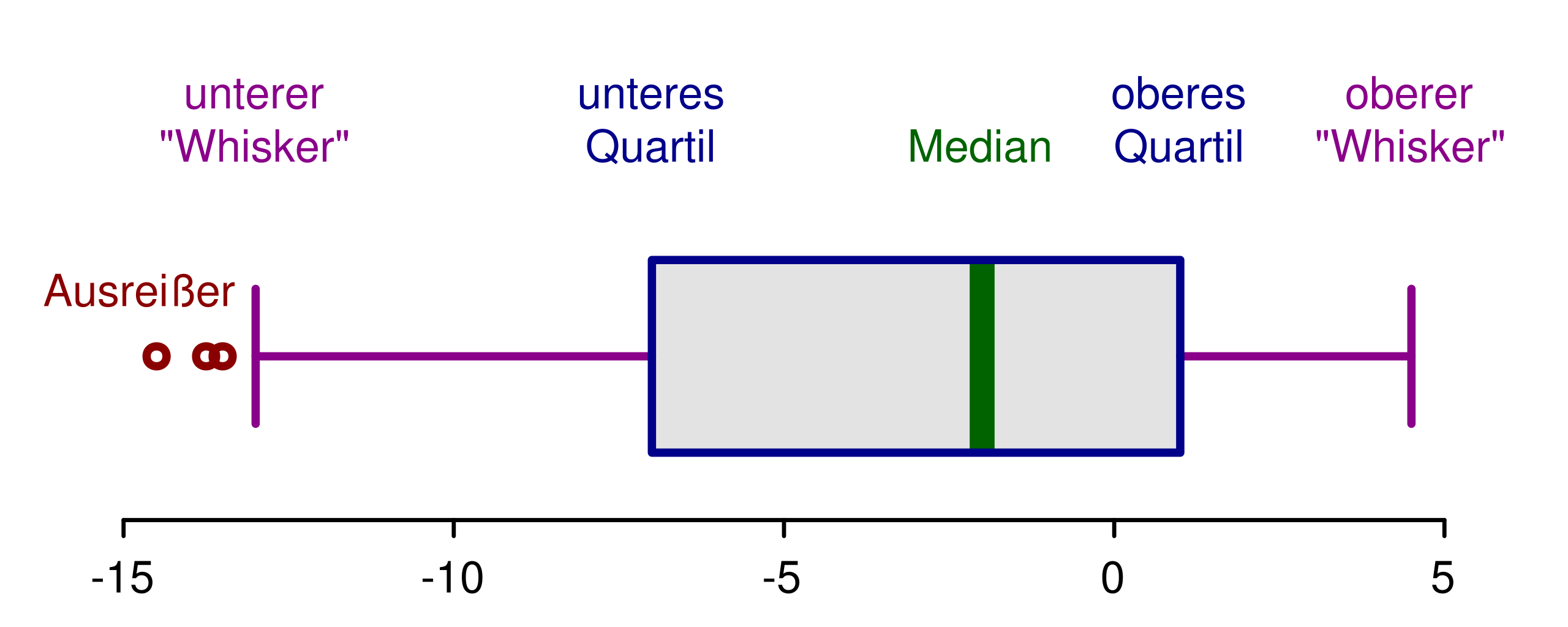
An annotated boxplot labels each component of the five-number summary, demonstrating how boxplots display central tendency and spread. The marked median and quartiles show where data concentrate and how values vary across the distribution. Its precise labeling supports interpreting boxplots before comparing multiple groups. Source.
Students should look for:
Higher or lower medians in boxplots
The approximate level of concentration in histogram peaks
Whether one sample consistently trends above or below the other
Comparing Variability
Variability indicates how spread out data values are within each distribution. Graphs reveal variability through:
Width of the box in a boxplot (IQR)
Length of whiskers, representing the overall spread
Range of bars in a histogram, showing how far values extend
When one group has much greater variability, its distribution appears more stretched or dispersed.
Comparing Distribution Shape
The shape of a distribution influences how data should be interpreted and compared. In graphical comparisons, shape differences may involve:
Symmetry versus skewness
Unimodality or multimodality, revealed in histograms
Clusters, shown as concentrated groups of bars or visible segments
Gaps, where no data values appear
Shape differences can suggest varying underlying processes or population characteristics.
Identifying Unusual Features
Unusual features add important context to distribution comparisons. These include:
Outliers, which may distort measures like the mean and standard deviation
Gaps, indicating missing intervals of data
Clusters, suggesting subgroups within a sample
Multiple peaks, revealing structural complexity in the distribution
Careful attention to such features enriches interpretations and prevents misleading conclusions.
Interpreting Graphical Comparisons Effectively
Once graphs are chosen and features identified, students must articulate clear, context-specific comparisons. Effective interpretation should include:
Explicit statements about which group has the higher center
Observations on which group shows greater variability
Notes on shape differences, especially skewness or modality
Identification of outliers and discussion of their implications
Well-supported claims rely on visual evidence rather than numerical calculations when working exclusively with graphical displays.
Using Visual Representations to Communicate Findings
Graphical comparisons provide accessible, immediate insights into group differences. They help justify claims by showing patterns clearly aligned with context. By focusing on center, spread, shape, and unusual features, AP Statistics students gain skill in examining multiple distributions and drawing accurate, data-informed conclusions directly from visual summaries.
FAQ
Choose a histogram when you need to examine the full shape of each distribution, especially features such as modality, skewness, and clustering.
Choose side-by-side boxplots when the goal is to compare centres, spreads, and potential outliers quickly and clearly.
Histograms offer more detail, while boxplots offer a clearer summary. The best choice depends on whether detailed shape or concise comparison is more important.
Students often mistakenly compare distributions with graphs using different scales or bin widths, making comparisons unreliable.
Another frequent issue is focusing on individual data points rather than overall distributional patterns.
A good comparison always mentions centre, spread, shape, and unusual features, rather than only one of these aspects.
Using a common horizontal and vertical scale ensures that differences between groups are genuine rather than artefacts of the graph’s construction.
If scales differ, one distribution may appear more spread out or more centred simply due to the axis choices.
Consistent scaling allows direct visual comparison of features such as range, clustering, and skewness.
Clusters may indicate subgroups or underlying factors affecting only some members of a population.
Gaps show where no data occur, suggesting distinct behavioural patterns or possible data-collection issues.
Including clusters and gaps in comparisons helps explain why two groups may differ beyond simple centre or spread differences.
Look for unusually long whiskers in a boxplot or isolated bars far from the main cluster in a histogram.
Outliers may shift the perception of spread or exaggerate skewness if not interpreted cautiously.
When comparing groups, note whether outliers appear in one distribution or both, as this affects how representative the centre and spread measures are for each group.
Practice Questions
Question 1 (1–3 marks)
A researcher compares the time (in minutes) spent on homework by two independent groups of students using side-by-side boxplots. The median for Group A is noticeably higher than the median for Group B, while the IQRs for both groups appear similar.
Based on the graphical comparison, what can the researcher conclude about the two groups?
Question 1 (1–3 marks)
Award up to 3 marks:
1 mark for stating that Group A has a higher centre (higher median) than Group B.
1 mark for noting that the spreads (IQRs) appear similar between the groups.
1 mark for a correct concluding statement, such as that students in Group A tend to spend more time on homework than students in Group B, based solely on the graphical comparison.
Question 2 (4–6 marks)
A school collects data on the number of text messages sent in a day by Year 11 students in two different classes: Class X and Class Y. The data are displayed using two histograms with common scales and identical bin widths.
Class X shows a unimodal, roughly symmetric distribution centred around 40 messages. Class Y shows a right-skewed distribution with most students sending around 20–30 messages, but with a long tail extending to 100 messages.
Using the graphical information provided:
a) Compare the centres of the two distributions.
b) Compare the variability of the two distributions.
c) Comment on any differences in shape and explain what these differences may imply about texting behaviour in the two classes.
Question 2 (4–6 marks)
Award marks as follows:
a) Centres (1–2 marks):
1 mark for correctly identifying that Class X has a centre around 40 messages.
1 mark for correctly identifying that Class Y has a lower centre, around 20–30 messages.
b) Variability (1–2 marks):
1 mark for noting that Class Y shows greater overall spread because of the long right tail.
1 mark for correctly stating that Class X appears more tightly clustered and therefore has lower variability.
c) Shape and implications (2 marks):
1 mark for describing the shape difference (Class X roughly symmetric; Class Y right-skewed).
1 mark for a reasonable interpretation, such as: the skew in Class Y suggests that while most students send relatively few messages, a small number send many more, creating the long tail.
Total: 6 marks.
