
AP Syllabus focus:
‘Explaining how side-by-side bar graphs, segmented bar graphs, and mosaic plots visually represent the relationship between two categorical variables, showcasing distribution within each category. Skill 2.D: Developing proficiency in comparing distributions and assessing associations between two categorical variables using graphical representations. Essential Knowledge UNC-1.P.1 & UNC-1.P.2: Detailed instructions on creating and interpreting side-by-side bar graphs, segmented bar graphs, and mosaic plots to analyze categorical data.’
Introducing how to graphically represent relationships between two categorical variables provides a powerful foundation for detecting patterns, comparing groups, and assessing possible associations. These visual tools help reveal structure that numerical tables alone may not fully convey.
Side-by-Side Bar Graphs
Side-by-side bar graphs are among the most accessible and widely used displays for comparing categorical distributions across groups. They place bars for each category next to one another, allowing clear visual comparison of frequencies or relative frequencies.
Side-by-side bar graph: A graphical display in which bars representing categories of one variable are grouped together for each category of a second variable, allowing comparisons across groups.
These graphs are particularly useful when the goal is to examine how one categorical variable distributes within categories of another. The visibility of bar heights makes differences between groups easy to spot, supporting Skill 2.D, which focuses on comparing distributions and assessing potential associations between variables.
When to Use Side-by-Side Bar Graphs
Side-by-side bar graphs are best suited for cases where:
The categories are limited in number.
A clear visual comparison of group sizes or proportions is needed.
The magnitude of differences matters more than the proportion within a whole.
Constructing a Side-by-Side Bar Graph
To construct the graph:
Identify the primary grouping variable (plotted along the x-axis).
For each category of this variable, draw adjacent bars representing the second variable’s categories.
Use either frequency counts or relative frequencies, depending on the analytical goal.
Keep scales consistent so comparisons remain meaningful.
Because bar heights represent the raw or relative counts, interpretation focuses on differences or similarities across groups. This aligns with UNC-1.P.1, which emphasizes correct graphical construction and interpretation.
A side-by-side bar graph displays the distribution of a categorical variable for two or more groups by placing bars for each group next to each other within each category.
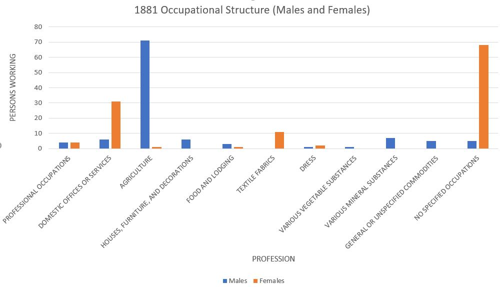
Grouped bar chart showing male and female counts across various occupations in 1881. Each pair of bars allows comparison of the two groups within a single category. The chart uses raw counts rather than proportions, but the visual structure directly reflects how side-by-side bar graphs compare categorical distributions. Source.
Segmented Bar Graphs
Segmented bar graphs (also known as stacked bar graphs) represent the proportional distribution of one categorical variable within each category of another, with each bar divided into segments that sum to a whole.
Segmented bar graph: A graphical representation in which each bar corresponds to a category of one variable and is partitioned into proportional segments representing categories of a second variable.
Unlike side-by-side bar graphs, segmented bar graphs highlight relative rather than absolute comparisons. Every bar typically has the same height, making it easier to evaluate differences in proportions.
Why Segmented Bar Graphs Are Useful
Use segmented bar graphs when:
Proportions are more important than raw frequencies.
The data set varies in total counts across groups.
You want to determine whether distributions differ across categories.
Constructing a Segmented Bar Graph
The construction follows a process aligned with UNC-1.P.2:
Draw a bar for each group of the explanatory categorical variable.
Convert frequencies to relative frequencies, ensuring each bar represents a whole.
Partition each bar into segments proportionally sized to reflect the distribution of the second variable.
Use clear labeling and consistent ordering of segments across bars.
These graphs are effective for identifying associations when segment proportions shift noticeably between bars.
A segmented bar graph shows each bar as a whole (typically representing 100% of a group) divided into stacked segments whose lengths represent the group’s relative frequencies for the categories.
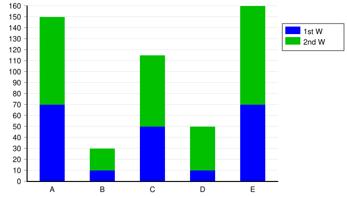
Stacked bar graph displaying two series within each of five categories. Each bar is divided into two segments, illustrating how a whole can be partitioned to show the composition of each category. This example uses raw counts instead of relative frequencies, an additional detail beyond the AP focus on proportional comparisons. Source.
Mosaic Plots
Mosaic plots provide one of the most informative visual summaries of two categorical variables because they represent both marginal and conditional distributions simultaneously through area.
Mosaic plot: A graphical display in which rectangles represent joint outcomes of two categorical variables, with each rectangle’s area proportional to the relative frequency of that combination.
Mosaic plots use area instead of height alone, enabling a more nuanced depiction of relationships. Each plot begins with a large rectangle representing the entire data set, which is then divided horizontally and vertically according to category proportions.
Interpreting Mosaic Plots
Mosaic plots help reveal:
Associations between variables, indicated by uneven segment widths or heights.
Differences in conditional distributions.
Joint patterns that may not be obvious from bar graphs.
They are especially useful when the categories of either variable differ greatly in size. Detecting varying proportions across segments supports the Skill 2.D emphasis on comparing distributions to assess relationships.
Constructing a Mosaic Plot
The construction steps include:
Divide the total rectangle into vertical strips proportional to the marginal distribution of the first categorical variable.
Subdivide each strip horizontally to represent the conditional distribution of the second variable within each category.
Ensure that each rectangle’s area accurately reflects its joint relative frequency.
A mosaic plot is a graphical display built from rectangles whose widths correspond to the marginal relative frequencies of one variable and whose heights represent the conditional relative frequencies of the second variable within each column.
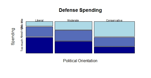
Mosaic plot illustrating the relationship between political party and opinion on defense spending using fabricated survey data. Rectangle widths show marginal frequencies for each party, while heights show conditional frequencies of opinion categories. The opinion scale is ordinal, an extra detail beyond the basic AP focus, but the visualization effectively demonstrates how mosaic plots reveal associations between categorical variables. Source.
A normal explanatory sentence follows here to create spacing after the definition above.
Assessing Associations Using Graphical Displays
All three graphical methods assist in identifying potential associations between categorical variables. Important features to compare include:
Differences in heights of adjacent bars (side-by-side bar graphs)
Differences in segment proportions (segmented bar graphs)
Differences in rectangle heights and widths (mosaic plots)
Associations are suggested when patterns differ meaningfully across groups. However, these visual observations only indicate possible relationships—they do not establish causation or quantify association strength.
FAQ
Frequency counts are useful when group sizes are similar, allowing straightforward comparisons of raw totals.
Relative frequencies are preferable when group sizes differ, as they standardise categories and make comparisons fairer.
In AP Statistics, relative frequencies often provide clearer insight into potential associations between two categorical variables.
A frequent error is comparing bar heights when the scales differ across graphs; always ensure the axes use the same units.
Students sometimes interpret small visual differences as meaningful when they may be due to sampling variation.
Another mistake is assuming a causal relationship from visual association, which is not supported by graphical evidence alone.
Colours should be distinct enough for easy differentiation, especially when graphs include multiple segments.
Avoid using colours that imply order, such as gradients, unless the categories genuinely have a natural ranking.
High-contrast combinations improve accessibility and help prevent misinterpretation.
A mosaic plot is more informative when both marginal and conditional distributions matter, as it captures both simultaneously.
It also highlights imbalances in group sizes, which may be hidden when only relative heights are compared in bar-based displays.
Mosaic plots are especially useful when assessing relationships where one category has substantially fewer observations.
For nominal variables, consistency matters more than order—choose an order and keep it the same across all related graphs.
For ordinal variables, ordering should follow the natural progression of the categories to avoid misleading patterns.
Clear and logical ordering helps viewers compare patterns and interpret associations more efficiently.
Practice Questions
A school records each student's preferred study location (Library or Home) and class year group (Year 10 or Year 11). The data are displayed using a side-by-side bar graph. Describe one feature visible in such a graph that would help determine whether there is an association between study location and year group.
(1–3 marks total)
1 mark for identifying a relevant visual feature, such as differences in bar heights or proportions between Year 10 and Year 11.
1 additional mark for stating that noticeable differences in these heights/proportions may suggest an association.
1 additional mark for correctly stating that similar bar patterns between groups would suggest little or no association.
A careers adviser surveys students about their intended post-school pathway (University, Apprenticeship, or Employment) and their favourite subject area (Humanities or STEM). The results are presented using a segmented bar graph and a mosaic plot.
(a) Explain how the segmented bar graph could be used to compare the distributions of post-school pathways between Humanities and STEM students.
(b) Explain how the mosaic plot could provide additional insight into whether there is an association between subject area and intended post-school pathway.
(c) Comment on one advantage and one limitation of using mosaic plots for displaying data on two categorical variables.
(4–6 marks total)
(a)
1 mark for stating that each bar represents a subject area and is divided into segments for pathways.
1 mark for explaining that comparing the relative sizes of segments shows how pathway distributions differ between Humanities and STEM.
(b)
1 mark for explaining that mosaic plots represent joint relative frequencies through rectangle areas.
1 mark for noting that differing rectangle heights or widths across subject areas indicate differences in conditional distributions and may suggest an association.
(c)
1 mark for stating a valid advantage, such as showing both marginal and conditional distributions simultaneously.
1 mark for stating a valid limitation, such as mosaic plots being harder to interpret when there are many categories or when the rectangles become too small.
