
AP Syllabus focus: 'Graphical representations of two categorical variables can be used to compare distributions and determine whether the variables appear to be associated.'
When two categorical variables are displayed together, a graph can reveal whether groups look similar or different. Those visual comparisons help you judge whether the variables seem to be related.
Reading Graphs of Two Categorical Variables
Identify the grouping
When two categorical variables appear on one graph, one variable usually forms the groups, while the other shows the category breakdown within each group.
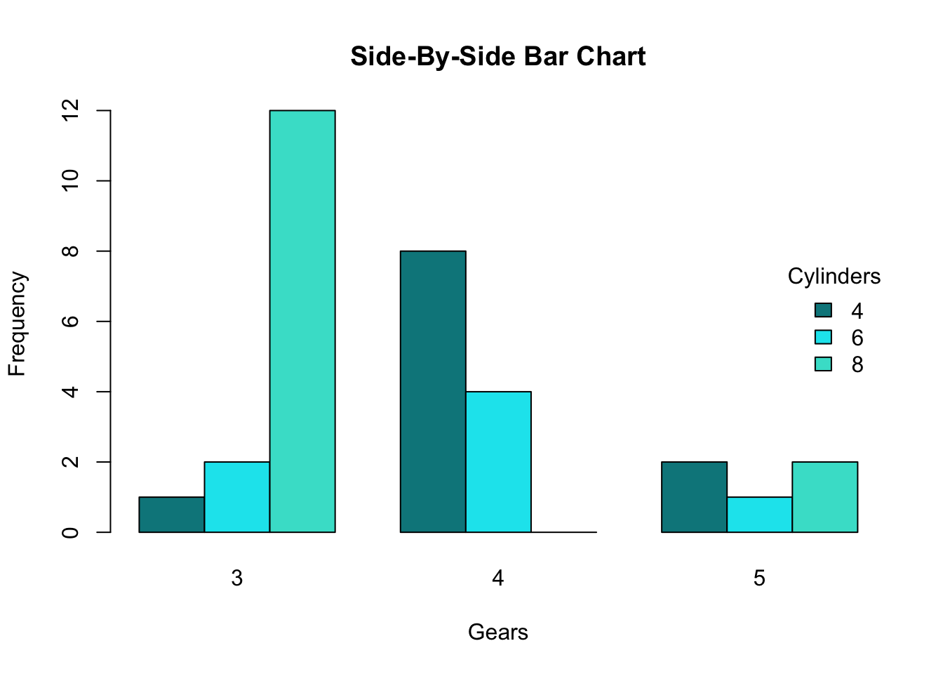
This side-by-side bar chart uses one categorical variable to form groups on the x-axis (gears) and a second categorical variable as the within-group breakdown (cylinders, shown by color). Comparing bars of the same color across groups helps you see how the distribution changes from group to group and avoids one-group-only descriptions. Source
Your job is to compare those breakdowns carefully rather than focusing only on the tallest bar or largest segment.
The first idea to study is the distribution of one variable within each category of the other variable.
Distribution: The pattern of values of a variable, described here by how the categories of one variable are divided within each group of another variable.
To compare well, keep your eye on the same category across all groups.
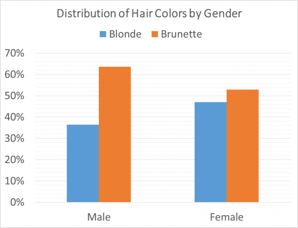
This grouped (side-by-side) bar chart compares the distribution of hair color across gender groups using percentages. Reading across the two clusters highlights how the conditional distribution changes from male to female, which is exactly the kind of cross-group comparison used to assess possible association. Source
Compare how large that category appears in group A, then in group B, then in group C. This is more informative than describing only one group by itself.
Comparing Distributions
Similar or different patterns
If the graphs for different groups have a similar shape or similar proportions, then the distributions are similar. Similar distributions suggest that the second variable does not change much from one group to another.
If the graphs show noticeable differences in bar heights, segment lengths, or areas, then the distributions differ. A difference in distributions means the category breakdown changes across groups.
A strong comparison is:
specific, not vague
comparative, not one-sided
in context, using the names of the variables and categories
Useful comparison language
Strong AP Statistics wording often includes phrases such as:
a higher proportion of
a lower proportion of
about the same proportion of
the distribution for ___ differs from the distribution for ___
A complete comparison often mentions more than one category if that helps show the overall pattern. If only one category is discussed, the description may miss important differences elsewhere in the graph.
Determining Whether Variables Appear Associated
Visual evidence of association
When the distributions for the groups are different, the variables may appear associated. This leads to the idea of association.
Association: A relationship between two variables in which knowing the category of one variable gives information about the likely category of the other.
In graphical analysis, association is judged visually. You are not proving anything mathematically; you are deciding whether the pattern in the graph suggests a relationship.
Useful visual signs of association include:
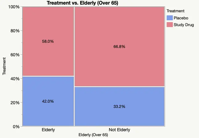
This mosaic plot displays two categorical variables (treatment group and elderly status) by splitting area into labeled percentages. Differences in segment sizes across groups provide visual evidence about whether the distributions are similar or meaningfully different, which is the basis for judging association in a two-way categorical display. Source
one group having much larger or smaller portions in a category than another group
several categories shifting in a consistent way across groups
group patterns that are clearly not alike
If the group distributions look nearly the same, there is little visual evidence of an association. In that case, knowing the category of one variable would not help much in predicting the category of the other variable.
The central idea is simple: different distributions suggest association; similar distributions suggest little or no association.
Cautious interpretation
Not every small difference matters. Real data often show slight variation even when there is no important pattern. That is why careful wording matters.
When describing a graph:
avoid claiming an association from tiny visual differences
focus on clear contrasts that would stand out to another reader
compare several parts of the graph before making a judgment
use cautious language such as appears, suggests, or seems
These words matter because a graph gives evidence, not certainty. A visual pattern can be suggestive without being definitive.
Also remember that association does not mean one variable causes the other. A graph can show that two variables vary together, but it does not explain why.
Writing Strong Graph-Based Interpretations
A good response structure
A strong interpretation usually has two parts:
compare the distributions
state whether the variables appear associated
A clear response often:
identifies which group has more or less of a category
notes whether the differences are substantial or consistent
gives a direct judgment about association
This helps your answer stay statistical rather than just descriptive.
Common mistakes to avoid
Weak responses often make one of these mistakes:
describing only one group
listing counts or categories without making a comparison
saying “there is an association” without evidence from the graph
using language that is too absolute
When graphs use proportions or percentages, comparisons are usually clearer because the group sizes do not distract from the pattern. Whatever the display, your reasoning should still be based on whether the category breakdown changes from group to group.
A practical reading process
To interpret efficiently on an exam, move through the graph in an organized way:
identify the two variables
decide which variable is defining the groups
compare the same category across those groups
look for overall similarities or differences
give a direct statement about whether an association appears to exist
This process keeps your response focused on the main statistical question: do the graphical distributions stay similar, or do they change enough to suggest a relationship between the two categorical variables?
Practice Questions
A segmented bar graph compares preferred study method (studying alone or studying with a group) for freshmen and seniors. The graph shows that the proportion who prefer studying with a group is noticeably larger for freshmen than for seniors.
Do the variables appear to be associated? Explain.
1 mark: States that the variables appear to be associated.
1 mark: Explains that the distributions differ between freshmen and seniors, such as noting that freshmen have a higher proportion preferring group study.
A graph compares lunch choice for students with a part-time job and students without a part-time job. The graph shows these approximate percentages:
Students with a part-time job: bring lunch from home 30%, buy lunch at school 55%, skip lunch 15%
Students without a part-time job: bring lunch from home 48%, buy lunch at school 42%, skip lunch 10%
(a) Compare the distributions of lunch choice for the two groups.
(b) Based on the graph, do the variables appear to be associated? Justify your answer.
1 mark: Correctly compares the “bring lunch” category, noting that students without a part-time job are more likely to bring lunch from home.
1 mark: Correctly compares the “buy lunch” category, noting that students with a part-time job are more likely to buy lunch at school.
1 mark: Notes an additional valid comparison or clearly states that the overall distributions differ.
1 mark: States that the variables appear to be associated.
1 mark: Justifies the association by linking it to the differing distributions across the two groups.
FAQ
Different graph designs emphasize different visual features.
For example, one display may make within-group proportions easy to compare, while another may make overall group size more noticeable. A graph with clearly separated bars can make category-by-category comparison faster, while a graph with stacked sections may make overall patterns easier to see.
If a graph feels hard to read, first decide which categories you are comparing, then follow that same category across all groups.
Small samples can create unstable visual patterns. A bar or segment may look unusually large or small just because only a few observations were recorded.
With larger samples, the displayed proportions are usually more stable, so visual differences are more trustworthy.
That is why a graph can suggest an association, but the strength of that suggestion depends partly on how much data were collected.
Yes. Combining categories can either hide differences or make them look more noticeable.
For example:
two categories with different patterns might be merged into one broader category
a small but important contrast may disappear
a weak overall pattern may become stronger if categories are grouped more meaningfully
This is why category definitions matter. Before interpreting a graph, make sure the categories are sensible and not overly broad.
Several design choices can distort visual judgment:
bars that are not drawn to a consistent scale
unequal widths used without explanation
distracting colors or 3D effects
categories ordered in a confusing way
These features can pull attention away from the actual distributions.
When reading a graph, focus on the relative sizes of comparable parts rather than the styling. Good statistical interpretation depends on the data pattern, not the decoration.
Sometimes one category differs a lot across groups, while another category looks almost the same. In that case, avoid forcing an overly strong claim.
You can say the variables appear somewhat associated or that the graph shows some evidence of association. Then support that statement with the clearest comparisons.
This kind of balanced wording is often better than making an all-or-nothing claim when the visual pattern is not completely consistent.
