
AP Syllabus focus: 'Side-by-side bar graphs, segmented bar graphs, and mosaic plots display one categorical variable broken down by categories of another categorical variable.'
When two variables are categorical, the goal is to organize categories clearly so patterns can be seen. AP Statistics uses three main graph types to display this kind of data.
Displaying Two Categorical Variables
When each individual in a data set is described by two categorical variables, both variables should appear in the same display. One variable creates the main grouping structure, and the other is shown within those groups. These displays are useful because they keep the categories separate while still showing how the variables fit together.
A graph for two categorical variables should make it easy to identify:
the categories of the first variable
the categories of the second variable
how the second variable is organized within each category of the first
In AP Statistics, the three standard displays are side-by-side bar graphs, segmented bar graphs, and mosaic plots. Each one shows the same basic idea in a different visual form.
Side-by-side bar graphs
Side-by-side bar graph: A bar graph in which bars for one categorical variable are grouped next to one another within each category of a second categorical variable.
This display is usually the easiest to read when direct visual comparison is the main goal. Within each category on the horizontal axis, separate bars represent the categories of the second variable. Because the bars share a common baseline and scale, differences in height are easy to spot. A legend is usually needed so the reader can tell which bar corresponds to which category.
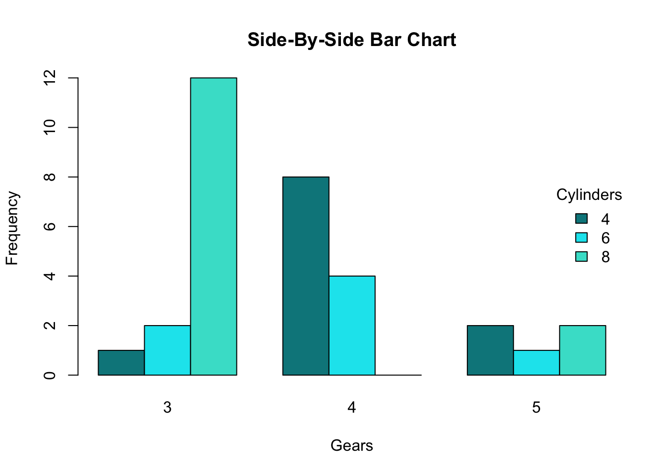
A side-by-side (clustered) bar chart displaying two categorical variables: the x-axis shows the main groups (gears), and within each group, separate colored bars represent the second categorical variable (cylinders). Because all bars share a common baseline, you can compare category counts across groups by comparing bar heights. The legend encodes which color corresponds to each cylinder category. Source
Segmented bar graphs
Segmented bar graph: A bar graph in which each bar is divided into segments that represent the categories of a second categorical variable.
A segmented bar graph emphasizes the parts within a whole. Instead of placing bars next to one another, it stacks the categories of the second variable inside a single bar for each group. This makes the internal composition of each group clear.
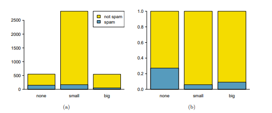
A segmented (stacked) bar plot where each bar corresponds to a category of the first variable, and the bar is partitioned into segments for the second variable. This format highlights the within-group composition—how each bar’s total is divided among categories—rather than emphasizing side-by-side height comparisons. The standardized version (proportions) is especially useful for comparing group makeup when totals differ across groups. Source
Consistent color or shading order matters, because the reader follows the same segment category across different bars.
Mosaic plots
Mosaic plot: A display of adjacent rectangles for two categorical variables in which one variable forms the widths and the other variable forms the subdivisions within those widths.
A mosaic plot extends the segmented bar graph idea. The widths of the large sections reflect how much data are in the categories of one variable, and the subdivisions inside those widths show the categories of the other variable. Each rectangle corresponds to one category pair. Unlike an ordinary bar graph, the viewer reads both width and height, so area carries the visual information.
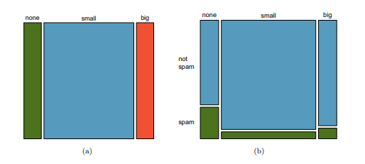
A mosaic plot for two categorical variables in which each column’s width reflects the marginal proportion of one variable, and the vertical splits within each column show the conditional breakdown of the second variable. Each rectangle represents one category pair, and its area is proportional to the corresponding count (or proportion) in the contingency table. This makes mosaic plots especially effective when you want the display to reflect both group size and internal composition simultaneously. Source
Understanding “Broken Down by Categories”
The phrase broken down by categories of another categorical variable is central to this topic. It means one variable is not shown as a single total. Instead, each of its categories is separated into smaller visual parts based on the categories of the second variable.
If one variable forms the main bars or widths, the second variable determines how those bars are grouped, split, or subdivided. The graph therefore preserves both variables at the same time. This is different from a one-variable bar graph, which shows only one set of categories.
Choosing the Most Appropriate Display
The choice of graph depends on what you want the reader to notice first.
Use a side-by-side bar graph when direct comparison of bar heights is most important.
Use a segmented bar graph when you want to highlight the makeup of each group.
Use a mosaic plot when you want the display to reflect group size as well as internal breakdown.
No matter which graph is used, the display should be carefully constructed:
Give the graph a title that identifies both variables.
Label category names clearly.
Keep the category order logical.
Use consistent colors or shading across the whole graph.
Make sure the legend is easy to match to the categories.
Avoid overcrowding the display with too many categories.
Counts and Proportions
These graphs may be built from counts or from relative frequencies. Counts show how many observations fall in each category pair. Relative frequencies show how large each category pair is compared with a total being used for the display. The important point here is that the graph should match its purpose and should be labeled so the reader knows what the bars, segments, or areas represent. A graph becomes misleading if counts and proportions are mixed or if the scale is not identified.
What to Notice in the Structure
Although these three graphs look different, they share several important features:
They are designed for categorical, not quantitative, variables.
They show categories rather than numerical values along a measured scale.
They organize one variable within the categories of another.
They depend on clear visual grouping so the reader can follow category patterns accurately.
Because the variables are categorical, the display is not about slope, curvature, or a mathematical relationship. Instead, it is about how the data are organized across category combinations.
Common Errors
Students often lose clarity by making structural mistakes rather than mathematical ones.
Switching the roles of the two variables without relabeling the graph clearly
Using inconsistent colors, so a category changes appearance from one bar or segment to another
Forgetting that side-by-side bar graphs need separated bars rather than stacked parts
Reading a mosaic plot only by height, even though its rectangles are interpreted through area
Including category labels that are too small or too crowded to read
Choosing a graph style that hides the feature the viewer most needs to see
Practice Questions
A school survey records two categorical variables: grade level and preferred lunch option. A student wants the graph that makes it easiest to compare lunch-option categories across grade levels.
Which display should the student use, and why?
1 mark for identifying a side-by-side bar graph.
1 mark for a valid reason, such as grouped bars sharing a common scale and making direct comparison across grade levels easy.
A survey records two categorical variables: housing type (house or apartment) and pet ownership (dog, cat, other, none). A student wants a display that shows both the size of each housing group and the pet-ownership breakdown within each group.
(a) Which of the three standard displays is most suitable?
(b) Describe how the two variables would appear in that display.
(c) State two features that should be included so the graph is clear and accurate.
(a) 1 mark for identifying a mosaic plot.
(b) 1 mark for stating that housing type would form the main sections or widths.
(b) 1 mark for stating that pet-ownership categories would appear as subdivisions/rectangles within each housing section.
(c) 1 mark for one valid clarity feature: clear title, readable labels, or legend.
(c) 1 mark for a second valid clarity feature: consistent color/shading, logical category order, or accurate labeling of categories.
FAQ
In most AP Statistics contexts, yes. A segmented bar graph is essentially a stacked bar chart used for two categorical variables.
The term “segmented” emphasizes that each bar is split into category segments, which helps describe how one variable is broken down by another.
The order does not change the underlying data, but it can strongly affect readability.
Good choices include:
natural order, such as grade levels
a consistent alphabetical order
the same order across multiple graphs
Changing category order from one graph to another can make interpretation much harder.
Most people compare heights more easily than areas. In a side-by-side bar graph, the bar heights do most of the visual work.
In a mosaic plot, both width and height matter, so the reader must interpret rectangle area. That makes mosaic plots powerful, but usually less immediate for beginners.
Keep the category if it is substantively important, even if it is small.
If categories are combined, that decision should be made carefully and should make sense in context. Combining categories just to make a graph look cleaner can hide useful information, especially in a two-variable display.
Yes. The same two-way categorical data can often be displayed with either variable creating the main groups.
However, the graphs will not emphasize the same visual comparisons. Switching the grouping variable changes what the viewer notices first, so the choice should match the purpose of the graph.
