
AQA Specification focus:
‘Students should be able to illustrate the misallocation of resources resulting from externalities in both production and consumption, using diagrams showing marginal private and social cost and benefit curves.’
In AQA A-Level Economics, diagram analysis is central to explaining how externalities create misallocation of resources. Understanding the role of marginal private costs/benefits and marginal social costs/benefits is essential for assessing inefficiencies.
Understanding Externalities and Resource Misallocation
Externalities occur when there is a divergence between private and social costs or benefits. In such cases, markets fail to allocate resources efficiently, leading to market failure. The AQA specification highlights the use of diagrams to show these divergences.
Key Terms and Definitions
Marginal Private Cost (MPC): The additional cost incurred by producers when producing one more unit of a good or service.
Marginal Social Cost (MSC): The total cost to society of producing one more unit, including both private costs and external costs.
Between these two definitions lies an important distinction: when MSC > MPC, a negative externality exists because production imposes costs on third parties.
Marginal Private Benefit (MPB): The additional benefit gained by consumers from consuming one more unit of a good or service.
Marginal Social Benefit (MSB): The total benefit to society from consuming one more unit, including private benefits and external benefits.
When MSB > MPB, a positive externality exists because consumption provides additional value to society not captured by the individual consumer.
Diagram Analysis of Externalities
Negative Externalities in Production
In cases such as pollution, firms consider only their MPC and ignore wider environmental damage.
The MPC curve lies below the MSC curve.
The market equilibrium occurs where MPB = MPC, producing a higher output than is socially desirable.
The socially optimal equilibrium should occur at MSB = MSC, where fewer resources are used.
This difference highlights over-production, leading to a welfare loss represented by the triangle between MSC and MPC at the overproduced output level.
Negative Externalities in Consumption
An example is excessive alcohol consumption.
The MPB curve lies above the MSB curve, as private individuals overvalue the benefit without accounting for social harms.
Market equilibrium occurs at a higher quantity than is socially optimal.
Again, the welfare loss triangle represents the misallocation.
Positive Externalities in Production
An example is research and development (R&D).
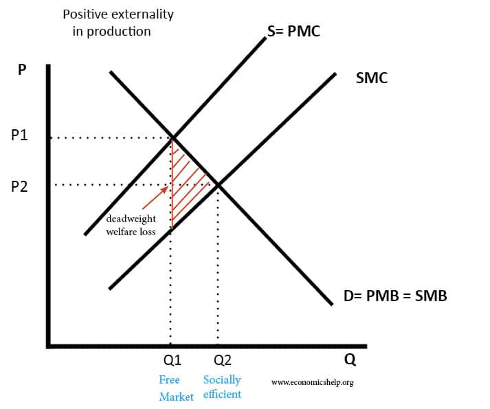
This diagram depicts a positive externality of production, where the marginal social cost (MSC) is lower than the marginal private cost (MPC), leading to underproduction. The socially optimal output is at Q2, while the market equilibrium is at Q1, resulting in a welfare gain. Source
Here, the MSC curve lies below the MPC curve, as society benefits from spill-over effects like innovation.
The market equilibrium under-produces the good because firms only consider private costs.
The socially optimal point is at MSB = MSC, requiring greater output to capture additional societal benefits.
Positive Externalities in Consumption
Examples include vaccination and education.
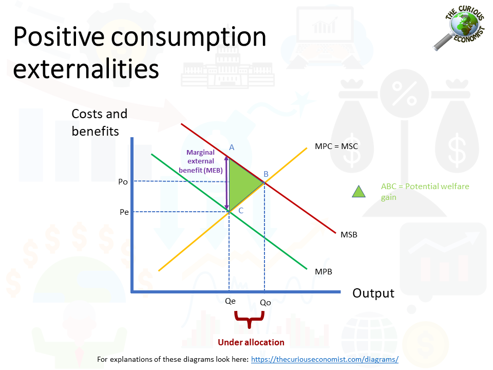
This diagram illustrates a positive consumption externality, where the marginal social benefit (MSB) exceeds the marginal private benefit (MPB), leading to underconsumption. The socially optimal quantity is at Q2, while the market equilibrium is at Q1, resulting in a welfare gain. Source
The MSB curve lies above the MPB curve, as society enjoys benefits beyond those to the consumer.
Market equilibrium is at a lower quantity than socially optimal, causing under-consumption.
A welfare loss triangle forms between MSB and MPB at the under-consumed level.
Welfare Analysis and Deadweight Loss
The diagrams not only show shifts in curves but also highlight welfare loss.
Over-production leads to resources wasted on goods that harm society.
Under-production leads to missed opportunities to create value.
The shaded welfare loss areas visually demonstrate these inefficiencies, making diagram analysis vital in AQA A-Level assessment.
Step-by-Step Process of Diagram Analysis
When illustrating misallocation of resources using MSC, MPC, MSB, and MPB, follow this logical structure:
Identify whether the externality is positive or negative, and whether it arises from production or consumption.
Place the private curve (MPC or MPB) and determine the social curve (MSC or MSB).
Locate the market equilibrium at MPC = MPB.
Identify the socially optimal equilibrium at MSC = MSB.
Highlight the divergence between the two equilibria, showing over- or under-production.
Shade the area representing welfare loss.
Evaluation Points for Diagrams
Students should be able to use these diagrams not only descriptively but also analytically. Important points include:
The extent of divergence between private and social curves determines the magnitude of misallocation.
Externalities vary in severity; minor divergences may have limited welfare implications, while major ones justify government intervention.
Policy tools, such as taxes, subsidies, or regulation, aim to shift market outcomes closer to the socially optimal level.
Diagrams provide a framework for evaluating the effectiveness of interventions in aligning private incentives with social welfare.
Importance in AQA Economics
Diagram analysis of MSC/MPC and MSB/MPB is a cornerstone of understanding market failure. It enables students to illustrate clearly:
How markets misallocate resources due to externalities.
Why government action may be justified.
The welfare losses involved in failing to address such externalities.
Practice Questions
Using a diagram, identify the difference between marginal private cost (MPC) and marginal social cost (MSC) in the presence of a negative externality in production. (2 marks)
1 mark for correctly stating that MSC > MPC when a negative externality exists.
1 mark for a clear diagram showing MSC above MPC, with both curves labelled.
Explain, with the aid of a diagram, how positive consumption externalities lead to under-consumption of goods or services in a market economy. (6 marks)
1 mark for defining positive consumption externality (when MSB > MPB).
1 mark for recognising that the market equilibrium occurs where MPB = MPC.
1 mark for identifying that the socially optimal equilibrium is where MSB = MSC.
1 mark for stating that the market equilibrium quantity (Q1) is below the socially optimal quantity (Q2).
1 mark for correctly drawing and labelling a diagram with MSB above MPB, and indicating Q1 and Q2.
1 mark for explaining that this leads to a welfare loss due to under-consumption.
FAQ
Diagrams provide a visual representation of how market equilibrium differs from the socially optimal outcome. They make it easier to see the scale of divergence between private and social costs or benefits.
They also highlight the areas of welfare loss or gain, which words alone may not make clear. This visual clarity is particularly useful in examinations and policy debates.
The welfare loss triangle shows the net loss to society caused by misallocation of resources.
In negative externalities, it represents overproduction or overconsumption.
In positive externalities, it highlights the benefits society misses due to underproduction or underconsumption.
Its size indicates the extent of inefficiency, with larger triangles reflecting greater welfare loss.
At this point, the total benefit to society of the last unit consumed equals the total cost of producing it.
This balance ensures that no additional units would create more benefit than cost, and none are produced where costs outweigh benefits. It is the condition for allocative efficiency in the presence of externalities.
Governments can influence market behaviour to reduce misallocation by:
Taxes on goods with negative externalities to raise MPC closer to MSC.
Subsidies on goods with positive externalities to increase MPB towards MSB.
Regulation to restrict harmful activity or encourage beneficial consumption.
Each policy aims to realign private decision-making with social welfare.
Linear curves simplify analysis, making the diagrams easier to interpret and use in exams.
In reality, costs and benefits may change at non-constant rates, leading to curved functions. However, the essential concept—that divergences between private and social values create inefficiency—remains the same, regardless of curve shape.
