AP Syllabus focus:
“Interpret the area between a rate-of-change graph and the x-axis as the total accumulated change of a quantity over a given time interval.”
Accumulation of change connects a varying rate to the total amount of something gained or lost over time, relying on understanding how area under a rate graph represents overall change.
Understanding Accumulation of Change
Accumulation of change describes how a quantity evolves when its rate of change varies over an interval. When you interpret a graph of a rate function, the vertical axis represents how quickly a quantity is increasing or decreasing, while the horizontal axis typically shows time or another independent variable. Connecting these ideas allows you to interpret the total accumulated change as the net effect of the rate over the entire interval.
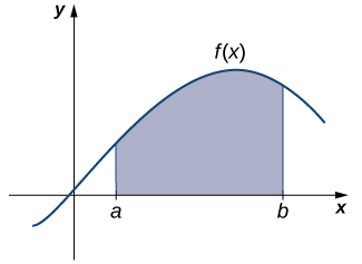
When the rate is expressed graphically, the accumulated change corresponds to the signed area between the curve and the x-axis.

A continuous function f(x)f(x)f(x) is graphed with the region between x=ax=ax=a and x=bx=bx=b shaded above the x-axis. This shaded region represents the accumulated change in the underlying quantity when the function is interpreted as a rate. The minimal labels highlight the essential relationship between a rate graph and its corresponding area as total change. Source.
Rate and Accumulation
The rate on the graph tells you how fast the underlying quantity is changing at each moment. High points on the graph indicate rapid increase in the quantity; points below the axis indicate decrease. Integrating these instantaneous changes across a time interval produces the total accumulated effect.
Rate of Change: The value that describes how a quantity increases or decreases per unit of the independent variable.
Before moving further, it is essential to distinguish visually between positive and negative regions on the graph, as these correspond to increases or decreases in the accumulated total.
Area Under a Rate Graph
The specification states that students must “interpret the area between a rate-of-change graph and the x-axis as the total accumulated change of a quantity over a given time interval.” This means that when a graph of a rate function is provided, the total accumulated change equals the area between the curve and the horizontal axis, counted with sign.
This interpretation is not merely geometrical; it connects directly to real-world meanings. For example, if a graph shows a rate of water flowing into a tank, the area under the curve represents how much water enters the tank over the interval shown.

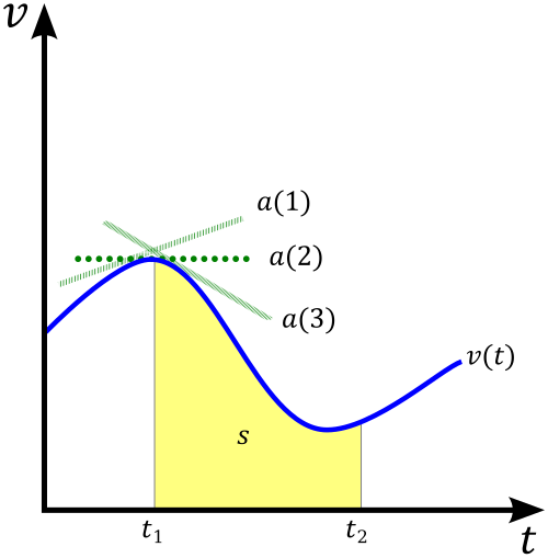
A velocity–time graph illustrates how an object’s velocity changes over a time interval. When velocity is interpreted as the rate of change of position, the area between the curve and the time axis corresponds to the object’s accumulated displacement. The diagram also shows the conceptual links among velocity, displacement, and acceleration, slightly extending beyond the immediate syllabus but reinforcing interpretation of area under a rate graph. Source.
Connecting Area to Real Quantities
To understand why area represents accumulated change, recall that area of a rectangle equals height times width. On a rate graph:
Height = the rate, or how much the quantity changes per unit time.
Width = the duration of time considered.
Multiplying them gives “change per unit time × time,” resulting in the total change. When the graph is not a simple rectangle, the curve can be approximated by many thin rectangles, meaning the total area still represents accumulated change.
= Change per unit of the independent variable
= Width of the interval
This relationship explains why area is meaningful even when the rate changes continuously.
The conceptual shift from geometric area to accumulated change is central to calculus and anchors later topics such as Riemann sums and the definite integral.
Interpreting Graphical Features
When analyzing a rate graph to determine accumulated change, you should pay attention to several key features:
1. The Interval of Interest
The problem will specify a time interval over which to measure accumulated change. Only the area within these boundaries contributes to the result.
2. The Sign of the Rate
If the graph is above the axis, the accumulated change over that region is positive.
If it is below, the accumulated change is negative.
If the graph crosses the x-axis, break the interval into subintervals to determine where increases and decreases occur.
3. The Shape of the Region
Interpreting accumulated change depends upon recognizing the region between the curve and the axis. Even if the shape is irregular, the conceptual meaning remains: the area gives the total change.
Visual and Conceptual Interpretation
Students must be able to look at the graph of a rate and interpret what the signed area implies for the underlying quantity. This includes understanding behaviors such as:
Larger positive areas correspond to greater increases in the quantity.
Larger negative areas correspond to greater decreases.
Nearly zero area indicates very little overall change despite possibly fluctuating rates.
A positive area followed by a negative area may result in small net change, depending on their relative sizes.
Understanding accumulation in this graphical sense prepares students for the formal introduction to integration. It builds intuition for how rates combine over time to produce total change, reinforcing the idea that the area under a rate graph represents the accumulated effect across an interval.
FAQ
Accumulated change measures the total effect of a varying rate over time, not the value of the quantity at one moment. It considers how the rate behaves across the entire interval.
If the rate fluctuates, the accumulated change accounts for all increases and decreases rather than relying on a single measurement.
Any irregular shape can be divided into many thin vertical strips, each acting like a small rectangle where height represents rate and width represents a tiny time step.
Adding these contributions gives an accurate measure of total change.
This remains true even when the rate changes abruptly or non-linearly.
Where the graph touches the axis, the rate is zero, meaning the underlying quantity is momentarily not increasing or decreasing.
This contributes no positive or negative area, so these portions do not affect total accumulated change.
However, the times at which the graph touches the axis may mark transitions between growth and decline.
Yes. If the rate is positive for part of the interval and negative for another, the positive and negative areas may cancel exactly.
In such cases, the quantity returns to its initial value even though it was continuously changing.
This highlights why net area, rather than total time spent increasing or decreasing, determines overall change.
Large positive accumulated change indicates substantial growth, inflow or increase over the interval, such as a tank filling or a population rising.
Large negative accumulated change indicates significant loss, outflow or decrease, such as a battery draining or a reservoir emptying.
The magnitude of the area gives insight into how dramatic the overall change is, regardless of moment-to-moment fluctuations.
Practice Questions
(1–3 marks)
The graph of a rate function r(t), measured in litres per hour, lies entirely above the horizontal axis on the interval 0 ≤ t ≤ 4.
Explain what the area between the graph of r(t) and the t-axis over this interval represents, and state whether the accumulated change is positive or negative.
(1–3 marks)
• 1 mark: States that the area represents the total accumulated amount of water added over the interval.
• 1 mark: Identifies that the accumulated change is positive because the graph lies above the axis.
• 1 mark: Gives a correct interpretation linking rate (litres per hour) and accumulated quantity (litres).
(4–6 marks)
A company records the rate at which customers enter a shop, modelled by a continuous function C(t), where t is measured in minutes after opening and C(t) is measured in customers per minute.
The graph of C(t) is partly above and partly below the t-axis on the interval 0 ≤ t ≤ 10.
(a) Describe the meaning of the area between C(t) and the t-axis where the graph lies above the axis.
(b) Describe the meaning of the area where the graph lies below the axis.
(c) Give a clear interpretation of what the net (signed) area over the interval 0 ≤ t ≤ 10 tells you about customer numbers.
(4–6 marks)
(a)
• 1 mark: States that the area above the t-axis represents the total number of customers entering during the times when C(t) is positive.
• 1 mark: Clearly connects positive rate to increase in customer count.
(b)
• 1 mark: States that the area below the t-axis represents the total number of customers leaving during the times when C(t) is negative.
• 1 mark: Clearly connects negative rate to decrease in customer count.
(c)
• 1 mark: Interprets the net signed area as the overall change in the number of customers in the shop between t = 0 and t = 10.
• 1 mark: Explains that if the positive area exceeds the negative area, more customers entered than left (and vice versa).

