
AP Syllabus focus: ‘Potential energy vs. internuclear distance graphs show how atoms interact, including the equilibrium bond length (minimum energy) and the bond energy needed to separate the atoms.’
Potential energy curves are a compact model for how two atoms interact as their distance changes.
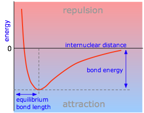
This diagram shows a typical potential energy curve for a covalent bond plotted against internuclear distance. The minimum marks the equilibrium bond length , while the vertical gap from the minimum to the separated-atoms reference level represents the bond dissociation energy. Labeled regions indicate where attractive forces dominate versus where short-range repulsion rises sharply. Source
Reading these graphs lets you identify stable bond lengths and the energy required to break a bond.
Interpreting potential energy curves
What a potential energy curve represents
Potential energy curve: a graph of the system’s potential energy as a function of internuclear distance for two interacting atoms.
On these graphs, the horizontal axis is internuclear distance (how far apart the nuclei are), and the vertical axis is potential energy of the two-atom system (relative energy due to electrostatic attractions and repulsions). The zero of energy is a chosen reference level; many curves set at infinite separation (atoms not interacting).
Why the curve has a minimum
As two atoms move from far apart toward each other:
At large , the atoms interact weakly, so potential energy is near the reference level.
At intermediate , attractive interactions dominate (each nucleus attracts the other atom’s electrons), lowering potential energy.
At very small , repulsive interactions dominate (nucleus–nucleus repulsion and electron cloud overlap), raising potential energy sharply.
This graph emphasizes the asymmetry of a realistic diatomic potential: a steep repulsive wall at short distances and a more gradual rise on the stretching side. The equilibrium bond length is identified at the minimum, visually reinforcing that stable bonding occurs at the energy minimum. The flattening toward large internuclear distance corresponds to approaching the separated-atoms limit where interactions become negligible. Source
The competition between attraction and repulsion produces a well-shaped curve with a lowest point. That lowest point corresponds to the most stable separation.
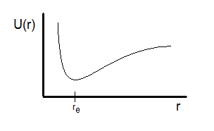
Equilibrium bond length (): the internuclear distance at the minimum of the potential energy curve, where the bonded atoms are most stable.
At , small displacements in either direction increase potential energy, so the system naturally tends to return toward .
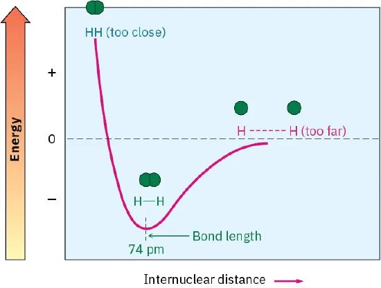
This figure plots energy versus internuclear distance for two hydrogen atoms and shows a distinct minimum at the H–H bond length. The curve illustrates why an optimum separation exists: moving either closer (repulsion) or farther apart (reduced attraction) increases the system’s potential energy. Reading the bond length directly from the x-axis at the minimum helps avoid confusing bond length with bond energy. Source
This is why bonds have characteristic lengths that can be measured.
Bond energy from the curve
The depth of the “well” indicates how much energy is needed to fully separate the atoms.
Bond energy (bond dissociation energy): the energy required to separate two bonded atoms from to infinite separation, producing separated atoms.
Bond energy is an energy difference read vertically from the minimum of the curve up to the reference level for separated atoms. In many AP-style diagrams, that reference is at , so bond energy corresponds to the magnitude of the minimum energy.
= bond energy (typically kJ/mol)
= potential energy at infinite separation (reference level)
= potential energy at the equilibrium bond length (minimum)
Because is lower than , is positive. If a diagram shows the minimum at a negative value, that does not mean the bond energy is negative; it means the bonded state is lower in potential energy than the separated state.
What you can infer from curve shape
Strength and stability comparisons
When comparing two potential energy curves (two different bonds):
Deeper well larger bond energy bond is harder to break.
Minimum at smaller shorter bond length for that bond.
A curve that rises more steeply on either side of indicates the energy increases rapidly when the bond is stretched or compressed, reflecting a “stiffer” interaction.
Only conclusions supported by the graph should be stated. For example, you can compare which bond has greater bond energy by comparing well depths, without needing to explain the cause.
Interpreting “bond breaking” on the curve
Bond breaking corresponds to moving from the minimum up and out toward large :
Energy must be added to go from the minimum to separated atoms.
Once sufficiently far apart, additional separation changes potential energy very little (atoms effectively stop interacting).
Common AP pitfalls in reading these graphs
Bond length vs. bond energy: bond length is the x-value at the minimum; bond energy is the vertical difference between the minimum and the separated-atom level.
Reference levels: if the curve’s “zero” is not explicitly labeled, rely on the diagram’s indicated separated-atom level rather than assuming a particular numeric value.
Minimum is not “zero energy”: the minimum is the most stable point, not necessarily zero on the y-axis.
Practice Questions
(2 marks) A potential energy curve for a diatomic molecule has a minimum at and , with the separated atoms defined at . State (i) the equilibrium bond length and (ii) the bond energy.
(i) (1)
(ii) (1)
(5 marks) Two bonds, A–A and B–B, have potential energy curves drawn on the same axes with the separated-atom level identical. Curve 1 has its minimum at and . Curve 2 has its minimum at and . Compare the two bonds in terms of (i) equilibrium bond length, (ii) bond energy, and (iii) which bond is more stable at its equilibrium distance. Justify each comparison using the graph features.
(i) Curve 2 shorter equilibrium bond length because is smaller (1)
(i) Curve 1 longer equilibrium bond length because is larger (1)
(ii) Curve 2 larger bond energy because its well is deeper () (1)
(ii) Curve 1 smaller bond energy because its well is less deep (1)
(iii) Curve 2 more stable at equilibrium because it has lower minimum potential energy (more negative) (1)
FAQ
At very short distances, nucleus–nucleus repulsion increases sharply, and overlapping electron clouds create additional repulsion due to electron–electron interactions and the Pauli exclusion principle.
These effects make the potential energy increase rapidly as $r$ decreases.
Real bonds vibrate about $r_e$, sampling distances on either side of the minimum.
Quantised vibrational energy levels sit within the well; higher vibrational states have larger average bond lengths and can approach dissociation near the top of the well.
Bond energy from a curve is for a specific bond in a specific species (often at $0\ \text{K}$ in simplified models).
Average bond enthalpy is an experimental, averaged value over many compounds and includes thermal/enthalpy conventions (e.g., measured near $298\ \text{K}$).
The equilibrium distance can be similar if the balance point between attraction and repulsion occurs at the same $r$.
Well depth can still differ if the attractive interactions are stronger overall, increasing the energy required to reach the separated-atom reference level.
No. The minimum marks the most probable/stable separation, but thermal energy means bonds vibrate around $r_e$.
As temperature increases, molecules spend more time at slightly larger $r$ values due to the curve’s asymmetry on the stretching side.
