
AP Syllabus focus:
‘Population pyramids are used to assess population growth and decline and to predict markets for goods and services.’
Population pyramids visually represent a population’s age and sex structure, allowing geographers to analyze demographic trends, interpret growth or decline, and anticipate future social, economic, and service needs.
Understanding Population Pyramids
Population pyramids are graphic representations showing the distribution of a population by age and sex, typically with males on the left and females on the right. Because they reveal key demographic patterns, they help geographers evaluate how populations are changing over time.
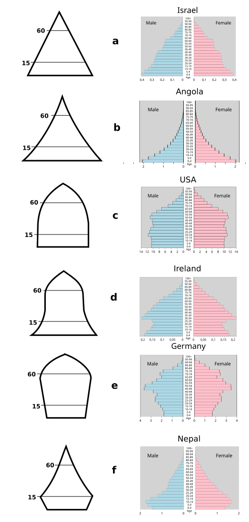
This diagram presents several forms of population pyramids, ranging from triangular “expansive” structures to more rectangular and urn-shaped “constrictive” profiles. It visually links base width and overall shape to underlying demographic conditions such as high fertility, stable growth, or population aging. The specific country examples and some extra shapes go beyond the AP syllabus but still support interpretation of the three core types discussed in the notes. Source.
Population Pyramid: A bar graph that displays a population’s age and sex structure, usually in five-year age cohorts, with males on one side and females on the other.
A single sentence between definition blocks helps ensure flow in the notes and avoids placing definitions back-to-back.
Key Components of Population Pyramids
Age Cohorts and Sex Distribution
A population pyramid organizes people into age cohorts, defined as groups of individuals born during the same time interval. These cohorts make it easier to compare demographic segments and notice patterns such as bulges or gaps. The proportion of males to females at each age reflects the sex ratio, which can vary due to social factors, migration, or differential mortality. Because each bar represents a specific age and sex group, the shape of the overall pyramid reveals broader demographic conditions.
Age Cohort: A population group made up of individuals of similar ages, commonly displayed in five-year intervals.
Interpreting Pyramid Shapes
Population pyramids generally fall into three broad shapes, each signaling different demographic processes:
Expansive pyramid
Wide base and narrow top.
Indicates high birth rates and potentially high death rates.
Suggests rapid population growth and a youthful structure.
Stationary pyramid
Narrower base, relatively uniform middle, and gradually tapering top.
Reflects stable birth and death rates.
Indicates slow or negligible population growth.
Constrictive pyramid
Narrower base than middle.
Shows declining birth rates and an aging population.
Signals future challenges related to labor shortages or elder support.
Because these patterns appear visually, geographers can quickly assess how the population is changing and what forces—such as fertility decline or increasing life expectancy—shape the demographic structure.
Reading Population Pyramids at Different Scales
Population pyramids can be constructed for local, national, and global scales. This flexibility makes them powerful tools for spatial comparison. At smaller scales, pyramids may reveal the effects of migration into a city, such as a bulge in young working-age adults. At larger scales, they highlight more general demographic transitions or regional differences. This allows geographers to analyze spatial variation in demographic characteristics and connect these patterns to cultural, economic, and political processes.
Identifying Growth and Decline
Population pyramids help determine whether a population is growing, stable, or shrinking.
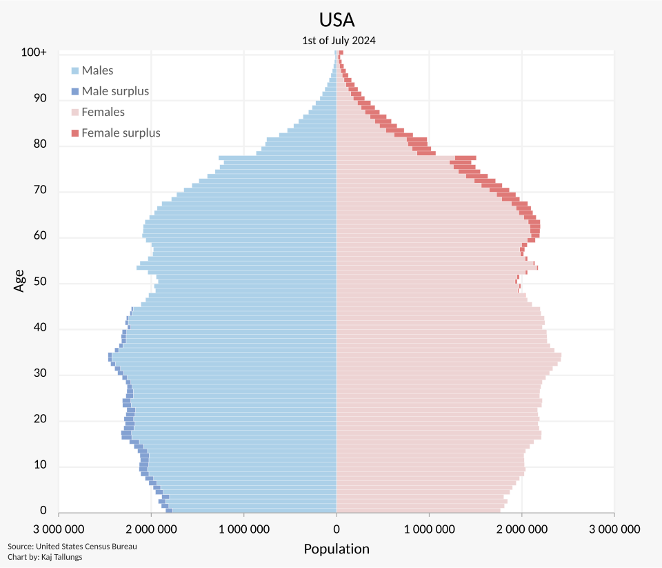
This population pyramid shows the age–sex structure of the United States, with males on the left and females on the right in five-year age cohorts. Its relatively narrower base and substantial older cohorts illustrate a population that is closer to a stationary or constrictive pattern rather than rapid growth. The detailed numerical labels and exact census year extend beyond the AP Human Geography syllabus but provide authentic data for applying pyramid-reading skills. Source.
Geographers assess:
Base width, which reflects birth rates.
Symmetry between sides, which reveals gender imbalances.
Proportion of elderly, which indicates aging trends.
Notches or bulges, which may signify historical events such as baby booms, wars, pandemics, or large-scale migration.
A pyramid with a wide base relative to the middle suggests high fertility and likely population growth. In contrast, a narrow base indicates lower fertility and potential long-term decline. Recognizing these patterns helps link demographic change to economic development, health conditions, cultural values, and policy decisions.
Using Population Pyramids to Predict Markets and Services
According to the AP Human Geography specification, population pyramids allow geographers to “assess population growth and decline and to predict markets for goods and services.” This predictive capability is central to their use in demographic analysis.
Forecasting Economic Demand
Different age groups consume different types of goods and services. By examining the structure of a pyramid, geographers and planners can anticipate demand for:
Education services when there is a large youth population.
Employment opportunities when there is a swelling working-age cohort.
Health care, pensions, and elder support services when the population is aging.
Housing development to match the needs of young families or retirees.
Understanding these trends enables businesses and governments to make informed decisions that align with future demographic conditions.
Anticipating Social and Political Change
Population pyramids also reveal shifts that may influence political priorities and social issues. A youthful population may require increased public spending on education and job creation, while an aging population may place pressure on healthcare systems and social security programs. These insights help policymakers plan for future budget requirements and anticipate potential social challenges.
Connecting Population Structure to Migration
Population pyramids can sometimes indicate the presence of migration flows, especially when certain age groups are disproportionately large or small. For instance, a bulge in young adults might signal labor migration, while a deficit in working-age males or females could reflect selective out-migration or past political conflict. Such patterns allow geographers to interpret demographic change within broader mobility processes.
Applying Population Pyramids in Geographic Analysis
Because population pyramids condense complex demographic information into a simple visual format, they serve as essential tools for geographic inquiry. They help explain why growth or decline occurs, reveal demographic imbalances, and aid in predicting future needs for goods, services, and infrastructure. By examining pyramid shape, scale, and context, geographers develop a deeper understanding of how population structure influences place-specific social, political, and economic outcomes.
Practice Questions
Question 1 (1–3 marks)
Using the population pyramid shown, identify one characteristic of a rapidly growing population and explain how the pyramid’s shape reflects this.
Mark scheme:
1 mark for identifying a characteristic of rapid growth (e.g., high birth rates, youthful population).
1 mark for referring to the wide base or broad lower cohorts.
1 mark for linking the pyramid shape explicitly to rapid population growth.
Question 2 (4–6 marks)
Discuss how a country’s population pyramid can be used to predict future economic and social service needs. Refer to specific age groups in your answer.
Mark scheme:
1 mark for recognising that different age cohorts indicate differing forms of demand (e.g., youth vs. working-age vs. elderly).
1 mark for explaining how a large youth population can predict increased future demand for schools or employment opportunities.
1 mark for explaining how a large working-age population may indicate potential economic productivity or labour market expansion.
1 mark for explaining how an ageing population can signal rising demand for healthcare, pensions, and elder care.
1 additional mark for linking pyramid shape to longer-term planning or demographic trends.
1 additional mark for coherent, well-structured reasoning referencing specific age ranges or visible pyramid features.
FAQ
Geographers look for irregular distortions in specific age cohorts that cannot be explained by typical birth or death patterns. Sudden bulges or deficits in young adult groups often indicate migration rather than natural demographic change.
They also compare multiple years of pyramid data. If the unusual cohort size does not progress upward in subsequent years as expected, this suggests migration rather than a temporary fluctuation in fertility or mortality.
A narrow middle cohort often points to historical events that reduced the population at the time the cohort was born or alive, such as war, famine, disease outbreaks, or economic depression.
Geographers connect these distortions to known historical timelines. This helps them identify long-term demographic consequences, including slowed economic growth or imbalances between generations.
Imbalances can arise due to gender-selective migration, where one sex moves for employment or safety, leaving a skewed distribution behind.
They may also reflect cultural or political influences that historically favoured one sex, though this requires careful contextual analysis.
Unusual sex ratios at older ages often stem from differences in life expectancy, with women typically living longer.
By identifying the size of cohorts approaching voting age, geographers can predict shifts in political influence. A large youth cohort may drive demand for education, employment, and housing policies.
An ageing electorate may increase support for healthcare funding, pensions, and welfare services. These structural trends help explain long-term changes in policy priorities and public spending.
Countries with similar shapes may differ in economic development, healthcare quality, employment patterns, or cultural expectations, leading to distinct outcomes even with comparable age structures.
For example:
A youthful pyramid in a lower-income state may strain education systems.
The same shape in a wealthier country could coincide with high investment capacity and better planning.
Context determines how demographic structure translates into real-world challenges.
