
AP Syllabus focus: ‘A change in a good’s own price causes an opposite change in quantity demanded, creating a movement along the demand curve.’
A demand curve is a simple model of how consumers respond when a good’s price changes. This page focuses on the law of demand and how to interpret a movement along the demand curve.
The law of demand (core relationship)
Law of demand: Holding other factors constant, a higher price leads to a lower quantity demanded, and a lower price leads to a higher quantity demanded.
This relationship is inverse: and . In AP Microeconomics, this is treated as a reliable general pattern for most goods in most realistic ranges of prices.
What “holding other factors constant” means
The law of demand is a ceteris paribus statement. When you apply it, you assume that everything other than the good’s own price is unchanged. This matters because the demand curve is built to show only one cause of consumer response at a time: changes in that good’s price.
Demand vs quantity demanded
Quantity demanded: The amount of a good consumers are willing and able to buy at a specific price, per time period.
A common AP mistake is mixing up demand and quantity demanded.
Demand refers to the entire relationship between price and quantity (the whole curve).
Quantity demanded is one specific point on that curve at one specific price.
When the good’s own price changes and nothing else changes, the correct language is: quantity demanded changes.
Reading a demand curve on a graph
A standard demand graph places price on the vertical axis and quantity on the horizontal axis.
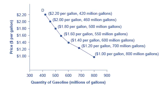
A downward-sloping demand curve with explicitly labeled price–quantity points illustrates the law of demand: higher prices correspond to lower quantities demanded. The labeled coordinates emphasize that each point on the curve is a specific price–quantity pair read directly off the axes. Source
Key interpretations:
Each point on the curve is a price–quantity pair: “At price , the quantity demanded is .”
A downward-sloping curve visually represents the inverse relationship required by the law of demand.
A change in price selects a different point on the same curve.
Demand schedule to demand curve
A demand schedule lists quantities demanded at different prices. Plotting those ordered pairs and connecting them (as a model) gives the demand curve. The curve is a simplified tool for comparing how quantity demanded differs across prices.
Movement along the demand curve (what it is)
Movement along the demand curve: A change in quantity demanded caused only by a change in the good’s own price, shown as moving from one point to another on the same demand curve.
Because the price is on the graph, a price change mechanically produces a new quantity demanded on the same curve (assuming ceteris paribus). There are two directions:
Decrease in price: movement down and to the right along demand, from a higher-price/lower-quantity point to a lower-price/higher-quantity point.
Increase in price: movement up and to the left along demand, from a lower-price/higher-quantity point to a higher-price/lower-quantity point.
The AP wording “creates a movement along the demand curve” is important: the curve itself does not relocate; your position on it changes.
A compact way to express the relationship
You can represent the demand relationship with a simple function, emphasizing that price is the input and quantity demanded is the response.
= Quantity demanded (units of the good per time period)
= Price of the good (dollars per unit)
This notation highlights the AP idea that, for the law of demand, changes in cause changes in (a movement along the curve).
How to describe the change precisely (AP language)
When analysing a price change, use wording that ties directly to the model:
“The price of the good increased, causing a decrease in quantity demanded, shown as a movement up the demand curve.”
“The price of the good decreased, causing an increase in quantity demanded, shown as a movement down the demand curve.”
Avoid saying “demand decreased” or “demand increased” when the only change is the good’s own price, because that implies the entire relationship changed rather than the chosen point on the relationship.
Common pitfalls to avoid
Students often lose marks by confusing “movement” with other types of change.
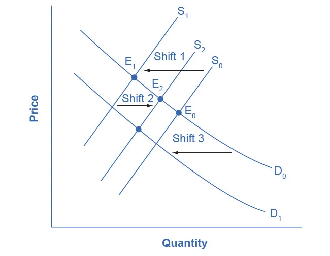
This diagram contrasts shifts of demand/supply curves with movements along the other curve caused by the resulting price change. It supports AP-style precision by showing that a change in a curve’s position is different from moving to a new point on an unchanged curve. Source
Stay focused on what the syllabus specifies: own-price changes move you along the curve.
A price change causes a change in quantity demanded, not “a change in demand.”
A movement along the curve always means the demand curve is unchanged; only the selected point differs.
On a graph, do not draw a new demand curve when the question only describes a change in the good’s own price.
Practice Questions
(2 marks) State the law of demand and explain what happens to quantity demanded when the price of a good rises, ceteris paribus.
1 mark: States inverse relationship: as price rises, quantity demanded falls (or equivalent).
1 mark: Mentions ceteris paribus/“all else equal” (or clearly implies other factors held constant).
(5 marks) A market for product X is in equilibrium. The price of X increases due to a change in the market price. Using a demand diagram, explain the effect on quantity demanded of X and how this is shown on the diagram. Use correct economic terminology.
1 mark: Correctly states that the increase in the price of X causes a fall in quantity demanded.
1 mark: Uses the term “movement along the demand curve” (or “contraction in quantity demanded”) correctly.
1 mark: Describes direction of movement: up/left along the same demand curve (to lower ).
1 mark: Diagram features: downward-sloping demand curve labelled , axes labelled price and quantity, initial and new points shown on the same curve.
1 mark: Explicitly states the demand curve does not shift (relationship unchanged); only the point changes.
FAQ
In AP terminology, “demand” means the entire set of price–quantity combinations (the whole curve).
A price change chooses a different point on the same curve, so only quantity demanded changes. Calling it a “change in demand” incorrectly implies the curve itself has moved.
Rare exceptions can occur in specific cases (often discussed in higher-level economics), such as:
Giffen goods (strong income effect for an inferior good)
Veblen goods (status-related purchasing)
AP Micro typically treats the law of demand as the standard case unless explicitly told otherwise.
No. Whether demand is linear or curved, a change in the good’s own price still moves you to another point on the same demand curve.
Linearity affects how steepness changes across prices, but not the meaning of “movement along.”
A change in price is a movement along the curve from one point to another.
A change in willingness to pay at each quantity would mean consumers value the good differently overall, which would require a different demand curve (a shift), not just a new point.
The demand curve is a partial-equilibrium tool: it isolates the relationship between a good’s own price and quantity demanded.
Ceteris paribus lets you attribute the observed change in $Q_d$ to the price change alone, which is essential for clear causal analysis in exam responses.
