
AP Syllabus focus: 'Bar charts or bar graphs display frequencies or relative frequencies for categorical data.'
Bar graphs are one of the most common ways to organize categorical data. They turn category counts or proportions into a visual display that makes patterns in the data easier to notice.
What a Bar Graph Shows
A bar graph is used when the variable being recorded is categorical, so each observation belongs to a named group such as a brand, response option, or classification. The graph displays those categories and shows how often each one appears.
Bar graph: A graph for a categorical variable in which separate bars represent categories, and the bars display either frequencies or relative frequencies.
A bar graph describes the distribution of one categorical variable. Each bar stands for a category, not for an individual person or object. The graph helps organize data so the most common and least common categories can be seen quickly.
Because categories are separate groups, the bars in a bar graph should be separated by spaces. This spacing shows that the categories are distinct rather than part of a continuous numerical scale. That is one of the key visual features of a correct bar graph.
When a bar graph is appropriate
Bar graphs are appropriate for data such as:
survey responses
yes/no outcomes
political party affiliation
favorite product or activity
classifying individuals into groups
They are not the correct display for raw quantitative measurements such as heights, ages, or test scores when the actual numerical values matter. In that case, a different graph is needed.
Frequencies and Relative Frequencies
A bar graph can display frequencies or relative frequencies. A frequency bar graph uses counts, so it answers the question, “How many observations fell in each category?”
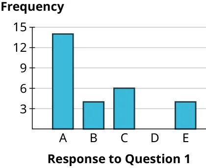
Frequency bar graph for a single categorical variable (“Response to Question 1”). The vertical axis is labeled “Frequency,” so each bar height represents the number of observations in that category (with a visible gap where the frequency is zero). Source
A relative frequency bar graph uses proportions or percentages, so it answers the question, “What share of the total fell in each category?”
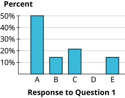
Relative-frequency (percent) bar graph for a single categorical variable (“Response to Question 1”). The vertical axis is in percent, so bar heights communicate each category’s share of the total rather than raw counts. Source
Relative frequency: The proportion or percentage of all observations that fall in a particular category.
Relative frequency is especially useful when you want to describe the size of a category as part of the whole. In a graph, the bars may be labeled with decimals, proportions, or percentages instead of counts.
Frequency versus relative frequency
A frequency bar graph is useful when:
the actual number of observations matters
the audience wants the raw counts
the total sample size is part of the story
A relative frequency bar graph is useful when:
you want to emphasize the share of the whole
percentages are easier for the audience to understand
the main interest is how the data are distributed across categories
Both versions represent the same categorical variable. The difference is the scale used on the numerical axis.
Parts of a Well-Made Bar Graph
A good bar graph should be clear, accurate, and easy to read. Important parts include:
a title that identifies the variable and context
labels for each category
a numerical axis showing either frequency or relative frequency
bars of equal width
spaces between bars
a consistent scale so the display is not misleading
The bars can be vertical or horizontal.
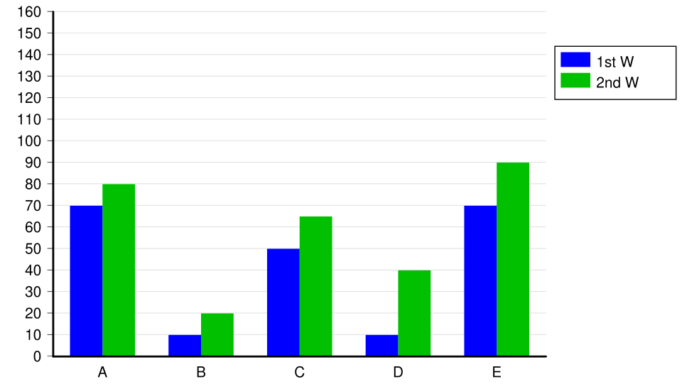
Grouped (clustered) bar chart showing the same categories repeated across two series, which is a common design for comparing groups side-by-side. The key bar-graph conventions remain: distinct categories, equal bar widths, and clear axis labeling. Source
Either form is acceptable as long as the categories and scale are labeled clearly.
The numerical axis should usually begin at zero. Starting at zero makes the visual differences between categories match the underlying data. If the scale is cut off, the graph can exaggerate differences and make a small change seem much larger than it really is.
Ordering the categories
The order of categories in a bar graph depends on the situation.
If the categories have a natural order, keep that order.
If the categories do not have a natural order, they may be placed alphabetically or in another logical arrangement.
Sometimes categories are arranged from largest to smallest frequency to make the pattern easy to see.
The choice of order should help the viewer read the graph without changing the data themselves.
What You Can Learn from a Bar Graph
A bar graph allows you to quickly identify:
which category is most common
which category is least common
whether one category clearly dominates
whether the distribution is fairly balanced across categories
The graph is a visual summary of the observed data. It is useful because it makes category patterns more immediate than a list of counts alone. However, the graph does not explain why the categories differ. It only displays the frequencies or relative frequencies that were recorded.
Common Mistakes to Avoid
Several errors make bar graphs harder to interpret or statistically inappropriate.
Mistake 1: Using a bar graph for quantitative values
A bar graph is for categories. If the values are actual measurements on a numerical scale, then a bar graph does not properly represent the data structure.
Mistake 2: Letting the bars touch
Bars in a bar graph should have gaps between them. Touching bars suggest a continuous variable, which is not what categorical data represent.
Mistake 3: Leaving out labels or context
Without a clear title, category names, or axis labels, the graph becomes difficult to understand. A viewer should be able to tell exactly what variable is being displayed.
Mistake 4: Mixing counts and percentages
A graph should use one scale consistently. If the graph is based on counts, the axis should show counts. If it is based on proportions or percentages, the axis should show those values instead.
Mistake 5: Distorting the scale
Unequal bar widths, inconsistent spacing, or a misleading axis scale can make the graph look more dramatic than the data justify. A bar graph should display the data honestly and simply.
Practice Questions
A school survey records each student's preferred type of music: pop, rock, hip-hop, country, or classical.
Explain why a bar graph is an appropriate display for these data.
1 mark for stating that preferred type of music is a categorical variable.
1 mark for stating that a bar graph displays the frequency or relative frequency for each category.
A teacher records the results of a class poll on preferred after-school activity:
Sports: 14 Music: 9 Gaming: 11 Art: 6
Describe how the teacher should construct an appropriate bar graph for these data. In your answer, include the type of variable, what should appear on each axis, two features the graph should have, and how the graph would differ if relative frequencies were used instead of frequencies.
1 mark for identifying the variable as categorical.
1 mark for stating that the categories should be placed on one axis and the counts on the other axis.
1 mark for describing two correct graph features, such as equal-width bars, spaces between bars, clear labels, or a title.
1 mark for stating that a relative frequency bar graph would use proportions or percentages instead of counts.
1 mark for explaining that the categories stay the same, but the numerical axis changes to relative frequency.
FAQ
Yes. A Pareto chart is a special kind of bar graph for categorical data.
Its categories are arranged from highest frequency to lowest frequency, which makes the most common categories stand out quickly.
This ordering is useful for identifying which categories contribute the most to the overall total.
Yes, if it helps readability and does not hide important information.
This is most useful when:
there are many rare categories
labels would otherwise be crowded
the focus is on the major groups
If you use an "Other" category, it should be clearly labeled and used consistently.
Many graphing tools apply default settings, such as alphabetical order or ordering by size.
You should check the output before using it because the default order may not match the context of the data.
For ordinal categories, automatic sorting can destroy the natural sequence, so manual adjustment may be necessary.
Usually no.
3-D effects can make bars look larger or smaller than they really are, especially when perspective changes the apparent height or width.
In AP Statistics, a simple 2-D bar graph is preferred because it is clearer, more accurate, and less likely to mislead the reader.
That depends on the purpose of the graph.
Options include:
treating missing responses as their own category
excluding them and graphing only valid responses
reporting them separately in the title or notes
The key is clarity. The viewer should be able to tell whether missing data were included, excluded, or grouped separately.
