
AP Syllabus focus: 'The height or length of each bar corresponds to the count or proportion of observations in that category.'
In a bar graph, meaning comes from the measurement shown on the axis. Accurate interpretation depends on knowing whether each bar represents a count or a proportion for its category.
What bar height or length represents
Each bar corresponds to one category, and the important information is encoded by its height in a vertical graph or its length in a horizontal graph. To interpret the graph correctly, read from the end of the bar to the numerical axis. The visual impression of “big” or “small” is not enough by itself.
A bar can represent either a count or a proportion.
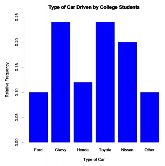
This figure illustrates a bar graph whose vertical axis is scaled in relative frequencies, so each bar height represents a category’s share of the total rather than the number of observations. It supports interpreting bar endpoints as proportions and connecting them back to a frequency/relative-frequency table. Source
A count is the number of observations in a category. A proportion is the share of all observations that belong to that category.
Proportion: The part of all observations that fall in one category, written as a value from 0 to 1.
This distinction matters.
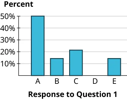
These example bar charts show the same categorical responses displayed two ways: first with bar heights representing frequency (count), and then with bar heights representing percent (a proportion scale). Comparing the two reinforces that the visual ordering of categories can look similar even though the numerical meaning on the axis changes. Source
A bar ending at 18 and a bar ending at 0.18 are interpreted very differently, even if the bars appear similar in shape.
Distinguishing counts from proportions
Before reading a bar, check the axis label and scale carefully.
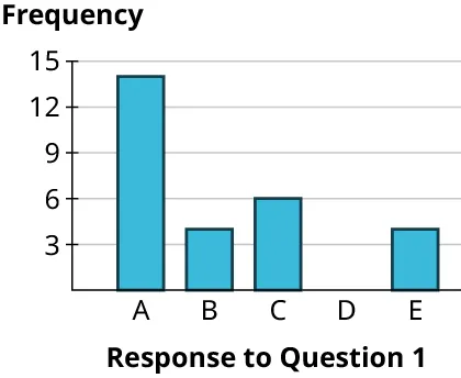
This example bar graph uses frequency on the numerical axis, so each bar height represents a count in its category. It is useful for practicing the reading process: identify the category, read the bar’s endpoint on the frequency scale, and state the value as a number of observations. Source
If the axis is labeled with numbers representing individual cases, the graph is usually showing a count.
If the axis is labeled from 0 to 1, the graph is showing a proportion.
If the axis is labeled with percents, the graph is still showing a category’s share of the data, just on a different scale.
A graph with counts answers the question how many. A graph with proportions answers the question what part of the data. These are related, but they are not the same unless the total number of observations is known.
When proportions are obtained from counts, the relationship is:
= proportion in the category
= count in the category
= total number of observations
If the graph already uses proportions, then the bar height or length gives directly, so no additional calculation is needed.
Reading vertical and horizontal bar graphs
Vertical bar graphs
In a vertical bar graph, the height of the bar gives the value. Read upward from the baseline to the top of the bar, then across to the numerical scale. The vertical axis determines the amount represented.
Horizontal bar graphs
In a horizontal bar graph, the length of the bar gives the value. Read from the category label across to the end of the bar, then to the numerical scale. The horizontal axis determines the amount represented.
The orientation does not change the meaning. A height of 12 in a vertical graph and a length of 12 in a horizontal graph both represent 12 units on the graph’s scale. Only the direction of reading changes.
A reliable reading process is:
identify the category named by the bar
identify whether the numerical axis shows counts, proportions, or percents
read the endpoint of the bar using the scale
state the value with the correct form
if the bar ends between tick marks, report an estimate and say “approximately”
Using the scale accurately
Because bar graphs encode information through length, the scale must be read with care. Equal distances on the axis should represent equal numerical changes. If the tick marks are uneven or unclear, the bar sizes cannot be interpreted accurately.
The starting point also matters. Since the graph is using visible length to show amount, the bars should be measured from a common baseline. If the baseline is altered, small numerical differences can look much larger than they really are. Careful readers therefore inspect the axis before making any strong claim from the graph.
It is also important not to confuse bar width with data value. In a standard bar graph, the amount is shown by height or length only. Wider bars, darker shading, and decorative styles do not mean a category has more observations.
Comparing categories by bar size
Comparisons come from differences in bar height or length. If one bar is longer or taller, that category has a larger count or proportion on the graph’s scale. The amount of the difference is found by subtracting the values read from the axis, not by relying only on appearance.
Ratios should also be interpreted carefully. Saying one bar is “about twice as large” is appropriate only when the axis scale supports that comparison and the bars are being measured from the same baseline. Even then, the statement refers to the graph’s scale: either counts or proportions.
A correct comparison must keep the scale in the language used. “More observations” refers to counts. “A greater share of observations” refers to proportions. Those are different interpretations.
Writing interpretations in context
A strong statistical interpretation includes three parts:
the category
the value read from the bar
whether that value is a count or a proportion
If the graph uses counts, say how many observations are in that category. If it uses proportions, say what fraction or share of the observations are in that category. If an exact reading is not possible from the graph, use approximate language rather than pretending the value is exact.
This keeps the interpretation tied to what the bar actually shows, instead of adding unsupported claims.
Common errors in interpretation
Several mistakes occur often when students read bar graphs:
reading the area of a bar instead of its height or length
forgetting to check whether the axis shows counts or proportions
assuming the longest bar must represent more than half of the data
comparing bars without checking the numerical scale
treating color, thickness, or style as if it carries extra data
Strong interpretation focuses on the category, the axis, and the endpoint of the bar. Those are the features that determine what the graph is actually saying.
Practice Questions
A vertical bar graph shows the distribution of survey responses by category. The vertical axis is labeled “Proportion,” and the bar for Category C reaches 0.28.
Interpret the height of the bar for Category C. [2 marks]
1 mark for stating that 0.28 is the proportion of observations in Category C.
1 mark for correctly interpreting this as 28% of the observations being in Category C.
A horizontal bar graph shows preferred after-school activities for 80 students. The horizontal axis is labeled “Number of students.” The bar for Sports has length 34, the bar for Music has length 18, and the bar for Art has length 12.
(a) Interpret the bar length for Sports. [1 mark]
(b) How many more students chose Sports than Music? [1 mark]
(c) Find the proportion of students who chose Sports and interpret it. [2 marks]
(d) A student says, “Because Sports has the longest bar, it represents more than half of the students.” Explain why this statement is not justified by bar length alone. [1 mark]
(a) 1 mark for stating that 34 students chose Sports.
(b) 1 mark for 16.
(c) 1 mark for or equivalent.
(c) 1 mark for interpreting this as 42.5% of the students choosing Sports.
(d) 1 mark for explaining that the longest bar only shows the largest count, not necessarily more than half; more than half would require a count greater than 40 out of 80.
FAQ
Multiply by 100 to change a proportion to a percent, and divide by 100 to change a percent to a proportion.
For example, 0.28 and 28% represent the same bar value. The graph scale changes the appearance of the number, but not the meaning of the category’s share.
This happens when one graph uses counts and another uses proportions, or when the total number of observations changes.
A count tells how many observations are in the category. A proportion tells how much of the whole that count represents. A larger count can still be a smaller share if the total is much larger.
Use the printed value as the exact value, especially if your eye estimate from the axis is slightly different.
Small differences usually happen because of rounding or because the graph is not drawn large enough for exact visual reading. On an exam, if a label is provided, that label is the best source.
It may appear as a bar of length 0, which means the bar stays at the baseline and is barely visible.
If the category label is shown but there is no visible bar, interpret that as zero observations in that category unless the graph says the category was omitted for another reason.
No. Reordering categories does not change the numerical meaning of any bar.
It can change how easy the graph is to read or which comparisons stand out first, but the count or proportion represented by each bar stays the same.
