
AP Syllabus focus: 'Frequency tables, bar graphs, and other displays can compare two or more data sets using the same categorical variable.'
Comparing categorical data sets helps reveal how different groups, time periods, or conditions are distributed across the same categories, making similarities and differences easier to identify and describe in context.
What is being compared
To compare categorical data sets, each data set must record the same categorical variable. The groups might be different classes, different regions, different years, or different treatments, but the response categories must match. If one data set records preferred lunch option and another records preferred sport, they cannot be compared as distributions of the same variable.
The goal is to see how observations are divided among categories in each group. A strong comparison looks for categories that are more common or less common in one group than another and describes those differences in context rather than only listing raw numbers.
A relative frequency is often the most useful basis for comparison.
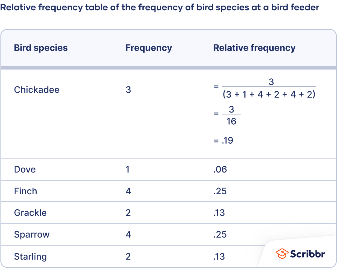
A relative frequency table that lists each category alongside its count and its proportion of the total. The worked example (showing division by the overall total) highlights the core idea that relative frequency standardizes categories onto a common scale for fair comparisons across data sets. Source
Relative frequency: The proportion of observations in a category, found by dividing the category count by the total number of observations in that data set.
This measure is especially helpful when the data sets do not have the same total number of observations.
= relative frequency for a category
= number of observations in the category
= total number of observations in the data set
Matching the variable
Before making any graph or claim, check that:
the category labels mean the same thing in each data set
every group is measured using the same question or classification rule
categories are complete and do not overlap
If the categories are inconsistent, the comparison can be misleading even if the graph looks clear.
Choosing counts or proportions
Counts tell how many observations fell in each category. They are useful when the data sets have equal or nearly equal sizes, because the counts can be compared directly. However, when one group is much larger than another, larger counts may reflect group size rather than a real difference in the distribution.
For that reason, proportions or percentages are usually better for comparing categorical data sets.
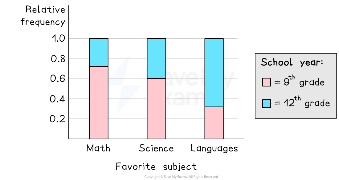
A segmented (100% stacked) bar chart where each bar represents a group and the segments show conditional relative frequencies across categories. Since each bar has the same total height, the visual emphasis is on comparing proportions rather than counts, supporting fair comparisons when sample sizes differ. Source
They place each category on the same scale from 0 to 1 or from 0% to 100%. That makes it easier to decide whether one group has a noticeably larger share in a category.
When you describe a comparison, be clear about whether you are using counts or proportions. Saying that one category is “bigger” is too vague. A better statement identifies the group, the category, and the basis for comparison.
Useful displays for comparison
Frequency tables
A set of frequency tables can compare groups if each table uses the same categories in the same order. This layout makes it easier to scan across categories and see where counts or proportions differ. Tables are especially helpful when exact values matter.
Bar graphs and similar displays
Bar graphs are often the clearest visual tool for comparing categorical data sets. The bars should represent the same categories in every group, and the scale should be consistent across the display. If separate graphs are used, the axes must match so that bar heights can be compared fairly.
For multiple groups, side-by-side bars or clearly separated bars for each category usually work well.
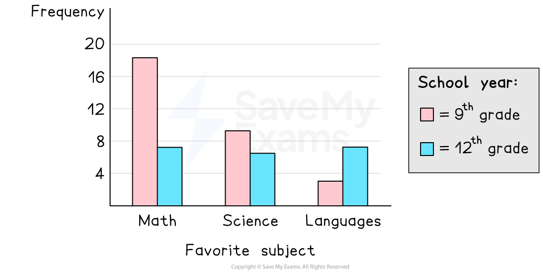
A side-by-side bar graph comparing two groups (9th grade vs 12th grade) across the same categorical variable (favorite subject). Because each category has paired bars on a shared scale, you can directly compare relative frequency (or frequency) by matching bar heights within each category. Source
Other displays can also be appropriate as long as they preserve the same categories, use clear labels, and make comparisons across groups easy to see.
When reading a graph, focus on the height or length of corresponding bars across data sets. The most important visual questions are:
Which categories are highest or lowest in each group?
Where are the largest differences between groups?
Do the overall patterns look similar or different?
How to write a statistical comparison
What strong comparisons include
A strong written comparison does more than point to one bar. It identifies meaningful similarities and differences across the full distribution. In AP Statistics, comparisons should be comparative, specific, and in context.
Useful features to describe include:
the most common category in each data set
categories with noticeably different proportions
categories that are similar across groups
whether one group is more concentrated in a few categories while another is more evenly spread
Statements should be tied to the setting. Instead of saying “the blue bar is taller,” refer to the actual category and group names.
Language that earns credit
Good comparison language often includes phrases such as:
“A larger proportion of ...”
“A smaller share of ...”
“The distributions are similar because ...”
“The biggest difference appears in ...”
“Both groups have ... as the most common category”
These statements are strongest when they mention approximate values or clearly visible differences rather than vague impressions.
Common errors to avoid
Using only counts when group sizes differ. This can make a large group seem to prefer every category more strongly.
Comparing graphs with different scales. If the axes are inconsistent, visual differences may be exaggerated or hidden.
Ignoring context. A correct numerical statement can still be incomplete if it does not identify the groups and categories being compared.
Making unsupported claims. A graph can describe differences in the observed data, but it does not by itself prove why those differences occurred.
Describing only one group. A comparison requires attention to at least two data sets and how they relate to each other.
Practice Questions
A survey asked students whether they preferred in-person, hybrid, or online tutoring. Among 40 freshmen, 18 chose in-person, 10 chose hybrid, and 12 chose online. Among 40 seniors, 8 chose in-person, 12 chose hybrid, and 20 chose online.
State one similarity and one difference between the two distributions. [2 marks]
1 mark for one valid similarity in context, such as noting that the proportion choosing hybrid is fairly similar for freshmen and seniors.
1 mark for one valid difference in context, such as noting that seniors have a larger proportion preferring online tutoring, while freshmen have a larger proportion preferring in-person tutoring.
A community center surveyed members in two exercise programs about their favorite class type. Program A had 80 members: 24 preferred yoga, 16 preferred cycling, 28 preferred strength, and 12 preferred dance. Program B had 40 members: 8 preferred yoga, 12 preferred cycling, 10 preferred strength, and 10 preferred dance.
(a) Explain why proportions are more appropriate than counts for comparing the two programs. [1 mark]
(b) Identify an appropriate display for comparing the two data sets. [1 mark]
(c) Compare the distributions using two specific statements in context. [2 marks]
(d) Based on these data alone, can you conclude that being in one program causes the difference in class preferences? Explain. [1 mark]
(a) [1 mark]
1 mark for stating that the program sizes are different, so counts are not directly comparable and proportions should be used.
(b) [1 mark]
1 mark for naming an appropriate display, such as a side-by-side bar graph, separate bar graphs with the same scale, or matched frequency tables using proportions.
(c) [2 marks]
1 mark for one correct comparative statement in context using the distributions.
1 mark for a second correct comparative statement in context using the distributions.
Possible answers include:
Program A has a larger proportion preferring strength classes than Program B.
Program B has a larger proportion preferring cycling classes than Program A.
Program B has a larger proportion preferring dance classes than Program A.
Program A has a larger proportion preferring yoga than Program B.
(d) [1 mark]
1 mark for saying no and explaining that these data describe differences but do not establish causation.
FAQ
Pie charts require the reader to compare angles or areas across separate circles, which is harder than comparing bar lengths on a common scale.
If the goal is to compare groups clearly, bar-based displays usually make differences easier to see, especially when the differences are small.
Do not treat them as directly comparable until you check whether the categories truly mean the same thing.
If the definitions can be aligned without changing meaning, you may recode them carefully. If they cannot be aligned, you should state that the comparison is limited or inappropriate.
Sometimes, yes, but only when the categories are conceptually similar and the combining rule is reasonable.
Do not combine categories just to make a graph look cleaner or to hide an inconvenient pattern. If categories are merged, the new label should be clear so the reader knows exactly what was combined.
First decide whether missing responses are part of the comparison or a data-quality issue.
If nonresponse is substantial, it may deserve its own category because it can differ across groups and affect interpretation. If it is very small, some analysts report it separately so the main comparison stays focused on actual responses.
A noticeable gap in percentages is not automatically important. Practical meaning depends on the context, the decision being made, and whether the difference affects real outcomes.
For example, a small percentage difference might matter in public health, while a larger difference might not matter much in a casual preference survey. Context determines importance.
