
AP Syllabus focus: 'Graphical representations of a categorical variable reveal information that can be used to justify claims about the data in context.'
When you interpret a categorical graph, your goal is not just to notice patterns, but to use visible evidence to support careful, context-based statements about the data.
What It Means to Make a Claim from a Categorical Graph
When you make a claim from a categorical graph, you are turning visual evidence into a justified statement. The graph is the evidence source, so every claim should be based on what it actually displays.
In AP Statistics, this is a claim supported by data.
Claim supported by data: A statement about the distribution of a categorical variable that is backed by the counts or proportions shown in a graph.
A strong claim identifies a real pattern, such as which category is most common, whether two categories are similar, or whether one category clearly stands out. A weak claim is too vague, too broad, or not linked to the displayed evidence.
Claims must also be written in context.
Context: The real-world meaning of the categories and the group of individuals represented in the graph.
A brief label-only statement is incomplete. A stronger claim names both what the categories mean and who or what was observed.
Reading Evidence from the Graph
Identify exactly what the graph shows
Before writing any claim, check:
the categorical variable
the category labels
whether the display uses counts or relative frequencies
the title, legend, and description of the group represented
These details determine what kind of evidence you should use. If the graph shows counts, support claims with numbers of observations. If it shows proportions or percentages, support claims with relative sizes such as about one-third or approximately 40%.
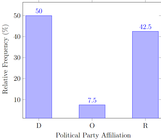
Relative-frequency bar charts encode a categorical distribution using bar heights measured in proportions or percentages. This example is clearly labeled (categories on the horizontal axis and relative frequency on the vertical axis), making it straightforward to justify claims like “Category A is slightly more common than Category B” using the displayed percentages. Source
If exact values are not labeled, use cautious language like about, approximately, or appears to be.
Turn visible patterns into statements
Valid claims often focus on comparisons the graph makes easy to see:
one category has the highest or lowest frequency
a category forms a majority, meaning more than half
a category forms a plurality, meaning the largest single category but not more than half
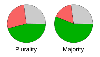
This diagram distinguishes a plurality from a majority using two pie charts. It reinforces that a category can be the largest slice (plurality) without exceeding half of the total (majority), which prevents overstating claims when interpreting categorical displays. Source
several categories are about the same size
the distribution is concentrated in one or two categories
Each statement must come directly from the display, not from a guess about why the pattern occurred.
Justifying Claims Properly
Match the wording to the evidence
A correct claim must match the scale of the graph. If the graph shows percentages, do not switch to counts unless the total is known. If the graph shows counts, do not state exact percentages unless they can be determined from the display.
The size of a difference matters too. If two bars are nearly equal, the graph supports only a modest statement, such as one category being slightly more common. It does not justify saying the difference is large unless the visual evidence clearly supports that description.
Useful AP-style wording includes:
The graph shows
The largest category is
Approximately
Slightly more than
About the same as
Less common than
This language helps you describe the pattern without overstating it.
Keep the claim tied to the data set
A categorical graph supports descriptive statements about the data shown. It does not automatically support claims about causes, motives, or explanations. It also does not justify extending the result to a larger population unless the context specifically says the graph represents that population.
That is why statements such as students prefer, customers always choose, or this caused are often too strong. Safer wording is in this sample, among the people surveyed, or for the data displayed.
Another common error is forgetting to mention evidence. On the AP exam, a claim is stronger when the comparison and the supporting counts or proportions appear together.
Common Pitfalls in AP Responses
What to avoid
Several mistakes weaken categorical claims:
treating a plurality as if it were a majority
making an exact numerical claim when the graph supports only an approximation
ignoring the category labels and writing too vaguely
comparing categories without mentioning the displayed frequencies or proportions
making a claim that goes beyond the group represented in the graph
Strong responses do three things at once:
name the relevant categories
compare them using evidence from the graph
keep the statement in context
This turns a visual impression into a statistical claim that is clear and defensible.
Practice Questions
A bar graph shows the preferred after-school activity of 150 students. The categories are sports: 63, music: 41, clubs: 30, and jobs: 16.
State one valid claim about the distribution and justify it using the graph.
1 mark for a valid contextual claim, such as stating that sports is the most common after-school activity among the students surveyed.
1 mark for justification using graph evidence, such as noting that 63 students chose sports, which is more than any other category shown.
A relative frequency bar graph summarizes a sample of 400 adults asked which device they use most often to access the internet. The graph shows smartphone: 0.47, laptop: 0.28, tablet: 0.15, and desktop: 0.10.
A student writes, “Most adults use smartphones, and smartphones cause people to go online more often than other devices.”
Evaluate this statement using the graph.
1 mark for recognizing that smartphone is the largest category in the sample.
1 mark for stating that “most adults” is not justified because the graph summarizes a sample, not all adults.
1 mark for stating that “most” is also inaccurate for the sample because 0.47 is less than 0.50.
1 mark for supporting the evaluation with graph evidence, such as comparing 0.47 to 0.28, 0.15, and 0.10.
1 mark for stating that the graph does not support a causal claim about smartphones causing people to go online more often.
FAQ
Bar graphs make category comparisons easier because people judge lengths more accurately than angles or areas.
That matters when categories are close in size. If you need to support a claim like “slightly more common” or “about the same,” a bar graph usually gives stronger visual evidence than a pie chart.
An Other category combines multiple responses into one group, so you can only make claims about that combined group.
You should not guess what is inside it or compare hidden subcategories. If Other is large, it may be worth noting that the graph does not show enough detail to describe those responses separately.
Then your claim should be limited to the responses that were actually included in the graph.
Missing responses can matter a lot. For example, a category may look dominant among reported answers even if many people did not answer. If that limitation seems important, mention that the graph may not fully represent all intended observations.
Yes. Visual design can exaggerate or hide differences between categories.
Watch for features such as:
bars that do not start from a common baseline
uneven bar widths
3D effects
colors that overemphasize one category
labels that are missing or hard to read
Good statistical interpretation depends on both the data and the honesty of the display.
Usually, no. If the graph shows separate categories, you should treat them as separate unless the context clearly supports combining them.
Combining categories after seeing the graph can create a misleading claim. On an exam, it is safer to describe the categories exactly as displayed unless the prompt explicitly asks for a combined interpretation.
