
AP Syllabus focus: 'Summary statistics for two categorical variables can be used to compare distributions and determine whether the variables appear to be associated.'
When a data set contains two categorical variables, the main goal is to compare group percentages carefully and decide whether differences in distributions suggest a meaningful association.
What comparing categorical variables means
With two categorical variables, the most useful summary statistics are usually proportions or percentages within categories. These statistics show how one variable is distributed for different groups of the other variable.
For AP Statistics, the key idea is not to compare groups by raw totals alone. Instead, compare how the categories are divided up within each group. That lets you judge whether the pattern stays about the same from group to group or changes noticeably.
Association: In two categorical variables, an association exists when the distribution of one variable differs across categories of the other variable.
If the distributions are very similar across groups, the variables do not appear to be associated. If the distributions are clearly different, the variables do appear to be associated.
Using percentages to compare distributions
The best way to compare categorical variables is usually to examine conditional distributions.
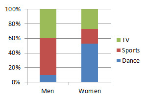
Segmented (stacked) bar charts display conditional distributions by showing each group as a 100% bar partitioned into category percentages. Differences in segment sizes across the bars indicate that the response distribution changes by group, which is visual evidence of association between the two categorical variables. Source
These are the percentages for one variable calculated separately within each category of the other variable.
Conditional distribution: The distribution of one categorical variable within a single category of another categorical variable, usually described using proportions or percentages.
Counts can be misleading when groups are different sizes. A larger group often has larger counts simply because there are more observations in it. Percentages adjust for that difference, so they make the comparison fair.
When comparing distributions, focus on the same response categories across groups. Ask questions like:
Is the proportion in each category about the same across groups?
Are some groups much more likely to fall into one category than others?
Do the differences show a consistent pattern?
Suppose one variable has three categories. A good comparison checks all three categories, not just the most common one. That matters because the full distribution shows how the categories fit together. If one group has a higher percentage in one category, it must have lower percentages somewhere else.
The strength of an apparent association is judged by how different the percentages are. Very small differences may suggest little or no association. Larger, more consistent differences suggest a clearer association.
Deciding whether variables appear to be associated
There is no single summary number in this topic that automatically tells you whether two categorical variables are associated. Instead, the decision comes from comparing the distributions carefully.
Look for these features:
Similarity: If corresponding percentages are close across groups, the variables do not appear to be associated.
Difference: If several categories have noticeably different percentages, the variables appear to be associated.
Consistency: If the same general pattern shows up across the categories, the evidence of association is stronger.
Context: A difference that matters in one setting may be less important in another.
It is also important to compare the entire distribution.
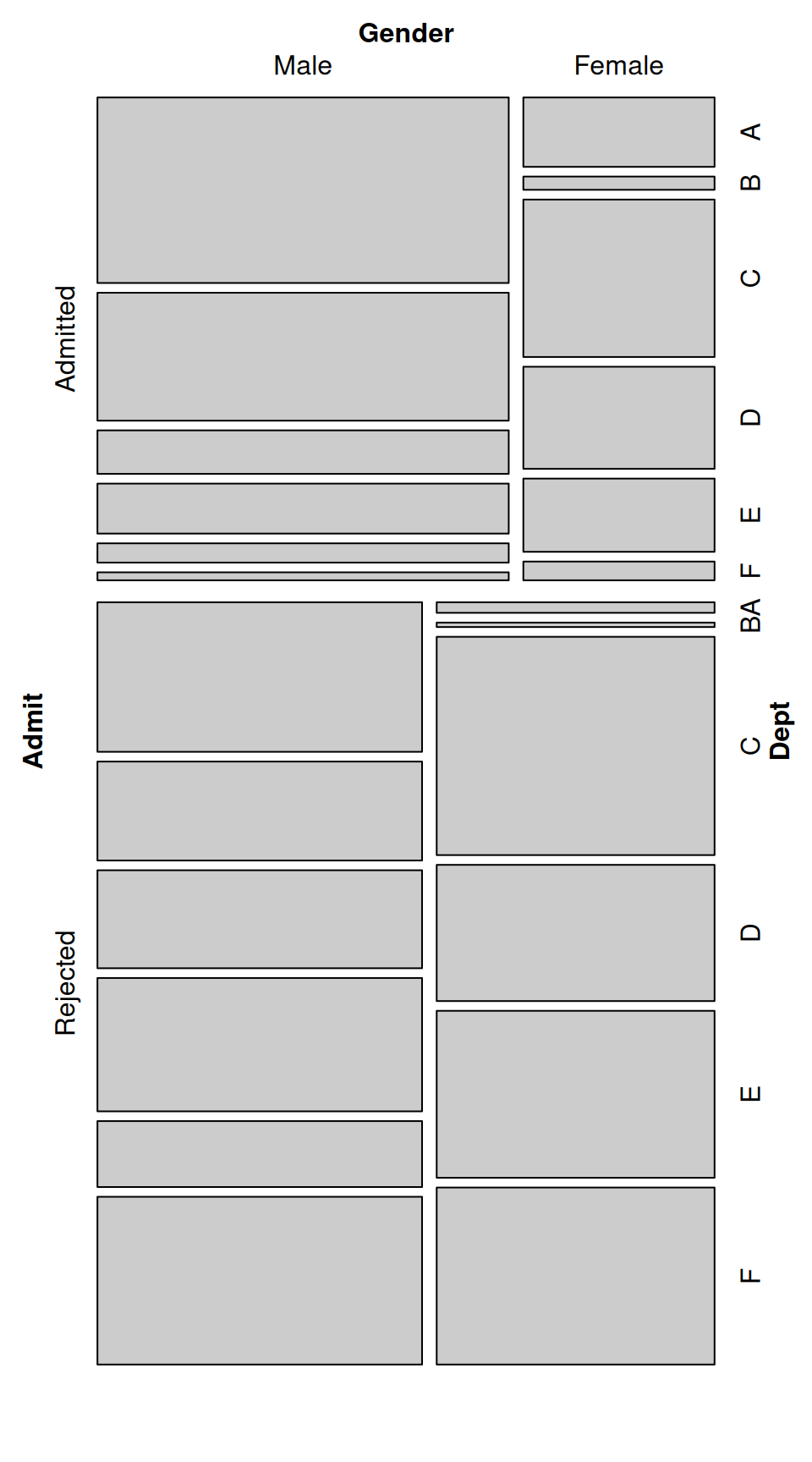
A mosaic plot represents a two-way (or multi-way) table using rectangles whose areas are proportional to cell frequencies, so the full distribution is visible at once. When the partitions differ noticeably across groups, the plot visually communicates association because the conditional distributions are not the same. Source
A student might notice one category with a gap between groups, but AP Statistics expects a judgment based on the overall pattern, not one isolated value.
Sometimes you can compare the variables in either direction. For example, you might compare the distribution of variable A within categories of variable B, or the distribution of variable B within categories of variable A. The better choice depends on the question being asked. Use the comparison that gives the clearest answer in context.
How to describe the comparison in words
On AP questions, strong responses are clear, specific, and tied to the context. Good statistical writing usually does three things:
identifies the groups being compared
states relevant percentages or proportions
explains whether those differences suggest an association
Useful sentence patterns include:
“The distribution of _____ differs across categories of _____.”
“The proportion in category _____ is higher for _____ than for _____.”
“Because the conditional distributions are different, there appears to be an association between _____ and _____.”
Avoid vague comments such as “the numbers are different” or “the graph looks uneven.” Those statements do not explain how the distributions compare.
Also, be careful with language. Association describes a relationship in the data. It does not prove that one variable causes the other.
Common mistakes to avoid
Students often lose accuracy by making one of these errors:
comparing counts instead of percentages when group sizes differ
switching between different sets of percentages without noticing
discussing only one category instead of the whole distribution
giving numbers without explaining what they mean in context
treating an observed association as proof of causation
deciding too quickly from tiny differences that may not matter much
A strong comparison stays focused on percentages, the full distributions, and a clear contextual statement about whether the variables appear to be associated.
Practice Questions
A school surveyed students about whether they buy lunch at school. Of the 90 students with a part-time job, 54 buy lunch at school. Of the 60 students without a part-time job, 18 buy lunch at school. Based on conditional relative frequencies, do the variables appear to be associated? Explain.
1 mark for calculating or stating the conditional proportions: and .
1 mark for concluding that the distributions differ and there appears to be an association between having a part-time job and buying lunch at school.
A principal surveys students in three grade levels about their preferred school event.
9th grade: sports event 24, dance 18, academic competition 8
10th grade: sports event 15, dance 25, academic competition 10
11th grade: sports event 10, dance 20, academic competition 20
There were 50 students surveyed in each grade.
(a) Find the conditional distribution of preferred event within each grade level.
(b) Compare the distributions of preferred event across the three grade levels.
(c) Based on your comparison, determine whether grade level and preferred event appear to be associated. Justify your answer in context.
2 marks for correct conditional distributions:
9th grade: , ,
10th grade: , ,
11th grade: , ,
2 marks for a valid comparison using specific proportions, such as noting that preference for sports events decreases from 0.48 to 0.30 to 0.20, while preference for academic competitions increases from 0.16 to 0.20 to 0.40.
1 mark for stating that the distributions are not similar across grades, so there appears to be an association between grade level and preferred school event.
FAQ
There is no universal cutoff.
What matters is:
how big the differences are
whether the differences are consistent across categories
whether the differences matter in the context of the problem
A 5-point gap may be important in one setting and minor in another. On AP Statistics, the safest approach is to describe the differences clearly and avoid claiming more certainty than the data support.
Be cautious when interpreting percentages from very small groups or very small cells.
Small counts can make percentages look dramatic even when the actual number of observations is tiny. In that situation:
mention the small size if relevant
avoid overinterpreting the pattern
focus on whether the differences are stable across the whole distribution
Small counts do not automatically make the comparison useless, but they do make it less convincing.
Yes. Reorganizing categories can change the visible pattern.
For example, combining two response categories may:
hide a difference that was clear before
make a weak pattern look stronger
remove detail that helps explain the relationship
That means category definitions matter. If categories are combined, the choice should make sense in context and should be explained carefully.
An overall percentage mixes groups together, so it can mask differences between them.
Two groups may have very different conditional distributions even if their combined total looks ordinary. This is why within-group percentages are often more informative than a single overall percentage.
When comparing categorical variables, always check whether the pattern within groups tells a different story from the overall summary.
Yes, if the data are recorded in named categories, you still compare distributions category by category.
However, the order can help your interpretation. You may notice:
increasing or decreasing percentages across ordered categories
a shift toward higher or lower categories in one group
a pattern that would be less obvious without the ordering
The variable is still categorical, but the ordering can make the association easier to describe clearly.
