
AP Syllabus focus: 'A bivariate quantitative data set records two quantitative variables for each individual. A scatterplot shows the two numeric values for each observation.'
Studying two quantitative variables together allows statisticians to move beyond single-variable summaries and examine paired numerical measurements, laying the foundation for visual displays that reveal whether a relationship may be present.
Understanding bivariate quantitative data
When statisticians study two numerical measurements collected on the same individuals, they are working with bivariate quantitative data. The key idea is pairing: the two numbers must belong to the same case, person, object, or event.
Term: A bivariate quantitative data set records two numerical variables for each individual in the data set.
In AP Statistics, quantitative means the variables take numerical values for which arithmetic makes sense, such as height, time, income, or temperature. Bivariate means there are exactly two such variables in the data set. If a class records each student's number of absences and final grade, each student contributes one matched pair of values rather than two separate single-variable records.
This pairing matters because the purpose is not just to list numbers. It is to preserve how the two measurements occur together for each individual. Once the pairing is lost, the relationship between the variables cannot be examined accurately.
What an observation looks like
Each observation in a bivariate quantitative data set is often written as an ordered pair, such as .
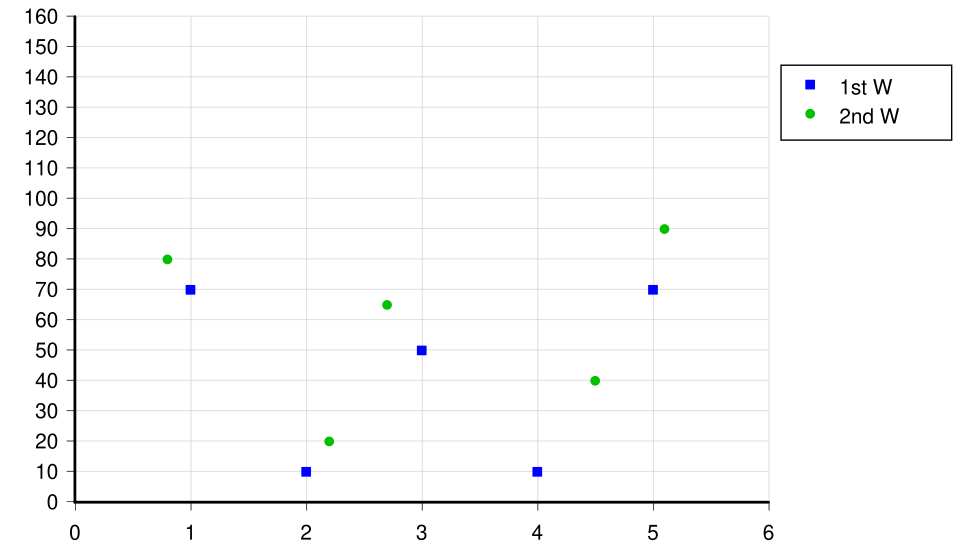
A simple scatter chart plots two numerical variables on perpendicular axes, with each marker representing one observation. The labeled axes and gridlines emphasize how coordinate position encodes both values simultaneously. Source
The first coordinate gives one variable's value, and the second coordinate gives the other variable's value. In a spreadsheet, each row usually represents one individual, with one column for each variable.
A single point on a graph therefore represents one complete observation, not a summary of many individuals unless the graph specifically says so.
Using scatterplots to display the data
The standard graph for bivariate quantitative data is a scatterplot. It keeps the paired nature of the data visible by placing both measurements for each individual on the same set of axes.
A scatterplot is a graph of bivariate quantitative data in which each observation is plotted as one point using its two numeric values.
In a scatterplot, one variable is placed on the horizontal axis and the other on the vertical axis. The location of a point is determined by the two recorded values. Because every observation becomes a point, the graph gives a direct visual display of the full data set rather than only a summary.
How to make a good scatterplot
A clear scatterplot should:
use numerical scales with equal intervals on both axes
label each axis with the variable name and, when relevant, the unit
plot each individual exactly once
use a scale large enough to spread the points so the display is easy to read
leave points unconnected, since the data represent separate observations rather than a continuous path
Whether made by hand or with technology, the goal is to show the paired data accurately and readably.
What scatterplots help you see
A scatterplot is valuable because it shows much more than a raw list of numbers. By looking at the overall arrangement of the points, you can quickly tell whether the two variables appear unrelated or whether some kind of pattern may be present.
For example, a scatterplot lets you see:
the range of values for each variable
where many observations lie on the graph
whether there are blank regions in the display
whether the paired values suggest a possible relationship worth studying further
This visual approach is especially useful because two data sets can have similar single-variable summaries but very different point displays when graphed together. A scatterplot preserves individual observations, so it often reveals structure that a list of numbers hides.
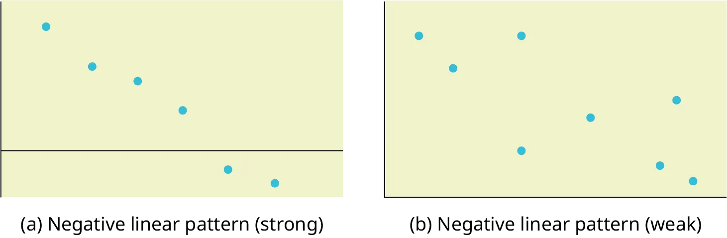
Two scatterplots show the same general upward trend, then illustrate how a single outlying point can break the pattern. This highlights how scatterplots reveal both the overall form of association and deviations such as outliers that can strongly influence interpretation. Source
It is also important to interpret points correctly. A point high on the graph has a large value on the vertical axis, but its full meaning depends on both coordinates. Reading only one axis gives an incomplete picture of that observation.
Choosing appropriate variables
A scatterplot should be used only when both variables are quantitative. If one variable is categorical, other displays are more appropriate. This matters because scatterplots rely on meaningful numerical position along each axis.
The data must also be matched by individual. Suppose one list contains weekly exercise times and another list contains blood pressure values, but there is no record showing which value belongs to which person. Even though both variables are quantitative, they cannot form a valid bivariate data set without the original pairing.
Common pitfalls
Students often make preventable mistakes when working with scatterplots.
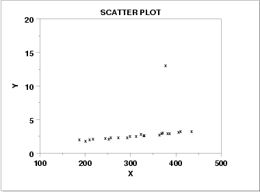
This scatterplot example shows a strong linear trend for most observations along with one clear outlier far from the main cloud. It reinforces the idea that a single unusual point can distort conclusions and should be investigated rather than ignored. Source
Watch for these issues:
graphing two numerical variables that were not measured on the same individuals
forgetting axis labels or units
using uneven scales that distort where points appear
placing values into the wrong coordinates
treating the graph as if it proves why the variables are related
forgetting that each point represents one matched pair of numerical values from one individual
Practice Questions
A researcher records the daily caffeine intake in milligrams and the number of hours slept last night for each of 20 adults.
(a) Explain why these data form a bivariate quantitative data set.
1 mark: States that two variables are recorded for each individual adult.
1 mark: States that both variables are quantitative numerical measurements.
A teacher records, for each student in a class, the number of minutes spent reading at home last week and the number of books borrowed from the library that week.
(a) Describe how these data would be displayed in a scatterplot. (2 marks)
(b) State two features that should be included on a well-made scatterplot of these data. (2 marks)
(c) Explain one advantage of using a scatterplot rather than two separate one-variable graphs. (1 mark)
(a)
1 mark: States that one quantitative variable is placed on the horizontal axis and the other on the vertical axis.
1 mark: States that each student is plotted as one point using the student's two recorded values.
(b)
1 mark: Any one valid feature, such as labeled axes, units, or equal numerical scale.
1 mark: Any second valid feature, such as readable spacing of points, plotting each student once, or leaving points unconnected.
(c)
1 mark: Explains that a scatterplot keeps the paired data together and allows the relationship between the two numerical variables to be seen.
FAQ
No. Unlike some other graphs, a scatterplot does not have to begin at zero on either axis.
What matters more is that each axis uses a consistent numerical scale and is labeled clearly. However, changing the starting point can stretch or compress the visual appearance, so you should always check the scale before interpreting the graph.
This is called overplotting, and it can hide how many observations are really there.
Possible fixes include:
using smaller points
adding slight jitter with software
making points transparent
noting the repeated count beside the point on a hand-drawn graph
These choices help the display show frequency without changing the original paired values.
Yes. A scatterplot can make impossible or suspicious values stand out more quickly than a spreadsheet can.
For example, a point may appear far outside the expected scale, or a value may seem inconsistent with the rest of the data because a digit was typed incorrectly. When that happens, the graph does not prove there is an error, but it gives a reason to check the original record carefully.
Stripe patterns often happen when one variable has been rounded or recorded only in whole-number steps.
For instance, if heights are rounded to the nearest inch, many points may line up vertically at the same $x$-value. If the response values are rounded, horizontal bands may appear instead. This does not automatically mean the data are wrong; it may simply reflect how the measurements were taken.
Yes. The same paired observations can be plotted with either variable on either axis.
The graph will still represent the same data, but the coordinates of each point will be reversed, so the visual appearance may change. If no explanatory variable has been chosen yet, either arrangement can be acceptable. The important thing is to label the axes clearly so the reader knows exactly what each coordinate represents.
