
AP Syllabus focus:
‘Detailed instructions on how to represent bivariate quantitative data using scatterplots, as described in UNC-1.S. A scatterplot is explained as a graphical representation showing two numeric values for each observation, one corresponding to the value on the x-axis and one corresponding to the value on the y-axis. The process of plotting these values to visualize relationships between the two variables will be covered in-depth.’
Scatterplots provide a foundational visual tool for analyzing relationships between two quantitative variables, helping reveal trends, patterns, and associations that numerical summaries alone cannot easily capture.
Constructing Scatterplots
Scatterplots are central to the study of bivariate quantitative data, which refers to paired numerical measurements collected from individuals in a sample or population. Each pair of values corresponds to two variables that may or may not be related. Plotting these pairs on a coordinate plane allows students to visually inspect possible associations before conducting more formal statistical analysis.
Understanding Bivariate Observations
A scatterplot assigns one variable to the x-axis and the other to the y-axis, forming points whose horizontal and vertical positions represent the specific measured values for each observation. This graphical structure enables the detection of relationships such as direction, strength, and general form.
Bivariate Quantitative Data: Data consisting of paired numerical observations for two quantitative variables recorded for each individual in a sample or population.
A scatterplot organizes bivariate data so that students can visually examine the relationship between the variables before deciding whether further statistical modeling is appropriate.
Choosing Variables for the Axes
When constructing a scatterplot, one variable typically plays the role of the explanatory variable, and the other serves as the response variable. The explanatory variable is placed on the x-axis because its values are used to help explain or predict the response variable on the y-axis. Although advanced analysis explores these roles in more depth, the scatterplot construction process begins with assigning variables to axes intentionally and consistently.
Essential Components of a Scatterplot
A well-constructed scatterplot must include several key elements to communicate data relationships clearly. These elements ensure that viewers can interpret the graph without ambiguity or missing context.
Important components include:
A clearly labeled x-axis and y-axis, specifying variable names and units.
Consistent scale intervals, which maintain equal spacing to preserve proportional relationships.
Accurate plotting of each point, representing a single individual’s paired numerical values.
An informative title, which restates or summarizes the variables involved.
Appropriate windowing, adjusting axis limits to avoid overcrowding or excessive empty space.
These features ensure the scatterplot provides reliable insight into the structure of the relationship between the variables.
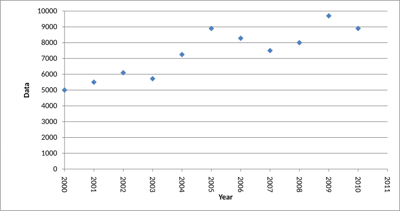
This scatterplot displays paired Data and Year values, demonstrating how points are positioned according to quantitative measurements. Gridlines and rotated labels are cosmetic additions not required for constructing a basic AP Statistics scatterplot. Source.
Steps for Constructing a Scatterplot
Students learn scatterplot construction not only to produce accurate graphs but also to develop an understanding of how graphical design choices influence data interpretation. The following sequence offers a structured approach:
Identify the two quantitative variables and determine which will serve as the explanatory and response variables.
Label the horizontal axis with the explanatory variable and the vertical axis with the response variable.
Choose scales that accommodate the full range of data for both axes.
Plot each ordered pair of values as a point on the coordinate plane, placing it according to the correct (x, y) position.
Review the plotted points for accuracy and ensure that all data values are represented.
After plotting the values, students can examine the scatterplot to begin describing characteristics such as direction, form, and strength, even though these descriptive tasks formally belong to later subsubtopics.
Interpreting a Scatterplot’s Visual Structure
Although the primary goal of this subsubtopic is the construction of scatterplots, the graphical output naturally invites initial observations. These early impressions help students understand why the scatterplot is such a useful tool in statistical analysis. At this stage, observations remain informal but set the stage for deeper analysis later.
Students might notice:
Whether points generally rise or fall as x increases.
Whether the overall layout appears linear or curved.
Whether the points are tightly clustered or widely scattered.
Whether any unusual observations stand out visually.
These insights motivate the formal descriptive and modeling techniques introduced in subsequent subtopics.
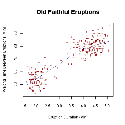
This scatterplot of Old Faithful eruption data illustrates how plotting pairs of quantitative values reveals trends and clusters. The dashed trend line is an added modeling element not required when students construct a basic scatterplot. Source.
Visualizing Relationships Using Scatterplots
A scatterplot’s primary purpose is to visualize possible relationships between two quantitative variables. Unlike tables of numbers, scatterplots reveal patterns that can suggest trends or associations. Even before performing calculations, the plotted points can hint at whether certain types of models or analyses may be appropriate. This aligns with the syllabus emphasis on using scatterplots to investigate bivariate data meaningfully and accurately.
Scatterplots also help highlight potential limitations in the data. When the plotted points do not indicate a clear pattern, or when the relationship appears weak or inconsistent, students can recognize that further statistical investigation may require caution. Identifying such features early enhances critical thinking about data analysis and interpretation.
The Role of Scatterplots in AP Statistics
In AP Statistics, scatterplots serve as a gateway to more advanced techniques such as correlation, regression, and residual analysis. Before applying these tools, constructing a high-quality scatterplot ensures that students begin with a precise and reliable visual representation of the data. This step helps validate whether additional analysis is appropriate and reinforces the fundamental practice of using graphical displays to understand and evaluate quantitative information.
FAQ
Select scales that cover the full range of each variable without compressing the data. The goal is to make patterns visually clear.
Avoid starting at zero unless the data require it; forcing a zero origin can distort the appearance of the relationship.
Use evenly spaced intervals to maintain proportionality.
A scale that is too wide or too narrow can hide trends or exaggerate noise.
When points overlap exactly, the scatterplot may hide the true frequency of those values.
Options include:
• Adding a small, random horizontal or vertical offset (jitter)
• Using semi-transparent plotting symbols
• Slightly reducing point size to prevent masking
These adjustments help reveal structure without altering the actual data.
Generally, you should not switch the axes because the roles of explanatory and response variables are conceptually important.
However, if the relationship is easier to interpret with reversed axes, you may adjust the layout as long as:
• the switch is clearly labelled
• the reasoning is explained
• it does not affect subsequent analysis
For AP Statistics, stick to the conventional arrangement except in rare cases.
In addition to obvious outliers, look for patterns such as:
• clusters of points that may indicate subgroups
• long horizontal or vertical strings of points
• sudden gaps that break an otherwise smooth pattern
Such features can reveal data-collection issues or suggest additional variables not initially considered.
Scatterplots work with any number of paired values, but interpretability increases as sample size grows.
With very small datasets (fewer than 8–10 points), patterns may appear misleading due to random variation.
Larger datasets make:
• overall form
• direction
• strength of association
easier to evaluate visually, improving the reliability of any conclusions drawn.
Practice Questions
Question 1 (1–3 marks)
A researcher records the number of hours students spent revising for a test and their corresponding test scores. They wish to construct a scatterplot.
(a) Identify which variable should be placed on the horizontal axis and explain why.
(b) State one essential feature that must be included when constructing the scatterplot.
Question 1
(a) 1 mark
• The number of hours revising should be placed on the horizontal axis because it acts as the explanatory variable used to predict test scores.
(b) 1 mark
• Any one essential feature: clearly labelled axes, appropriate scale, accurately plotted points, or an informative title.
Total: 2 marks
Question 2 (4–6 marks)
A sports scientist collects data on the speed and distance of 20 long jumps performed by athletes.
(a) Describe the steps required to construct a scatterplot of speed against jump distance.
(b) After plotting the scatterplot, the scientist observes that the points appear widely dispersed with no clear pattern. Explain what this suggests about the relationship between speed and jump distance.
(c) Explain why constructing a scatterplot is an appropriate first step before performing any further statistical modelling.
Question 2
(a) Up to 3 marks
• 1 mark: Identify the explanatory variable (speed on the horizontal axis) and response variable (jump distance on the vertical axis).
• 1 mark: Choose and apply suitable scales that accommodate all observed values.
• 1 mark: Plot each pair of values accurately as a single point.
(b) 1–2 marks
• 1 mark: States that little or no association is evident.
• 1 mark: Explains that the lack of a pattern suggests a weak or non-existent relationship.
(c) 1 mark
• Constructing a scatterplot allows the researcher to visually assess form, direction, and strength before applying more advanced statistical methods.
Total: 5–6 marks
