
AP Syllabus focus:
‘A comprehensive overview of how to describe the characteristics of a scatter plot, including form, direction, strength, and unusual features (DAT-1.A). It will elaborate on the methodology for describing the direction of the association (positive or negative), the form of the association (linear or non-linear), and the strength of the association (strong, moderate, or weak). Additionally, it will discuss how to identify and interpret unusual features in a scatterplot, such as clusters of points or points with significant discrepancies between the actual and predicted values of the response variable.’
Scatterplots reveal patterns in bivariate quantitative data, helping analysts determine whether variables appear related. Describing their characteristics supports clear communication and deeper statistical understanding.
Describing Scatter Plot Characteristics
Understanding the Purpose of Scatter Plot Description
A scatter plot displays paired observations for two quantitative variables and allows students to explore associations visually. The AP Statistics curriculum emphasizes that identifying the form, direction, strength, and unusual features of an association is essential for interpreting patterns in data. These characteristics help determine whether a relationship appears meaningful or may simply reflect random variation across observations.
Form of the Association
The form of a scatterplot refers to the general shape or pattern the data points appear to follow. Because scatterplots support the investigation of bivariate quantitative relationships, identifying form is a foundational observational step when interpreting data. The syllabus requires distinguishing between linear and nonlinear forms, as form guides the choice of analytical methods, including whether a linear model may be appropriate.
Form: The overall pattern or shape of the relationship between two quantitative variables in a scatterplot, commonly described as linear or nonlinear.
After identifying the form, students should consider whether deviations from this pattern are substantial enough to suggest alternative modeling approaches. Recognizing a nonlinear pattern, for example, may indicate the potential need for transformations or non-linear modeling techniques not covered in this subsubtopic.
Direction of the Association
The direction of the relationship describes whether the variables tend to increase or decrease together. Direction is highlighted in the AP syllabus as a core descriptive element of scatterplots and is necessary for developing later interpretations of correlation and regression.
Direction: The indication of whether two quantitative variables exhibit a positive association (increase together) or a negative association (one increases as the other decreases).
Students should look for consistent upward or downward trends that reflect directional tendencies.
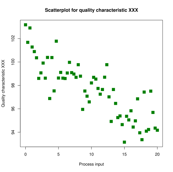
This scatterplot shows a downward, roughly linear association between two quantitative variables, illustrating a negative direction with moderate strength and natural variability. Source.
When direction is ambiguous or inconsistent across the range of data, this may signal a weak or nonexistent association.
Strength of the Association
The strength of the association describes how closely the data points follow the identified form. Strength is qualitative at this stage—terms like strong, moderate, or weak reflect how tightly points cluster around a general pattern. Strength is crucial because even a clearly positive or negative direction may have little predictive value if the relationship is weak.
Strength: The degree to which data points follow a consistent pattern or trend in a scatterplot, often described as strong, moderate, or weak.
When assessing strength, students should look for the density of points around the perceived form. Tighter clustering suggests stronger relationships, whereas widely scattered points indicate weaker associations. Strength helps determine whether a linear model could provide reasonable predictions, though formal assessment of model fit is addressed in later subsubtopics.
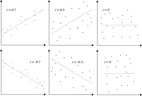
This grid illustrates differences in linear strength and direction, from strong positive to strong negative and near-zero associations, providing visual comparisons that reinforce descriptive terminology. Source.
Identifying Unusual Features
Unusual features provide critical context for interpreting scatterplots and can affect conclusions drawn about form, direction, and strength. The AP syllabus specifically lists clusters, gaps, and points with significant discrepancies as features that warrant attention. These irregularities can indicate subgroups, measurement issues, or influential values.
Common unusual features include:
Clusters: Groups of points that suggest subpopulations or distinct behavioral patterns within the dataset.
Gaps: Empty regions that interrupt otherwise continuous patterns and may signal missing values or discontinuities.
Outlying points: Observations that lie far from the general trend, potentially affecting interpretation of any association.
Points with large vertical discrepancies: Observations that differ substantially from what a trend might predict, later understood as large residuals.
Outlier (in scatterplots): A data point that deviates markedly from the general pattern of the relationship between two quantitative variables.
Unusual features may influence conclusions about trend and strength, so they must be addressed explicitly whenever students describe a scatterplot. Their presence may also suggest limitations in using a linear model or may indicate potential influential or high-leverage points, which are explored further in later topics.
Methodology for Describing a Scatterplot
To meet AP expectations, students should describe a scatterplot in a structured manner that references each major characteristic in clear, concise language. A consistent descriptive process enhances communication and ensures that essential features of the relationship are addressed.
A recommended approach includes:
Identify the form of the association (linear or nonlinear).
State the direction (positive, negative, or none).
Describe the strength (strong, moderate, weak).
Note any unusual features, such as clusters, gaps, or outliers.
Provide context-based interpretation only after all characteristics have been identified.
Normal sentences following these steps help maintain clarity when describing a scatterplot and reinforce the habits needed for formal statistical communication.
Interpreting Discrepancies Between Actual and Predicted Values
Although formal residual analysis appears later in the curriculum, the syllabus requires that students notice points with significant discrepancies between observed and predicted values. In scatterplot descriptions, these points appear vertically distant from the general pattern. Their presence suggests variability not captured by simple visual trends and highlights the importance of considering randomness and variation before making inferential claims.
Understanding these discrepancies builds foundational reasoning for later work with regression lines, residuals, and model evaluation, linking this subsubtopic to broader themes in two-variable analysis.
FAQ
Random scatter shows no consistent directional tendency, whereas a weak association still shows a very slight upward or downward trend.
To distinguish them:
Look for an overall tilt in the cloud of points.
Check whether local clusters slope in the same direction.
Consider whether removing a few extreme points changes the visible pattern dramatically.
A truly random scatter will not reveal any persistent directional structure, even when viewed in segments.
A pattern may appear roughly straight at first glance, yet small inconsistencies reveal curvature.
Watch for:
Changes in slope as x increases.
A pattern that bends slightly upward or downward at the extremes.
Residual vertical spread that systematically increases or decreases.
Mild curvature often becomes clearer when focusing on the outer sections of the scatterplot, where deviations from linearity usually appear first.
A meaningful subgroup shows a consistent internal pattern and is separated in context, not just position.
Indicators include:
Points forming a mini-trend distinct from the main group.
A gap between the subgroup and the remaining data.
Contextual variables (time, conditions, categories) that could logically explain the separation.
Random clusters tend to have no interpretable shape or explanation and blend into the overall pattern when zooming out.
Clusters and gaps signal irregular distribution across the explanatory variable, which weakens the uniformity of the relationship.
They influence strength by:
Creating areas where the association appears stronger or weaker than elsewhere.
Reducing how representative the central pattern is for the entire dataset.
Suggesting hidden variables that disrupt the overall consistency of the trend.
Even when points align well in part of the plot, irregular spacing may indicate that the association is not uniformly strong.
Such a point is best described as an unusual combination of x and y rather than an extreme value on either axis.
Characteristics include:
Falling away from the main cloud diagonally rather than vertically or horizontally.
Suggesting an atypical pairing of the two variables.
Signalling that the relationship breaks down for that observation.
This type of outlier is important because it can distort impressions of form or direction even when not extreme on a single variable.
Practice Questions
Question 1 (1–3 marks)
A scatterplot shows data on the number of hours students revise and their scores on a statistics test. The points follow a generally upward, moderately linear pattern with some spread around the trend.
Describe the direction and strength of the association between revision hours and test scores.
(3 marks)
Question 1 (3 marks total)
1 mark for stating the association is positive or upward.
1 mark for describing the association as moderately strong or moderately linear.
1 mark for referring to the presence of some variability or spread around the trend.
Question 2 (4–6 marks)
A researcher creates a scatterplot comparing the daily temperature and the number of cold drinks sold at a café. The scatterplot shows the following features:
A clear upward trend.
Points closely clustered around a roughly straight-line pattern, except for one point far below the trend at a temperature of 32°C.
A small cluster of points at very low temperatures that appear separate from the main pattern.
Using the language of form, direction, strength, and unusual features, provide a full description of the relationship displayed in the scatterplot.
(6 marks)
Question 2 (6 marks total)
1 mark for identifying the form as approximately linear.
1 mark for stating the direction is positive or upward.
1–2 marks for describing the strength as strong or fairly strong, supported by reference to points being tightly clustered.
1 mark for identifying the outlier (the point far below the trend at 32°C).
1 mark for noting the cluster of points at low temperatures as an unusual feature.
