
AP Syllabus focus: 'The correlation, r, gives the direction and quantifies the strength of the linear association between two quantitative variables, usually using technology.'
Correlation helps statisticians summarize how two quantitative variables move together. In AP Statistics, it is a numerical description of a linear pattern, so it must be interpreted carefully and always in context.
What correlation measures
The correlation condenses a two-variable quantitative relationship into a single statistic.
Correlation: The statistic that describes the direction and strength of the linear association between two quantitative variables.
Because correlation is based on paired observations, each individual in the data set must have two numerical values recorded, one for each variable. The value of comes from comparing how the two variables vary together across all observations, not from looking at either variable by itself.
A correlation is useful when the relationship is approximately straight-line in form. It is not a general measure of any kind of association; it is specifically about how well the points follow a linear pattern.
Direction
The sign of gives the direction of the linear association.
If larger values of one variable tend to occur with larger values of the other, the correlation is positive.
If larger values of one variable tend to occur with smaller values of the other, the correlation is negative.
The sign does not tell you how strong the relationship is; it tells you only the direction of the trend.
When interpreting direction, state both variables clearly. A correct interpretation always connects the sign of to what happens to one variable as the other changes.
Strength
The magnitude of tells how strongly the points follow a straight-line pattern.
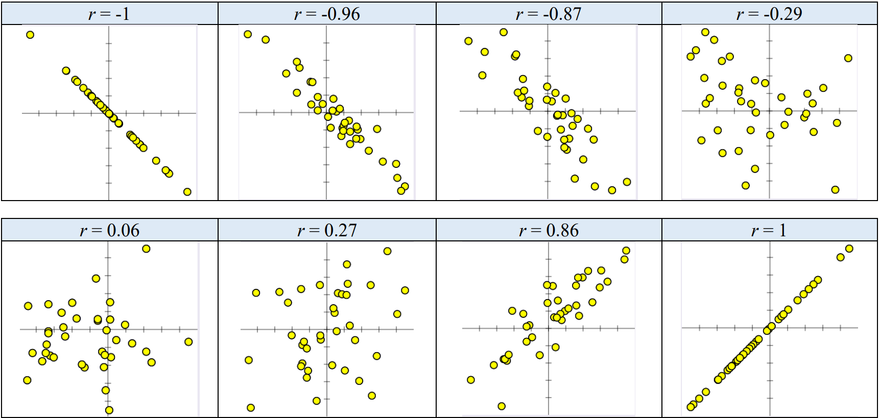
A set of scatterplots labeled with their correlation values illustrates how the sign of indicates direction (negative vs. positive trend) while the magnitude indicates strength (how tightly points cluster around a line). Comparing multiple panels helps students separate “linear tightness” from other visual features like slope or spread. Source
A stronger correlation means the points lie more closely around a line.
A weaker correlation means the points are more scattered around any straight-line trend.
Strength is about how tightly the data cluster around a line, not about whether the line would be steep or shallow.
A common mistake is to confuse strength with slope. Correlation does not describe the amount of increase or decrease in one variable for each unit of the other. Instead, it tells how well a linear pattern fits the paired data overall.
How correlation is calculated
In AP Statistics, correlation is usually found with technology. A graphing calculator or statistical software uses all of the paired data values to compute . This is important because correlation is not based on a few selected points or on visual guessing alone.
Although you will usually rely on technology, it helps to know what the calculation is doing. Correlation is built from the paired standardized values of the two variables and combines them into one overall measure of how the variables move together.
= sample correlation
= number of paired observations
= sum of the products of paired standardized values
= standardized value of the variable
= standardized value of the variable
This formula explains why correlation uses the entire data set. Each observation contributes to the calculation through its pair of standardized scores. In practice, however, AP Statistics students are generally expected to compute correlation with approved technology rather than by hand.
To calculate correlation appropriately:
Make sure both variables are quantitative.
Use data in matched pairs from the same individuals.
Enter all pairs correctly into technology.
Interpret the resulting value in context, rather than reporting the number alone.
Interpreting correlation well
A complete interpretation of correlation includes the variables, the direction, and the strength of the linear association. Good statistical writing avoids vague statements such as “the variables are related” without saying how they are related.
Useful interpretations often follow this pattern:
identify the two quantitative variables
describe the direction using the sign of
describe the strength of the linear association
connect the interpretation to the real setting
Correlation is a descriptive statistic. It summarizes a pattern in observed data, but it does not explain why the pattern exists. A strong correlation can be scientifically interesting, but the value of alone does not provide an explanation for the relationship.
Limits of correlation
Correlation is powerful because it turns a cloud of points into a single number, but that simplicity also creates limits. A value of should not be used without considering the data structure it is summarizing.
Keep these cautions in mind:
Correlation applies only to two quantitative variables.
It measures only linear association.
A single value of cannot show the full appearance of a scatterplot.
Correlation should support, not replace, a visual look at the data.
If the relationship is curved rather than straight, correlation may not describe it well. That is why technology output should be interpreted together with a graph whenever possible. In AP Statistics, understanding correlation means knowing both what the statistic tells you and what it leaves out.
Practice Questions
A study records the number of hours of sleep and reaction time for each student. Technology reports .
What does this value tell you about the relationship between hours of sleep and reaction time? [2 marks]
1 mark for identifying the negative direction: students who sleep more tend to have lower reaction times, or students who sleep less tend to have higher reaction times.
1 mark for describing the relationship as a strong linear association.
For 15 used laptops, = age in years and = resale price in dollars. A calculator gives .
(a) State what the correlation measures in this setting. [2 marks]
(b) Interpret in context. [2 marks]
(c) Explain why the correlation value alone should not be the only evidence used to describe the relationship. [1 mark]
(a)
1 mark for stating that correlation measures the direction of the linear association.
1 mark for stating that correlation measures the strength of the linear association between two quantitative variables, here age and resale price.
(b)
1 mark for correctly interpreting the negative direction in context: as laptop age increases, resale price tends to decrease.
1 mark for describing the association as moderate negative linear association.
(c)
1 mark for explaining that correlation is only a single numerical summary of linear association, so a graph is also needed to see the actual pattern of the data.
FAQ
Correlation measures how two variables vary together, not which one comes first.
In the calculation, the paired standardized values are multiplied, and $z_{x}z_{y}=z_{y}z_{x}$. Because of that symmetry, swapping the variables does not change the value of $r$.
No. Reordering the observations does not change the correlation as long as each $x$ value stays matched with its original $y$ value.
Correlation depends on the full set of paired observations, not the sequence in which they appear in the list.
Correlation relies on standardized values, and standardizing uses the standard deviation.
If one variable is constant, its standard deviation is $0$, so the standardization step breaks down. Also, if a variable does not vary at all, there is no meaningful way to measure how it changes with another variable.
With a small number of observations, the value of $r$ can change noticeably if just a few points shift.
With a larger sample, the computed correlation is usually more stable and gives a more reliable description of the overall linear pattern in the observed data.
Yes. Correlation compresses a pattern into one number, so different point arrangements can produce the same or very similar $r$ values.
For example, one plot might look fairly even while another has clusters or gaps, yet both can have similar correlation. That is one reason a graph should accompany the numerical value.
