
AP Syllabus focus: 'Linearity'
Correlation is powerful only when the relationship between two quantitative variables is reasonably straight. This page focuses on linearity, the key condition that makes correlation an informative summary.
Why Linearity Matters
Correlation is often represented by , but its usefulness depends on shape. It is designed to summarize how closely points follow a straight-line pattern in a scatterplot. If that basic shape is missing, the number can hide important structure instead of clarifying it.
A relationship can be strong in a general sense without being linear. For AP Statistics, this distinction matters because correlation is not a measure of any kind of association. It is a measure of linear association only.
Linearity: A relationship between two quantitative variables is linear when the overall pattern in a scatterplot is reasonably well described by a straight line.
The phrase reasonably well is important. Real data rarely fall exactly on a line. Small deviations are normal, and some scatter is expected. What matters is whether a straight line captures the main pattern without missing a clear bend or curve.
What an approximately linear pattern looks like
In an approximately linear relationship:
the points show a steady upward or downward trend
there is no obvious U-shape, arch, or leveling-off pattern
the scatter around an imagined straight line is not dominated by systematic curvature
a straight line would describe the overall direction of the data sensibly
If these features are present, correlation can summarize strength and direction effectively. If not, its value becomes much less informative.
It is also important to separate shape from strength. A relationship can be linear but weak if the points are widely scattered around a line. It can also be linear and strong if the points stay close to a line. Before judging strength, first judge whether the form is actually linear.
When Correlation and Linearity Do Not Match
A common mistake is to treat a small correlation as evidence that two variables are unrelated. That statement is too broad. A small value of only suggests that there is little linear association. It does not rule out a clear nonlinear pattern.
Why a strong relationship can have a weak correlation
Correlation works by detecting straight-line movement. When a scatterplot bends, rises and then falls, or curves sharply, the linear signal may weaken even if the points follow a very clear pattern. In that situation:
the variables may still be closely connected
the association may still be highly predictable
the value of may understate that pattern because the form is not linear
This is why a scatterplot should be examined before using correlation as a summary. The graph reveals whether a straight-line description is appropriate.
Nonlinear patterns that cause problems
Several shapes can make correlation misleading:
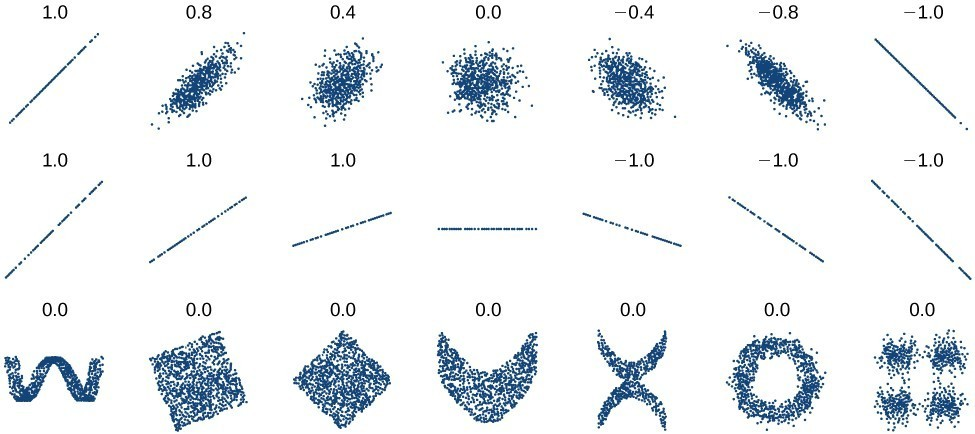
A panel of scatterplots illustrating how Pearson’s correlation coefficient changes with different point-cloud shapes. The top row shows increasingly strong linear patterns as approaches 1, while the bottom row shows structured but nonlinear patterns (e.g., U-shapes and circles) that can yield . This makes clear why you must judge form (linearity) from the scatterplot before trusting . Source
U-shaped patterns
inverted U-shaped patterns
patterns that increase quickly and then level off
patterns that decrease quickly and then flatten
relationships made of curved sections rather than one straight trend
In each case, the issue is not that the data lack structure. The issue is that the structure is not straight enough for correlation to describe it well.
A pattern can even seem to move generally upward overall but still fail the linearity condition. If the increase changes direction or rate in a noticeable way, a straight line may still be a poor summary.
Judging Linearity from a Scatterplot
When you look at a scatterplot, focus first on form. Before thinking about the size of , ask whether the data could be represented sensibly by a straight line. This is a visual judgment, not a rigid numerical rule.
Questions to ask
Does the cloud of points have an overall straight shape?
Is there a noticeable bend across the range of the data?
Would drawing one straight line miss an important part of the pattern?
Do the points suggest one line, or do they suggest a curve?
If the answers support a straight-line description, correlation is appropriate. If the plot clearly curves, reporting correlation alone is incomplete and can be misleading.
This also explains why two data sets can have similar correlations but very different scatterplots.
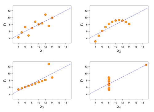
Anscombe’s quartet: four scatterplots constructed to have nearly identical summary statistics (including the same Pearson correlation) but visibly different forms. One plot is roughly linear, another is clearly curved, and others are dominated by an outlier or a high-leverage point. The figure emphasizes that similar values of do not guarantee similar linearity—or even a similar story in the data. Source
The same value of does not guarantee the same shape. One data set may be genuinely linear, while another may produce a similar number even though its form is curved.
Interpreting Correlation with Linearity in Mind
The value of should always be interpreted as a statement about linear association.
A value of close to means a strong positive linear pattern.
A value of close to means a strong negative linear pattern.
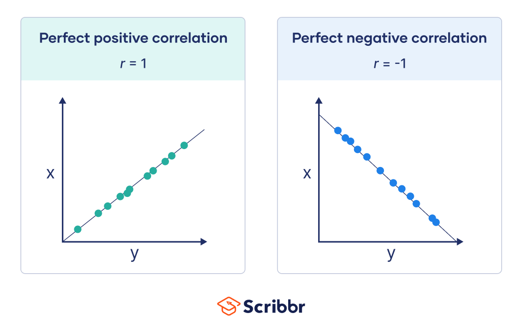
Side-by-side scatterplots showing perfect positive and perfect negative linear correlation. In each panel, all points fall exactly on a straight line, illustrating the idealized meaning of and . This visual anchors the interpretation of correlation as a statement about linearity rather than general association. Source
A value of close to means little or no linear pattern.
The final bullet is especially important. It does not mean there is no relationship at all. It means that a straight line does not describe the relationship well.
Because of this, correlation should never be used as the first or only tool for understanding the relationship between two quantitative variables. The scatterplot comes first because it shows whether linearity is a reasonable assumption. Only after that visual check does the value of become meaningful.
Common Errors About Linearity and Correlation
Students often lose accuracy by making statements that are too broad. Watch for these mistakes:
saying “the variables are not related” when is near
using correlation without first checking the scatterplot
describing a strong curved relationship as weak just because is small
assuming a relationship must be linear because the points generally move upward or downward
forgetting that correlation summarizes one specific form of association rather than every possible form
A careful AP Statistics response should connect the number and the graph. If linearity is present, correlation is a valuable summary. If linearity is absent, the scatterplot must take priority over the numerical value of .
Practice Questions
A scatterplot of two quantitative variables is strongly U-shaped, but a calculator gives . Explain why it is incorrect to conclude that the variables have no relationship. [2 marks]
1 mark: States that correlation measures linear association only.
1 mark: Explains that a strong nonlinear or U-shaped relationship can exist even when is close to .
A researcher studies two pairs of quantitative variables.
Set A: The scatterplot shows points closely clustered around a downward-sloping straight line.
Set B: The scatterplot shows points following a clear curved pattern that rises quickly and then levels off.
(a) For which set is correlation an appropriate summary of the relationship? Explain. [2 marks]
(b) Which set could reasonably have a value of closest to ? Explain. [2 marks]
(c) A student says, “Set B must have a large positive correlation because the variables increase together.” Evaluate this statement. [1 mark]
(a)
1 mark: Identifies Set A.
1 mark: Explains that Set A is approximately linear, while Set B is nonlinear.
(b)
1 mark: Identifies Set A.
1 mark: Explains that close to indicates a strong negative linear relationship, matching the downward straight-line pattern in Set A.
(c)
1 mark: States that the claim is not necessarily correct because an increasing curved pattern may still have a correlation that does not fully reflect the strength of the relationship.
FAQ
There is no single cutoff. The decision is based on whether a straight line captures the main pattern without missing an obvious bend.
If the curve is mild and the points still look roughly straight overall, using correlation may be reasonable.
If the bend is visually clear across the plot, correlation is no longer a good summary by itself.
Yes. Correlation reduces a relationship to one number, so different shapes can sometimes produce the same or similar values of $r$.
That is why scatterplots matter. A single number cannot show:
curvature
gaps
separate groups
unusual shapes
A graph provides structure that correlation alone cannot capture.
A calculator applies the formula mechanically. It does not decide whether the linearity condition makes the result meaningful.
That judgment belongs to the statistician or student.
So a calculator output is not automatically an acceptable interpretation. You still need to inspect the scatterplot first and decide whether a straight-line summary makes sense.
A change of units such as inches to centimeters or pounds to kilograms does not destroy linearity.
Correlation is unchanged by multiplying a variable by a positive constant or adding a constant, so unit changes of that type do not alter the value of $r$.
The scatterplot scale changes, but the basic straight-line pattern remains the same.
Yes. A curved relationship can appear almost straight when you view only a limited portion of it.
This means a restricted range may hide nonlinearity that would be visible in a wider data set.
For that reason, judgments about linearity should consider the full range of observed values whenever possible, not just a small segment that happens to look straight.
