
AP Syllabus focus: 'A complete scatterplot description includes form, direction, strength, and unusual features such as clusters or points with large discrepancies from predicted values.'
Scatterplots do more than show a general trend. To describe them well, you must also notice unusual features that may affect interpretation, suggest subgroups, or show that the overall pattern is incomplete.
Why unusual features matter
A complete scatterplot description is not finished when you name form, direction, and strength. You must also look for unusual features because they can change what the graph means. A scatterplot may seem to show one simple association, but separated groups or unexpected points can reveal that the relationship is less uniform than it first appears. In AP Statistics, a strong description is specific. Instead of stopping with “positive, fairly strong, linear,” add whether there are clusters, gaps, or points that do not follow the main pattern. This makes your description more accurate and better supported by the graph.
Unusual feature: A part of a scatterplot that does not fit the main visual pattern, such as a cluster, a gap, or a point far from the overall trend.
One useful habit is to scan the entire graph before focusing on the main trend. This helps prevent you from overlooking important exceptions.
Common kinds of unusual features
Clusters
A cluster is a group of points that lie close together and seem separated from other groups.
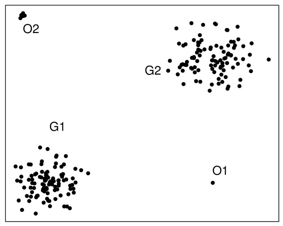
An example of a scatterplot with two distinct clusters (labeled and ) and points that deviate strongly from the clusters (labeled and ). This supports describing not just form and direction, but also unusual features such as separated groups and points that do not follow the main structure. Source
Clusters matter because they may suggest that the data include different subgroups, even though both variables on the axes are quantitative. For example, the observations might come from different populations, conditions, or time periods. If two clusters are present, a single overall description may hide important structure. Each cluster may follow its own pattern, or the overall association may be driven mainly by the separation between the groups rather than by one smooth relationship across all points.
Cluster: A group of points close together in a scatterplot that appears separated from other observations.
When you report clusters, describe where they appear on the graph and whether they seem clearly separated or only loosely grouped.
Gaps
A gap is a region of the scatterplot where few or no observations appear. Gaps can separate clusters, indicate that certain combinations of values did not occur, or show that the data do not fill the graph smoothly.
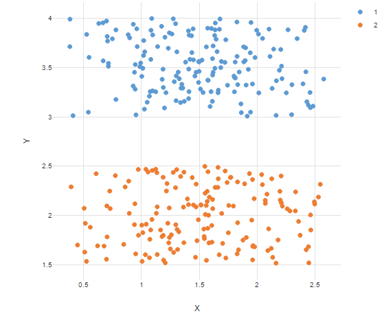
A scatterplot where points form two well-separated clusters, emphasized using different colors and a legend. This kind of visual separation is exactly what you would report as an unusual feature because a single overall description may hide subgroup structure. Source
A gap is worth mentioning when it stands out visually and changes how the overall pattern should be described. However, you should not guess the reason for the gap unless context is provided.
Points with large discrepancies from predicted values
Some scatterplots have a point that lies far above or far below the pattern suggested by most of the other points. In the language of the syllabus, this is a point with a large discrepancy from a predicted value. Here, the predicted value means the approximate -value you would expect from the overall visual trend at that particular -value. You do not need a formal regression equation to notice this feature.
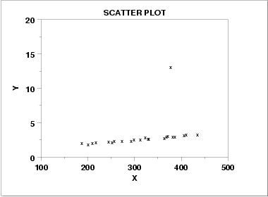
A scatterplot in which most points follow an approximately linear pattern, but one point lies far from that trend (an outlier). Visually, this is the kind of observation that would have a large residual (a large discrepancy between the observed and the predicted by the overall pattern). Source
A point can be unusual because it does not match the main pattern, even if it is not the highest or lowest point on either axis. What matters is its position relative to the trend. For example, a point may sit near the middle of the x-values yet fall well below the rest of a positive association. Such a point should be named in your description because it may weaken the apparent strength of the relationship or show that one observation behaves differently from the others.
Changes in the pattern
Sometimes the unusual feature is not a single point or a separate cluster, but a section of the graph where the relationship changes. The points may follow one pattern for smaller values of and a different pattern for larger values of , or the spread may widen in one part of the graph. When this happens, the scatterplot is not fully described by one simple statement. Mentioning the changed pattern shows that you are reading the graph carefully rather than forcing the data into one description.
How to describe unusual features well
A strong AP Statistics response usually moves from the big picture to the exceptions. When you describe unusual features, try to do the following:
Briefly state the overall association, then add the unusual feature.
Name the feature precisely, such as cluster, gap, or point far from the overall pattern.
Locate it using approximate position, such as “in the upper-right” or “around moderate -values.”
Explain how it compares with the main pattern, such as “well below the positive trend” or “separated from the rest of the data.”
Keep your wording visual and statistical. Do not claim a cause unless the context supports it.
Specific descriptions are better than vague ones. “There is one point far below the general upward trend at a high -value” is stronger than “There is an unusual point.”
Common mistakes to avoid
Students often notice the general trend but miss the exceptions. Watch for these errors:
Calling a point unusual only because it has a large -value or large -value. A point should be judged by the overall pattern, not just by being extreme on an axis.
Mentioning a cluster without saying that it is separated from other points.
Ignoring a clear gap that breaks the data into parts.
Using unsupported explanations such as “this happened because the person was careless” when the graph alone cannot show that.
Giving a description that is too broad, such as “linear,” when a cluster or unusual point makes the relationship more complicated.
The best descriptions show that you can see both the main association and the features that do not fit neatly within it.
Practice Questions
A student writes, “The scatterplot shows a strong positive linear association.” The graph also contains one point far below the overall pattern at a large value of .
Identify one important part of the scatterplot description the student omitted, and describe it.
1 mark for identifying that the student omitted an unusual feature.
1 mark for describing the unusual feature as one point far below the overall positive trend, or as a point with a large discrepancy from the predicted value.
A scatterplot shows the relationship between practice time and performance score for 24 students. Most points show a positive association. Eight points form a group in the lower-left of the graph, 14 points form a second group in the upper-right, and there are almost no points between these groups. One point in the upper-right group has a much lower score than expected based on the overall pattern of that group.
(a) Describe the unusual features in the scatterplot. (3 marks)
(b) Explain why saying only “there is a positive association” is an incomplete description. (2 marks)
Part (a):
1 mark for identifying two clusters.
1 mark for identifying a gap or very few points between the clusters.
1 mark for identifying one point with a large discrepancy from the expected pattern in the upper-right group.
Part (b):
1 mark for explaining that the clusters suggest different subgroups or that the relationship is not one uniform pattern.
1 mark for explaining that the unusual point should be mentioned because it does not follow the pattern and affects the completeness of the description.
FAQ
Yes. Sometimes an unusual point comes from a data-entry error, a wrong unit, or a recording problem.
Before dismissing it, check the original source if possible. If the value is correct, it should usually remain in the data and be interpreted as a real part of the scatterplot.
Axis scales can visually stretch or compress the plot. A wide scale may hide a gap or make a separated point seem less noticeable.
A narrower scale can make the same feature stand out much more clearly. This is why scatterplots should be read carefully rather than judged only by first impression.
There is no fixed cutoff. A cluster is identified visually, not by a strict rule.
In practice, you should look for a group of points that is close together and reasonably separated from other points. With very small data sets, be more cautious about labeling a cluster.
If the clusters match known categories in the context, separate analysis may make sense. For example, the groups could represent different populations or conditions.
If no meaningful grouping variable is known, you can still mention the clusters in your description, but you should avoid assuming too much about why they appear.
Yes. In small samples, random variation can create an apparent gap or isolated point that looks important at first.
With more observations, the pattern may fill in and the feature may seem less unusual. On the other hand, if the feature reflects a real subgroup or a genuine exception, it may remain visible even after more data are added.
