
AP Syllabus focus:
‘This part focuses on the critical understanding that a correlation coefficient close to 1 or -1 does not necessarily mean that a linear model is appropriate for the data (DAT-1.B.3). It will discuss scenarios where the correlation might be misleading and the importance of visualizing data to confirm the appropriateness of a linear model.’
A strong or weak correlation can easily be misinterpreted, so understanding its limitations is essential for avoiding incorrect conclusions about relationships in quantitative data.
Misinterpretations of Correlation
Understanding Why Correlation Can Be Misleading
The correlation coefficient, introduced here as correlation (r), measures the direction and strength of a linear association between two quantitative variables. Students often assume that a large positive or negative value of r guarantees a meaningful linear model, but the specification emphasizes that this assumption can be incorrect. A high magnitude of r does not ensure that the relationship is linear, meaningful, or suitable for prediction.
Correlation (r): A numerical measure describing the direction and strength of the linear association between two quantitative variables.
Because correlation reflects only linear relationships, it can disguise nonlinear patterns or structural irregularities in the data. Even datasets with identical values of r can have extremely different shapes, distributions, and suitability for linear modeling.
Anscombe’s quartet displays four datasets with nearly identical summary statistics—including correlation and regression lines—yet with very different shapes and patterns. This demonstrates that the same correlation value can describe relationships that differ fundamentally in form and linear suitability. It emphasizes the need to visualize data rather than rely on correlation alone. Source.
When Correlation Creates False Confidence
A common misunderstanding arises when students interpret a correlation value near 1 or –1 as evidence that two variables follow a linear pattern. The syllabus specifically warns that “a correlation coefficient close to 1 or -1 does not necessarily mean that a linear model is appropriate.” This highlights the need to inspect the full context and structure of the data rather than relying on r alone.
Key reasons correlation may be misleading include:
Nonlinear relationships: Variables may have a strong association that is curved rather than linear.
Clusters within data: Multiple subgroups can inflate or obscure correlation strength.
Outliers: A single outlier can dramatically increase or decrease the value of r without representing the general pattern.
Restricted ranges: Limiting the data to a narrow set of values can alter or distort the measured correlation.
These scenarios illustrate the limitations of correlation as a sole diagnostic tool.
Importance of Visualizing the Data
The specification underscores the necessity of visualizing data, particularly through scatterplots, before deciding whether a linear model is appropriate. A scatterplot allows students to examine form, direction, and strength while also observing any unusual features that correlation alone cannot capture.
Visualization helps reveal:
Whether the relationship appears linear, curved, or random
Whether certain groups of points follow different trends
Whether influential or extreme points are present
Whether a straight line would reasonably reflect the overall pattern
Because correlation cannot communicate any of these essential features, visual inspection becomes a critical step in preventing misinterpretation.
Outliers and Their Distorting Effects
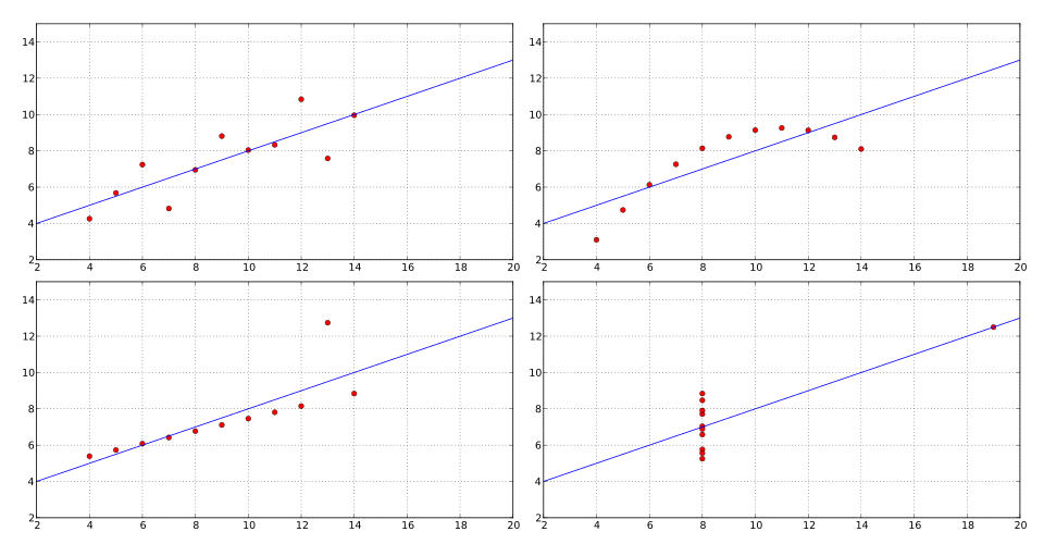
One important source of misinterpretation involves outliers, which can disproportionately influence linear correlation. When an extreme data point lies far from the cluster of other observations, correlation may be artificially strengthened or weakened.
Outlier: A data point that deviates markedly from the general pattern of the rest of the observations.
After recognizing this definition, it becomes clear that relying solely on r in the presence of outliers could lead students to draw conclusions that do not reflect the true structure of the data.
Since correlation assesses only the strength of a linear trend, it ignores curvature and other non-linear patterns.
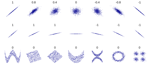
This figure shows scatterplots with similar or identical correlation coefficients but different slopes, shapes, and noise levels. Some panels include nonlinear structures, illustrating how correlation alone cannot describe curved relationships. These variations reinforce that correlation reflects only linear association, not overall form. Source.
Correlation and the Shape of the Association
Since correlation assesses only the strength of a linear trend, it ignores curvature and other non-linear patterns. A dataset might show an impressive absolute value of r, yet the scatterplot might reveal a shape that bends, curves, or changes direction. In these cases a linear model becomes inappropriate despite a seemingly strong numerical summary.
Students should carefully evaluate:
The form of the relationship
Whether a straight line fits the pattern
Whether a transformation or nonlinear model might be more appropriate
Whether the data are too variable to support any simple model
Understanding these points prevents overreliance on correlation values.
Correlation Does Not Confirm the Suitability of a Linear Model
The specification stresses that a strong correlation coefficient cannot validate a linear model on its own. Even when r suggests a strong linear association, a proper assessment requires:
Reviewing the scatterplot
Identifying any patterns inconsistent with linearity
Considering variations or deviations across the range of x
Examining whether certain segments of the data behave differently
Visual checks make it possible to determine whether the apparent strength measured by r reflects a genuine linear trend or if it is distorted by underlying structures.
Avoiding Overgeneralized Interpretations of Correlation
Students must avoid what is perhaps the most widespread misconception: the belief that correlation alone can determine model appropriateness or causality. While correlation quantifies the direction and strength of linear association, it does not describe form, account for outliers, or demonstrate causation. A high value of r provides only one piece of the analytical puzzle and must be interpreted with caution and context.
Practices for Responsible Interpretation
To apply correlation responsibly, students should:
Always pair correlation values with graphical analysis
Examine the full distribution of data points rather than summary values alone
Remain cautious of extreme observations, clusters, and nonlinear shapes
Confirm that a linear model aligns with the observed structure of the data
Remember that strong correlation does not imply causation or appropriateness of prediction
These practices align directly with the syllabus emphasis on understanding the limitations of correlation and the importance of visual inspection before selecting a linear model.
FAQ
Correlation reflects only the strength and direction of a linear trend, not the degree to which individual points tightly follow a predictable pattern.
Two datasets may share a similar correlation value yet differ because of:
The spread of points around the trend
The presence of subgroups or clusters
Differences in variability across the range of x
Predictability depends on how consistently the relationship behaves, not just the numerical value of the correlation.
Correlation is unit-free, but differences in scale can conceal structural elements of the relationship.
If one variable changes slowly and another changes rapidly, a moderate or strong correlation may appear even when the underlying behaviour is inconsistent across the range of data.
Scale differences can also hide or exaggerate curvature or threshold effects, leading to an incorrect assumption that a linear model is suitable.
Several curved forms can present a misleadingly high correlation value:
Gently curved relationships that approximate a line
Exponential or logarithmic patterns that rise or fall steadily
Quadratic patterns with a wide, shallow curve
Because these curves increase or decrease consistently over part of their range, the correlation coefficient may appear strong even though the relationship is not linear.
Clusters can inflate or obscure correlation by mixing distinct subpatterns into a single numerical summary.
If two different groups both show internal structure but differ in location or direction, the combined dataset may:
Show a stronger correlation than either group alone
Mask opposing trends between groups
Produce an apparent linear trend where none truly exists
The correlation value then reflects the arrangement of groups rather than a genuine relationship.
Restricting the range reduces visible variability, which typically weakens the observed correlation.
A narrower range:
Limits the ability to detect trends
Makes data appear more scattered relative to the available scale
Reduces the contrast needed to capture the true strength of association
As a result, the correlation coefficient understates the real relationship, giving the false impression of weak or no association.
Practice Questions
A data set has a correlation coefficient of 0.93. A student claims this means a linear model is definitely appropriate for describing the relationship between the variables. Explain why this conclusion may be incorrect. (1–3 marks)
Question 1 (1–3 marks)
Award up to 3 marks as follows:
1 mark: States that correlation measures only linear association.
1 mark: States that a high correlation does not guarantee that the relationship is linear.
1 mark: Refers to the need to inspect a scatterplot or mentions potential issues such as non-linear patterns, outliers, or clusters.
Full marks require a clear explanation that correlation alone cannot confirm linear suitability.
A researcher collects data on two quantitative variables and finds a correlation coefficient of −0.87. A scatterplot of the data, however, shows a curved pattern with one high-leverage point on the far right of the graph.
(a) Explain how the curved pattern affects the interpretation of the correlation coefficient.
(b) Explain how the high-leverage point could influence the value of the correlation coefficient.
(c) Using both features, discuss why correlation alone is insufficient for determining whether a linear model is suitable.
(4–6 marks)
Question 2 (4–6 marks)
Award marks for each part:
(a) (1–2 marks)
1 mark: States that correlation describes only the strength of linear association.
1 mark: Explains that a curved pattern means the relationship is not linear, so the correlation coefficient is misleading or not appropriate.
(b) (1–2 marks)
1 mark: Identifies that a high-leverage point can strongly influence the correlation coefficient.
1 mark: Explains that it may artificially increase or decrease the value of the correlation, distorting the apparent strength of the relationship.
(c) (2 marks)
1 mark: States that correlation alone cannot determine the suitability of a linear model.
1 mark: Explains that visual inspection (e.g., scatterplot) is needed to detect non-linear form, unusual features, or influential points.
Full marks require clear explanations connecting both the curved pattern and the high-leverage point to the limitations of correlation.
