
AP Syllabus focus: 'Transformations of variables can create data sets that are more linear in form than the original untransformed data.'
Some relationships between two quantitative variables are clearly patterned but too curved for a straight-line model. Transforming one or both variables can make the overall form more nearly linear and easier to study.
Why transformations are used
Many statistical methods for two quantitative variables work best when a scatterplot has an approximately straight-line pattern. In real data, though, the association may be smooth but curved. One variable might rise very quickly and then level off, or change slowly at first and then increase rapidly. That kind of pattern is not random, but it is not linear either. This idea matters because many linear-model tools are designed for straight-line relationships.
A curved association may suggest using a transformation.
Transformation: A mathematical change applied to every value of a variable so the data are represented on a new scale.
A transformation must be applied consistently to every value of the variable. You cannot transform only selected observations. The goal is not to force a perfect line. Instead, the goal is to reduce curvature enough that a straight-line description becomes reasonable and useful.
When a transformation may help
A transformation is most helpful when the original scatterplot shows a clear, smooth bend. Common signs include:
the points follow an upward or downward curve rather than a straight path
the rate of change is not roughly constant across the graph
equal increases in one variable are associated with multiplying, not adding, changes in the other
the pattern resembles exponential growth, exponential decay, or a power relationship
If the plot has no clear form and mostly looks random, a transformation usually will not help. Transformations address systematic nonlinearity, not a lack of association.
Common transformations used in AP Statistics
In AP Statistics, the most common transformations are:
taking the logarithm of the response, such as plotting against
taking the logarithm of the explanatory variable, such as plotting against
taking logarithms of both variables, such as plotting against
taking a square root, such as using or sometimes
These transformations usually compress large values more than small values. That change in spacing is often what straightens a curved pattern.
Transforming the response variable
When changes by multiplicative factors or by roughly constant percentages as changes, plotting against may produce a more linear pattern.
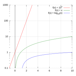
A semi-log plot (logarithmic -axis, linear -axis) showing how different functions appear when one axis is logarithmic. The key takeaway is that an exponential relationship becomes a straight line on a log–linear scale, which is exactly why plotting versus can reduce curvature and make linear modeling reasonable. Source
This is often useful when the response grows or decays quickly.
Transforming the explanatory variable
When the effect of is very strong for small values and then weakens as gets larger, plotting against may help. This spreads out crowded lower values on the horizontal axis.
Transforming both variables
Some relationships become more nearly linear only when both variables are transformed. A plot of against is often helpful when one variable changes as a power of the other.
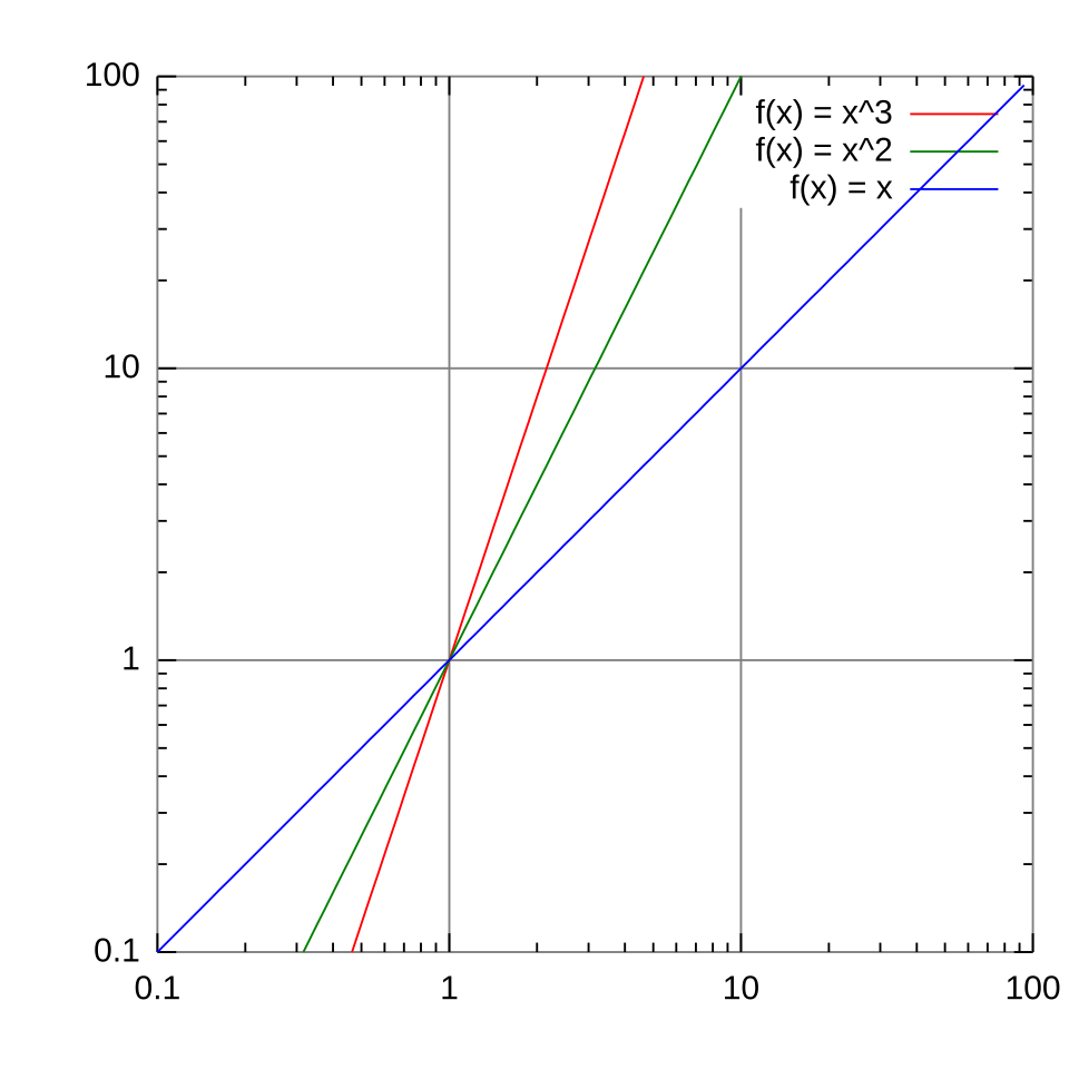
A log–log plot illustrating that power functions (e.g., , , ) appear as straight lines when both axes are logarithmic. This visual reinforces why plotting versus is a standard way to detect and model power-law-type relationships with a straight-line pattern. Source
The key idea is not memorizing every case, but recognizing that a curve on one scale may be straighter on another.
What a transformation changes
A transformation does not change which observations are paired together. The same individuals remain in the data set, and the overall direction of the association is usually preserved for the common transformations used in AP Statistics.
What does change is the spacing along an axis. Large values may be pulled closer together, while smaller values may be spread apart. Because curvature often comes from uneven spacing, changing the scale can turn a bent pattern into one that looks approximately straight.
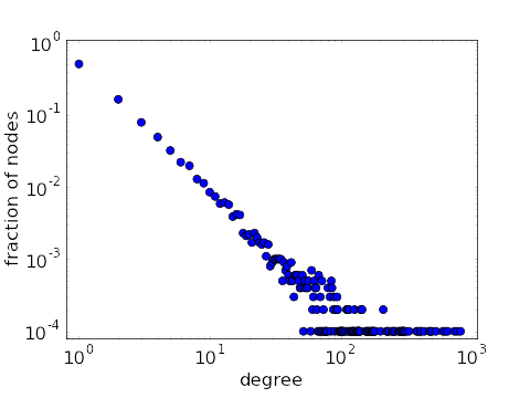
A scatterplot on log–log axes where the points fall roughly along a straight line, indicating an approximately power-law relationship on the transformed scale. This is a concrete example of how transforming both axes changes the spacing and can make a curved pattern on the original scale look close to linear. Source
This is why transformed plots can reveal structure that is hard to see on the original scale.
How to describe transformed data
When discussing a transformed graph, state clearly which variable was transformed. A correct description says that “the plot of versus is approximately linear,” not that “the original variables are linear.” The relationship is being viewed on a transformed scale, so the wording must match that scale.
Clear labels matter. If both variables are transformed, the axes should reflect that. Otherwise, readers may confuse the transformed relationship with the original one and misinterpret what the graph shows.
Choosing a useful transformation
There is no rule that guarantees a single best transformation in every situation. Several transformations can be reasonable, and more than one may improve linearity. Statisticians try reasonable transformations and examine whether the new plot has a straighter overall form.
A useful transformation generally does the following:
reduces obvious bending in the scatterplot
makes the association easier to describe with a line
keeps the pattern understandable in context
avoids creating a graph that is harder to interpret than the original
If the transformed scatterplot still has strong curvature or multiple distinct shapes, then the transformation has not adequately improved linearity.
Cautions and limitations
Transformations are helpful, but they are not a universal fix.
They do not create a real relationship if the variables are not meaningfully associated.
They do not automatically remove unusual observations.
They may be inappropriate for some data values, especially logarithms when zero or negative values are present.
They change the measurement scale, so interpretation must be made with care.
They should be used to clarify structure, not to hide inconvenient features of the data.
In AP Statistics, the main purpose of transformation is simple: to see whether a relationship that appears curved in its original form can be represented more effectively by a line on a new scale.
Practice Questions
A scatterplot of population size versus time curves upward, with larger and larger increases as time passes. Suggest a transformation that could make the relationship more linear, and state what you would look for in the transformed plot. [2 marks]
1 mark for suggesting a logarithmic transformation of the response, such as plotting versus
1 mark for stating that the transformed plot should appear more nearly linear or straighter
A student measures the diameter and mass of several spherical objects. The scatterplot of versus is curved upward. After plotting versus , the points lie close to a straight line.
(a) Explain why transforming the data was reasonable.
(b) Identify which variables were transformed.
(c) State what the new scatterplot suggests about linearity.
(d) Give one caution the student should mention when reporting the result. [5 marks]
1 mark for explaining that the original relationship showed a clear pattern but was nonlinear or curved
1 mark for identifying that both and were transformed using logarithms
1 mark for stating that the relationship is approximately linear on the transformed, log-log scale
1 mark for recognizing that this does not mean the original variables are linear in their original units
1 mark for one valid caution, such as:
the axes must be labeled as transformed variables
unusual observations may still matter
interpretation must be made on the transformed scale
FAQ
In an exponential relationship, equal increases in $x$ multiply $y$ by a constant factor instead of adding a constant amount.
Taking a logarithm turns multiplication into addition. That means equal changes in $x$ can produce roughly equal changes in $\log(y)$, which is why the transformed pattern often looks much straighter.
Usually, no.
For positive data, changing from base 10 to base $e$ or another base only rescales the logged values by a constant factor. The numerical slope and intercept of a fitted line will change, but the basic linear appearance of the transformed scatterplot will usually stay the same.
A logarithm cannot be taken for zero or negative values.
In that situation, you should:
consider a different transformation
reconsider whether a linear model is appropriate
avoid adding a constant unless the context specifically justifies it
In AP Statistics, arbitrary adjustments are usually not the focus unless they are clearly described.
It is a transformation, but not usually one that helps linearize data.
A unit conversion multiplies or shifts all values in a simple way. That changes the scale of the axes, but it does not usually remove curvature. So converting units may change the numbers, but it typically does not change a nonlinear pattern into a linear one.
A good habit is to keep the original variables and create new columns or lists for transformed values.
For example:
store the original data as $x$ and $y$
create new lists such as $\log(x)$, $\log(y)$, or $\sqrt{y}$
label the transformed variables clearly
This helps you compare original and transformed plots without losing the raw data or confusing one scale with another.
