This section explores the criteria for selecting appropriate data presentation methods and provides an in-depth discussion on the merits and limitations of various data representation types.
Criteria for Choosing Data Presentation Methods
- Purpose of Data: Select method based on whether you're showing trends, comparisons, or distributions.
- Nature of Data: Whether it's qualitative/quantitative or continuous/discrete matters.
- Audience Understanding: Use simpler methods for audiences less familiar with statistics.
- Simplicity vs Detail: Aim for a balance between being detailed and being clear.
Data Representation Pros and Cons
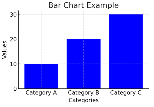
Bar Charts
- Pros: Easy to make and understand. Good for discrete categories.
- Cons: Not for continuous data. Can mislead if scales vary.
Ilustration
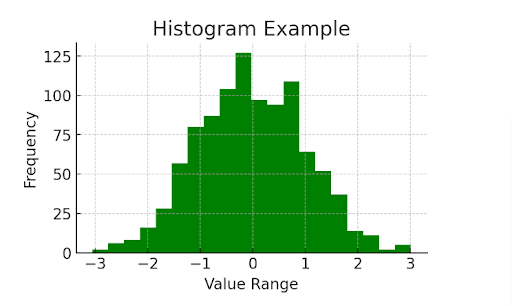
Histograms
- Pros: Great for continuous data distributions. Shows frequency within ranges.
- Cons: Requires understanding bin sizes. Not for categorical data.
Illustration
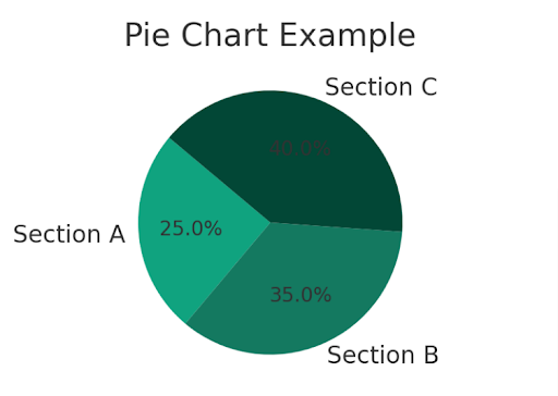
Pie Charts
- Pros: Visually good for showing proportions. Good for parts of a whole.
- Cons: Not great for many categories. Hard to compare multiple pie charts.
Illustration
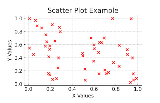
Scatter Plots
- Pros: Shows variable relationships and trends.
- Cons: Can be complex. Not for individual data point representation.
Illustration
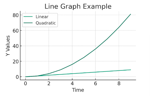
Line Graphs
- Pros: Excellent for trends over time. Can show multiple data sets.
- Cons: Not for categorical data. Cluttered with too many points.
Illustration
Example Questions
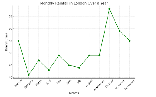
Example 1: Monthly Rainfall in London Over a Year
- Problem: Choose a method to show London's monthly rainfall.
- Data: Monthly rainfall in millimeters.
- Choice: Line graph for continuous data and trend illustration.
- Why: Shows data flow over time and highlights rainfall variations.
- Graph Details: X-axis for months, Y-axis for rainfall in millimeters. Line connects monthly rainfall, with markers for each month.
- Conclusion: The line graph effectively shows London's monthly rainfall changes.
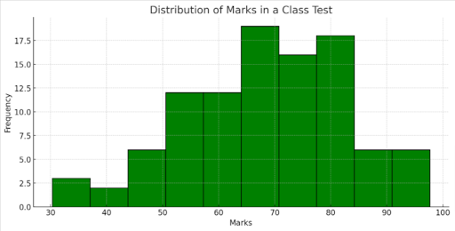
Example 2: Distribution of Marks in a Class Test
- Problem: Find the best way to show mark distribution in a test.
- Analysis: Marks are continuous numerical data.
- Choice: Histogram for distribution.
- Calculation: Plot histogram with test marks.
- Interpretation: Histogram shows mark frequency, indicating class performance trends.
- Conclusion: The histogram clearly shows the distribution of test marks, helping understand class performance.