
OCR Specification focus:
‘Present information and data in a scientific way and use appropriate software or tools to process data and report findings.’
Accurate and professional presentation of data is fundamental to effective scientific communication. In OCR A-Level Biology, students must learn to process, analyze, and display information clearly using appropriate digital and manual tools.
The Purpose of Data Presentation
In biology, data presentation is not simply about displaying numbers; it demonstrates how well a student understands their experimental results. Clear and accurate presentation allows trends, anomalies, and relationships to be identified quickly. Effective data presentation:
Makes complex findings accessible and interpretable.
Ensures reproducibility and transparency.
Follows accepted scientific conventions and ethical standards.
Types of Scientific Data
Biological experiments generate different kinds of data, each requiring suitable methods of presentation.
Quantitative Data
This involves numerical measurements such as enzyme activity rate or temperature change.
Often displayed using tables, graphs, or charts.
Allows statistical analysis and mathematical treatment.
Qualitative Data
This is descriptive information that cannot easily be measured numerically (e.g., colour changes or behavioural responses).
Presented through annotated drawings, labelled diagrams, or written summaries.
Requires clear, objective language to avoid bias.
Recording and Organising Data
Data Tables
Tables are the foundation of data presentation and must be clearly labelled and logically structured.
Key features of scientific tables:
A title describing the experiment and variables.
Independent variable in the first column (the factor you change).
Dependent variable in subsequent columns (the factor you measure).
Units stated in column headings, not beside each value.
Consistent significant figures to reflect precision of measurement.
Well-organised data tables make subsequent analysis and graphing more straightforward.
Graphical Presentation
Choosing the Correct Graph Type
Selecting the correct visual format is crucial to effectively communicate results.
Line graphs – used for continuous data to show trends (e.g., enzyme activity vs temperature).
Bar charts – used for discontinuous data (e.g., comparing means of different species).
Histograms – display frequency distributions of continuous variables.
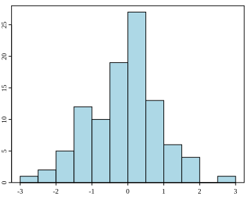
A histogram showing the distribution of values across contiguous class intervals. Bars touch to indicate continuous data, and axes are clearly labelled to emphasise frequency. This figure focuses on core features only; distributional context (normal sample) is incidental to the plotting principles. Source.
Scatter graphs – explore correlations between two variables.
Constructing Graphs Correctly
When constructing a scientific graph, always:
Label both axes with quantity and unit.
Use an appropriate scale so that data occupies most of the grid.
Include error bars where applicable to show uncertainty.
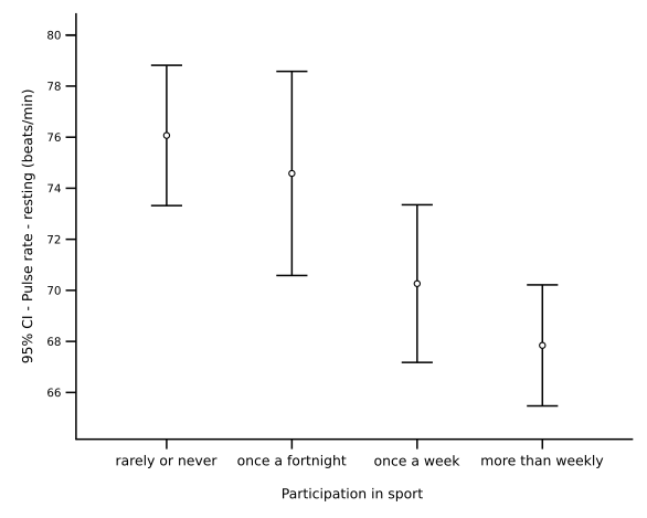
Bar chart of group means with 95% confidence interval error bars. This visual communicates both central tendency and the precision of estimates, matching OCR expectations for professional data presentation. The specific context (pulse rate by exercise level) is extra but does not affect the graphing principles. Source.
Draw lines of best fit rather than simply connecting points.
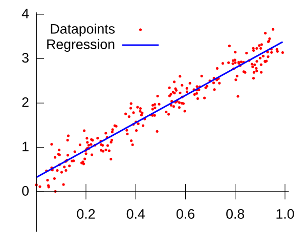
Scatter plot with a fitted linear regression line, demonstrating how trends are summarised across bivariate data. Axes and plotted points follow scientific convention for clarity. The statistical fitting context is slightly beyond the minimum requirement, but it directly supports best-fit presentation. Source.
Provide a descriptive title indicating the relationship shown.
Graphs must be neat, accurate, and scientifically formatted to meet OCR practical standards.
Use of Software Tools
Spreadsheet and Data Analysis Programs
Modern biology relies heavily on digital tools for data handling. Programs such as Microsoft Excel, Google Sheets, or GraphPad Prism allow students to:
Input and organise large datasets efficiently.
Apply formulas for automatic calculations (e.g., mean, standard deviation).
Generate graphs and charts rapidly.
Perform statistical tests using built-in functions.
Software Tool: A computer program used to collect, process, analyse, or display data in a scientifically appropriate format.
Using software tools ensures that calculations are consistent, reduces human error, and allows data to be shared electronically in professional formats.
Processing and Analysing Data
Descriptive Statistics
Statistical tools are vital for summarising and interpreting biological data.
Common measures include:
Mean (average) – the central tendency of a dataset.
Range – the difference between highest and lowest values.
Standard deviation – shows how much data varies from the mean.
EQUATION
—-----------------------------------------------------------------
Mean (x̄) = Σx / n
Σx = Sum of all measured values
n = Number of values in the dataset
—-----------------------------------------------------------------
These measures help identify consistency and reliability of experimental results.
Inferential Statistics
When comparing datasets, inferential tests determine whether observed differences are statistically significant or due to chance.
Examples include the t-test and chi-squared test, which are also presented using appropriate software outputs.
Results are typically reported alongside p-values, allowing evaluation of hypothesis validity.
Scientific Conventions in Data Presentation
Significant Figures and Units
Numerical precision must match the accuracy of instruments used. All measurements and calculated values should maintain consistent significant figures.
Round only at the final calculation stage.
Always include SI units (e.g., m, g, s, mol).
Titles, Labels, and Legends
Each table or figure must include a concise title.
Labels clearly identify variables and their units.
Legends (keys) are essential for distinguishing multiple datasets or experimental conditions.
Visual and Digital Clarity
Formatting for Accessibility
Scientific data should be easy to interpret visually:
Use contrasting colours sparingly for clarity.
Avoid 3D effects or decorative features that obscure meaning.
Maintain a consistent style across all figures and graphs.
Reporting Findings
The final step of data presentation involves compiling processed results into a scientific report.
This may include:
A results section with figures and commentary.
Integration of software-generated graphs directly into text.
References to numerical and statistical evidence supporting conclusions.
Integrating Software Outputs in Reports
Word Processors and Citation Tools
Software such as Microsoft Word or Google Docs allows integration of data tables, figures, and statistical summaries directly into written reports.
Charts can be embedded from spreadsheets.
Reference managers (e.g., Zotero, Mendeley) support accurate source citation for secondary data.
Proper citation and software integration maintain academic integrity and align with OCR’s expectations for scientific professionalism.
Error Representation and Data Reliability
Error Bars and Confidence
When displaying mean data, error bars are used to indicate uncertainty or variation. These may represent:
Standard deviation (spread of data).
Standard error (precision of mean).
Confidence intervals (range where true value likely lies).
Error Bar: A graphical representation of data variability or uncertainty on a chart, showing how reliable a measurement is.
Data Validation
Students must critically assess data reliability by checking for:
Outliers and anomalies.
Adequate sample size.
Consistent methodology and calibration of instruments.
Effective validation ensures scientific credibility and supports accurate biological interpretation.
Practice Questions
Question 1 (2 marks)
A student records data on the effect of temperature on enzyme activity and decides to present the results in a bar chart. Explain why this choice of graph is inappropriate and identify the correct type of graph that should be used instead.
Mark scheme:
1 mark for identifying that temperature is a continuous variable and bar charts are for discontinuous (categorical) data.
1 mark for stating that a line graph or scatter graph should be used to show the trend between continuous variables.
Question 2 (5 marks)
An investigation was carried out to determine the effect of light intensity on the rate of photosynthesis. Students used software to process their data and create a graph of results. Discuss how presenting data using appropriate software tools and including error bars improves the reliability and interpretation of the results.
Mark scheme:
1 mark for describing that software tools allow accurate calculation of mean values, standard deviation, or other statistical measures.
1 mark for explaining that graphs generated by software are more precise and clearly formatted than hand-drawn versions.
1 mark for stating that error bars show the variability or uncertainty in the data.
1 mark for recognising that overlapping error bars indicate no significant difference between results.
1 mark for linking presentation clarity and inclusion of statistical features to improved reliability and interpretation of experimental findings.
FAQ
A trend line generally refers to any line showing direction or pattern within data, while a line of best fit is drawn mathematically or visually to represent the overall relationship between two variables.
In A-Level Biology, the line of best fit is used to identify correlations or proportional relationships, such as enzyme activity increasing with temperature up to an optimum. It should not connect each point directly but reflect the general data pattern.
Data transformation is useful when results cover a wide range or follow a non-linear relationship. Transformations such as logarithmic or square root scales can help linearise data, making patterns clearer and statistical analysis more valid.
For example, bacterial growth data often increase exponentially, so plotting log(cell number) against time produces a straight line. Always state any transformation clearly in axis labels to maintain transparency.
The choice depends on what you want to communicate:
Standard deviation (SD): Shows variability among individual data points, useful for assessing consistency of measurements.
Standard error (SE): Shows precision of the mean; smaller SE means more confidence that the sample mean represents the true population mean.
In OCR practical reporting, both are acceptable if the correct one is justified and consistently applied.
Consistency in significant figures reflects the precision of measurement instruments and prevents false accuracy.
If one temperature is recorded as 37.0°C and another as 37°C, this inconsistency implies different levels of precision. Always round data to the same number of decimal places as the least precise measurement.
This ensures the reported results are scientifically credible and adhere to standard data presentation conventions.
Typical errors include:
Forgetting to label axes with units or giving vague titles.
Using inappropriate graph types (e.g., bar chart for continuous data).
Applying 3D effects or colour gradients that reduce clarity.
Failing to include error bars or report statistical significance.
Always preview graphs for accuracy and readability before including them in reports. Simplicity and precision are key to professional scientific communication.
