
OCR Specification focus:
‘Apply line of best fit, worst line, error bars, and percentage difference to analyse data.’
Accurate graphical treatment of data allows physicists to visualise patterns, test hypotheses, and assess uncertainties. Understanding lines, error bars, and data analysis techniques ensures valid conclusions from experimental results.
Graphical Treatment and Data Analysis
Graphical methods are essential in experimental physics because they transform numerical data into visual form, revealing trends and relationships between quantities. The OCR specification requires students to apply a line of best fit, determine the worst line, use error bars, and calculate percentage differences to analyse data effectively.
The Role of Graphs in Experimental Physics
Graphs are used to:
Identify relationships between dependent and independent variables.
Determine constants or gradients from straight-line plots.
Assess accuracy and uncertainty in experimental results.
When plotting, the independent variable (the one you control) should be on the x-axis, and the dependent variable (the one measured) on the y-axis. Axes must have clear labels including both the quantity and its unit, following OCR conventions.
Lines on Graphs
Line of Best Fit
A line of best fit represents the trend of the data, balancing points that lie above and below it.
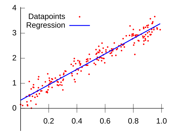
A scatter plot with a straight best-fit line demonstrating a linear relationship. In OCR practical work, this line is drawn to balance points about the trend and is used to extract the gradient and intercept. Note that this diagram does not include error bars; it isolates the visual idea of the best-fit line itself. Source.
Line of Best Fit: A straight or smooth curve drawn through a scatter of data points that best represents their overall trend, minimising deviation from the data.
The line of best fit should:
Pass close to as many points as possible, with roughly equal numbers above and below.
Reflect physical reasoning—for example, a line through the origin if theory predicts proportionality.
Avoid being influenced unduly by outliers, which may result from random or systematic errors.
The gradient (slope) of the line often corresponds to a physical constant, such as resistance (from a V–I graph) or acceleration (from a velocity–time graph).
EQUATION
—-----------------------------------------------------------------
Gradient (m) = Δy / Δx
Δy = Change in dependent variable (unit varies)
Δx = Change in independent variable (unit varies)
—-----------------------------------------------------------------
A steep gradient indicates a strong relationship, while a shallow one implies a weaker or more gradual relationship.
The Worst Acceptable Line
To evaluate the uncertainty in a gradient or intercept, we use worst lines—lines that still pass within all the error bars but give the maximum and minimum possible gradients.
Worst Line: A straight line drawn through the outer limits of error bars that represents the steepest or shallowest acceptable fit to the data.
Procedure for determining worst lines:
Draw the best-fit line first.
Then draw two additional lines that still pass through the range of all error bars—one with the largest gradient and one with the smallest.
Calculate both gradients and determine the uncertainty in gradient as half the range:
EQUATION
—-----------------------------------------------------------------
Uncertainty in Gradient (Δm) = (m_max – m_min) / 2
m_max = Steepest acceptable gradient
m_min = Shallowest acceptable gradient
—-----------------------------------------------------------------
This gives a quantitative measure of uncertainty that can be expressed as a percentage.
Error Bars
Understanding Error Bars
Error bars represent the uncertainty in each measured value on a graph. They indicate the range within which the true value is expected to lie.
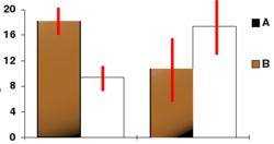
A chart showing error bars (red lines) indicating uncertainty around plotted values. The concept generalises to scatter plots where vertical and/or horizontal error bars bound each data point. Extra detail: this particular figure displays bars rather than point-wise scatter; the error-bar concept is identical. Source.
Error Bar: A graphical representation of the uncertainty in a data point, showing the possible range of values due to measurement limitations.
Each data point should include vertical and/or horizontal error bars depending on which variable carries uncertainty:
Vertical error bars show uncertainty in the dependent variable.
Horizontal error bars show uncertainty in the independent variable.
Error bars should extend one uncertainty value above and below the data point. For instance, a length measured as 1.20 ± 0.02 m should have error bars from 1.18 m to 1.22 m.
When assessing agreement between data and the best-fit line:
If the line passes through all the error bars, the results are consistent with the line.
If points consistently lie outside, this suggests systematic error or a non-linear relationship.
Percentage Difference and Data Evaluation
Percentage Difference Between Values
Percentage difference provides a method for comparing two quantities, often theoretical and experimental results, or gradients from best and worst lines.
EQUATION
—-----------------------------------------------------------------
Percentage Difference (%) = (|Value₁ – Value₂| / Mean of Values) × 100
Value₁ = First value being compared
Value₂ = Second value being compared
—-----------------------------------------------------------------
A small percentage difference suggests high agreement, while large differences indicate potential experimental error or inaccuracy in measurement.
Percentage Uncertainty in a Gradient
EQUATION
—-----------------------------------------------------------------
Percentage Uncertainty in Gradient (%) = (Δm / m_best) × 100
Δm = Uncertainty in gradient
m_best = Gradient from best-fit line
—-----------------------------------------------------------------
This calculation quantifies the reliability of the measured relationship, helping to identify whether discrepancies are significant or within expected experimental variation.
Analytical Use of Graphs
Accurate graphical analysis helps in verifying laws and models. For example:
A linear relationship supports direct proportionality.
A curve may indicate power or exponential dependence.
The intercept can represent a constant offset or systematic bias.
When presenting data:
Use appropriate scales that utilise most of the graph space.
Label axes clearly with quantity and unit.
Mark data points precisely, using small crosses or dots with error bars.
Draw lines smoothly and avoid joining points directly unless data are discrete.
These conventions align with OCR’s data presentation standards and are essential for clarity and accuracy in experimental analysis.
Evaluating Graph Quality
A well-constructed graph should demonstrate:
Consistency between the line of best fit and theoretical expectations.
Proportional distribution of data about the best-fit line.
Visible error margins allowing the evaluation of uncertainty.
Calculated gradients and intercepts with clearly stated uncertainties.
Through applying lines of best fit, worst lines, error bars, and percentage difference analysis, students can ensure their experimental conclusions are both quantitative and scientifically rigorous, as required by the OCR A-Level Physics specification.
Practice Questions
Question 1 (2 marks)
A student plots a graph of voltage (V) against current (A) for a resistor. The plotted points lie roughly along a straight line, but some points are slightly above and below the line.
(a) Explain why the student draws a line of best fit rather than joining the points directly.
Mark scheme (2 marks total)
1 mark: Recognises that a line of best fit shows the general trend of the data.
1 mark: States that it reduces the effect of random errors or scatter in the measurements.
Question 2 (5 marks)
A student investigates the relationship between the force on a spring and its extension. The data are plotted on a graph, and a straight line of best fit is drawn through the origin. The student adds error bars for each data point and draws two additional straight lines to determine the uncertainty in the gradient.
(a) Explain the purpose of including error bars on the graph. (2 marks)
(b) Describe how the student can use the steepest and shallowest acceptable lines to determine the uncertainty in the gradient. (3 marks)
Mark scheme (5 marks total)
(a) Purpose of error bars (2 marks):
1 mark: Error bars show the uncertainty or range of possible true values for each data point.
1 mark: They allow assessment of whether data points are consistent with the line of best fit or if systematic errors may be present.
(b) Determining gradient uncertainty (3 marks):
1 mark: Draw the steepest and shallowest lines that still pass within all error bars.
1 mark: Calculate both gradients (m_max and m_min).
1 mark: Determine the uncertainty using (m_max – m_min)/2 or express as a percentage uncertainty using (Δm / m_best) × 100.
FAQ
If a point lies well outside the error bars, it may indicate a blunder or systematic error. First, check for experimental or recording mistakes. If the value is confirmed, it should remain on the graph but be noted as an anomalous result in analysis. Anomalies are not ignored; instead, they prompt discussion about possible causes, such as zero errors, incorrect calibration, or environmental factors. They must not be used when drawing the best-fit or worst lines.
Theoretical relationships guide the expected shape.
Directly proportional variables produce a straight line through the origin.
Power relationships (e.g. y ∝ x²) produce curves that can be linearised using logarithmic or reciprocal plots.
Exponential or inverse relationships can also be made linear by plotting log(y) or 1/x.
Choosing the correct form ensures meaningful gradient and intercept interpretation.
Expanding both scales maximises precision when reading values. A well-filled grid reduces percentage uncertainty in gradient and intercept determination because small divisions correspond to smaller real-world changes.
Avoid awkward scales (e.g. 3, 7, 30) that make plotting and reading difficult. Always use uniform increments that allow easy estimation of intermediate values.
Good scaling is part of data presentation conventions required by OCR.
Percentage difference compares two distinct values, such as experimental and theoretical results, or two gradients. It shows how close they are to one another.
Percentage uncertainty expresses the range of possible values around a single measurement or calculated result, such as a gradient or intercept.
Percentage difference assesses accuracy, while percentage uncertainty reflects precision in measurement and graphical analysis.
Larger error bars mean a wider range of acceptable lines can fit the data, producing a greater spread between the steepest and shallowest gradients and therefore a larger uncertainty in the calculated gradient.
To reduce this:
Improve measurement precision (use better instruments or repeat readings).
Use larger data ranges to make the line longer, reducing relative uncertainty.
Smaller error bars and well-spaced data points increase the reliability of the gradient estimate.
