
AP Syllabus focus: 'In a histogram, each bar shows the count or proportion of observations in an interval; changing interval widths can change its appearance.'
Histograms are one of the most important displays for quantitative data because they show how values are distributed across intervals and how display choices can strongly influence what you notice.
What a Histogram Shows
A histogram displays the distribution of a quantitative variable by grouping observations into intervals along a numerical scale. Each bar represents all values that fall within one interval, not a single exact data value. Because the intervals sit next to each other on a number line, the bars usually touch.
Histogram: A graph for quantitative data in which each bar shows the count or proportion of observations within an interval of values.
The horizontal axis shows the variable and its intervals. The vertical axis shows how much data fall into each interval. This makes a histogram useful for seeing where values are concentrated and where they are less common.
Count or proportion on the vertical axis
A histogram can be drawn using counts or proportions. With counts, bar height tells how many observations are in an interval. With proportions, bar height tells what share of the data falls in that interval. The choice changes the scale on the vertical axis, but not the basic pattern, as long as the intervals stay the same.
When reading a histogram, always identify what the bar height measures before making claims about the graph.

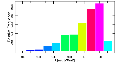
This example contrasts a frequency histogram (counts on the vertical axis) with a relative frequency histogram (proportions on the vertical axis). The overall pattern is essentially the same, but the y-axis scale changes the numerical interpretation of bar heights. This helps reinforce that you must read axis labels before describing “how much” data fall in an interval. Source
A tall bar may mean many observations or a large proportion, depending on the axis label.
Interval Widths
The intervals used in a histogram must cover the range of the data and place each observation into exactly one group. The numerical size of each interval is called the interval width.
Interval width: The numerical length of each interval used to group values in a histogram.
Most histograms used in AP Statistics have equal interval widths. This makes the bar heights easy to compare directly, because each bar summarizes the same amount of the number line. If the intervals are not handled carefully, the display can be misleading or hard to interpret.
Why interval width matters
A histogram is a summary display, so the intervals determine how much detail is shown. Changing the interval width changes how observations are grouped, which can change the apparent shape of the data even though the underlying values are unchanged.
Wider intervals combine more observations into fewer bars.
Narrower intervals separate observations into more bars.
This is why two histograms of the same data can look different and still both be correct.
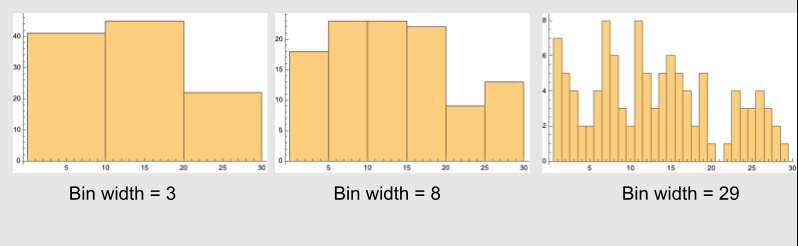
The same underlying dataset is shown using different interval (bin) widths, producing noticeably different-looking histograms. This highlights how wider bins can smooth away local features, while narrower bins can reveal (or exaggerate) small fluctuations. The key takeaway is that the data have not changed—only the grouping into intervals has changed. Source
How Width Changes the Appearance
With wider intervals, the graph often looks smoother and simpler. Large-scale features may be easier to notice quickly. However, wide intervals can also hide important details, including:
small gaps in the data
separated concentrations of values
extreme observations
local rises and dips
With narrower intervals, the graph shows more detail. This may reveal features that were hidden before, such as dips between ranges of values. But very narrow intervals can also make the histogram look jagged, especially with smaller data sets. Random variation may create many small ups and downs that are not especially meaningful.
Width and interpretation
Because interval width affects appearance, claims about a histogram should be cautious and based on the overall pattern rather than one isolated bar. If a feature disappears as soon as the width changes slightly, that feature may not be strong evidence about the data.
A useful histogram balances clarity and detail. It should reveal the main structure of the data without exaggerating random irregularities.
Interval boundaries
The starting point of the first interval also affects the display. Shifting the boundaries slightly can move some observations from one bar to another, which can change whether a rise looks strong or whether a dip appears. For that reason, histograms should be interpreted as summaries of nearby values, not as exact pictures of every individual observation. Clear interval boundaries also prevent double counting at shared endpoints.
Reading Bars Correctly
Each bar represents an interval of values. A bar does not mean that all observations in that interval are equal to the midpoint or concentrated at one exact number. It only tells you how many or what proportion of observations fall somewhere inside that range.
This matters when describing a histogram in context. Good interpretations use interval language, such as noting that many observations lie within a certain range or that relatively few observations lie beyond a certain point. Poor interpretations treat bars like separate categories with no numerical connection.
Common mistakes
assuming the bars can be separated like bars in a categorical bar graph
forgetting to check whether the vertical axis shows count or proportion
thinking the data themselves changed when only the interval width changed
choosing so few intervals that important structure is hidden
choosing so many intervals that noise is mistaken for a real pattern
What to Look for in a Well-Made Histogram
A well-made histogram uses intervals that are easy to read and wide enough to keep the display understandable, but narrow enough to show meaningful variation in the data. The intervals should span the full data range and avoid overlap, so every observation belongs in one place only.
When interpreting any histogram, keep the interval widths in mind from the start. The bars show how data are distributed across ranges of values, and the choice of those ranges strongly affects what the graph seems to say.
Practice Questions
A histogram is used to display the ages of customers in a store. State what the height of one bar represents, and explain one effect of redrawing the histogram with wider intervals.
1 mark for stating that the height of a bar represents the count or proportion of customers whose ages fall within that interval.
1 mark for explaining that wider intervals group more ages together, so the histogram may look smoother and show less detail.
The same set of test scores is displayed in Histogram A using intervals of width 5 and in Histogram B using intervals of width 15. A student says, “Histogram A and Histogram B look different, so one of them must be wrong.”
Explain why both histograms could still be correct. In your response, discuss:
what each bar represents,
how changing interval width changes the appearance,
one advantage of narrower intervals,
one advantage of wider intervals.
1 mark for stating that each bar represents the count or proportion of observations in a score interval.
1 mark for explaining that both histograms can be correct because they use the same data but different interval widths.
1 mark for explaining that narrower intervals show more detail or reveal smaller features in the data.
1 mark for explaining that wider intervals produce a simpler or smoother overall display.
1 mark for clearly linking the different appearances to grouping choices rather than to different underlying data.
FAQ
Different software often uses different default choices for:
the number of intervals
the interval width
the starting point of the first interval
Because a histogram depends on those choices, two correct graphs of the same data can look noticeably different.
If you are using technology, do not rely only on the default display. Check the interval settings before interpreting the graph.
Yes. An interval with no observations can still be informative.
It may suggest:
a clear separation between groups of values
a sparse part of the scale
a gap created by the chosen interval boundaries
An empty bar does not automatically prove an important pattern, but it can be a clue that the data are not spread evenly across the scale.
Rounding can create artificial bunching. For example, if many values are recorded to the nearest whole number, several observations may pile up at the same nearby positions.
This can make a histogram look more uneven than the original unrounded data really were. It may also create bars that appear unusually tall just because of the recording process.
So when interpreting a histogram, it helps to know how precisely the data were measured.
If interval widths differ, comparing bar heights directly can be misleading. A wider interval may contain more observations partly because it covers more of the scale.
In more advanced settings, the bar area rather than just the height should reflect the amount of data. That is why introductory AP Statistics work usually emphasizes equal-width intervals for standard histograms.
Equal widths make the display easier to read and interpret correctly.
With a small sample, moving just a few observations from one interval to another can noticeably change the graph. That means the appearance may depend heavily on the chosen interval width.
As a result:
small rises and dips may be accidental
the overall pattern may look different after a minor bin adjustment
strong claims should be made carefully
For small samples, it is especially important to try reasonable interval widths before deciding what the histogram shows.
