
AP Syllabus focus: 'A dotplot represents each observation with a dot positioned by its data value; nearly identical values are stacked above one another.'
Dotplots are simple graphs that preserve every data value. They help you see individual observations, repeated values, and the placement of data along a number line without grouping observations together.
What a Dotplot Shows
A dotplot is especially useful for displaying one quantitative variable on a number line.
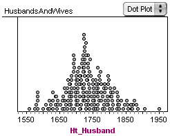
A high-resolution dotplot example (rendered from statistical software) that places dots along a common scale for straightforward comparisons. The plot illustrates how dotplots can retain individual values while still organizing them into a readable distributional display. Because labels and a consistent scale are prominent, it also models good graph “context” practices for AP Statistics write-ups. Source
Every recorded value is shown, so the graph keeps the raw data visible instead of combining observations into groups.
Dotplot: A graph in which each observation is marked with a dot placed at the position of its data value on a scale.
Because each point corresponds to an actual recorded value, a dotplot allows you to count exact observations and notice repeated values immediately.
Each observation represents one individual case in the data set.
Observation: A single measured or counted value for the variable being studied.
In AP Statistics, the most important idea is that the horizontal position shows the data value itself. The vertical stacking is only a way to prevent dots from overlapping.
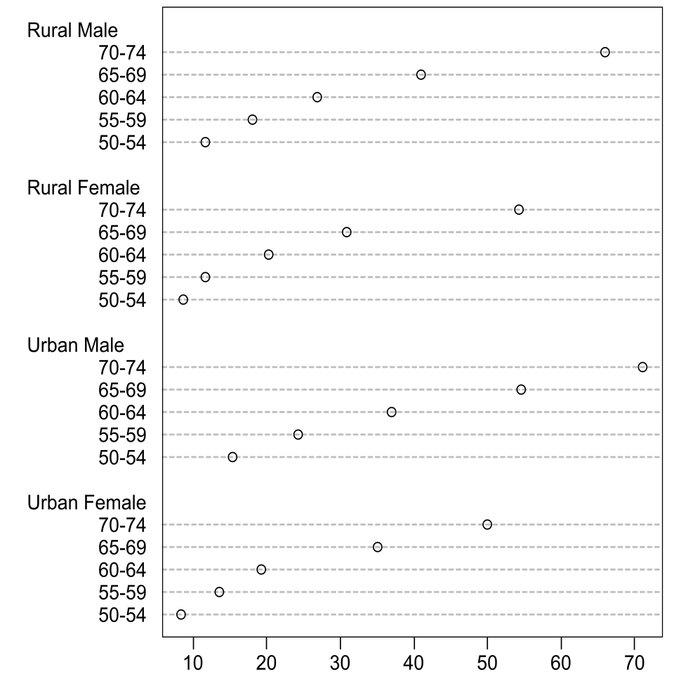
A dotplot showing a quantitative axis with many values stacked into columns where observations repeat. The horizontal location encodes the data value, while the vertical position is only a stacking convention to display frequency at that value. This kind of example is useful for reinforcing that dotplots preserve individual data points while still revealing the distribution’s shape. Source
Essential parts
a labeled scale for the quantitative variable
one dot for each observation
vertical stacking when two or more observations share the same recorded value
labels or units so the graph has context
How a Dotplot Is Constructed
To make a dotplot correctly, begin with a scale that covers the smallest and largest observed values. The scale should increase evenly so that equal distances on the axis represent equal changes in the variable.
Then place one dot above the correct location for each recorded value. If multiple observations have the same value, stack the dots directly above one another. This stacking shows the frequency at that value while still preserving the idea that every dot is an individual case.
The syllabus also mentions nearly identical values. In practice, this usually means values that are recorded the same because of rounding or measurement precision. If measurements are recorded to the nearest tenth, observations with the same recorded tenth would be stacked at that position.
Building steps
Choose a clear numerical scale.
Mark the possible values or positions on the scale.
Plot one dot for each observation.
Stack dots vertically for repeated or nearly identical recorded values.
Label the variable and include units when appropriate.
How to Read a Dotplot
A dotplot makes it easy to answer questions about individual values. You can see how many observations occur at a particular number by counting the dots stacked above that value. You can also see where observations are concentrated and where the display has few or no dots.
Because the original values remain visible, dotplots are useful when you want to identify exact observations rather than only grouped counts. A single isolated dot may stand out, and tall stacks signal values that appear often. When reading such features, remember that the vertical height itself is not a separate variable. It only represents how many observations are located at the same position on the horizontal scale.
What the stack means
A taller stack means more observations share that recorded value.
A single dot means one observation at that value.
No dots at a position means no observations were recorded there.
The height of the stack shows frequency, not an additional measurement.
Why Dotplots Are Helpful
Dotplots are especially effective for small to moderate data sets because they keep every observation visible. This makes them helpful when precision matters and when the audience needs to see the actual recorded values, not just a summary.
They are also visually direct. A reader can often identify repeated measurements quickly, count how many observations fall at a given value, and see whether the data are tightly packed or spread across the scale. Since every observation is shown, the connection between the graph and the raw data is transparent.
Limits of Dotplots
Dotplots can become crowded when a data set is very large or when values are measured with many decimal places. If nearly every observation falls at a slightly different position, the graph may look cluttered and harder to read.
Care is also needed when data are rounded. Stacking should reflect the recorded values, not the unknown exact values before rounding. If the data were recorded to the nearest whole number, all observations with the same recorded whole number belong in the same stack.
Common Errors to Avoid
A correct dotplot is simple, but several mistakes can make it misleading.
Using an uneven scale: If the axis spacing is inconsistent, the visual spacing between values becomes inaccurate.
Plotting one dot for a group instead of an observation: In a dotplot, each dot stands for one case.
Misreading the vertical direction: The height of a dot does not represent a second variable.
Failing to stack tied values: Repeated values should not be spread sideways or hidden on top of each other.
Ignoring context: A dotplot should identify the variable clearly so the reader knows what the values mean.
Describing a Dotplot in Context
When writing about a dotplot, refer to the variable, the units, and the observations shown. Good descriptions focus on what the graph directly displays, such as repeated values, exact counts at certain positions, and where most of the observations appear on the scale.
A strong interpretation stays connected to the data set itself. Rather than making unsupported general claims, describe what the displayed dots show about the recorded observations.
Practice Questions
In a dotplot of the number of text messages sent in one day by a sample of students, there are 5 dots stacked above 18.
Interpret this in context.
1 mark: States that 5 observations are represented.
1 mark: States that those 5 students each sent 18 text messages that day.
A class records the number of pets owned by 12 students:
0, 1, 1, 1, 2, 2, 3, 3, 3, 4, 4, 6
A student draws a graph with one dot above 0, one dot above 1, one dot above 2, one dot above 3, one dot above 4, and one dot above 6. The student says, "The higher values occur more often because I placed those dots slightly higher."
Explain two reasons why this is not a correct dotplot. Then state how many dots should be stacked above 1, 2, 3, and 4 in a correct dotplot.
1 mark: Explains that a correct dotplot uses one dot for each observation, not one dot for each distinct value.
1 mark: Explains that vertical position is only for stacking repeated values and does not represent a second measured variable.
1 mark: States that 3 dots should be above 1.
1 mark: States that 2 dots should be above 2.
1 mark: States that 3 dots should be above 3.
1 mark: States that 2 dots should be above 4.
FAQ
Yes. A dotplot can use any numerical scale that fits the variable, including negative values and zero.
The key requirement is that the scale stays even and clearly labeled so each dot is placed at the correct location.
Jittering means software shifts dots slightly so overlapping points can be seen more clearly.
This shift is only visual. The actual data values are still represented by their intended positions on the scale, so the display is easier to read without changing the data.
Yes, if the list gives exact values and the number of observations at each value.
You can reconstruct the dotplot by placing the stated number of dots above each exact value. If the data are grouped into intervals instead of exact values, then you no longer have enough detail for a true dotplot.
Usually no. Connecting dots suggests order, trend, or movement from one value to another.
In a one-variable dotplot, each dot is a separate observation, so the points should remain unconnected.
Different graphing tools may use different dot sizes, stack spacing, or small visual offsets.
As long as the scale is correct and the number of dots at each value is accurate, both dotplots can still represent the same data correctly.
