
AP Syllabus focus: 'A cumulative graph shows the number or proportion of a data set less than or equal to a value; other quantitative graphs are possible.'
Cumulative graphs organize quantitative data by showing how totals build across values, helping students see overall patterns, estimate proportions below cutoffs, and answer questions about accumulated counts.
What a Cumulative Graph Shows
A cumulative graph is useful when interest centers on totals up to a value rather than frequencies in separate intervals. The graph builds running totals as the quantitative variable increases. On the horizontal axis, values or class boundaries appear in order. On the vertical axis, the graph shows either a cumulative count or a cumulative proportion. Because the totals accumulate, each point represents all observations at or below that location.
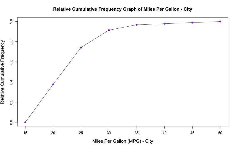
Relative cumulative frequency (ogive) for a quantitative variable, with cumulative percentile/proportion on the vertical axis and x-values on the horizontal axis. The monotone increasing shape shows how the running total builds as increases, with steeper segments indicating ranges where observations accumulate quickly and flatter segments indicating few observations in that range. Source
Cumulative graph: A graph that shows the running total number or proportion of observations less than or equal to each value or class boundary.
A cumulative graph emphasizes how a distribution grows. Early parts of the graph describe the lower end of the data, while later parts represent larger values. A steeper section means observations are being added quickly over that range. A flatter section means relatively few observations lie there. This makes the display especially helpful for locating cutoffs and judging how data accumulate across the scale.
Counts and Proportions
Some cumulative graphs use counts, and others use proportions. Both communicate the same ordering idea, but proportions are often easier when sample sizes differ or when results need to be interpreted as percentages. In a proportion-based graph, the final value is 1, or 100%, because all observations have been accumulated by the largest value.
Cumulative proportion: The proportion of observations in a data set that are less than or equal to a given value.
When reading either version, always connect the vertical value to the phrase less than or equal to. A cumulative value of 0.68 at 12 does not mean 68% are exactly 12. It means 68% of observations are 12 or less. That distinction is essential.
How to Read a Cumulative Graph
Reading a cumulative graph requires attention to both axes and to the direction of accumulation. Start with a specific x-value, move upward to the graph, then move across to the vertical axis. The vertical coordinate gives the number or proportion of observations at or below that value. Reversing the process is also useful: start with a cumulative count or proportion and find the corresponding value on the horizontal axis.
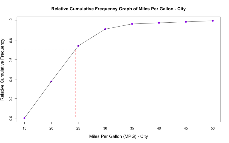
Ogive annotated with horizontal-then-vertical guide lines that show how to translate between a cumulative proportion (y) and its corresponding cutoff value (x). This is the graphical workflow for locating percentiles: pick a cumulative level on the y-axis, move to the curve, then read the associated x-value. Source
Common interpretations include:
finding how many observations are less than or equal to a cutoff
finding what proportion of the data fall below a benchmark
estimating the value where a chosen cumulative percentage is reached
comparing how rapidly the data accumulate across different ranges
A cumulative graph should never decrease as you move from left to right.
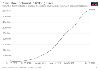
Cumulative count over time (an empirical cumulative total), illustrating that cumulative graphs are nondecreasing because totals only add as time advances. Flat portions indicate little or no additional accumulation over that interval, while steep portions indicate rapid accumulation. Source
Counts and proportions can stay the same over an interval if no observations are added, but they cannot go down. If a graph drops downward, it has been constructed incorrectly or read incorrectly.
Constructing and Interpreting from Data
To create a cumulative graph, the data must first be ordered from smallest to largest, or grouped into ordered intervals. Then running totals are formed.
Basic steps are:
order the values or class intervals from low to high
calculate the cumulative count or cumulative proportion at each value or upper class boundary
plot each boundary with its accumulated total
connect the plotted points in a way that reflects the data structure used
With grouped data, cumulative graphs are typically plotted at upper class boundaries because each point represents observations less than or equal to the top of that interval. This matches the meaning of cumulative frequency. If the data have been grouped, the graph provides an approximation rather than a perfect record of individual observations.
That approximation matters. A grouped cumulative graph can answer questions about overall accumulation, but exact values inside an interval may not be known precisely. Any estimated cutoff taken from the graph should therefore be described as approximate, especially when intervals are wide.
Other Quantitative Displays and Choosing a Graph
The syllabus notes that other quantitative graphs are possible. This matters because no single display is best for every statistical question. A cumulative graph is specialized: it highlights accumulation. If the goal is to know how many values fall at or below a threshold, it is often the clearest choice. If the goal is different, another type of quantitative display may be more informative.
A cumulative graph is especially strong for:
answering at most questions
estimating the share of observations below a standard
locating approximate cut points in the ordered data
showing whether data accumulate gradually or rapidly across regions
A cumulative graph is less effective for:
showing exact frequencies in isolated intervals
displaying individual observations
revealing local features that do not strongly affect the running total
Because the cumulative totals only move upward or stay level, some details of distribution shape are compressed. Two data sets can have similar cumulative patterns even if their internal interval-by-interval frequencies differ. For that reason, statisticians choose graphs based on the question being asked, not just on habit. When the question is about the number or proportion of observations less than or equal to a value, a cumulative graph directly answers that question.
Practice Questions
A cumulative relative frequency graph of quiz scores shows a value of 0.84 at a score of 18.
(a) Interpret the value 0.84 in context.
(b) What proportion of students scored above 18?
1 mark: States that 84% of students scored 18 or less on the quiz.
1 mark: Gives the proportion above 18 as 0.16 or 16%.
A cumulative count graph for 40 runners records race completion times in minutes. The cumulative counts are:
at 10 minutes: 3
at 20 minutes: 11
at 30 minutes: 26
at 40 minutes: 35
at 50 minutes: 40
(a) How many runners finished in more than 20 minutes and up to 30 minutes?
(b) What proportion of runners finished in 40 minutes or less?
(c) Which 10-minute interval contains the greatest number of runners? Justify your answer using the cumulative counts.
(d) Explain one reason a cumulative graph is useful for answering questions about race-time cutoffs.
Part (a), 1 mark: 15 runners.
Part (b), 1 mark: or 87.5%.
Part (c), 2 marks:
1 mark for identifying the 20 to 30 minute interval.
1 mark for correct justification using increases between cumulative counts: 3, 8, 15, 9, 5.
Part (d), 1 mark: Explains that a cumulative graph directly shows how many or what proportion of observations are less than or equal to a chosen cutoff.
FAQ
A cumulative graph answers questions of the form “how many are less than or equal to this value?” That meaning matches an upper class boundary, not a midpoint.
If midpoints were used, the graph would no longer clearly represent accumulated totals up to a specific cutoff. Using upper boundaries keeps the interpretation consistent and avoids ambiguity.
Yes. With raw data, you can order the observed values and track the running total after each value. The result is often a step-like graph because the cumulative total only changes when a new observation is reached.
This version preserves more detail than a grouped cumulative graph, but it can look crowded if there are many observations or many distinct values.
If several observations have the same value, the cumulative total increases by more than one at that point. In an ungrouped display, this creates a larger jump.
In a grouped display, repeated values are absorbed into the interval total, so you may not see exactly where within the interval the repetition occurs. Grouping smooths out that detail.
Often, yes. In many statistics courses, an ogive is the name used for a cumulative frequency graph or a cumulative relative frequency graph.
Some textbooks use the term more narrowly, but the central idea is the same: the graph shows accumulated counts or proportions up to each boundary or value.
They can cause problems. A class such as “50 or more” has no upper boundary, so it is harder to place the final cumulative point in a precise location on the horizontal axis.
For clear graphing, cumulative displays work best when each class has a definite endpoint. If open-ended intervals are present, the graph may need to be modified or interpreted with extra caution.
