
AP Syllabus focus: 'The direction of an association in a scatterplot may be positive or negative, depending on how values of one variable change with the other.'
Scatterplots do more than show whether two quantitative variables are related. One of the first things to identify is direction: whether larger values of one variable tend to go with larger or smaller values of the other.
What direction of association means
In a scatterplot, the direction of association describes the overall movement of the point pattern as you read the graph from left to right.
A lineup of scatterplots illustrating negative direction, no clear direction, and positive direction with varying strengths. Reading left to right, the negative examples fall, the “no relationship” example shows no overall movement, and the positive examples rise. This makes it easier to separate direction (up vs. down vs. none) from strength (how tightly the points cluster around a line). Source
Direction of association: In a scatterplot, the overall way the vertical variable changes as the horizontal variable increases; it is commonly described as positive or negative.
A direction statement is about the general pattern, not about every single point. Real data usually show scatter, so some observations may not follow the overall trend.
Positive direction
A scatterplot shows a positive association when larger values of one variable tend to occur with larger values of the other variable. Visually, the cloud of points tends to rise from left to right.
Smaller values of one variable are usually paired with smaller values of the other.
Larger values of one variable are usually paired with larger values of the other.
A common description is: “As one variable increases, the other variable tends to increase.”
The phrase tends to is important. A positive direction does not require every point to rise perfectly. The overall pattern is what matters.
Negative direction
A scatterplot shows a negative association when larger values of one variable tend to occur with smaller values of the other variable. Visually, the cloud of points tends to fall from left to right.
Smaller values of one variable are often paired with larger values of the other.
Larger values of one variable are often paired with smaller values of the other.
A common description is: “As one variable increases, the other variable tends to decrease.”
Negative direction does not mean the values themselves are negative. It refers only to how the two variables change together.
How to identify direction in a scatterplot
To decide on direction, focus on the overall movement of the points rather than on any single observation.
Three scatterplots presented together to contrast positive association (points rising left to right), no clear direction (a roughly patternless cloud), and negative association (points falling left to right). Seeing these in one panel emphasizes that direction is determined by the overall pattern rather than by a few points that break the trend. It also provides a visual anchor for the phrases “tends to increase” and “tends to decrease.” Source
Start at the left side of the plot and scan toward the right.
Ask whether the typical vertical values get higher, lower, or show no consistent change.
Look for the main cloud of points, not just isolated points at the edges.
Separate the idea of direction from how tightly the points follow a pattern.
Once you identify the pattern, describe it using the variables in context.
This process matters because real data are messy. A few points that go against the trend do not automatically change the direction if most of the graph still moves one way.
When direction is unclear
Some scatterplots do not show a clear positive or negative direction. If the points form a loose cloud with no overall upward or downward movement, then the direction is not apparent.
Do not force a positive or negative label when the pattern does not support it.
It is better to say there is no clear direction of association.
Careful wording is important in AP Statistics.
You should also be cautious if different parts of the scatterplot seem to suggest different movements. In those cases, avoid making a strong direction claim unless the overall picture is still clear.
Writing strong direction statements
A strong AP Statistics description of direction usually has two parts:
the label: positive or negative
the interpretation: what happens to one variable as the other variable increases
Strong responses often use wording such as:
“There is a positive association between the variables.”
“As the horizontal-axis variable increases, the vertical-axis variable tends to decrease.”
Avoid vague statements such as “the variables are related” if the question specifically asks for direction. That does not explain which way the pattern moves.
Good habits for interpretation
Refer to the variables by name whenever possible.
Use words such as tends to, generally, or overall.
Base your statement on the full scatterplot.
Keep the description focused on the visible pattern.
The word overall is especially useful because scatterplots represent general trends rather than perfect rules.
Common mistakes
Students often lose points by making direction statements that are incomplete or misleading.
Mistake 1: Reading the graph incorrectly
Direction is read from left to right because the horizontal axis shows the values being compared across the plot. Looking at the graph in another way can lead to confused wording.
Mistake 2: Confusing direction with steepness
A steep upward pattern and a gentle upward pattern both have positive direction. Direction tells whether the pattern rises or falls, not how steep it is.
Mistake 3: Letting one unusual point control the description
One observation may go against the trend, but direction should come from the overall cloud of points unless that point completely changes the visual pattern.
Mistake 4: Forgetting context
Saying only “positive” or “negative” is often too brief. Strong AP Statistics responses explain the meaning of that direction using the actual variables shown on the axes.
Practice Questions
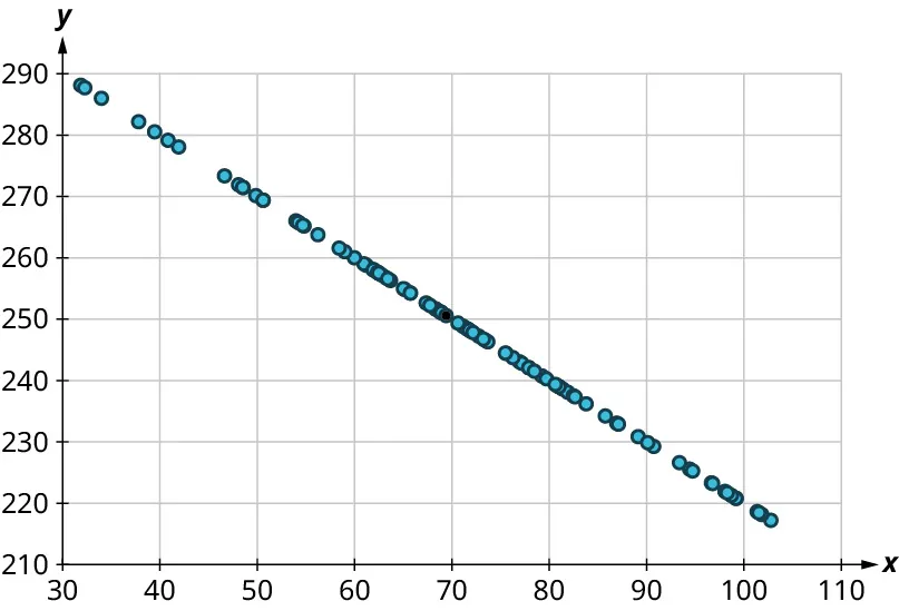
A scatterplot shows the relationship between outside temperature and daily hot chocolate sales. On warmer days, fewer cups of hot chocolate are usually sold.
State the direction of the association and explain how you can tell from the scatterplot.
1 mark for identifying the association as negative.
1 mark for explaining that, from left to right, the points tend to move downward, so larger temperature values are paired with smaller sales values.
A student makes a scatterplot of age of a used car and selling price. Most of the points suggest that older cars sell for lower prices, but one older car has an unusually high selling price.
(a) Describe the direction of the association.
(b) Explain why the unusual point does not necessarily change the direction description.
(c) Write one sentence interpreting the direction in context.
1 mark for correctly identifying the direction as negative.
2 marks for explaining that the overall pattern of points falls from left to right and that most older cars have lower prices.
1 mark for stating that a single unusual point does not override the overall trend.
1 mark for a correct contextual sentence such as: “As car age increases, selling price tends to decrease.”
FAQ
No. Switching the variables between the horizontal and vertical axes does not change a positive association into a negative one, or vice versa.
The paired values are still the same, so the overall pattern keeps the same direction. What changes is the wording of your interpretation, because you are now describing how a different axis variable changes.
Yes. Direction depends on how paired values move together, not on whether each variable is rising or falling over time by itself.
If higher values of one variable still tend to occur with higher values of the other, the scatterplot can show a positive association even when both variables are trending downward across time.
In that case, there may not be one single overall direction that is well described as positive or negative.
A looping or strongly curved pattern can mean:
one part of the graph rises
another part falls
the full pattern does not have one consistent direction
When that happens, it is better to describe the direction as unclear rather than force a label.
No, but they can make it harder. When many observations share the same horizontal value, points may stack vertically.
You can still judge direction by looking at what happens overall as you move from smaller to larger horizontal values. If the centers of those vertical stacks tend to move upward, the association is positive; if they move downward, it is negative.
Different groups can follow different patterns, and combining them can change the appearance of the full scatterplot.
This can happen when:
the groups have different centers
the groups cover different ranges
one group is much larger than another
If context suggests distinct groups, checking each group separately can give a more accurate description of direction than looking only at the combined plot.
