
AP Syllabus focus: 'The form of an association may be linear or nonlinear. Strength describes how closely the points follow a specific pattern.'
When analyzing two quantitative variables, one of the first goals is to describe the overall pattern in the scatterplot by identifying its form and judging its strength.
Understanding form
A scatterplot description begins with form, the shape made by the overall cloud of points. Form is about the broad pattern across the graph, not about isolated values or minor irregularities. Identifying form helps you decide what kind of relationship seems to connect the two variables.
Form: The overall shape of the relationship shown by the points in a scatterplot.
In AP Statistics, the most important distinction is whether the relationship appears linear or nonlinear.
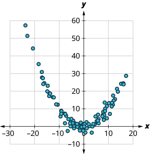
Example of a nonlinear (curved) association in a scatterplot: the points follow an overall parabolic pattern rather than clustering around a straight line. This is the kind of situation where describing the form as nonlinear is more accurate than forcing a linear summary. Source
Linear form
A relationship has linear form when the points lie around an imaginary straight line. The line does not need to pass through every point, and the pattern does not need to be perfect. What matters is that a straight path captures the main trend without obvious bending.
Linear association: A relationship between two quantitative variables that is reasonably described by a straight-line pattern in a scatterplot.
A scatterplot is usually described as linear when:
the points follow a roughly straight path
there is no clear curve across the full graph
a line seems to summarize the pattern better than any curved shape
The word roughly is important. Real data nearly always contain some scatter, so a linear association often means “close enough to a line to be described that way,” not “perfectly straight.”
Nonlinear form
A relationship has nonlinear form when a curved pattern describes the data better than a straight line. The points may bend, level off, or change their rate of movement as the variables change. In these cases, forcing a straight-line description would miss the actual shape of the association.
Nonlinear association: A relationship between two quantitative variables that is better described by a curve than by a straight line.
A nonlinear pattern may appear in different ways:
a smooth bend across the graph
a pattern that rises or falls quickly at first and then flattens
a relationship that changes shape from one part of the graph to another
On AP Statistics, you usually do not need to name the exact kind of curve unless the pattern is especially clear. It is often enough to recognize that the form is nonlinear because a line is not appropriate.
Understanding strength
Once the form has been identified, the next question is how tightly the points follow that form. This is the idea of strength. Strength is always judged relative to the pattern you see. If the form is linear, judge how close the points are to a line.
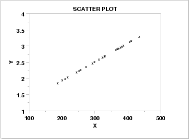
Example of a strong positive linear association: the point cloud is tightly clustered around an upward-sloping straight-line trend. Visually, the small vertical scatter around the implied line is what justifies calling the relationship “strong.” Source
If the form is nonlinear, judge how close they are to a curve.
Strength: The degree to which the points in a scatterplot cluster closely around a particular pattern.
A relationship is often described in general terms such as strong, moderate, or weak.
Strong association: The points stay close to the identified pattern, so the shape is easy to see.
Moderate association: The pattern is still visible, but there is noticeable scatter around it.
Weak association: The points are spread out enough that the pattern is faint or difficult to describe confidently.
There are no exact cutoffs for these labels in visual descriptions. Strength is based on statistical judgment, so two people may choose slightly different words when a graph is borderline. What matters is whether the description matches the overall appearance of the points.
Form and strength must be described together
A complete description of association should combine both ideas. Saying that a relationship is strong linear, weak linear, or moderate nonlinear gives much more information than using only one of those words.
A useful approach is:
look at the full cloud of points
decide whether a straight line or a curve better matches the pattern
judge how closely the points follow that pattern
write a concise description using both form and strength
This order matters. You should identify form first because strength depends on the pattern being used as the reference.
If a scatterplot does not show a clear pattern at all, then the association is very weak, and the form may be difficult to classify. In that situation, careful language such as little apparent association may be more accurate than forcing a specific description.
Common interpretation issues
One common mistake is confusing strength with steepness. A relationship can be very steep and still be weak if the points are widely scattered around the pattern. Likewise, a relationship can be fairly flat and still be strong if the points stay tightly grouped around the same form.
Another mistake is calling a relationship linear just because part of the scatterplot looks straight. The form should describe the overall pattern across the graph. If the points clearly bend when viewed as a whole, nonlinear is the better description.
It is also important to avoid overly certain wording when the pattern is not clear. Statistical descriptions are often based on visual evidence rather than exact rules. Phrases such as appears linear, roughly nonlinear, or moderately strong are appropriate when the graph suggests a pattern but does not show it perfectly.
Good AP Statistics writing is precise but cautious. The goal is not to force every scatterplot into a rigid category, but to describe the visible relationship accurately using the language of form and strength.
Practice Questions
A scatterplot of two quantitative variables shows points clustered closely around a straight line. Describe the form and strength of the association.
1 mark for identifying the form as linear.
1 mark for identifying the strength as strong.
A botanist makes a scatterplot of years since planting and average fruit yield for a group of trees. The points rise quickly at first and then level off. Most points stay very close to this curved pattern.
(a) Describe the form of the association.
(b) Describe the strength of the association.
(c) Explain why a straight-line description would not be appropriate.
(d) Write one complete sentence that combines the correct form and strength.
(a) 1 mark for stating that the form is nonlinear.
(b) 1 mark for stating that the association is strong.
(c) 2 marks total:
1 mark for recognizing that the pattern bends or levels off.
1 mark for explaining that a straight line would not capture the overall pattern.
(d) 1 mark for a correct combined statement such as: “The scatterplot shows a strong nonlinear association.”
FAQ
Usually, the underlying relationship does not change, but the visual impression can.
Stretching or compressing an axis can make a pattern look flatter, steeper, tighter, or more curved. That is why good graph reading focuses on the overall pattern, not just first impressions from the picture’s shape.
With only a few points, random variation can hide the true pattern or create a misleading one.
A small scatterplot may look linear just by chance, or a few points may suggest curvature that would disappear with more data. When the sample is small, cautious wording is especially important.
Yes. Some relationships are approximately straight only within a limited range.
If you examine a short interval, the points may seem to follow a line, but when the full range is shown, the pattern may clearly bend. Always describe form using the entire scatterplot, not just one section.
Measurement error usually adds extra scatter to the plot.
That added scatter makes points look less tightly grouped around the true pattern, so the association can appear weaker than it really is. Even a genuinely strong relationship may look only moderate if the measurements are noisy.
Yes. More data can make the overall pattern clearer.
Additional points may reveal curvature that was not obvious before, or they may show that an apparent curve was only random scatter. They can also change how tightly the data seem to follow the pattern, which affects your judgment of strength.
