
OCR Specification focus:
‘Interpret patterns and relationships shown by graphs, linking to the biological context to support conclusions.’
Interpreting graphical data is an essential skill in biology, enabling clear recognition of relationships, trends and patterns so that meaningful conclusions can be drawn from experimental evidence.
Understanding the Purpose of Graph Interpretation
Interpreting graphs and trends requires identifying how one variable changes in response to another and relating this pattern to underlying biological principles or processes. Graphs visually communicate relationships that may not be obvious from data tables alone, and interpretation allows you to extract meaning from results rather than simply restating what the graph shows. Effective interpretation requires reference to the independent variable, dependent variable, and the wider biological context of the investigation.
When first analysing a plotted graph, focus on:
The overall trend or direction of change
The shape or pattern formed by the data
The scale of change and the steepness of any slopes
Points of interest, including maxima, minima or plateaus
Describing Overall Trends
A trend is the general direction in which data points move. When interpreting, avoid vague terms and instead make precise statements about the pattern. State whether the dependent variable increases, decreases, or remains constant as the independent variable changes, and indicate whether the trend is linear, curvilinear, or sigmoidal, depending on the shape formed by the plotted points.
Key Descriptive Language
Use correct trend vocabulary to strengthen clarity:
Linear positive correlation
Linear negative correlation
No correlation
Rapid increase or decrease
Gradual change
Plateau or constant phase
These phrases help show the examiner that you can interpret, rather than merely describe, the visual pattern.
Recognising Relationships Between Variables
Graphs are frequently used to show correlations, but correlation does not necessarily imply causation.
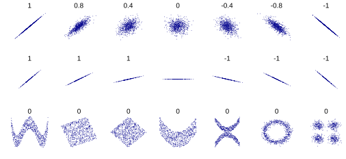
Scatter plots illustrating positive, negative and zero correlations, showing how relationship strength and direction are represented visually. Some non-linear graphs are included for contrast, though these are not required by the syllabus. Source.
In biological investigations, relationships may arise due to enzyme activity, transport mechanisms, population changes, or limiting factors.
Correlation
Correlation: A statistical relationship in which changes in one variable are associated with changes in another.
When a correlation is identified, the next step is to evaluate whether it is biologically reasonable. Real biological systems often produce curves rather than straight lines due to changing limiting factors or feedback regulation.
Linking Trends to Biological Context
Interpreting graphs at A-Level requires more than describing shapes; you must connect patterns to biological mechanisms. For example, a plateau on a graph of reaction rate against substrate concentration can be linked to enzyme active site saturation.
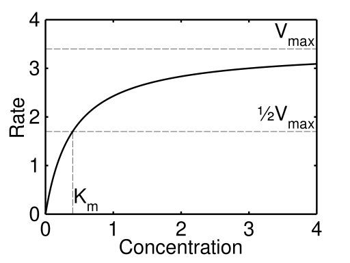
A reaction rate curve that rises and then plateaus as Vmax is approached, representing enzyme active site saturation at high substrate levels. Extra kinetic labels are shown but are not required by the syllabus. Source.
Always state the biological reason for a trend, using key knowledge from the relevant topic area. Graphs demand that you demonstrate understanding, not memorisation.
Identifying Key Graph Features
A trend may not be uniform across the entire graph. Good interpretation highlights:
Starting and finishing values or states
Regions where the trend changes direction or steepness
Anomalous points that fall outside the pattern
Maximum or minimum values
Thresholds or optimum conditions
Describing these features shows that you have examined the graph critically and thoroughly.
Interpreting Rate of Change
The gradient of a line shows how fast the dependent variable changes.
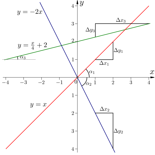
A diagram showing how rise (Δy) and run (Δx) determine gradient, illustrating how steeper lines represent faster changes in the dependent variable. Angle markings are included as extra detail beyond syllabus requirements. Source.
Steeper gradients indicate a faster rate. Rate-based interpretations are common in enzyme, respiration, photosynthesis and ecological investigations. Although the focus here is interpretation rather than calculation, when discussing rates you should refer to whether the gradient becomes steeper, shallower, or remains constant as the experiment progresses.
A rate can be qualitative (described in words) or quantitative (derived from the gradient of a graph).
Using Biological Reasoning to Support Conclusions
OCR requires that graph interpretation leads to valid conclusions. This involves:
Using the trend shown by the graph as evidence
Linking the trend to biological theory
Avoiding over-interpretation or unjustified claims
To do this effectively, follow a three-part structure when writing about graphs:
State the trend
Provide data or a visual reference to support it
Explain the biological reasoning
Spotting Anomalies
Anomalies are data points that do not follow the pattern of the rest of the graph. When interpreting trends, identify anomalies and comment on their possible effect on reliability. Anomalies should not dominate your interpretation, but acknowledging them shows good analytical skill.
Synthesising Graphical Information
Interpreting graphs and trends draws together observation, analysis and explanation. Strong interpretation demonstrates that you can extract meaning from data, comment on relationships, and relate patterns to biological principles, fulfilling the OCR requirement to link graphs to scientific conclusions.
Practice Questions
Question 1 (2 marks)
A student plots a graph showing the relationship between light intensity and the rate of photosynthesis. Describe the trend shown as light intensity increases, and explain what this shows about the relationship between the two variables.
Question 1 (2 marks)
Award 1 mark for description and 1 mark for interpretation:
Clear description of the trend (e.g., rate increases as light intensity increases) (1)
Correct explanation that the relationship is positive or that higher light intensity increases photosynthesis (1)
Question 2 (5 marks)
Figure 1 shows a graph of enzyme reaction rate against temperature. Analyse the trends shown by the graph and explain the biological reasons for these trends. In your answer, you should refer to the rate of change, key features of the curve, and the relationship between temperature and enzyme activity.
Question 2 (5 marks)
Award up to 5 marks for:
Identifying that the rate increases as temperature rises (1)
Stating that the rate increases more rapidly up to an optimum temperature (1)
Identifying that the rate then decreases after the optimum (1)
Explaining that the increase is due to faster kinetic energy and more frequent successful collisions (1)
Explaining that the decrease is due to denaturation and loss of active site shape (1)
FAQ
A relationship is proportional when the graph shows a straight line through the origin, indicating that the dependent variable changes at a constant rate relative to the independent variable.
To confirm proportionality:
Check that doubling the independent variable doubles the dependent variable
Look for a constant gradient across the whole range
Ensure there is no plateau or curve at higher values
Line graphs are preferred because they show continuity, allowing you to track how one variable changes in direct response to another. This makes it easier to identify gradients, turning points, and overall trends.
Bar charts separate data into categories, which is useful for comparison but less effective for analysing relationships or rates of change.
State the overall trend first, then comment on fluctuations. Examiners want to see that you can prioritise the main pattern before acknowledging minor variations.
You may also:
Identify specific points where the data deviates
Suggest possible causes, such as biological variation or measurement error
Avoid over-interpreting individual irregularities that do not change the overall conclusion
A graph can reveal a limiting factor when a trend changes slope or reaches a plateau. For example, a levelling off indicates that increasing the independent variable no longer raises the rate of the process.
Look for:
A rapid initial increase (factor not yet limiting)
A slowing rate of increase (factor beginning to limit)
A plateau (factor now fully limiting)
Steepness reflects how rapidly the dependent variable changes, helping you judge the strength or intensity of the relationship. A steeper gradient means a faster rate of change.
Commenting on steepness allows you to:
Compare different regions of the same graph
Highlight where conditions have the greatest biological effect
Support more analytical, higher-level interpretations
