
OCR Specification focus:
‘Interpret graph shapes and numerical outputs to explain trends, test models and draw justified conclusions.’
Understanding Data Interpretation in Chemistry
In A-Level Chemistry, analysing data is central to transforming raw experimental results into meaningful scientific understanding. Students must interpret trends within data and draw justified conclusions that reflect both evidence and theory.
Recognising and Interpreting Trends
Identifying Patterns in Data
When analysing data, chemists seek relationships between independent and dependent variables. These relationships can be:
Directly proportional: As one variable increases, the other increases proportionally.
Inversely proportional: As one variable increases, the other decreases proportionally.
Non-linear: The relationship follows a curve, such as exponential or logarithmic growth.
Recognising these relationships helps in explaining chemical principles, such as rate–concentration or pressure–volume relationships.
Graphical Representations
Graphs provide visual clarity in recognising trends. Students must be able to identify:
Linear trends (straight lines) indicating constant proportionality.
Curved trends indicating non-linear relationships.
Plateaus or asymptotes that suggest equilibrium or saturation points.
When describing a graph, always refer to both axes, the shape of the curve, and any key features such as intercepts, maxima, or minima.
Using Graph Shapes to Explain Chemical Behaviour
Correlating Graph Shape with Theory
Each graph shape reflects an underlying chemical process or law. For example:
A straight-line graph in a first-order reaction rate plot indicates constant proportionality between rate and concentration.
A curve that flattens in a gas solubility plot implies the system is approaching saturation.
Temperature–rate graphs typically rise exponentially, showing kinetic dependence on activation energy.
Understanding how theoretical models correspond to these shapes is crucial for drawing valid interpretations.
Testing Models and Theoretical Predictions
Model Validation
Once a pattern is observed, students must evaluate whether it fits a theoretical model.
Confirmatory trends support the model (e.g., obeying Boyle’s law: P × V = constant).
Deviations may suggest experimental errors or that assumptions in the model are invalid under the conditions tested.
Revising Theories
When significant discrepancies appear, these should prompt critical evaluation of both:
The experimental procedure, to check for systematic error.
The theoretical explanation, which may need refining or extension.
Drawing Justified Conclusions
Logical Reasoning
Drawing conclusions involves linking data trends with chemical reasoning. A valid conclusion must:
Refer directly to observed data (quantitative or qualitative).
Incorporate scientific principles that explain why the trend occurs.
Avoid assumptions not supported by the evidence.
This requires careful integration of empirical results and theoretical understanding.
Evidence-Based Judgement
Students should support their conclusions with:
Numerical evidence (ratios, differences, gradients).
Graphical interpretation (e.g., slope indicating rate).
Reference to uncertainty, where the data’s precision limits confidence in the conclusion.
Quantitative Interpretation of Trends
Using Gradients and Intercepts
In linear graphs, gradients and intercepts quantify the strength and direction of relationships.
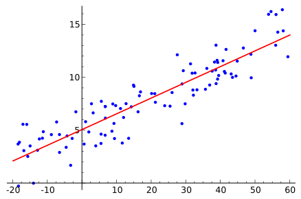
A scatter plot with a fitted line illustrates a linear trend through noisy data. The intercept shows the estimated value when the independent variable is zero, and the slope indicates the rate of change. Minor point scatter reflects experimental variability rather than a change in the underlying relationship. Source
Gradient (m) = Change in y / Change in x
m = Rate of change or proportional constant (unit depends on context)
The gradient may represent a physical quantity, such as a rate constant (k) or enthalpy change per unit.
The intercept often provides contextual information, such as the initial value of a variable.
Recognising Rate of Change
A steep gradient implies a rapid change, whereas a shallow gradient indicates a weak relationship. These distinctions are essential in topics like kinetics or thermodynamics, where small changes in variables can have large chemical implications.
Interpreting Numerical Outputs
From Raw Data to Processed Information
Processed data, such as means, ratios, or percentages, reveal numerical patterns that may not be visible in raw data. When interpreting numerical outputs:
Compare magnitudes and ratios rather than absolute values.
Assess whether changes are proportional, increasing, decreasing, or constant.
Identify outliers that could distort trend recognition.
Assessing Consistency
If multiple sets of data show the same pattern, the trend is likely reliable. Consistency across replicates increases confidence that the observed relationship reflects true chemical behaviour.
Linking Trends to Chemical Concepts
Examples of Trend Interpretation
Rates of reaction: Faster rate at higher temperature supports the collision theory due to more particles exceeding activation energy.
Equilibrium position: Shifts predicted by Le Chatelier’s principle explain changes in concentration or pressure.
Titration curves: The shape of the curve identifies acid–base strength and equivalence points.
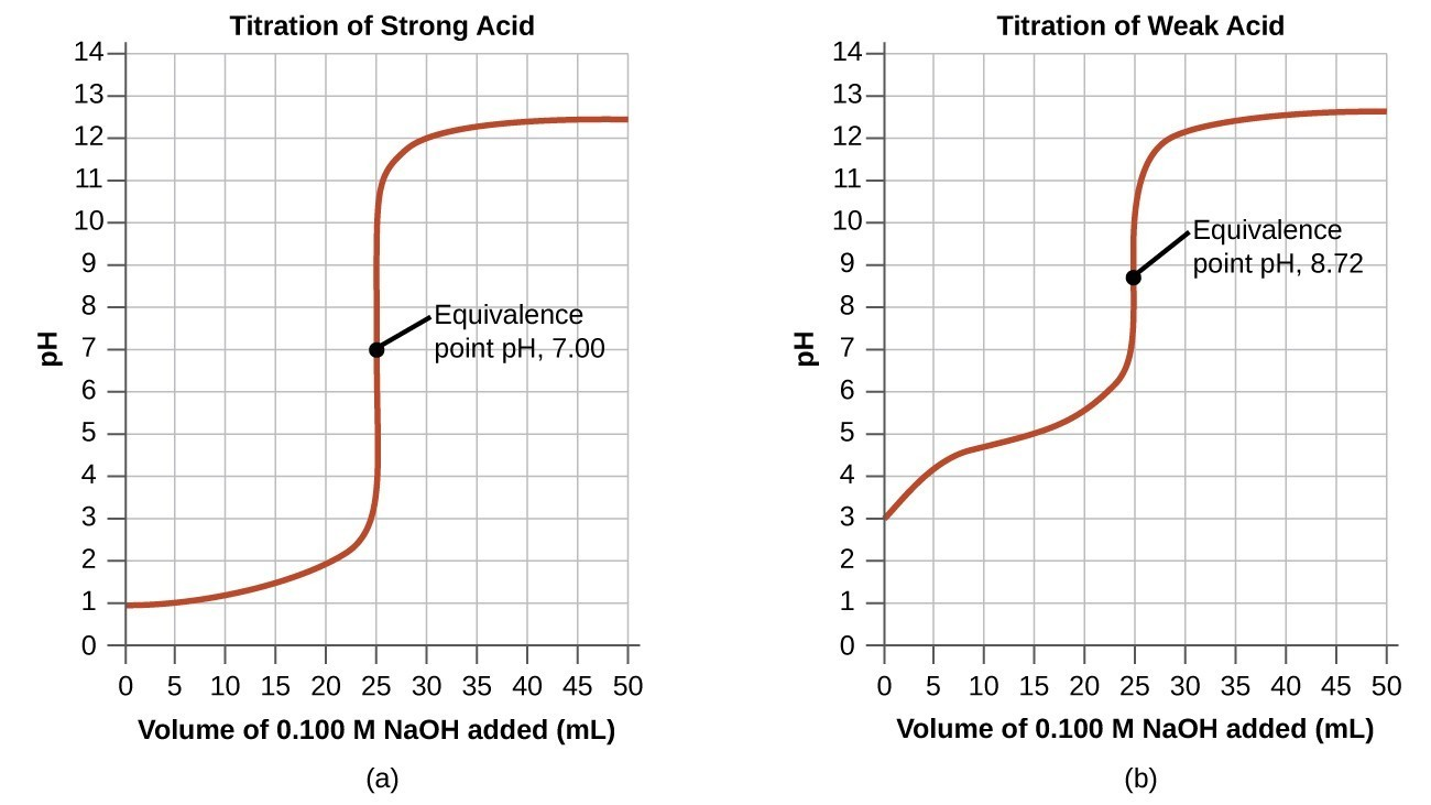
Comparative titration curves show how pH changes with volume of titrant, highlighting the equivalence point as the midpoint of the steep rise. Notation for weak vs strong systems illustrates how curve shape supports chemical conclusions. This figure includes introductory indicator context not required by the syllabus but helps visualise the steep transition region. Source
Each interpretation must connect observable data with molecular-level explanations.
Evaluating the Validity of Conclusions
Consistency and Corroboration
A strong conclusion should be:
Consistent with all collected data.
Corroborated by known scientific laws.
Reproducible by other experiments under similar conditions.
Where inconsistencies appear, conclusions must be revised or qualified with uncertainty statements.
Recognising Overinterpretation
Avoid extending conclusions beyond the scope of the data. For instance, observing a linear relationship over a small range does not confirm it applies universally.
Integrating Uncertainty and Reliability
Interpreting trends must also include consideration of data uncertainty. Large uncertainties or inconsistent data reduce confidence in the trend. Students should describe how:
Random errors affect scatter on graphs.
Systematic errors shift the entire dataset.
Repeat measurements improve reliability.
Conclusions should reflect both the direction of the trend and the degree of certainty with which it is known.
Key Points for Examinations
When interpreting data in written exams, ensure to:
Describe what the data show before explaining why.
Use quantitative references such as gradient or numerical difference.
Always relate trends to chemical principles.
Include any limitations or uncertainties that may weaken the conclusion.
Through systematic interpretation and critical reasoning, students can convert graphical and numerical information into scientifically robust conclusions that meet the OCR assessment objectives.
Practice Questions
A student measures the rate of a chemical reaction at several different temperatures. When the results are plotted as rate versus temperature, the graph shows an upward curve that becomes steeper at higher temperatures.
(a) Explain what this trend suggests about the relationship between temperature and rate of reaction.
(2 marks)
1 mark: States that the rate increases as temperature increases.
1 mark: Explains that higher temperature means more particles have energy greater than the activation energy, leading to more frequent successful collisions.
A student investigates the decomposition of hydrogen peroxide using manganese(IV) oxide as a catalyst. The concentration of oxygen produced over time is plotted on a graph, showing a curved line that gradually levels off.
(a) Describe the trend shown by the graph and explain what it indicates about the progress of the reaction. (3 marks)
(b) Suggest two ways the student could test whether the results are reliable. (2 marks)
(5 marks)
(a)
1 mark: Identifies that the rate of reaction is fast at the start and slows down over time.
1 mark: Explains that the curve levels off when the reaction is complete or reactants are used up.
1 mark: Links the change in gradient to decreasing concentration of reactants or fewer effective collisions.
(b)
1 mark: Suggests repeating the experiment to check for consistency in results.
1 mark: Suggests comparing results with secondary data or another group’s data to assess reproducibility.
FAQ
A correlation shows that two variables change together, but it does not necessarily mean one causes the other. In chemistry, a causal relationship is only established when a variable’s change can be explained by a scientific mechanism, such as an increase in temperature causing more frequent particle collisions. Always use theoretical understanding to distinguish between correlation and causation.
Anomalies can obscure real trends by distorting the overall pattern of data. To manage them:
Identify points that deviate significantly from the general trend.
Check for possible causes, such as measurement error or contamination.
Reassess whether excluding the anomaly changes the interpretation.
Discussing anomalies improves the reliability of conclusions.
Linearisation converts curved data into a straight line, making it easier to analyse relationships quantitatively. For instance, plotting ln(rate) versus 1/T transforms the Arrhenius equation into a linear form. This allows direct determination of constants such as activation energy from the gradient, improving precision in interpretation.
Chemists compare the observed pattern to predictions from theory. Support is confirmed if:
The data follow the expected mathematical relationship.
Gradients or intercepts align with theoretical constants.
Repeated experiments yield similar trends.
If data deviate, they may indicate limitations in the model or experimental design.
Uncertainty defines the range within which measured values are likely to fall. When analysing trends:
Include error bars to show measurement variability.
Avoid over-interpreting small differences that fall within the uncertainty range.
Use uncertainty to discuss the confidence level of conclusions. Acknowledging uncertainty demonstrates scientific rigour and strengthens data interpretation.
