
OCR Specification focus:
‘Present information and data in a scientific way; use appropriate software and tools to process data, research and report findings.’
Introduction
Presenting data effectively is essential for communicating scientific findings clearly and accurately. This subtopic focuses on applying digital tools and scientific conventions to process, display, and report chemical data.
Presenting Data Scientifically
Presenting data in chemistry involves transforming raw experimental observations into meaningful, interpretable formats that allow trends, patterns, and relationships to be seen. The presentation must be clear, accurate, and reproducible, adhering to conventions of scientific communication.
Key Principles of Data Presentation
Chemists present data in ways that:
Allow for comparison between experimental and theoretical values.
Ensure accuracy and precision of measurements are reflected.
Demonstrate validity, reliability, and consistency of results.
Enable others to replicate and evaluate the investigation.
Types of Data
Qualitative data: Descriptive information, such as colour changes or precipitate formation.
Quantitative data: Numerical results obtained from measurements such as temperature, volume, or mass.
Units and Significant Figures
All numerical data must include SI units and correct significant figures. The number of significant figures should match the least precise measurement used in a calculation.
Significant Figures: The digits in a number that carry meaning regarding its precision, including all certain digits and the first uncertain digit.
Tables and Raw Data Recording
Accurate recording is the first step before digital processing. Data tables should:
Include headings with units in brackets, e.g., Temperature (°C).
Maintain a consistent decimal format within each column.
Use clear titles and labels for each variable measured.
Avoid unnecessary repetition and ensure clarity for re-analysis.
When using digital tools such as spreadsheets (e.g., Microsoft Excel, Google Sheets), ensure formulas are correctly applied and data integrity is maintained through proper formatting.
Graphical Representation
Graphs convert numerical data into visual trends, aiding interpretation and comparison. Line graphs, scatter plots, and bar charts are commonly used, depending on the nature of data.
Key Features of Scientific Graphs
Axes labels must include both variable names and units.
The independent variable is plotted on the x-axis and the dependent variable on the y-axis.
Linear relationships should use a best-fit line, while non-linear data may require curves.
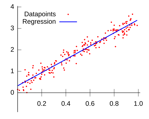
A scatter plot with a least-squares best-fit line superimposed. Axes are cleanly labelled and point markers are unobtrusive, exemplifying good scientific graph presentation. The image focuses on regression only and does not include uncertainty bars, which are discussed separately. Source
Avoid connecting points dot-to-dot unless explicitly required for discrete data.
Best-fit Line: A straight or curved line that passes as close as possible to all data points, showing the general trend of results.
Use error bars when appropriate to represent uncertainty in measurements. These show how much each data point might vary due to experimental limitations.
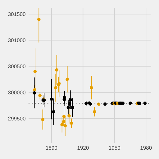
A set of data points plotted with vertical error bars indicating the uncertainty of each estimate. This teaches how error bars communicate precision and variability around measured means. Extra contextual details (historical speed-of-light studies) are present but not required by the syllabus. Source
Using Digital Tools
Spreadsheet Software
Spreadsheets such as Excel or Google Sheets are used to:
Enter, organise, and calculate data efficiently.
Perform statistical analysis using built-in functions (e.g., AVERAGE, STDEV).
Generate graphs and charts automatically with accurate scaling.
Apply formulas to check relationships between variables.
Digital tools enhance reproducibility, as formulas and datasets can be easily checked and shared.
Data Loggers and Sensors
In modern laboratories, data can be captured directly through digital sensors connected to computers. These tools provide:
Real-time data collection (e.g., temperature, pH, voltage).
Higher accuracy and faster sampling rates.
Automatic plotting of data over time.
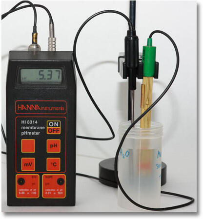
A laboratory pH meter with a glass electrode probe positioned above a sample cup. The device converts electrode voltage into a pH reading and can interface with software for recording and display. The image shows instrument layout; specific calibration steps are beyond the syllabus focus. Source
Such devices reduce human error and support continuous data monitoring during reactions.
Processing Data Scientifically
After collecting data, chemists process it to identify relationships, trends, and errors.
Calculations and Derived Data
Processed data includes averages, percentage yields, and rate constants. Using digital tools allows automatic calculation with formula-based systems to minimise human error.
Percentage Error (%) = (|Experimental Value − Accepted Value| ÷ Accepted Value) × 100
Experimental Value = Value obtained during the experiment
Accepted Value = True or literature value
After calculations, results should be checked for reasonable precision, ensuring that rounding does not distort outcomes.
Statistical Analysis
Digital tools can perform statistical tests to assess data reliability:
Mean: Average value representing central tendency.
Standard deviation: Indicates the spread of data about the mean.
Correlation coefficient (r): Measures the strength of linear relationships.
These metrics allow chemists to discuss how consistent and accurate their data are.
Using Graphing Software and Modelling Tools
Beyond spreadsheets, scientific graphing software (e.g., Logger Pro, Origin, or GraphPad Prism) provides more detailed options for curve fitting and data modelling. These programs enable:
Polynomial or exponential fits for non-linear data.
Regression analysis to determine equations of best-fit lines.
Automatic calculation of gradients and intercepts for kinetics or titration studies.
Graphs must always display clear scales, labelled axes, and correctly plotted data points.
Research and Reporting with Digital Tools
Digital platforms are also used for compiling and communicating results. This may include:
Word processors for formal reports following scientific conventions (introduction, method, results, discussion).
Presentation software (e.g., PowerPoint, Google Slides) to share findings visually.
Reference managers (e.g., Zotero, Mendeley) to organise and correctly cite scientific sources.
Referencing in Scientific Work
When using digital resources, accurate referencing is vital to acknowledge data sources and maintain academic integrity.
Citation: A reference to the original source of information, data, or ideas, allowing others to locate the same resource.
Most scientific work follows Harvard or APA referencing styles, ensuring consistency across publications.
Ensuring Accuracy and Reliability
Digital tools must be used responsibly to avoid introducing new errors through incorrect formula entry, rounding issues, or formatting mistakes. Chemists must routinely:
Check calculations for accuracy.
Validate results through repeat measurements.
Save datasets securely with appropriate file naming conventions.
In doing so, they ensure that their data presentation and reporting meet the professional standards expected in scientific research and assessment.
Practice Questions
A student records experimental data in a table but forgets to include units for each measurement. Explain why including units is important when presenting scientific data. (2 marks)
1 mark: States that units identify the physical quantity measured (e.g., mass, volume, temperature).
1 mark: Explains that omitting units makes data unclear or prevents comparison between different measurements.
A student uses a pH probe connected to a computer to monitor changes in pH during a neutralisation reaction. The data are automatically plotted on a graph by the software.
(a) Explain two advantages of using digital tools such as a pH probe and computer software to collect and present this data. (2 marks)
(b) Describe three key features that should be included when presenting the pH data graphically to meet scientific standards. (3 marks)
(5 marks)
(a)
1 mark: Allows for real-time data collection and automatic recording, reducing human error.
1 mark: Produces accurate and reproducible graphs that can be easily analysed and shared.
(b)
1 mark: Correctly labels axes with variable names and units (e.g., time/s, pH).
1 mark: Uses appropriate scaling and a smooth curve or best-fit line for continuous data.
1 mark: Includes clear title and consistent formatting to ensure readability and accuracy.
FAQ
Digital tools minimise human error by automating calculations, graph plotting, and data recording. They ensure consistency across datasets and provide precision through built-in functions that standardise significant figures and units.
Additionally, software such as Excel or Logger Pro allows automatic error analysis and real-time graph updates, helping students quickly identify outliers or inconsistent results.
Precision refers to how close repeated measurements are to each other, while accuracy indicates how close results are to the true or accepted value.
When presenting data:
Precision is reflected by the number of significant figures or small error bars.
Accuracy is assessed through comparison with literature or theoretical values.
Both should be addressed when evaluating the quality of experimental data.
Scatter plots: Continuous data, such as rate of reaction against temperature.
Line graphs: Continuous change over time, such as titration curves.
Bar charts: Discrete categories, such as comparing solubility of different salts.
Choosing the correct type improves clarity and ensures that relationships between variables are accurately represented.
Common errors include:
Forgetting to label axes or include units.
Using inconsistent significant figures.
Selecting inappropriate graph types (e.g., bar chart instead of scatter plot).
Over-formatting graphs with colours or effects that obscure clarity.
Maintaining scientific simplicity ensures results remain clear and interpretable.
Uncertainty can be visually shown using error bars or numerically through percentage uncertainty calculations. Software tools can automate both.
When adding error bars:
Use consistent lengths to represent standard deviation or confidence intervals.
Clearly state the source of uncertainty (instrumental, procedural, or random).
This ensures transparency and improves the reliability of the presented data.
